React Native Viewpager Carousel


Contribution
Feel free to make a pull request. I'm happy about every contribution.
Examples
You can find example implementations for all use cases of this library in the repo react-native-viewpager-carousel-example-app. The example project is also linked as git submodule in this project.
Installation
yarn add react-native-viewpager-carousel
or
npm install --save react-native-viewpager-carousel
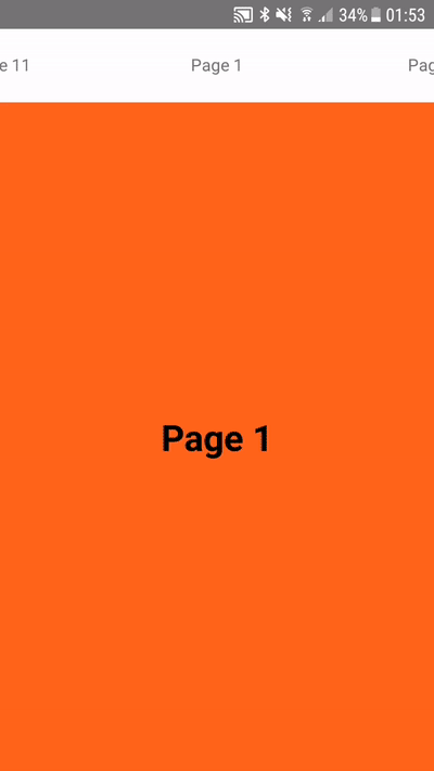
Preview
ViewPager
The <ViewPager /> is the base component of the library. Till now it acts like a simple view-carousel:
import { ViewPager } from 'react-native-viewpager-carousel'

class ExampleCarousel extends PureComponent {

    constructor() {
        this.data = [
            { title: 'title 1' },
            { title: 'title 2' },
            { title: 'title 3' },
        ]
    }

    _renderPage = ({data}) => {
        return ( <Text>{item.title}</Text> )
    }

    render() {
        return (
            <ViewPager
                data={this.data}
                renderPage={this._renderPage}
            />
        )
    }
}
API
| prop name | data type | default | functionality |
|---|---|---|---|
| containerStyle | style | {} | the component is wrapped into a <View />. Styles to this <View /> can be assigned through this property |
| contentContainerStyle | style | {} | posibility to set styles to the content container (the entire scrollable area) |
| data | array | [] | a data array of objects |
| dev | boolean | false | draws a black line around the pages and tabs for debugging |
| lazyrender | boolean | false | lazyrender renders the active page only when its in the viewport |
| lazyrenderThreshold | number | 1 | determines how many threshold left and right the current visible page sould be rendered if lazyrender={true} |
| renderAsCarousel | boolean | true | renders the as endless carousel |
| thresholdPages | number | 1 | number of pages left and right of the scrollable content (sneak preview) |
| pageWidth | number | {{screen width of device}} | width of page |
| initialPage | object | {} | key value pair of initial page: e. g. data=[{key:'page-a'}, {key:'page-b'}] & initialPage={{key:'page-b}} |
| scrollEnabled | boolean | true | decleares wether the ViewPager should be able to scroll by user or not |
| firePageChangeIfPassedScreenCenter | boolean | false | toggle's if onPageChange sould already be called when the dragged page passed half of the screen |
| pagingEnabled | boolean | true | |
| experimentalMirroring | boolean | false | toggles the mirroring of the scrollposition of the threshold views - more information here |
| showNativeScrollIndicator | boolean | false | native ScrollView indicator is disabled by default |
| renderPage | function | () => {} | render callback for content page |
| onPageChange | function | () => {} | callback when the page changes -> retuns the current pageNumber as first argument |
| onScroll | function | () => {} | callback when the content area scrolls |
TabbedPager
In addition to the <ViewPager /> the <TabbedPager /> component provides an additional renderFunction for Tabs above the content view. The following pseudo-code shows the basic usage with an <Image /> as content and a <Text /> as tab.
import { TabbedPager } from 'react-native-viewpager-carousel'

class ExampleCarousel extends PureComponent {

    constructor() {
        this.data = [
            { title: 'title 1', url: 'http://...' },
            { title: 'title 2', url: 'http://...' },
            { title: 'title 3', url: 'http://...' },
        ]
    }

    _renderTab = ({data}) => {
        return ( <Text>{data.title}</Text> )
    }

    _renderPage = ({data}) => {
        return ( <Image source={{uri: data.url}} /> )
    }

    render() {
        return (
            <ViewPager
                data={this.data}
                renderTab={this._renderTab}
                renderPage={this._renderPage}
            />
        )
    }
}
API
| prop name | data type | default | functionality |
|---|---|---|---|
| data | array | [] | a data array of objects |
| dev | boolean | false | draws a black line around the pages and tabs for debugging |
| fullScreen | boolean | true | draws the in full screen mode (flex 1) |
| lazyrender | boolean | false | lazyrender renders the active page only when its in the viewport |
| lazyrenderThreshold | number | 1 | determines how many threshold left and right the current visible page sould be rendered if lazyrender={true} |
| renderAsCarousel | boolean | true | renders the as endless carousel |
| tabContainerPosition | string | 'top' | could be 'top' || 'bottom' - places the tab container on top of the viewpager or on the bottom side |
| scrollTabsEnabled | boolean | false | |
| firePageChangeIfPassedScreenCenter | boolean | false | toggle's if onPageChange sould already be called when the dragged page passed half of the screen |
| staticTabWidth | number | {{screen width of device / 2}} | |
| initialPage | object | {} | key value pair of initial page: e. g. data=[{key:'page-a'}, {key:'page-b'}] & initialPage={{key:'page-b}} |
| showTabIndicator | boolean | true | toggles the tab indicator |
| tabIndicatorColor | string | 'transparent' | changes the color of the tab indicator |
| tabIndicatorHeight | number | 2 | height of tab indicator |
| tabsVisible | boolean | true | indicates if tabs should be visible or not |
| DividerComponent | any | null | renders a given Component between the tabs and the content area |
| renderPage | function | () => {} | render callback for content page |
| renderTab | function | () => {} | render callback for the tab |
| onPageChange | function | () => {} | callback when the page changes -> retuns the current pageNumber as first argument |
| experimentalMirroring | boolean | false | toggles the mirroring of the scrollposition of the threshold views - more information here |