No longer actively maintained
I no longer have the time nor the energy to maintain Picky. Please fork and improve. For alternatives I suggest:
Picky ☜
Yet another React select list.


Motivation
When dealing with medium+ length select lists, especially multi-select lists. The common approach is to use tags e.g.
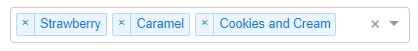
Source: React-Select by Jed Watson
This approach is fine for smaller lists. When you have options for 20, 30, 100+ options that the use can select, it becomes unmanigable.
For example you have a internal staff mailing list. You want to mail all staff in a department (30 employees). You select all. That would be 30 tags taking unneccessary space.
This is a multiselect with checkboxes, a select all option, and a filter. Along a similar vein as David Stutz's Bootstrap Multiselect. There is a port of that library to react with Skratchdot's React Bootstrap Multiselect. However I don't want a dependency on jQuery. If you are already using jQuery that might be an alternative for you.
If you like the tag list like React-Select, then that would be a great option for you. It's a really great, well-tested library. Give it a look.
You can also achieve the same result with a great deal of flexibility using Paypal's Downshift.
More on React Select
React Select V2 is pretty incredible, you can replace and provide custom functionality for almost every element of the select component. With a little work you could rebuild Picky from the components of React Select, take a look at React Select: Experimental, the Popout example is close to what Picky does. You could even build a date picker in React Select...HOW COOL IS THAT!
What Picky is
Picky provides a medium amount of flexibility, you can custom render: Options, List (useful for creating a virtualized menu), and SelectAll. Any further customisation and it's a little out of scope for Picky. It was built with a common pattern in mind so you can get up and running with little-to-no work. If you need Picky to be more flexible, I'm happy to take a PR if it would benefit the rest of the community.
Peer Dependencies
 "react": "^16.8.0",
 "react-dom": "^16.8.0"
Installation
  npm install --save react-picky
  # or
  yarn add react-picky
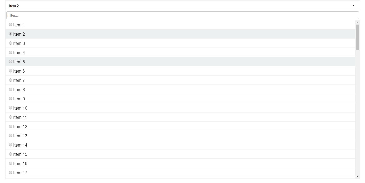
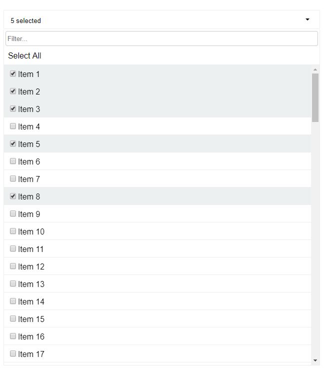
Screenshots
Single Select
Multi Select
Usage
Basic example
import { Picky } from 'react-picky';
import 'react-picky/dist/picky.css'; // Include CSS

<Picky
  id="picky"
  options={[1, 2, 3, 4, 5]}
  value={[]}
  multiple={true}
  includeSelectAll={true}
  includeFilter={true}
  onChange={values => console.log(values)}
  dropdownHeight={600}
/>;
Examples
Props
Picky.defaultProps = {
  numberDisplayed: 3,
  options: [],
  filterDebounce: 150,
  dropdownHeight: 300,
  onChange: () => {},
  tabIndex: 0,
  keepOpen: true,
  selectAllText: 'Select all',
  selectAllMode: 'default',
};
Picky.propTypes = {
  id: PropTypes.string.isRequired,
  placeholder: PropTypes.string,
  value: PropTypes.oneOfType([
    PropTypes.array,
    PropTypes.string,
    PropTypes.number,
    PropTypes.object,
  ]),
  numberDisplayed: PropTypes.number,
  multiple: PropTypes.bool,
  options: PropTypes.array.isRequired,
  onChange: PropTypes.func.isRequired,
  open: PropTypes.bool,
  includeSelectAll: PropTypes.bool,
  includeFilter: PropTypes.bool,
  filterDebounce: PropTypes.number,
  dropdownHeight: PropTypes.number,
  onFiltered: PropTypes.func,
  onOpen: PropTypes.func,
  onClose: PropTypes.func,
  valueKey: PropTypes.string,
  labelKey: PropTypes.string,
  render: PropTypes.func,
  tabIndex: PropTypes.oneOfType([PropTypes.string, PropTypes.number]),
  keepOpen: PropTypes.bool,
  manySelectedPlaceholder: PropTypes.string,
  allSelectedPlaceholder: PropTypes.string,
  selectAllText: PropTypes.string,
  renderSelectAll: PropTypes.func,
  defaultFocusFilter: PropTypes.bool,
  className: PropTypes.string,
  renderList: PropTypes.func,
  filterPlaceholder: PropTypes.string,
  disabled: PropTypes.bool,
  getFilterValue: PropTypes.func,
  caseSensitiveFilter: PropTypes.bool,
  buttonProps: PropTypes.object,
  selectAllMode: PropTypes.oneOf(['default', 'filtered']),
  clearFilterOnClose: PropTypes.bool,
  singleSelectPlaceholder: PropTypes.func,
};
Prop descriptions
id- HTML id assigned to input. Also used as a base for other elements inside Picky.placeholder- Default message when no items are selected.value- The selected value(s), array if multiple is true. Not needed if using as an uncontolled componentnumberDisplayed- Then number of selected options displayed until it turns into '(selected count) selected'.multiple- Set to true for a multiselect, defaults to false.options- Array of possible options.onChange- Called whenever selected value(s) have changed. Pass the selected value back intovalue.open- Can open or close the dropdown manually. Defaults to false.includeSelectAll- If set totruewill add aSelect Allcheckbox at the top of the list.includeFilter- If set totruewill add an input at the top of the dropdown for filtering the results.filterDebounce- Debounce timeout, used to limit the rate the internalonFilterChangegets called. Defaults to 150ms.dropdownHeight- The height of the dropdown. Defaults to 300px.onFiltered- Called after a filter has been done with the filtered options.onOpen- Called after the dropdown has opened.onClose- Called after the dropdown has closed.valueKey- If supplying an array of objects as options, this is required. It's used to identify which property on the object is the value.labelKey- If supplying an array of objects as options, this is required. It's used to identify which property on the object is the label.render- Used for custom rendering of items in the dropdown. More info below.tabIndex- Pass tabIndex to component for accessibility. Defaults to 0keepOpen- Default true. Single selects close automatically when selecting a value unless this is set to true.manySelectedPlaceholder- Default "%s selected" where %s is the number of items selected. This gets used when the number if items selected is more than thenumberDisplayedprop and when all options are not selected.allSelectedPlaceholder- Default "%s selected" where %s is the number of items selected. This gets used when all options are selected.selectAllText- Default "Select all", use this to override "Select all" text from top of dropdown when included withincludeSelectAll.renderSelectAll- Used for rendering a custom select alldefaultFocusFilter- If set to true, will focus the filter by default when opened.renderList- Render prop for whole list, you can use this to add virtualization/windowing if necessaryfilterPlaceholder- Override the filter placeholder. Defaults to 'Filter...'getFilterValue- Will provide the input value of filter to the picky dropdown, so that if we have a larger list of options then we can only supply the matching options based on this value.caseSensitiveFilter- If true options will be returned when they match casebuttonProps- Additional props to apply the the button component, useful for supplying class names.selectAllMode- default:default. When the mode isfilteredthe Select All won't be hidden when filtering.clearFilterOnClose- When set to true filtered options and filtered state will be cleared on close. Defaults to false.filterTermProcessor- A function that takes a string and returns a string. Useful for trimming and processing a filter term before it filters the options. Default: (term) => termsingleSelectPlaceholder- A function that takes the currently selected value and returns a string.(val: OptionType) => string
Custom rendering
Items
You can render out custom items for the dropdown.
Example
<Picky
  id="picky"
  value={this.state.arrayValue}
  options={bigList}
  onChange={this.selectMultipleOption}
  open={false}
  valueKey="id"
  labelKey="name"
  multiple={true}
  includeSelectAll={true}
  includeFilter={true}
  getFilterValue={this.getFilterValue}
  dropdownHeight={600}
  render={({
    style,
    isSelected,
    item,
    selectValue,
    labelKey,
    valueKey,
    multiple,
  }) => {
    return (
      <li
        style={style} // required
        className={isSelected ? 'selected' : ''} // required to indicate is selected
        key={item[valueKey]} // required
        onClick={() => selectValue(item)}
      >
        {/* required to select item */}
        <input type="checkbox" checked={isSelected} readOnly />
        <span style={{ fontSize: '30px' }}>{item[labelKey]}</span>
      </li>
    );
  }}
/>
The render callback gets called with the following properties: style, isSelected, item, labelKey, valueKey, selectValue, multiple
isSelected- boolean - true if item is selected. Use this for styling accordingly.item- object | number | string - The item to render.labelKey- Used to get the label if item is an objectvalueKey- Used to get the value if item is an object, good for keys.selectValue- function(item) - Selects the item on clickmultiple- boolean - Indicates if is a multiselect.
Note
- If your rendered item affects the height of the item in anyway. Supply
itemHeightto Picky. - If you wish to show a radio button or a checkbox, be sure to add
readOnlyprop to the input.
Select All
<Picky
  // ...
  renderSelectAll={({
    filtered,
    tabIndex,
    allSelected,
    toggleSelectAll,
    multiple,
  }) => {
    // Don't show if single select or items have been filtered.
    if (multiple && !filtered) {
      return (
        <div
          tabIndex={tabIndex}
          role="option"
          className={allSelected ? 'option selected' : 'option'}
          onClick={toggleSelectAll}
          onKeyPress={toggleSelectAll}
        >
          <h1>SELECT ALL</h1>
        </div>
      );
    }
  }}
/>
Gets called with the following properties:
filtered: boolean - true if items have been filtered.allSelected: boolean true if all items are selected.toggleSelectAll: function selects or deselects all items.tabIndex: number used for specifying tab index.multiple: boolean true if multiselect.
Render List
<Picky
  id="picky"
  value={this.state.arrayValue}
  options={bigList}
  onChange={this.selectMultipleOption}
  open={true}
  valueKey="id"
  labelKey="name"
  multiple={true}
  includeSelectAll={true}
  includeFilter={true}
  dropdownHeight={600}
  manySelectedPlaceholder={dynamicPlaceholder}
  defaultFocusFilter={true}
  renderList={({ items, selected, multiple, selectValue, getIsSelected }) =>
    items.map(item => (
      <li key={item.id} onClick={() => selectValue(item)}>
        {getIsSelected(item) ? <strong>{item.name}</strong> : item.name}
      </li>
    ))
  }
/>
This is an example of a custom rendered list.
styled-components support
Support is pretty basic by allowing a className prop to <Picky>, so as a side effect you can add a custom class to the core Picky for easier style overrides.
Usage
const Select = styled(Picky)`
  background-color: #ff0000;
  .picky__dropdown,
  .option {
    font-size: 2em;
  }
`;
Migrations
v4 to v5
Picky is no longer a default export
V4
import Picky from 'react-picky'
V5
import { Picky } from 'react-picky'