input-output-hk / React Polymorph
Programming Languages
React Polymorph
React Polymorph is a UI framework for React, that separates logic, markup and theming of components. It's inspired by react-toolbox (but more flexible), powered by CSS Modules and harmoniously integrates with your webpack workflow, although you can use any other module bundler.
Why?
- Existing React UI frameworks are too hard to customize.
- Overriding css styles is not enough for complex components.
- You need multiple variations of a component with shared logic.
- You need multiple, completely unique themes for your components.
How:
Separate monolithic React components into:
- Component (logic) - Only handle UI logic, do not render markup.
- Skin (markup) - Only render the markup, delegate to component.
- Theme (styling) - Only concerned about styling your skin.
Installation & Usage
React Polymorph can be installed as an npm package:
$ npm install --save react-polymorph
Usage in Webpack Projects
npm install --save style-loader css-loader sass-loader
module: {
  loaders: [
    {
      test: /\.scss$/,
      loaders: [
        'style?sourceMap',
        'css?sourceMap&modules&localIdentName=[name]_[local]&importLoaders=1',
        'sass?sourceMap'
      ]
    },
    // your other loaders …
  ]
},
Now you can import and use components like this in your app:
import React from "react";
import { Input } from "react-polymorph/lib/components";
import { InputSkin } from "react-polymorph/lib/skins/simple/InputSkin";
import { InputTheme } from "react-polymorph/lib/themes/simple/InputTheme";

const MyInput = () => (
  <Input // <- Logic
    skin={InputSkin} // <- Markup
    theme={InputTheme} // <- Styling
    label="My Input" // <- Component prop
  />
);
Each component needs a skin to render markup and will receive its styles (css/scss) via a theme.
Theme Provider
Of course this would be a lot of code just to render a simple input. That's why you should always use a theme provider
to inject skins and themes into all components below the ThemeProvider automatically (components can be arbitrarily
deep nested).
import React from "react";
import { Input } from "react-polymorph/lib/components";
import { SimpleSkins } from "react-polymorph/lib/skins/simple";
import { SimpleTheme } from "react-polymorph/lib/themes/simple";

// Notice that we don't have to pass any skin or theme to the inputs:
const MyForm = () => (
  <div>
    <Input label="First Name" />
    <Input label="Last Name" />
  </div>
);

const SimpleFormApp = () => (
  <ThemeProvider skins={SimpleSkins} theme={SimpleTheme}>
    <MyForm />
  </ThemeProvider>
);
Components and Skins
React-polymorph comes with simple themes & skins out of the box, but anything is customizable.
Imagine you need a standard text Input component for text and a NumericInput
for floating point numbers. The only difference is the logic of the component,
in both cases it is "just" an input field showing some text:
Input
Represents a single-line input field.
Example Usage:
import React from "react";
import { Input } from "react-polymorph/lib/components";

// Standard input component:
const MyStandardInput = () => (
  <Input
    label="Input with max. 5 Characters"
    maxLength={5}
  />
);
Input Props:
type InputProps = {
  autoFocus: boolean,
  className?: ?string,
  disabled?: boolean,
  error: string | Element<any>,
  label?: string | Element<any>,
  maxLength?: number,
  minLength?: number,
  onBlur?: Function,
  onChange?: Function,
  onFocus?: Function,
  onKeyPress?: Function,
  placeholder?: string,
  readOnly: boolean,
  setError?: Function,
  skin?: ComponentType<any>,
  theme: ?Object,
  themeOverrides: Object,
  value: string
};
Numeric Input
Component specialized in guiding the user to enter correct floating point numbers.
Example Usage:
import React from "react";
import { NumericInput } from "react-polymorph/lib/components";
import { InputSkin } from "react-polymorph/lib/skins/simple";

const MyNumericInput = () => (
  <NumericInput // notice the different logic component!
    skin={InputSkin} // but the same skin!
    label="Amount"
    placeholder="0.000000"
    numberLocaleOptions={{ maximumFractionDigits: 6 }}
  />
);
Side Note: this shows how you can make/use specialized versions of basic components by composition
(reusing the InputSkin with a specialized logic component) - a core idea of react-polymorph!
Expected Behavior & Limitations:
Since there is no web standard on how to build numeric input components, here is the specification we came up with that serves our purposes in the best way:
- Only numeric inputs that are representable by Javascript numbers are valid. This is guarded by
Number.MIN_SAFE_INTEGER(-9007199254740991) andNumber.MAX_SAFE_INTEGER(9007199254740991) but since also fractions need to represented, the calculation for the maximum integer part goes like this:Number.MAX_SAFE_INTEGER / 10 ** (maximumFractionDigits + 1)(which basically means that one integer digit is lost for each supported fraction digit). FormaximumFractionDigits == 3this results in9007199254740991 / 10 ** 4 == 900719925474.099being the biggest number that can be entered. - Only numeric digits
[0-9]and dots.can be entered. - When invalid characters are pasted as input, nothing happens
- When a second dot is entered it replaces the existing one and updates the fraction part accordingly
- Commas cannot be deleted but the cursor should jump over them when DEL or BACKSPACE keys are used
- The fraction dot can only be deleted if
minimumFractionDigitsis not defined or if the resulting number does not exceed the numeric limits! - It's possible to replace the whole number or parts of it (even the dot) by inserting another number.
- If the fraction dot is deleted but the resulting number is too big the cursor jumps over the dot without deletion
- If you insert a digit but the resulting number would exceed the numeric limit, nothing happens
Props:
type NumericInputProps = {
  autoFocus?: boolean,
  className?: string,
  context: ThemeContextProp,
  disabled?: boolean,
  error?: string,
  label?: string | Element<any>,
  numberLocaleOptions?: Number$LocaleOptions,
  onBlur?: Function,
  onChange?: Function,
  onFocus?: Function,
  placeholder?: string,
  readOnly?: boolean,
  skin?: ComponentType<any>,
  theme: ?Object,
  themeId: string,
  themeOverrides: Object,
  useDynamicDigitCalculation: boolean,
  value: ?number,
};
numberLocaleOptions
Number.toLocaleString() is used internally to localize the given number value. This method takes options
explained in greater detail in the
MDN web docs
The most important parts are maximumFractionDigits (defaults to 3 as per web standard) and minimumFractionDigits
which dictate the handling of fraction digits.
useDynamicDigitCalculation
This is an optional mode that "sacrifices" simple, clear UX in favor of being able to enter bigger numbers. Basically it works the same way but it dynamically calculates how large the integer part of the number can be based on the actual fraction digits entered. The less fraction digits, the more integer digits are possible and vice versa.
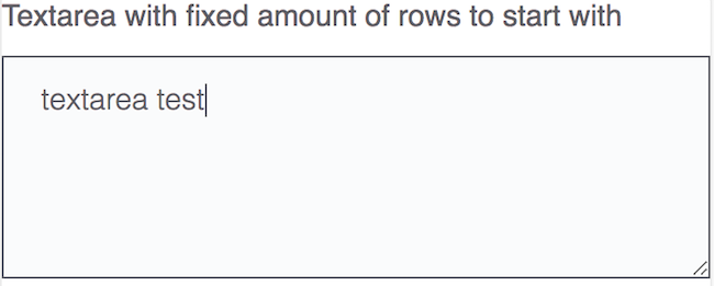
Textarea
Simple component that represents an input which can receive multiple lines of text.
Example Usage:
import React from "react";
import { TextArea } from "react-polymorph/lib/components";

const MyTextArea = () => (
  <TextArea
    label="Textarea with fixed amount of rows to start with"
    placeholder="Your description here"
    rows={5}
  />
);
TextArea Props:
type TextAreaProps = {
  autoFocus: boolean,
  autoResize: boolean,
  className?: string,
  context: ThemeContextProp,
  disabled?: boolean,
  label?: string | Element<any>,
  error?: string | Node,
  maxLength?: number,
  minLength?: number,
  onBlur?: Function,
  onChange?: Function,
  onFocus?: Function,
  placeholder?: string,
  rows?: number,
  skin?: ComponentType<any>,
  theme: ?Object,
  themeId: string,
  themeOverrides: Object,
  value: string
};
Button
Represents a clickable area.
Example Usage:
import React from "react";
import { Button } from "react-polymorph/lib/components";

const MyButton = () => (
  <Button label="Button label" />
);
Button Props:
type ButtonProps = {
  className?: string,
  disabled?: boolean,
  label?: string | Element<any>,
  loading: boolean,
  onClick?: Function,
  skin?: ComponentType<any>,
  theme: ?Object,
  themeOverrides: Object
};
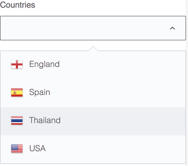
Select
The select component is like standard select but with additional logic for adding custom option renderer and opening directions (upward / downward).
Example Usage:
import React from "react";
import { Select } from "react-polymorph/lib/components";

const COUNTRIES_WITH_FLAGS = [
  { value: 'EN-gb', label: 'England', flag: flagEngland },
  { value: 'ES-es', label: 'Spain', flag: flagSpain },
  { value: 'TH-th', label: 'Thailand', flag: flagThailand },
  { value: 'EN-en', label: 'USA', flag: flagUSA }
];

const MySelect = () => (
  <Select
    label="Countries"
    options={COUNTRIES_WITH_FLAGS}
    optionRenderer={option => {
      return (
        <div className={styles.customOptionStyle}>
          <img src={option.flag} />
          <span>{option.label}</span>
        </div>
      );
    }}
  />
);
Select Props:
type SelectProps = {
  allowBlank: boolean,
  autoFocus: boolean,
  className?: string,
  error?: string | Element<any>,
  label?: string | Element<any>,
  isOpeningUpward: boolean,
  onBlur?: Function,
  onChange?: Function,
  onFocus?: Function,
  optionRenderer?: Function,
  options: Array<any>,
  placeholder?: string,
  skin?: ComponentType<any>,
  theme: ?Object,
  themeOverrides: Object,
  value: string
};
Checkbox
Represents a component which can toggle between checked and unchecked state.
Example Usage:
import React from "react";
import { Checkbox } from "react-polymorph/lib/components";

const MyCheckbox = () => (
  <Checkbox label="My checkbox" />
);
Checkbox Props:
type CheckboxProps = {
  checked: boolean,
  className?: string,
  context: ThemeContextProp,
  disabled?: boolean,
  label?: string | Element<any>,
  labelLeft?: string | Element<any>,
  labelRight?: string | Element<any>,
  onChange?: Function,
  onBlur?: Function,
  onFocus?: Function,
  skin?: ComponentType<any>,
  theme: ?Object,
  themeId: string,
  themeOverrides: Object
};
Switch
Like checkbox but uses a different skin part.
Example Usage:
import React from "react";
import { Checkbox } from "react-polymorph/lib/components";

const MySwitch = () => (
  <Checkbox label="My switch" />
);
Switch Props -> see Checkbox (above)
Toggler
Like checkbox but uses a different skin part.
Example Usage:
import React from "react";
import { Checkbox } from "react-polymorph/lib/components";

const MyToggler = () => (
  <Checkbox
    labelLeft="Included"
    labelRight="Excluded"
  />
);
Toggler Props -> see Checkbox (above)
Modal
The modal is component which wraps its children as standard dialog. As is shown in example, modal can have multiple other polymorph components:
Example Usage:
import React from "react";
import { Modal, Button } from "react-polymorph/lib/components";

const MyModal = props => (
  <Modal triggerCloseOnOverlayClick={false}>
    <h1 className={styles.modalTitle}>
      Are you sure you want to delete this thing?
    </h1>
    <div className={styles.buttonsContainer}>
      <Button
        label="Cancel"
        onClick={closeModalCallback}
      />
      <Button
        label="Delete"
        onClick={closeModalCallback}
      />
    </div>
  </Modal>
);
Modal Props:
type ModalProps = {
  contentLabel: string | Element<any>,
  isOpen: boolean,
  onClose?: Function,
  skin?: ComponentType<any>,
  triggerCloseOnOverlayClick: boolean,
  theme: ?Object,
  themeOverrides: Object
};
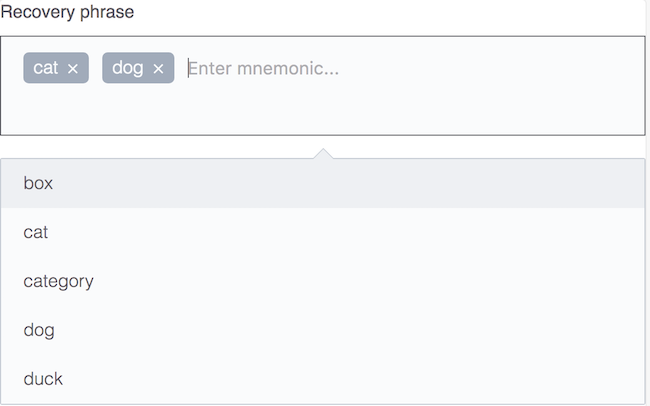
Autocomplete
The autocomplete input is specialized to help users to select between multiple suggested words depending on entered letters:
Example Usage:
import React from "react";
import { Autocomplete } from "react-polymorph/lib/components";

const MyAutocomplete = props => (
  <Autocomplete
    label="Recovery phrase"
    placeholder="Enter recovery phrase"
    suggestedWords={SUGGESTED_WORDS}
    placeholder="Enter mnemonic..."
    maxSelections={12}
    maxVisibleSuggestions={5}
    invalidCharsRegex={/[^a-zA-Z]/g}
  />
);
Autocomplete Props:
type AutocompleteProps = {
  className?: string,
  error: ?string,
  invalidCharsRegex: RegExp,
  isOpeningUpward: boolean,
  label?: string | Element<any>,
  maxSelections?: number,
  maxVisibleOptions: number,
  multipleSameSelections: boolean,
  onChange?: Function,
  options: Array<any>,
  preselectedOptions?: Array<any>,
  placeholder?: string,
  renderSelections?: Function,
  renderOptions?: Function,
  skin?: ComponentType<any>,
  sortAlphabetically: boolean,
  theme: ?Object,
  themeOverrides: Object
};
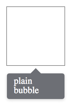
Bubble
The bubble component will open up an absolutely positioned speech bubble. This is position in respect to it's closest relatively positioned parent.
Example Usage:
import React from "react";
import { Bubble } from "react-polymorph/lib/components";

const MyBubble = props => (
  <div className={{ position: "relative" }}>
    <Bubble>
      plain bubble
    </Bubble>
  </div>
);
Bubble Props:
type BubbleProps = {
  className?: string,
  isHidden: boolean,
  isFloating: boolean,
  isOpeningUpward: boolean,
  isTransparent: boolean,
  skin?: ComponentType<any>,
  theme: ?Object,
  themeOverrides: Object,
  targetRef?: Ref<*>, // ref to the target DOM element used for positioning the bubble
};
Tooltip
The tooltip opens a bubble relative to it's children, containing text or html to display.
Example Usage:
import React from "react";
import { Tooltip } from "react-polymorph/lib/components";

const MyTooltip = props => (
  <Tooltip
    tip="Description of the child element"
  >
    hover over me
  </Tooltip>
);
Tooltip Props:
type TooltipProps = {
  className?: string,
  isAligningRight?: boolean,
  isBounded?: boolean,
  isOpeningUpward: boolean,
  isTransparent: boolean,
  arrowRelativeToTip: boolean,
  skin?: ComponentType<any>,
  theme: ?Object,
  themeOverrides: Object,
  tip?: string | Element<any>
};
Radio
The radio is as simple as possible and does not have much logic:
Example Usage:
import React from "react";
import { Radio } from "react-polymorph/lib/components";
import { RadioSkin } from "react-polymorph/lib/skins/simple";
import { RadioTheme } from "react-polymorph/lib/themes/simple";

const MyRadio = props => (
  <Radio label="My radio" skin={SimpleRadioSkin} theme={RadioTheme} />
);
Radio Props:
type RadioProps = {
  disabled?: boolean,
  label?: string | Element<any>,
  onBlur?: Function,
  onChange?: Function,
  onFocus?: Function,
  selected: boolean,
  skin?: ComponentType<any>,
  theme: ?Object,
  themeOverrides: Object
};
Customizing Component Skins
Theme API
Each component has a theme API. This is a plain object which exposes the shape of a component's theme. Each property on the theme API object is a class name assigned to an element within the component's skin and a class definition within the component's theme. Below is the Button's theme API.
{
  root: '',
  disabled: ''
}
Every component accepts an optional themeOverrides property intended to provide a
CSS Module import object which is used by the component to
assign a user's local classnames to its DOM nodes. If the component has already been passed a theme prop,
the css/scss properties passed via themeOverrides will be merged with the injected theme object. This automatic
composition saves the user from manually piecing together custom styles with those of the injected theme that
the user may wish to retain. If you want to customize a component's theme, the themeOverrides object must
contain the appropriate classname mapping to its documented theme API. In this way, you can add or
override classnames on the nodes of a specific component.
Overriding styles in a theme
For example, if you want to override the background-color of Button's injected theme with green:
import React from "react";
import { Button } from "react-polymorph/lib/components";
import { ButtonSkin } from "react-polymorph/lib/skins/simple";
import { ButtonTheme } from "react-polymorph/lib/themes/simple";
import themeOverrides from "./GreenButton.css";

const GreenButton = props => (
  <Button
    {...props}
    skin={ButtonSkin}
    theme={ButtonTheme}
    themeOverrides={themeOverrides}
  />
);

export default GreenButton;
themeOverrides
.root {
  background-color: green;
}
ButtonTheme
.root {
  background-color: blue;
  color: white;
  border-radius: 5px;
}
Result
.root {
  background-color: green;
  color: white;
  border-radius: 5px;
}
The user's custom background color overrides Simple theme's blue background.
Compose
Similarly, you can compose your own custom styles with an injected theme
themeOverrides
.root {
  text-transform: uppercase;
}
will be composed with
ButtonTheme
.root {
  background-color: blue;
  color: white;
  border-radius: 5px;
}
Result
.root {
  text-transform: uppercase;
  background-color: blue;
  color: white;
  border-radius: 5px;
}
In this case we are composing custom styles with an instance of Button where the Simple ButtonTheme was
already injected. If a theme isn't passed to a component, a theme object implementing that component's full theme
API is necessary. When implementing a component's full theme, take into account that every classname is there for
a reason. You can either provide a component's theme as a prop or pass it through context as described in the
next section.
ThemeProvider HOC
ThemeProvider allows you to pass a theme to multiple instances of a component without explicitly
passing them a theme prop. Wrap your component tree with ThemeProvider at the desired level in your
component hierarchy. You can maintain different themes and themeOverrides for specific portions of your app's tree.
Example Usage:
import React, { Component } from "react";

// components
import {
  ThemeProvider,
  Modal,
  FormField,
  Input,
  Button
} from "react-polymorph/lib/components";

// skins
import {
  ModalSkin,
  FormFieldSkin,
  InputSkin,
  ButtonSkin
} from "react-polymorph/lib/skins/simple";

// themes
import {
  ModalTheme,
  FormFieldTheme,
  InputTheme,
  ButtonTheme
} from "react-polymorph/lib/themes/simple";

class App extends Component {
  state = {
    isOpen: true,
    value: ""
  };

  setValue = value => this.setState({ value });

  render() {
    // Custom Theme
    const SimpleTheme = {
      modal: { ...ModalTheme },
      formfield: { ...FormFieldTheme },
      input: { ...InputTheme },
      button: { ...ButtonTheme }
    };
    // Custom Skins
    const SimpleSkins = {
      modal: ModalSkin,
      formfield: FormFieldSkin,
      input: InputSkin,
      button: ButtonSkin,
    };

    return (
      <ThemeProvider skins={SimpleSkins} theme={SimpleTheme}>
        <Modal
          isOpen={this.state.isOpen}
          triggerCloseOnOverlayClick={false}
        >
          <div>
            <FormField
              label="FormField in Modal"
              render={props => (
                <Input
                  {...props}
                  value={this.state.value}
                  onChange={this.setValue}
                />
              )}
            />
          </div>

          <div>
            <Button
              onClick={this.props.handleClick}
              className="primary"
              label="Submit"
            />
          </div>
        </Modal>
      </ThemeProvider>
    );
  }
}
export default App;
Customizing all instances of a Component using ThemeProvider
Create a CSS Module theme file for the component you wish to customize, for example for Input & FormField:
input.css
.input {
  width: 25%;
}

.input:focus {
  border-color: green;
  width: 50%;
}

.input:hover {
  border-color: green;
}
formfield.css
.label {
  color: green;
  font-family: "Lato", sans-serif;
}
Create a theme file that imports each component's custom styles as CSS-Modules object(s). Apply the styles according
to the root theme API structure. The root theme API is simply an object whose keys are named after each component
in the react-polymorph library. For example, the styles you assign to the input key will be applied to all
instances of the Input component nested within ThemeProvider. The same goes for the formfield key and all
nested instances of the FormField component.
customInputs.js
import MyCustomInputTheme from "./css/input.css";
import MyCustomFormFieldTheme from "./css/formfield.css";

export default {
  input: MyCustomInputTheme,
  formfield: MyCustomFormFieldTheme
};
Import your custom theme to pass ThemeProvider's themeOverrides property. This will apply your custom css/scss
to all of its nested react-polymorph components. In this example, all 3 instances of the Input and FormField
components will have the user's custom css definitions composed with Simple InputTheme and FormFieldTheme.
import React from "react";

// components
import {
  ThemeProvider,
  FormField,
  Input,
  NumericInput
} from "react-polymorph/lib/components";

// skins
import { SimpleSkins } from "react-polymorph/lib/skins/simple";

// themes
import { FormFieldTheme, InputTheme } from "react-polymorph/lib/themes/simple";

// the user's custom Input and FormField styles
import CustomInputsTheme from "./styles/customInputs.js";

const CustomInputs = props => {
  const SimpleTheme = {
    input: { ...InputTheme },
    formfield: { ...FormFieldTheme }
  };

  return (
    <ThemeProvider skins={SimpleSkins} themeOverrides={CustomInputsTheme} theme={SimpleTheme}>
      <FormField
        label="Recipient's First Name"
        render={props => (
          <Input {...props} placeholder="Avery" />
        )}
      />

      <FormField
        label="Recipient's Last Name"
        render={props => (
          <Input {...props} placeholder="McKenna" />
        )}
      />

      <FormField
        label="Amount to Send"
        render={props => (
          <NumericInput {...props} placeholder="10.000" />
        )}
      />
    </ThemeProvider>
  );
};

export default CustomInputs;
You may also pass the entire SimpleTheme object to ThemeProvider and maintain the same functionality without
having to import themes specific to the components you're using.
import React from "react";

// components
import { ThemeProvider } from "react-polymorph/lib/components";

// skins
import { SimpleSkins } from "react-polymorph/lib/skins/simple";

// themes
import { SimpleTheme } from "react-polymorph/lib/themes/simple";

const App = () => (
  <ThemeProvider skins={SimpleSkins} theme={SimpleTheme}>
    <div>...</div>
  </ThemeProvider>
);

export default App;


