BosNaufal / React Scrollbar
Programming Languages
Projects that are alternatives of or similar to React Scrollbar
React Scrollbar
The Simplest Scroll Area Component with custom scrollbar for React Js. It's adopted from reactScrollbar but without any dependencies. All animation, Height and Width are pure CSS, So it's TOTALLY CUSTOMIZABLE and RESPONSIVE! YEAH!.
Install
You can install it via NPM
npm install react-scrollbar-js --save
Note: You don't need any other dependencies or webpack loaders to start using this package. You can even use it with the
ES5sintax if you need. But all examples in this readme will be shown in theES6sintax.
Usage
// scrollable-component.jsx:
import React from 'react';
import ReactDOM from 'react-dom';

import ReactScrollbar from 'react-scrollbar-js';

class ScrollableComponent extends React.Component {

  render() {
    const myScrollbar = {
      width: 400,
      height: 400,
    };
    return(
      <ReactScrollbar style={myScrollbar}>
        <div className="should-have-a-children scroll-me">
          <p>And Now</p>
          <p>You Can Put</p>
          <p>A Long Content Here</p>
        </div>
      </ReactScrollbar>
    )
  }

}
Note:
react-scrollbar-jsships with a good looking default appearance, so you don't need to add any css styles to start it working. Only you need is to pass dimensions via css or inline style. But you can simply customize it by importing your own css styles.
Props
className (String) [optional]
Just the ordinary class name of the root scrollbar element (div). So, It's TOTALLY CUSTOMIZABLE!
default value:
'react-scrollbar-default'
You can set different class names in oder to have some scrollbars with a various appearance on same page.
/*The Scrollbar Root*/
.react-scrollbar-default {
  width: 35%;
  min-width: 300px;
  max-height: 450px;
}

/*The Content*/
.scroll-me {
  min-width: 750px;
}
style (Object) [optional]
If you prefer to use inline style to styling the scrollbar root (div element), you can pass the styling object to this props.
default value:
{ }
let styling = {

  /* Scrollbar */
  scrollbar: {
    width: "35%",
    minWidth: "300px",
    maxHeight: "450px"
  },

}

<ReactScrollbar style={ styling.scrollbar } />
speed (Number) [optional]
The wheel step in pixel.
default value:
53
API
scrollToY(y), scrollToX(x)
To scroll the scrollbar by vertical/horizontal
where x and y could be:
- numbers - sets scrollbar position in pixels
- strings like '58%' - sets scrollbar position in percents
if the value is negative it'll count from the end in the backward direction. ex:
-
scrollToY(150)set vertical scroll to 150px from top -
scrollToY(-150)set vertical scroll to 150px from bottom -
scrollToY('30%')set vertical scroll to 30% from top -
scrollToY('-30%')same asscrollToY('70%')
if you pass the value that is bigger than the maximum size it will scroll to 100%.
// in ScrollableComponent class:
scrollTo(pos) {
  return () => {
    this.scroll.scrollToY(pos);
// or:    this.scroll.scrollToX(pos);
  };
}

// in ScrollableComponent render():
...
<ReactScrollbar ref={(c) => { this.scroll = c; }}>
...
Customizing the appearance
You can add you own css styles to define the appearence and behavior of scrollbar. Scrollbar has a structure of nested elements wich defined by specific css classes. You need to follow this structure to apply your properties to the right place. Each element has a set of classes (the number is different depending on the current mode). In general it has name like: -reactjs-scrollbar-element:modifier1:modifier2. Modifiers are optional and specify a position or a interaction mode of element. For your convenience the elements has a range of classes with different combinations of modifiers, ex:
-reactjs-scrollbar-track // for any scrollbar track in any state
-reactjs-scrollbar-track:vertical // for the vertical scrollbar track in any state
-reactjs-scrollbar-track:dragging // for any scrollbar track while dragging
-reactjs-scrollbar-track:vertical:dragging // for vertical scrollbar track while dragging
-reactjs-scrollbar-track:vertical:dragging:hover // ...and while mouse is over it
But oder of modifiers does matter, so you can't set -reactjs-scrollbar-track:dragging:vertical
This class structure is inspired by -webkit-scrollbar, but here it's pretty simplified
Scrollbar structure
react-scrollbar-default // The scrollbar root. You can set any className here

    -reactjs-scrollbar-area // Scrollbar children and tracks are here
    -reactjs-scrollbar-area:dragging // when it's dragging by mouse
    -reactjs-scrollbar-area:scrolling // when it's scrolling by mouse wheel

        scroll-content // it just a child element, you can set any className

        -reactjs-scrollbar-track // vertical track
        -reactjs-scrollbar-track:vertical:dragging // you can use one of them or bouth

            -reactjs-scrollbar-thumb // thumb on vertical track
            -reactjs-scrollbar-thumb:vertical:dragging // you can use one of them or bouth

        -reactjs-scrollbar-track // horizontal track
        -reactjs-scrollbar-track:horizontal:dragging // you can use one of them or bouth

            -reactjs-scrollbar-thumb // thumb on horizontal track
            -reactjs-scrollbar-thumb:horizontal:dragging // you can use one of them or bouth
You can add
:hoveror any pseudo class you need.
Style Applying
In oder to set custom style for your scrollbar add css styles to your page.
// scrollable-component.jsx:
import './style_custom1.css';

// ScrollableComponent class:
...
<ReactScrollbar />
...
// style_custom1.css:
.react-scrollbar-default .-reactjs-scrollbar-thumb {
  background: red;
  cursor: default;
  width: 10px;
  height: 10px;
}
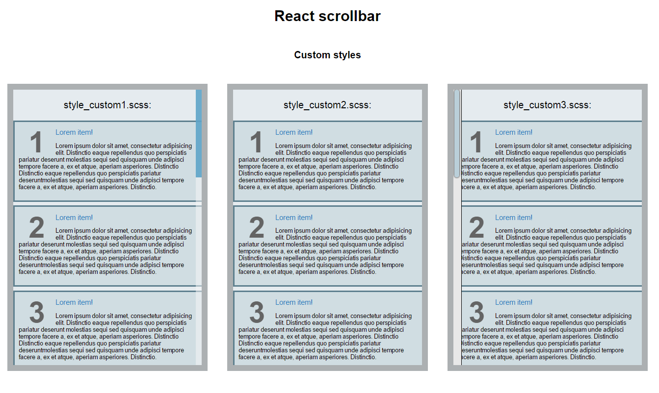
You can have some scrollbars with a different appearance. You can scope it by setting different root class names for them.
You can use the default style as a starting point for customizing:
Examples
This repo has some example projects.
git clone https://github.com/BosNaufal/react-scrollbar.git
cd react-scrollbar-js/doc/examples/simple
# or
cd react-scrollbar-js/doc/examples/custom

npm i
npm start
open localhost:8080 in your browser.
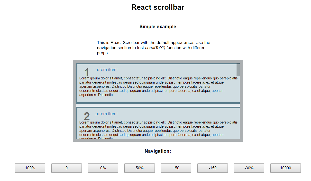
Simple example whit navigation API
It has scrollbar with default settings and some navigation buttons
Contributing
Start from cloning this repo:
git clone https://github.com/BosNaufal/react-scrollbar.git
cd react-scrollbar-js
npm i
npm start
open localhost:8080 in your browser.
You will see a demo app with a scrollbar area.
All source code of this package is located in src/ folder and the demo app is in develop/ (it's not included into this package).
We use webpack-dev-server for developing. It starts by npm start. The config file is webpack.dev.config.js.
We publish to NPM a compiled and bundled code, so it could be used in ES5 projects and don't have any dependencies. To prepare a library bundle we use webpack with the webpack.publish.config.js config file.
To publish it to NPM save all src files and type:
npm publish
this script automatically prepare dist folder for publishing and if there are no errors publish it to NPM.
You can check this process without publishing by typing:
npm run prepublish
it'll do the follow:
-
checks src code with ESLint (
npm run lint) -
builds the library package into
dist/folder (npm run build) -
puts an actual copy of default style into
doc/examples(npm run getstyles) you need to push it to GitHub manually after that
We use ESLint for code linting in this project. You can try to fix some common linting issues by typing npm run lintfix. It'll check the code only within src/ folder.
We are welcome any issues or PR's to make this project better!
Thank You for Making this useful~
Let's talk about some projects with me
Just Contact Me At:
- Email: [email protected]
- Skype Id: bosnaufal254
- twitter: @BosNaufal
License
MIT Copyright (c) 2016 - forever Naufal Rabbani


