mukeshsoni / React Telephone Input
Projects that are alternatives of or similar to React Telephone Input
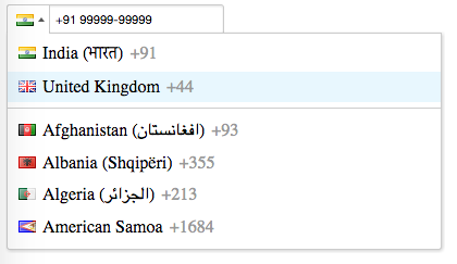
Reactjs Component for International Telephone Input
IMP: From 5.*, the withStyles file will not be bundled in dist. If you want to use the css, you can import the css file directly to your module -
import 'react-telephone-input/css/default.css'
IMP: From 3.*, the styles won't be included by default. Can use require('react-telephone-input/lib/withStyles') to get the styles.
Inspired from the awesome jquery plugin for International Telephone Input.
This one is written as a reactjs component.
Live Demo here - http://unstack.in/react-telephone-input/
function handleInputChange(telNumber, selectedCountry) {
    console.log('input changed. number: ', telNumber, 'selected country: ', selectedCountry);
}

// Use declaratively within another react components render method
var ReactTelInput = require('react-telephone-input');
// var ReactTelInput = require('react-telephone-input/lib/withStyles'), if you need the styles

<MyAwesomeReactComponent>
  <ReactTelInput
        defaultCountry="in"
        flagsImagePath='/path/to/images/flags.png'
        onChange={handleInputChange}
        onBlur={handleInputBlur}
        />
</MyAwesomeReactComponent>

// or render standalone
var ReactTelInput = require('react-telephone-input');
React.render(<ReactTelInput
                defaultCountry="in"
                flagsImagePath='/path/to/images/flags.png'
                onChange={handleInputChange}
                onBlur={handleInputBlur}
              />,
              document.getElementById('my-container'));
The component accepts other props to customize it -
value and initialValue
Both the props have the same purpose - for setting the initial value of the input programatically.
initialValue
See value above.
autoFormat
true by default. Setting it to false will turn off all auto formatting.
defaultCountry
The component selects the country code of a country by default. You can change it by passing the iso2 name of a country. E.g. for United States, set defaultCountry to 'us'.
onlyCountries
If you don't want all countries to be shown in the dropdown list, you can pass an array of objects representing the countries. The structure of each country object can be seen here https://github.com/mukeshsoni/country-telephone-data/blob/master/country_telephone_data.js
E.g.
<ReactTelInput
    defaultCountry='us'
    value={value}
    onChange={onPhoneChange}
    onlyCountries={[
        {name: "United States", iso2: "us", dialCode: "1", priority: 0, format: "+. (...) ...-...."},
        {name: "Canada", iso2: "ca", dialCode: "1", priority: 1, format: "+. (...) ...-....", hasAreaCodes: true},
        {name: "Mexico (México)", iso2: "mx", dialCode: "52", priority: 0, format: "+..-..-..-...."},
        {name: "Brazil (Brasil)", iso2: "br", dialCode: "55", priority: 0, format: "+..-..-....-...."},
    ]}
 />
preferredCountries
Preferred countries show up at the top of the list. This prop also accepts an array of country iso2 names.
E.g.
<ReactTelephoneInput
  preferredCountries={['in', 'us', 'gb']}
  />
classNames
You can send in additional classes to be applied to the top container div of the component.
onChange
Function, which is called whenever there is a change of value in the input box.
onEnterKeyPress
Function, which is called when user presses the 'enter' key when the input box is in focus.
onBlur
Function, which is called when the focus goes away from the input box.
onFocus
Function, which is called when the input box gets the focus.
disabled
Boolean value. When set to true, the input box is disabled and clicking on flag dropdown does nothing.
pattern
String. This is passed on to the input field and works like it should for any other input field.
inputProps
Object. If you want to set some property on the input element, you can pass in an object with attributes. E.g.
let inputProps={
    readOnly: true,
    autoFocus: true
}

<ReactTelephoneInput inputProps={inputProps} ... />
autoComplete
string. Specify the type of autocomplete for the input element.
Default value - 'tel'
listStyle
Object. Style applied to the dropdown list container. There is a default value for it
listStyle = {
  zIndex: 20,
  backgroundColor: 'white'
}
listItemClassName
string. Classname which will be applied to each item in the dropdown list. The default is country
How to use it
- If you install it from
npm install, you can just dovar ReactTelephoneInput = require('react-telephone-input'); - You will need to copy flags.png from example/src folder to see the flag icons for each country.
- Set the path to the flags image using the prop
flagsImagePath
function handleInputChange(telNumber, selectedCountry) {
  console.log('input changed. number: ', telNumber, 'selected country: ', selectedCountry)
}

function handleInputBlur(telNumber, selectedCountry) {
  console.log(
    'Focus off the ReactTelephoneInput component. Tel number entered is: ',
    telNumber,
    ' selected country is: ',
    selectedCountry
  )
}

<ReactTelephoneInput
  defaultCountry="in"
  flagsImagePath="/path/to/images/flags.png"
  onChange={handleInputChange}
  onBlur={handleInputBlur}
/>
The default value for flagsImagePath is 'flags.png'
Features
- Automatically format the number as the user types
- Navigate the country dropdown by typing a country's name, or using up/down keys
- Selecting a country from the dropdown will update the dial code in the input
- Typing a different dial code will automatically update the displayed flag
- Country names in the dropdown also include localised versions in brackets
- Dropdown appears above or below the input depending on available space/scroll position
Contributing
You can try the app by downloading everything and running the commands given below -
$ npm install
$ npm start

go to your browser and type http://localhost:3000
Running tests
$ npm run test
$ npm run test -- --watch # to run tests in watch mode


