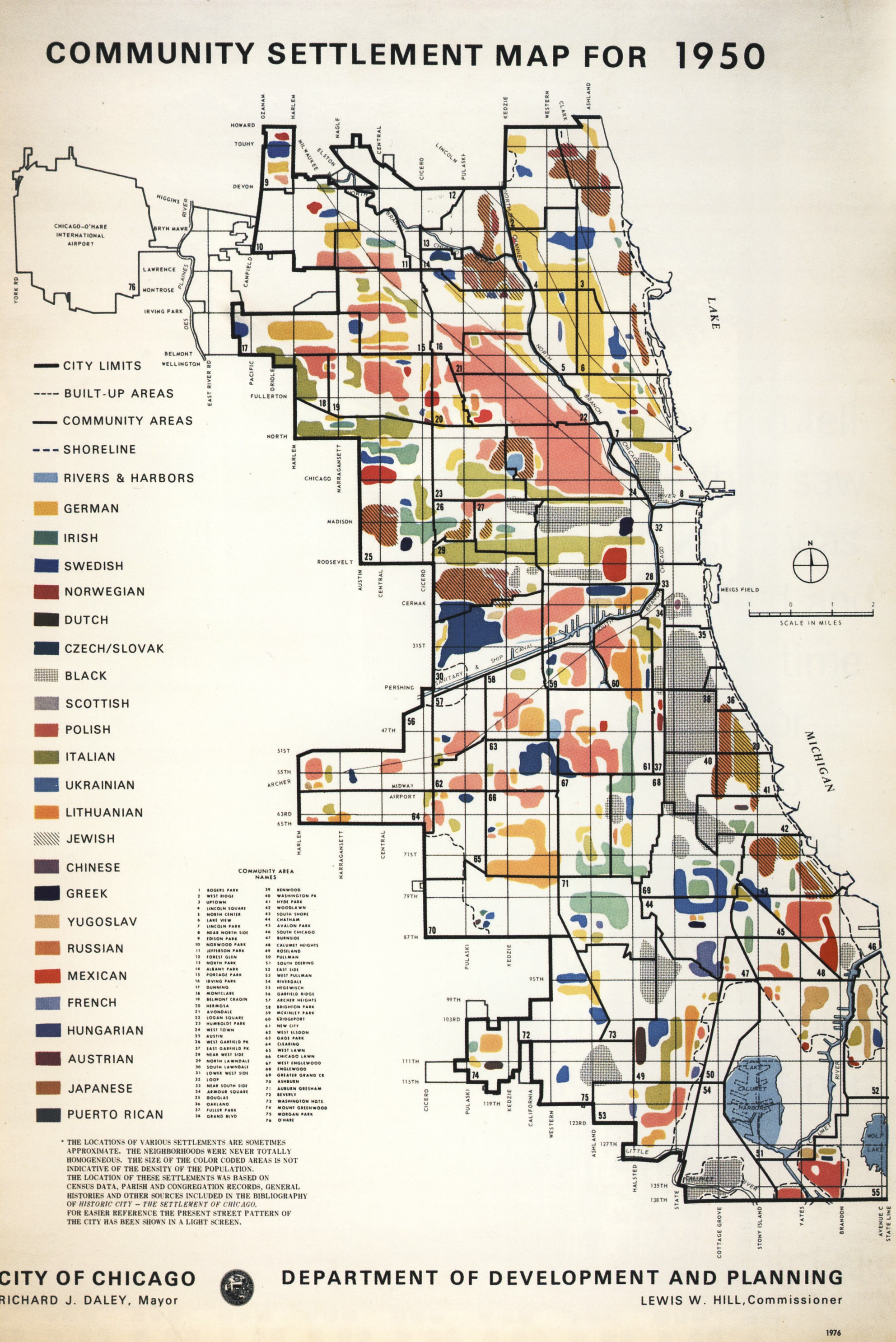
Redlines
Urban planners used to see lines in the human canvas of America's cities. They used to see a series of communities and tribes, clustered and separately identifiable, each with its own history, customs and rights. This view of lines is antiquated in the equality-minded planning policy of today, theoretically blind to race, ethnicity and ancestry.
But the lines remain.
This project began as a recreation of a 1976 map representing Chicago's racial and ancestral groups ca. 1950. It expanded to include the complex picture that the original mapmakers missed - where the lines are blurry and where they seem fixed in the asphalt still. These updated maps incorporate the observations of Jane Jacobs and Ta-Nehisi Coates; they show where people are coming together and where they are still separated by invisible lines.
Then:

Now:

Methods
This is a tough map to recreate with 21st century data. The reason for using an aggregate approach is that the census only reports ancestry for slightly more than half of the US population, including in configurations that fail to represent whole racial/ethnic groups, which are in turn detailed on other tables. In order to capture the conceptual spirit and geographic detail of the original map, it is worthwhile to combine the two in the most-representative way possible.
This map draws from 99 distinct ancestry/race/ethnicity/origin categories from across 5 census tables to produce maps like this.
Data sources
- Census TIGER geographic boundaries - tract-level
- Census API SF1 and ACS
- OpenStreetmap reference data via Mapbox
Processing steps
- Hit the Census API for tabular data
- Add
largest_groupaggregate field, populated with largest ancestry/racial/ethnic group in each census tract by proportion of the population; retain proportion stats - Add plurality and population density
- Get geodata
- Join tract geometries,
community, ancestry and race tables on geoid - Delete empty tracts
- Expand block boundaries by 50m, dissolve, then erode by 150m and simplify a bit for cartographic effect
- Map according to original style with additional small multiples and supporting charts
Usage
Dependencies
(Sorry, things got out of hand)
- node.js
- GDAL/OGR
- PostGIS
- csvkit
- Mapbox CLI
- Mapbox Studio Classic (Gotta have that CartoCSS)
- Mercantile
- geojson-merge
- phantomjs (to capture chart images)
- Census API key
- jq for json parsing in bash
In theory this will work for any county in the country. Set location parameters as arguments in the order below:
bash build_communities.sh <state abbreviation (e.g. 'MA')> <county name (e.g. 'Suffolk')>e.g. this:
bash build_communities.sh MA Suffolk
. . . will get you a map of Suffolk county (Boston), MA
Assumptions (a running list)
- Meta-assumption: ancestry can be inferred by race. This is a dramatic oversimplification, to say the least.
- Census categories that dance around race, ancestry and ethnicity can be coherently flattened to a non-overlapping set of categories.
- Counting multiple races as multiple people is legit, when trying to show community membership.
- Asian and Hispanic/Latino groups can be represented by race in the absence of ancestral categories encompassing them.
- In majority-black census blocks, "American" ancestry refers almost exclusively to African-Americans.
- The "Mixed" racial group in a block is adequately represented by the largest ancestral group in the containing tract.
- Margin of error can be ignored.
- To make it under the API limit (50 variables), the smallest-population groups (<100,000 nationally) may be ignored.
- Religion-based communities (e.g. Jewish, Mennonite) may be excluded; the Census does not collect information on religious practice.