All Projects → ufologist → Responsive Page

ufologist / Responsive Page

Licence: mit
让你的页面轻松适配各种移动设备和PC端浏览器

Programming Languages

javascript
184084 projects - #8 most used programming language

Labels

Projects that are alternatives of or similar to Responsive Page

Arkit Cardboard Vr
ARkit + GVR to make VR and Mixed Reality 6dof AR for iphone
Stars: ✭ 132 (-10.2%)
Mutual labels:  mobile
Unityurp Billboardlensflareshader
(1)Add a new Quad GameObject (2)Use this shader (3)Done! Now you have billboard lens flare shader for URP!
Stars: ✭ 140 (-4.76%)
Mutual labels:  mobile
Realm Java
Realm is a mobile database: a replacement for SQLite & ORMs
Stars: ✭ 11,232 (+7540.82%)
Mutual labels:  mobile
React Native Data Table
Stars: ✭ 133 (-9.52%)
Mutual labels:  mobile
Mobile Device Detect
Detect mobile device and its type.
Stars: ✭ 132 (-10.2%)
Mutual labels:  mobile
Cordova Browser
Apache Cordova
Stars: ✭ 142 (-3.4%)
Mutual labels:  mobile
Cordova Plugin Globalization
Apache Cordova Plugin globalization
Stars: ✭ 131 (-10.88%)
Mutual labels:  mobile
Canoe
Canoe is a Nano Wallet heavily based on the MIT licensed Copay wallet from Bitpay
Stars: ✭ 146 (-0.68%)
Mutual labels:  mobile
React Drag Drawer
A responsive mobile drawer that is draggable on mobile, and falls back to a modal on desktop
Stars: ✭ 135 (-8.16%)
Mutual labels:  mobile
Panda Run
A panda parkour game, based on Cocos2d-js, running on Android / iOS
Stars: ✭ 145 (-1.36%)
Mutual labels:  mobile
Jeelizglassesvtowidget
JavaScript/WebGL glasses virtual try on widget. Real time webcam experience, robust to all lighting conditions, high end 3D PBR rendering, easy to integrate, fallback to server-side rendering
Stars: ✭ 134 (-8.84%)
Mutual labels:  mobile
Mobile
React Native apps for viewing Dota 2 data on Android/iOS
Stars: ✭ 134 (-8.84%)
Mutual labels:  mobile
Xabber Android
Open-source XMPP client for Android
Stars: ✭ 1,773 (+1106.12%)
Mutual labels:  mobile
Screenshoteer
Make website screenshots and mobile emulations from the command line.
Stars: ✭ 1,650 (+1022.45%)
Mutual labels:  mobile
Cordova Plugin Console
[DEPRECATED] Apache Cordova Plugin console
Stars: ✭ 145 (-1.36%)
Mutual labels:  mobile
Tensorflow realtime multi Person pose estimation
Multi-Person Pose Estimation project for Tensorflow 2.0 with a small and fast model based on MobilenetV3
Stars: ✭ 129 (-12.24%)
Mutual labels:  mobile
Reason Expo
ReasonML bindings for Expo
Stars: ✭ 140 (-4.76%)
Mutual labels:  mobile
Testowanieoprogramowania
Testowanie oprogramowania - Książka dla początkujących testerów
Stars: ✭ 146 (-0.68%)
Mutual labels:  mobile
Typewriter
Type safety + intellisense for your Segment analytics
Stars: ✭ 146 (-0.68%)
Mutual labels:  mobile
React Native Story
React native instagram story
Stars: ✭ 144 (-2.04%)
Mutual labels:  mobile

icon responsive-page

v1.0.0 2015-7-16 by Sun

让你的页面轻松适配各种移动设备和桌面端(PC)浏览器, 1.46 KB only! 无任何其他依赖.

  • 非常适合专题着陆页(landing page)
  • 页面内容一般为几张图片拼接而成
  • 需同时适配移动端和桌面端
  • 需自适应宽度
  • (绝对)定位元素仅需使用 px 单位即可适配
  • 仅需按照 640px(可配置) 宽的设计稿来切图
  • 即使内容很长, 换行也需要正确

演示 responsive-page 适配功能

基础原理

计算出页面内容与页面宽度的比率, 通过 transform: scale 缩放页面内容来达到适配任何屏幕(占满屏幕宽度)的目的.

兼容性

特性: querySelectorAll, CSS3 transform, matchMedia

  • PC端: IE9+, 其他现代浏览器(chrome, firefox等等)
  • 移动端: iOS4+, Android 2.3+
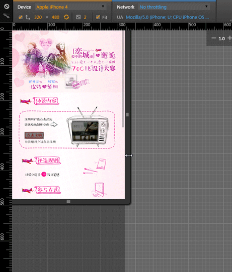
示例

  • jd.html 页面中包含多个需要适配的模块
  • 70c.html 页面仅包含一个需要适配的模块和绝对定位的可点击区域, 并开启 center 模式来适配PC端

页面宽度超过切图宽度后, 不再适配页面宽度, 而是居中显示在页面中

演示 responsive-page center 模式

使用手册

最好的使用手册就是示例, 下载/引入JS, 执行JS, 坐等适配结果

API文档

responsivePage({
    selector: '.mod-responsive', // string 内容区域的父级元素, 接受任何合法的CSS选择器
    sliceWidth: 640,             // number 切图宽度(单位是px), 即设计稿宽度
    center: true                 // boolean 页面宽度超过切图宽度后, 是否不再适配宽度居中显示在页面中
});

感谢他们给我的灵感

如果有任何bug或者问题, 请发个 issue 给项目, 非常感谢.

其他适配方案

  • 百分比

    只用CSS就能够适配屏幕, 比较适合多图片拼接的页面. 由于需要适配屏幕, 因此绝对定位元素的位置, 宽, 高都需要使用百分比来设置, 在布局时我们需要手工将原来的 px 值计算成百分比(特别是 top 难以计算), 让人心好累.

    对于混合大段文字内容时就会出现适配不了的问题, 可能就需要你通过JS来动态设置文字的大小和行高了.

  • initial-scale

    用非常简单的JS就能够实现和 responsive-page 一样的适配效果, 但对于混合大段文字内容时就会出现适配不了的问题(这个很可能是移动端浏览器的BUG造成的, 通过chrome模拟时没有这个问题)

  • rem | flexible

    与"百分比"的解决方案类似, 只不过这里使用的是 rem 单位, 使用此方案时所有元素的尺寸单位和位置单位都需要使用 rem, 才能确保适配屏幕时元素的尺寸能够自由适配, 相对于百分比值的计算, 计算出元素的 rem 值要方便多了.

    此方案也需要借助 JS 来实现适配的逻辑, 主要是根据屏幕宽度比来修改 root(html) font-size, 以达到适配任何屏幕的目的. 可以参考web app变革之rem阿里无线前端可伸缩布局方案来详细了解下关于 rem 和适配.

    对于混合大段文字内容时也出现了一点点不适配的问题, 文字相对于原始布局出现了一些偏移, 其他方面都很好, 算是非常完满的适配方案了.

版本更新历史

CHANGLOG

Licence

MIT

Note that the project description data, including the texts, logos, images, and/or trademarks, for each open source project belongs to its rightful owner. If you wish to add or remove any projects, please contact us at [email protected].