Sliding-Carousel


Features • Development • Usage • License • Contribution
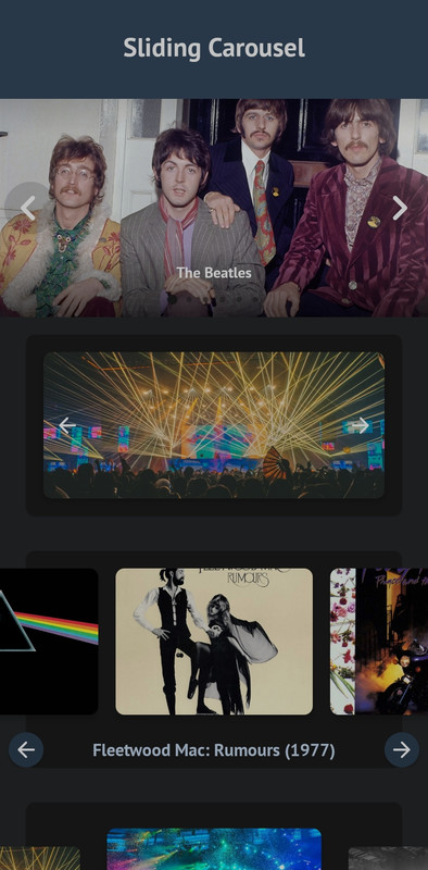

Slider is an Android library to add a beautiful image carousel to your app at ease.
Features
- Written in Kotlin
- No boilerplate code
- Easy initialization
Gradle Dependency
- Add the JitPack repository to your project's build.gradle file
allprojects {
    repositories {
        ...
        maven { url 'https://jitpack.io' }
    }
}
- Add the dependency in your app's build.gradle file
dependencies {
    implementation 'com.github.akshaaatt:Sliding-Carousel:1.0.4'
}
Basic Usage
Add the view com.aemerse.slider.ImageCarousel in your layout:
<com.aemerse.slider.ImageCarousel
    android:id="@+id/carousel"
    android:layout_width="match_parent"
    android:layout_height="256dp" />
Use the CarouselItem class for data item. Initialize the ImageCarousel with data using setData() function:
// Kotlin
val carousel: ImageCarousel = findViewById(R.id.carousel)

// Register lifecycle. For activity this will be lifecycle/getLifecycle() and for fragment it will be viewLifecycleOwner/getViewLifecycleOwner().
carousel.registerLifecycle(lifecycle)

val list = mutableListOf<CarouselItem>()

// Image URL with caption
list.add(
    CarouselItem(
        imageUrl = "https://images.unsplash.com/photo-1532581291347-9c39cf10a73c?w=1080",
        caption = "Photo by Aaron Wu on Unsplash"
    )
)

// Just image URL
list.add(
    CarouselItem(
        imageUrl = "https://images.unsplash.com/photo-1534447677768-be436bb09401?w=1080"
    )
)

// Image URL with header
val headers = mutableMapOf<String, String>()
headers["header_key"] = "header_value"

list.add(
    CarouselItem(
        imageUrl = "https://images.unsplash.com/photo-1534447677768-be436bb09401?w=1080",
        headers = headers
    )
)

// Image drawable with caption
list.add(
    CarouselItem(
        imageDrawable = R.drawable.image_1,
        caption = "Photo by Kimiya Oveisi on Unsplash"
    )
)

// Just image drawable
list.add(
    CarouselItem(
        imageDrawable = R.drawable.image_2
    )
)

// ...

carousel.setData(list)
That's all you need to use the library! :)
ImageCarousel XML attributes
All the custom XML attributes for ImageCarousel view with default values are given below. All attributes are optional.
<com.aemerse.slider.ImageCarousel
    android:id="@+id/carousel"
    android:layout_width="match_parent"
    android:layout_height="match_parent"

    app:showTopShadow="true"
    app:topShadowAlpha="0.6"
    app:topShadowHeight="32dp"

    app:showBottomShadow="true"
    app:bottomShadowAlpha="0.6"
    app:bottomShadowHeight="64dp"

    app:showCaption="true"
    app:captionMargin="0dp"
    app:captionTextSize="14sp"

    app:showIndicator="true"
    app:indicatorMargin="0dp"

    app:imageScaleType="centerCrop"

    app:carouselBackground="#00000000"
    app:imagePlaceholder="@drawable/ic_picture"

    app:carouselPadding="0dp"
    app:carouselPaddingBottom="0dp"
    app:carouselPaddingEnd="0dp"
    app:carouselPaddingStart="0dp"
    app:carouselPaddingTop="0dp"

    app:showNavigationButtons="true"
    app:previousButtonLayout="@layout/previous_button_layout"
    app:previousButtonId="@id/btn_previous"
    app:previousButtonMargin="4dp"
    app:nextButtonLayout="@layout/next_button_layout"
    app:nextButtonId="@id/btn_next"
    app:nextButtonMargin="4dp"

    app:carouselType="BLOCK"
    app:carouselGravity="CENTER"

    app:scaleOnScroll="false"
    app:scalingFactor="0.15"
    app:autoWidthFixing="true"
    app:autoPlay="false"
    app:autoPlayDelay="3000"
    app:infiniteCarousel="true"
    app:touchToPause="true" />
ImageCarousel methods
You can also set all the attributes programmatically. All the methods and their usages given below.
val carousel: ImageCarousel = findViewById(R.id.carousel)

// Attributes
carousel.carouselPadding = 0.dpToPx(context)
carousel.carouselPaddingStart = 0.dpToPx(context)
carousel.carouselPaddingTop = 0.dpToPx(context)
carousel.carouselPaddingEnd = 0.dpToPx(context)
carousel.carouselPaddingBottom = 0.dpToPx(context)

carousel.showTopShadow = true
carousel.topShadowAlpha = 0.6f // 0 to 1, 1 means 100%
carousel.topShadowHeight = 32.dpToPx(context) // px value of dp

carousel.showBottomShadow = true
carousel.bottomShadowAlpha = 0.6f // 0 to 1, 1 means 100%
carousel.bottomShadowHeight = 64.dpToPx(context) // px value of dp

carousel.showCaption = true
carousel.captionMargin = 0.dpToPx(context) // px value of dp
carousel.captionTextSize = 14.spToPx(context) // px value of sp

carousel.showIndicator = true
carousel.indicatorMargin = 0.dpToPx(context) // px value of dp

carousel.showNavigationButtons = true
carousel.imageScaleType = ImageView.ScaleType.CENTER_CROP
carousel.carouselBackground = ColorDrawable(Color.parseColor("#333333"))
carousel.imagePlaceholder = ContextCompat.getDrawable(
    context,
    R.drawable.ic_picture
)

// For custom previous or next button layout,
// set the layout using "previousButtonLayout" attribute and
// give the View/Button id in "previousButtonId" attribute.
carousel.previousButtonLayout = R.layout.previous_button_layout
carousel.previousButtonId = R.id.btn_previous
carousel.previousButtonMargin = 4.dpToPx(context) // px value of dp

carousel.nextButtonLayout = R.layout.next_button_layout
carousel.nextButtonId = R.id.btn_next
carousel.nextButtonMargin = 4.dpToPx(context) // px value of dp

carousel.carouselType = CarouselType.BLOCK
carousel.scaleOnScroll = false
carousel.scalingFactor = .15f // 0 to 1; 1 means 100

// If the width of a single item in ImageCarousel is not greater then
// half of the whole ImageCarousel view width, then the ImageCarousel
// will not work as expected, So it is recommended to set this value
// true all the time. So, the carousel will automatically increase the
// width of the items if necessary.
carousel.autoWidthFixing = true

// If you want auto slide, turn this feature on.
carousel.autoPlay = false
carousel.autoPlayDelay = 3000 // Milliseconds

// Touch to pause autoPlay.
carousel.touchToPause = true

// Infinite scroll for the carousel.
carousel.infiniteCarousel = true

// Scroll listener
carousel.onScrollListener = object : CarouselOnScrollListener {
    override fun onScrollStateChanged(
        recyclerView: RecyclerView,
        newState: Int,
        position: Int,
        carouselItem: CarouselItem?
    ) {
        // ...
    }

    override fun onScrolled(
        recyclerView: RecyclerView,
        dx: Int,
        dy: Int,
        position: Int,
        carouselItem: CarouselItem?
    ) {
        // ...
    }
}

// Carousel listener
carousel.carouselListener = object : CarouselListener {
    override fun onCreateViewHolder(
        layoutInflater: LayoutInflater,
        parent: ViewGroup
    ): ViewBinding? {
        // ...
    }

    override fun onBindViewHolder(
        binding: ViewBinding,
        imageScaleType: ImageView.ScaleType,
        item: CarouselItem,
        position: Int
    ) {
        // ...
    }

    override fun onClick(position: Int, carouselItem: CarouselItem) {
        // ...
    }

    override fun onLongClick(position: Int, dataObject: CarouselItem) {
        // ...
    }

}

// Goto next slide/item
carousel.next()

// Goto previous slide/item
carousel.previous()

// Start auto play
carousel.start()

// Stop auto play
carousel.stop()

// If you need custom indicator, use the CircleIndicator2 from CircleIndicator (https://github.com/ongakuer/CircleIndicator).
// Then pass the view to the ImageCarousel.
val customIndicator: CircleIndicator2 = findViewById(R.id.custom_indicator)
carousel.setIndicator(customIndicator)

// For activity this will be lifecycle/getLifecycle() and for fragment it will be viewLifecycleOwner/getViewLifecycleOwner().
carousel.registerLifecycle(lifecycle)

// ...

// You can use the following methods to add CarouselItem data to the carousel:
// 1. setData(data: List<CarouselItem>): Set a list of CarouselItem. This will remove previous data from the carousel.
// 2. addData(data: List<CarouselItem>): Append list of CarouselItem with existing data.
// 3. addData(item: CarouselItem): Append a CarouselItem with existing data.
carousel.setData(list)
Contribution
You are most welcome to contribute to this project!