All Projects → whitespace-se → storybook-addon-html

whitespace-se / storybook-addon-html

Licence: other
A Storybook addon that extracts and displays compiled syntax-highlighted HTML

Programming Languages

javascript
184084 projects - #8 most used programming language

Projects that are alternatives of or similar to storybook-addon-html

learn-react-typescript
Learning React contents with TypeScript (Hooks, Redux)
Stars: ✭ 15 (-75.41%)
Mutual labels:  storybook
elm-book
Rich documentation builder for Elm applications and packages. Inspired by Storybook and HexDocs.
Stars: ✭ 52 (-14.75%)
Mutual labels:  storybook
clockface
UI Kit for building Chronograf
Stars: ✭ 33 (-45.9%)
Mutual labels:  storybook
nft-market
NFT Marketplace prototype using Typescript, WalletConnect, Metamask, Web3, Solidity, React and Storybook
Stars: ✭ 385 (+531.15%)
Mutual labels:  storybook
killer-storybook-config
A killer Storybook Webpack config to help you bootstrap a great storybook config ASAP. It includes a React Frontend, GraphQL compatibility for Storybook, TypeScript, Babel, and ESlint.
Stars: ✭ 32 (-47.54%)
Mutual labels:  storybook
vuetibook
Integrating Vue.js, Vuetify and Storybook
Stars: ✭ 16 (-73.77%)
Mutual labels:  storybook
storybook-addon-matrix
Storybook addon for rendering components with a matrix of props
Stars: ✭ 32 (-47.54%)
Mutual labels:  storybook
communication-ui-library
UI Library for Azure Communication Services helps developers build communication applications with ease. From turn-key composites to UI components that can be composited together.
Stars: ✭ 44 (-27.87%)
Mutual labels:  storybook
storybook-addon-intl
Addon to provide a locale switcher and react-intl for storybook
Stars: ✭ 84 (+37.7%)
Mutual labels:  storybook
elements
Lovingly crafted ui components based on web components. Works well with all Frameworks - including Angular, React and Vue.
Stars: ✭ 42 (-31.15%)
Mutual labels:  storybook
chic-ui
Lightweight CSS-in-JS styled UI Component Library for React
Stars: ✭ 39 (-36.07%)
Mutual labels:  storybook
vuetify-component-lib-template
Template for creating a component library/design system using Vue.js and Vuetify.js.
Stars: ✭ 35 (-42.62%)
Mutual labels:  storybook
stencil-storybook
Storybook meets Stencil in 2021
Stars: ✭ 66 (+8.2%)
Mutual labels:  storybook
msw-storybook-addon
Mock API requests in Storybook with Mock Service Worker.
Stars: ✭ 168 (+175.41%)
Mutual labels:  storybook
react-activity-calendar
A React component to display activity data in a calendar (heatmap)
Stars: ✭ 69 (+13.11%)
Mutual labels:  storybook
storybook-styled-components
No description or website provided.
Stars: ✭ 76 (+24.59%)
Mutual labels:  storybook
outline
Outline is a web component based design system starter kit. Outline is based on the latest technologies and tools to help your component authoring experience and facilitate adoption in your organization.
Stars: ✭ 28 (-54.1%)
Mutual labels:  storybook
react-enterprise-starter-kit
Highly Scalable Awesome React Starter Kit for an enterprise application with a very easy maintainable codebase. 🔥
Stars: ✭ 55 (-9.84%)
Mutual labels:  storybook
expo-with-storybook-howto
How to setup an Expo-based React Native project to use Storybook
Stars: ✭ 41 (-32.79%)
Mutual labels:  storybook
personal-blog
✍️ 个人技术博客
Stars: ✭ 79 (+29.51%)
Mutual labels:  storybook

Storybook Addon HTML

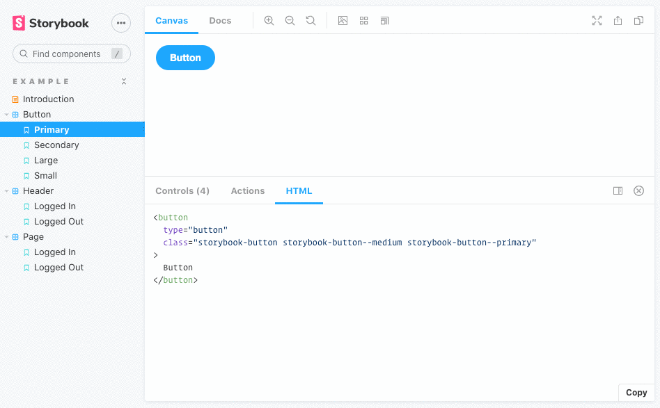
This addon for Storybook adds a tab that displays the compiled HTML for each story. It uses highlight.js for syntax highlighting.

Animated preview

Getting Started

With NPM:

npm i --save-dev @whitespace/storybook-addon-html

With Yarn:

yarn add -D @whitespace/storybook-addon-html

Register addon

// .storybook/main.js

module.exports = {
  // ...
  addons: [
    '@whitespace/storybook-addon-html',
    // ...
  ],
};

Usage

The HTML is formatted with Prettier. You can override the Prettier config (except parser and plugins) by providing an object following the Prettier API override format in the html parameter:

// .storybook/preview.js

export const parameters = {
  // ...
  html: {
    prettier: {
      tabWidth: 4,
      useTabs: false,
      htmlWhitespaceSensitivity: 'strict',
    },
  },
};

You can override the wrapper element selector used to grab the component HTML.

export const parameters = {
  html: {
    root: '#my-custom-wrapper', // default: #root
  },
};

When using Web Components, the HTML will contain empty comments, i.e. <!---->. If you want to remove these, use the removeEmptyComments parameter:

export const parameters = {
  html: {
    removeEmptyComments: true, // default: false
  },
};

You can override the showLineNumbers and wrapLines settings for the syntax highlighter by using the highlighter parameter:

export const parameters = {
  html: {
    highlighter: {
      showLineNumbers: true, // default: false
      wrapLines: false, // default: true
    },
  },
};

Supported frameworks

As of version 4.0.0 all frameworks are supported per default 🎉

Note that the project description data, including the texts, logos, images, and/or trademarks, for each open source project belongs to its rightful owner. If you wish to add or remove any projects, please contact us at [email protected].