rqrauhvmra / Tobi
Programming Languages
Projects that are alternatives of or similar to Tobi
Tobi
Tobi 1.9.x will be the last 1.x.x version. Check out Tobii (version 2.x.x)
An accessible, open-source lightbox with no dependencies.
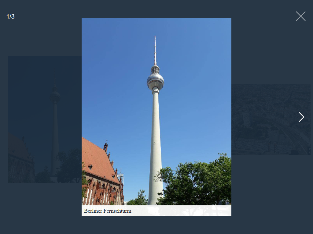
Table of contents
Features
- No dependencies
- Accessible:
- ARIA roles
- Keyboard navigation:
-
Prev/NextKeys: Navigate through slides -
ESCAPEKey: Close Tobi -
TABKey: Focus elements within Tobi, not outside
-
- User preference media features:
-
prefers-reduced-motionmedia query
-
- When Tobi opens, focus is set to the first focusable element in Tobi
- When Tobi closes, focus returns to what was in focus before Tobi opened
- Touch & Mouse drag support:
- Drag/ Swipe horizontal to navigate through slides
- Drag/ Swipe vertical to close Tobi
- Responsive
- Support iframes
- Support inline HTML
Get Tobi
Download
CSS: css/tobi.min.css minified, or css/tobi.css un-minified
JavaScript: js/tobi.min.js minified, or js/tobi.js un-minified
Package managers
Tobi is also available on npm.
npm install @rqrauhvmra/tobi --save
Usage
You can install Tobi by linking the .css and .js files to your HTML file. The HTML code may look like this:
<!DOCTYPE html>
<html>
<head>
  <meta charset="UTF-8">
  <meta name="viewport" content="width=device-width, initial-scale=1">
  <title>Your page title</title>

  <!-- CSS -->
  <link href="tobi.min.css" rel="stylesheet">
</head>
<body>
  <!-- Your HTML content -->

  <!-- JS -->
  <script src="tobi.min.js"></script>
</body>
</html>
Initialize the script by running:
const tobi = new Tobi()
Media types
Image
The standard way of using Tobi is a linked thumbnail image with the class name lightbox to a larger image:
<a href="path/to/image.jpg" class="lightbox">
  <img src="path/to/thumbnail.jpg" alt="I am a caption">
</a>
Instead of a thumbnail, you can also refer to a larger image with a textlink:
<a href="path/to/image.jpg" class="lightbox">
  Open image
</a>
Inline HTML
For inline HTML, create an element with a unique ID:
<div id="selector">
  <!-- Your HTML content -->
</div>
Then create a link with the class name lightbox and a href attribute that matches the ID of the element:
<a href="#selector" data-type="html" class="lightbox">
  Open HTML content
</a>
or a button with the class name lightbox and a data-target attribute that matches the ID of the element:
<button type="button" data-type="html" data-target="#selector" class="lightbox">
  Open HTML content
</button>
In both ways, the attribute data-type with the value html must be added.
Iframe
For an iframe, create a link with the class name lightbox:
<a href="https://www.wikipedia.org" data-type="iframe" class="lightbox">
  Open Wikipedia
</a>
or a button with the class name lightbox and a data-target attribute:
<button type="button" data-type="iframe" data-target="https://www.wikipedia.org" class="lightbox">
  Open Wikipedia
</button>
In both ways, the attribute data-type with the value iframe must be added.
Optional attributes
-
data-heightset the height anddata-widththe width of the iframe.
YouTube
For an YouTube video, create a link with the class name lightbox and a data-id attribute with the YouTube video ID:
<a href="#" data-type="youtube" data-id="KU2sSZ_90PY" class="lightbox">
  Open YouTube video
</a>
or a button with the class name lightbox and a data-id attribute with the YouTube video ID:
<button type="button" data-type="youtube" data-id="KU2sSZ_90PY" class="lightbox">
  Open YouTube video
</button>
In both ways, the attribute data-type with the value youtube must be added.
Optional attributes
-
data-controlsindicates whether the video player controls are displayed:0do not display and1display controls in the player. -
data-heightset the height anddata-widththe width of the player. I recommend using an external library for responsive iframes.
Grouping
If you have a group of related types that you would like to combine into a set, add the data-group attribute:
<a href="path/to/image_1.jpg" class="lightbox" data-group="vacation">
  <img src="path/to/thumbnail_1.jpg" alt="I am a caption">
</a>

<a href="path/to/image_2.jpg" class="lightbox" data-group="vacation">
  <img src="path/to/thumbnail_2.jpg" alt="I am a caption">
</a>

// ...

<a href="path/to/image_4.jpg" class="lightbox" data-group="birthday">
  <img src="path/to/thumbnail_4.jpg" alt="I am a caption">
</a>

// ...
Options
You can pass an object with custom options as an argument.
const tobi = new Tobi({
  captions: false
})
The following options are available:
| Property | Type | Default | Description |
|---|---|---|---|
| selector | string | ".lightbox" | All elements with this class triggers Tobi. |
| captions | bool | true | Display captions, if available. |
| captionsSelector | "self", "img" | "img" | Set the element where the caption is. Set it to "self" for the a tag itself. |
| captionAttribute | string | "alt" | Get the caption from given attribute. |
| nav | bool, "auto" | "auto" | Display navigation buttons. "auto" hides buttons on touch-enabled devices. |
| navText | string | ["inline svg", "inline svg"] | Text or HTML for the navigation buttons. |
| navLabel | string | ["Previous", "Next"] | ARIA label for screen readers. |
| close | bool | true | Display close button. |
| closeText | string | "inline svg" | Text or HTML for the close button. |
| closeLabel | string | "Close" | ARIA label for screen readers. |
| loadingIndicatorLabel | string | "Image loading" | ARIA label for screen readers. |
| counter | bool | true | Display current image index. |
| keyboard | bool | true | Allow keyboard navigation. |
| zoom | bool | true | Display zoom icon. |
| zoomText | string | "inline svg" | Text or HTML for the zoom icon. |
| docClose | bool | true | Click outside to close Tobi. |
| swipeClose | bool | true | Swipe up to close Tobi. |
| hideScrollbar | bool | true | Hide browser scrollbars if Tobi is displayed. |
| draggable | bool | true | Use dragging and touch swiping. |
| threshold | number | 100 | Touch and mouse dragging threshold (in px). |
| autoplayVideo | bool | false | Videos will automatically start playing as soon as they can do so without stopping to finish loading the data. |
API
| Function | Description |
|---|---|
open(index, callback) |
Open Tobii. Optional index (Integer), zero-based index of the slide to open. Optional callback (function). |
next(callback) |
Show the next slide. Optional callback (function). |
prev(callback) |
Show the previous slide. Optional callback (function). |
selectGroup(value) |
Select a group with value (string), name of the group to select. |
close(callback) |
Close Tobi. Optional callback (function). |
add(element, callback) |
Add element (DOM element). Optional callback (function). |
remove(element, callback) |
Remove element (DOM element). Optional callback (function). |
isOpen() |
Check if Tobi is open. |
currentSlide() |
Return the current slide index. |
currentGroup() |
Return the current group. |
reset(callback) |
Reset Tobi. Optional callback (function). |
destroy(callback) |
Destroy Tobi. Optional callback (function). |
Browser support
Tobii supports the following browser (all the latest versions):
- Chrome
- Firefox
- Internet Explorer
- Edge
- Safari
License
Tobi is available under the MIT license. See the LICENSE file for more info.