Translucence Theme - 


A translucent/frosted glass Discord theme
Current version: v1.0.6.3 (26/02/2021)
Assets located at: https://github.com/CapnKitten/BetterDiscord/tree/master/Themes/Translucence/
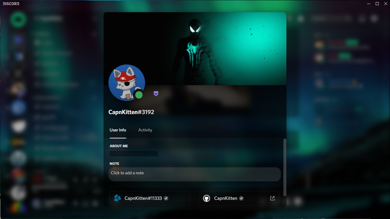
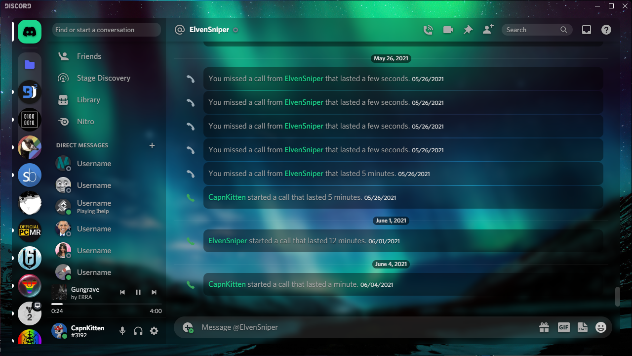
Previews
Main chat area

User server info

User info popout
User settings

DMs
Variables
App elements
--app-bg- The background image for the entire Discord app. Default:url(https://i.imgur.com/U8bSjj5.jpg)--app-blur- The strength of the blur for every element that has one. Default:6px--app-margin- The margin surrounding the content area. Default:24px--app-radius- The border radius of the app and every element that has a border radius. Default:8px--sidebar-color- The background color of the sidebars. Default:rgba(0,0,0, 0.4)--main-content-color- The background color of the main content areas. Default:rgba(0,0,0, 0.2)
Accent color
--accent-hue- The hue value for the accent color of the theme. Default:156--accent-saturation- The saturation value for the accent color of the theme. Default:77.5%--accent-lightness- The lightness value for the accent color of the theme. Default:47.1%--accent-opacity- The opacity of everything, excluding text, that uses the accent color. Default:1--accent-text-color- The text color for buttons and other various elements with the accent background color. Default:#000
Messages
--message-color- The background color for messages. Default:rgba(0,0,0, 0.4)--message-radius- The border radius for messages. Default:8px--message-padding-top- The top and bottom padding for messages. Default:8px--message-padding-side- The left and right padding for messages. Default:8px--mention-hue- The hue value for the message mention color. Default:156--mention-saturation- The saturation value for the message mention color. Default:77.5%--mention-lightness- The lightness value for the message mention color. Default:47.1%--mention-opacity- The opacity of the message mention color. Default:1--reply-hue- The hue value for the reply message color. Default:226--reply-saturation- The saturation value for the reply message color. Default:77.6%--reply-lightness- The lightness value for the reply message color. Default:61.8%--reply-opacity- The opacity of the reply message color. Default:1
Textareas and inputs
--textarea-color- The background color for any textareas and inputs. Default:0,0,0--textarea-alpha- The opacity for any textareas and inputs. Default:0.15--textarea-text-color- The text color for textareas and inputs. Default:#fff--textarea-radius- The border radius for textareas (not inputs). Default:22px--input-height- The height for inputs. Default:36px--input-radius- The border radius for inputs (not textareas). Default:18px
Cards
--card-color- The background color for cards. Default:rgba(0,0,0, 0.4)--card-color-hover- The background color for hovering over cards (if there is a hover animation). Default:rgba(0,0,0, 0.5)--card-radius- The border radius for cards. Default:8px
Buttons
--button-height- The height for buttons. Default:32px--button-padding- The padding for buttons. Default:0 16px--button-color- The background color for most buttons. Default:#d73d3d--button-action-color- The background color for hovering and clicking on buttons (has a lowered opacity). Default:#000--button-text-color- The text color for any buttons that use--button-color. Default:#000--button-radius- The border radius for buttons. Default:8px
Popouts and modals
--popout-color- The background color for modals/popouts. Default:rgba(0,0,0, 0.55)--popout-blur- The blur strength for modals/popouts. Default:5px--popout-header-opacity- The header opacity for modals/popouts. Default:0.3--popout-header-shadow- The shadow for headers in modals/popouts. Default:0px 3px 9px 0px rgba(0,0,0, 0.25)--popout-radius- The border radius for modals/popouts. Default:8px--popout-shadow- The shadow for modals/popouts. Default:0 8px 10px 1px rgba(0,0,0, 0.14)
Changelog
v1.0.6 (18/11/2020)
- Inline replies styled
- Updated elements that Discord changed (If I missed any, please let me know)