vue-tel-input-vuetify
International Telephone Input with Vuetify.
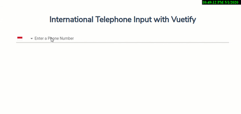
Table of Contents
Installation
Example Repository
You might want to follow and use the basic example usage of this library in this repository Example
OR try from scratch with below steps
vue-cli
- create new vue project using
vue-cli:
  vue create my-app
  cd my-app
vuetify
- install
vuetifyto newly created vue project
vue add vuetifynpm
- install
vue-tel-input-vuetifyto newly created vue project
npm install vue-tel-input-vuetifyInstall the plugin into Vue:
With vuetify loader:
  // vue.config.js

  "transpileDependencies": [
    "vuetify",
    "vue-tel-input-vuetify"
  ]
// src/plugins/vuetify.js
import Vue from 'vue';
import Vuetify from 'vuetify/lib';
Vue.use(Vuetify);
export default new Vuetify({
});// src/main.js
import Vue from 'vue';
import vuetify from "@/plugins/vuetify";
import VueTelInputVuetify from 'vue-tel-input-vuetify/lib';
Vue.use(VueTelInputVuetify, {
vuetify,
});
new Vue({
vuetify,
render: (h) => h(App),
}).$mount("#app");Without vuetify loader:
  // vue.config.js

  "transpileDependencies": [
    "vuetify",
    "vue-tel-input-vuetify"
  ]
// src/plugins/vuetify.js
import Vue from 'vue';
import Vuetify from 'vuetify';
import 'vuetify/dist/vuetify.min.css'
Vue.use(Vuetify);
export default new Vuetify({
});// src/main.js
import Vue from 'vue';
import VueTelInputVuetify from "vue-tel-input-vuetify";
import vuetify from "./plugins/vuetify";
Vue.use(VueTelInputVuetify, {
vuetify,
});
new Vue({
vuetify,
render: (h) => h(App),
}).$mount("#app");View all available options in Props.
Use the vue-tel-input-vuetify component:
<template>
  <vue-tel-input-vuetify v-model="phone"></vue-tel-input-vuetify>
</template>

<script>
export default {
  data() {
    return {
      phone: null
    }
  }
};
</script>
Usage
Props
| Property | Type | Default value | Description |
|---|---|---|---|
messages |
String | Array |
[] |
Displays a list of messages or message if using a string |
success-messages |
String | Array |
[] |
Puts the input in a success state and passes through custom success messages. |
error-messages |
String | Array |
[] |
Puts the input in an error state and passes through custom error messages. Will be combined with any validations that occur from the rules prop. This field will not trigger validation |
hint |
String |
undefined |
Hint text |
suffix |
String |
undefined |
Displays suffix text |
prefix |
String |
undefined |
Displays prefix text |
background-color |
String |
undefined |
Changes the background-color of the input |
rules |
String |
Array |
Accepts an array of functions that take an input value as an argument and return either true / false or a string with an error message |
loader-height |
Number | String |
2 |
Specifies the height of the loader |
loading |
String | Boolean |
false |
Displays linear progress bar. Can either be a String which specifies which color is applied to the progress bar (any material color or theme color - primary, secondary, success, info, warning, error) or a Boolean which uses the component color (set by color prop - if it's supported by the component) or the primary color |
hide-details |
String | Boolean |
undefined |
Hides hint and validation errors. When set to auto messages will be rendered only if there's a message (hint, error message, counter value etc) to display |
clearable |
Boolean |
false |
Add input clear functionality, default icon is Material Icons clear |
filled |
Boolean |
false |
Applies the alternate filled input style |
full-width |
Boolean |
false |
Designates input type as full-width |
flat |
Boolean |
false |
Removes elevation (shadow) added to element when using the solo or solo-inverted props |
light |
Boolean |
false |
Applies the light theme variant to the component. |
validate-on-blur |
Boolean |
false |
Delays validation until blur event |
dense |
Boolean |
false |
Reduces the input height |
outlined |
Boolean |
false |
Applies the outlined style to the input |
persistent-hint |
Boolean |
false |
Forces hint to always be visible |
readonly |
Boolean |
false |
Puts input in readonly state |
error |
Boolean |
false |
Puts the input in a manual error state |
success |
Boolean |
false |
Puts the input in a manual success state |
shaped |
Boolean |
false |
Round if outlined and increase border-radius if filled. Must be used with either outlined or filled |
single-line |
Boolean |
false |
Label does not move on focus/dirty |
rounded |
Boolean |
false |
Adds a border radius to the input |
value |
any |
'' |
The input's value |
label |
String |
'Enter a Phone Number' |
Native input 'label' attribute |
selectLabel |
String |
'' |
Country selector 'label' attribute |
autocomplete |
String |
'on' |
Native input 'autocomplete' attribute |
autofocus |
Boolean |
false |
Native input 'autofocus' attribute |
defaultCountry |
String |
'' |
Default country, will override the country fetched from IP address of user |
disabled |
Boolean |
false |
Disable input field |
disabledFetchingCountry |
Boolean |
false |
Disable fetching current country based on IP address of user |
ignoredCountries |
Array |
[] |
List of countries will NOT be shown on the dropdown. ie ['AU', 'BR'] |
inputId |
String |
'' |
Custom 'id' for the input |
inputOptions |
Object |
{ showDialCode: false, tabindex: 0 } |
Options for input, supporting showDialCode (always show dial code in the input) and tabindex |
maxLen |
Number |
25 |
Native input 'maxlength' attribute |
mode |
String |
'' |
Format number to 'international' (with + dial code) or 'national' (with 0...) |
name |
String |
'telephone' |
Native input 'name' attribute |
onlyCountries |
Array |
[] |
List of countries will be shown on the dropdown. ie ['AU', 'BR'] |
placeholder |
String |
'Enter a phone number' |
Placeholder for the input |
preferredCountries |
Array |
[] |
Preferred countries list, will be on top of the dropdown. ie ['AU', 'BR'] |
required |
Boolean |
false |
Required property for HTML5 required attribute |
wrapperClasses |
String | Array | Object |
'' |
Custom classes for the wrapper |
Events
| Event | Arguments | Description | Notes |
|---|---|---|---|
input |
String, Object |
Fires when the input changes with the argument is the object includes { number, isValid, country } |
onInput deprecated |
validate |
Object |
Fires when the correctness of the phone number changes (from true to false or vice-versa) and when the component is mounted { number, isValid, country } |
onValidate deprecated |
blur |
Fires on blur event | onBlur deprecated |
|
change |
Emitted when the input is changed by user interaction | ||
click |
Emitted when input is clicked | ||
focus |
Emitted when component is focused | ||
keydown |
Emitted when any key is pressed | ||
mousedown |
Emitted when click is pressed | ||
mouseup |
Emitted when click is released | ||
blur |
Fires on blur event | onBlur deprecated |
|
space |
Fires on keyup.space event | onSpace deprecated |
|
enter |
Fires on keyup.enter event | onEnter deprecated |
|
open |
Fires when the flags dropdown opens | ||
close |
Fires when the flags dropdown closes | ||
country-changed |
Object |
Fires when country changed (even for the first time) |
Credits & Contributors
Credits
- Telephone Number parsing, validation by awesome-phonenumber.
- Country Codes data from intl-tel-input.
- User's country by ip2c.org, request using Fetch API.
made with