enisn / Xamarin.forms.inputkit
Projects that are alternatives of or similar to Xamarin.forms.inputkit

|
Xamarin.Forms.InputKitCheckBox, Radio Button, Advanced Entry, Advanced Slider, Dropdown etc. |


Available Platforms
| Platform | Version | Supported |
|---|---|---|
| Android | MonoAndroid10.0 | ✅ |
| Android | MonoAndroid90 | ✅ |
| Android | MonoAndroid81 | ❌ |
| iOS | Xamarin.iOS10 | ✅ |
| UWP | - | EXPERIMENTAL |
| MAC | Xamarin.Mac20 | ✅ |
| WatchOS | Xamarin.WatchOS10 | ⚠ |
| .NET Standard | 2.0 | ✅ |
| .NET Standard | 1.0 | ✅ |
Getting Started with InputKit
There is no complicated steps for set-up, no Inits no implementation codes. Plug & Play.
Read Documentation of Getting Started.
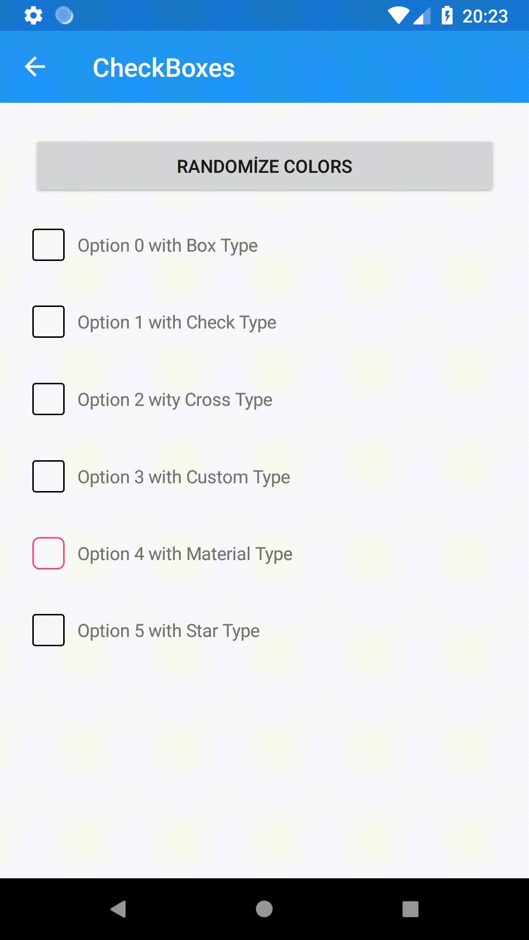
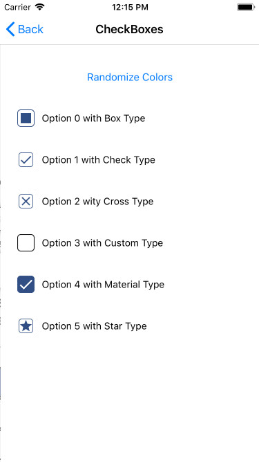
Checkbox
As you know ther is no CheckBox in Xamarin Forms Library. You can use a custom renderer to use Native Checkbox in portable layer. This CheckBox is not a native one, It's created in Xamarin Forms Portable layer.
Also you can read more about Checkbox from here
SAMPLE:
<?xml version="1.0" encoding="utf-8" ?>
<ContentPage xmlns="http://xamarin.com/schemas/2014/forms"
             xmlns:x="http://schemas.microsoft.com/winfx/2009/xaml"
             xmlns:local="clr-namespace:Sample.InputKit"
             xmlns:input="clr-namespace:Plugin.InputKit.Shared.Controls;assembly=Plugin.InputKit"
             x:Class="Sample.InputKit.MainPage">
        <StackLayout Spacing="12" Padding="30,0">
            <input:CheckBox Text="Option 1" Type="Box" />
            <input:CheckBox Text="Hello World I'm Option 2" Type="Check"/>
            <input:CheckBox Text="Consetetur eum kasd eos dolore Option 3" Type="Cross"/>
            <input:CheckBox Text="Sea sed justo" Type="Star"/>
        </StackLayout>
</ContentPage>
|
|
PROPERTIES:
- CheckChanged: (Event) Invokes when check changed.
- CheckChangedCommand: (Command) Bindable Command, executed when check changed.
- Key: (int) A key you can set to define checkboxes as ID.
- Text: (string) Text to display description
- IsChecked: (bool) Checkbox checked situation. Works TwoWay Binding as default.
- Color: (Color) Color of selected check.
- TextColor: (Color) Color of description text.
- Type: (CheckType) Type of checkbox checked style. (Check,Cross,Star,Box etc.)
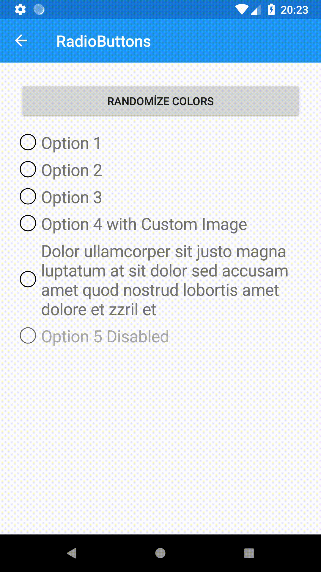
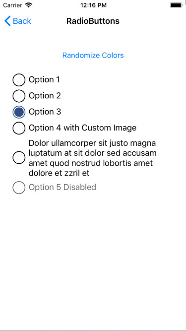
RadioButon
Radio Buttons should use inside a RadioButtonGroupView. If you want this view will return you selected radio button. But you can handle it one by one too.
SAMPLE:
<?xml version="1.0" encoding="utf-8" ?>
<ContentPage xmlns="http://xamarin.com/schemas/2014/forms"
            xmlns:x="http://schemas.microsoft.com/winfx/2009/xaml"
            xmlns:local="clr-namespace:Sample.InputKit"
            xmlns:input="clr-namespace:Plugin.InputKit.Shared.Controls;assembly=Plugin.InputKit"
            x:Class="Sample.InputKit.MainPage">

        <StackLayout Spacing="12" Padding="30,0">

            <input:RadioButtonGroupView>
                <input:RadioButton Text="Option 1" />
                <input:RadioButton Text="Option 2" />
                <input:RadioButton Text="Option 3" />
                <input:RadioButton Text="Option 4" />
            </input:RadioButtonGroupView>

        </StackLayout>

</ContentPage>
|
|
PROPERTIES:
RadioButtonGroupView
- SelectedIndex: (int) Gets or Sets selected radio button inside itself by index
- SelectedItem: (object) Gets or Sets selected radio button inside itself by Value
RadioButton
- Clicked: (event) Invokes when clikced
- ClickCommand: (int) Bindable Command, Executes when clicked
- Value: (object) A value keeps inside and groupview returns that value as SelectedItem
- IsChecked: (bool) Gets or Sets that radio button selected
- Text: (string) Text to display near of Radio Button
- TextFontSize: (double) Fontsize of Text
- Color: (Color) Color of selected radio button dot
- TextColor: (Color) Color of Text
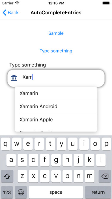
AutoCompleteEntry ( Experimental )
Alternative picker with dropdown menu.
SAMPLE:
 <input:AutoCompleteEntry Title="Type something below:"
                          ItemsSource="{Binding MyList}"
                          SelectedItem="{Binding SelectedItem}" />

|
|
PROPERTIES:
- Placeholder: (string) Placehodler Text
- Title: (string) Title will be shown top of this control
- IconImage: (string) Icons of this Entry. Icon will be shown left of this control
- Color: (Color) Color of Icon Image. IconImage must be a PNG and have Alpha channels. This fills all not-Alpha channels one color. Default is Accent
- ValidationMessage: (string) This is message automaticly displayed when this is not validated. **Use this one instead of annotationmessage**
- AnnotationColor: (Color) AnnotationMessage's color..
- IsRequired: (bool) IValidation implementation. Same with IsAnnotated
- ItemsSource: (IList) Suggestions items
To be added...
Dropdown ( Experimental * Not Stable * )
Alternative picker with dropdown menu.
SAMPLE:
 <input:Dropdown Title="Chosse an option below:"
                            TitleColor="Black"
                            ValidationMessage="This field is required"
                            AnnotationColor="Accent"
                            IsRequired="True"
                            BorderColor="Black"
                            Color="BlueViolet"
                            Placeholder="Choose one"
                            ItemsSource="{Binding MyList}"
                            SelectedItem="{Binding SelectedItem}" />
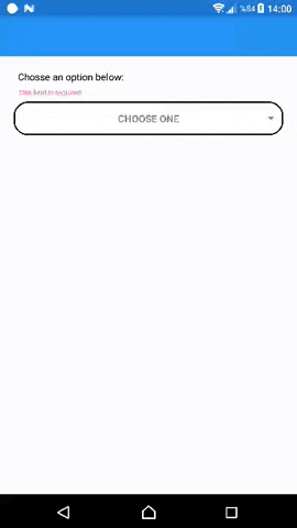
PROPERTIES:
- Placeholder: (string) Placehodler Text
- Title: (string) Title will be shown top of this control
- IconImage: (string) Icons of this Entry. Icon will be shown left of this control
- Color: (Color) Color of Icon Image. IconImage must be a PNG and have Alpha channels. This fills all not-Alpha channels one color. Default is Accent
- ValidationMessage: (string) This is message automaticly displayed when this is not validated. **Use this one instead of annotationmessage**
- AnnotationColor: (Color) AnnotationMessage's color..
- IsRequired: (bool) IValidation implementation. Same with IsAnnotated
To be adde...
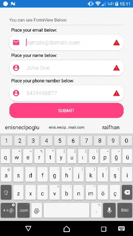
Advanced Entry
This entry has many features to develop your applications quickly. When this entry completed, it finds next entry in Parent layout and focus it. AdvancedEntry contains validation system inside it. You can set some properties to validate it and you can handle all your entries is validated or not with **FormView**. You can set validation message and AnnotatinColor. Entry will automaticly display your message when it's not validated.
SAMPLE:
 <StackLayout Padding="30">
            <Label Text="You can see FormView Below:"/>
            <BoxView HeightRequest="1" Color="LightGray" />
            <input:FormView IsValidated="{Binding IsValidated}">

                <input:AdvancedEntry
                    Text="{Binding Email}"
                    IsRequired="True"
                    Title="Place your email below:"
                    Annotation="Email"
                    Placeholder="[email protected]"
                    AnnotationColor="Accent"
                    ValidationMessage="Please type a valid email address"
                    IconImage="ic_email_black_24dp.png"
                    MinLength="10"
                    MaxLength="50"
                    />

                <input:AdvancedEntry
                    Text="{Binding NameSurname}"
                    IsRequired="True"
                    Title="Place your name below:"
                    Annotation="NameSurname"
                    Placeholder="John Doe"
                    AnnotationColor="Accent"
                    ValidationMessage="Please type your name correctly"
                    IconImage="ic_account_circle_black_24dp.png"
                    MinLength="5"
                    MaxLength="30"
                    />

                <input:AdvancedEntry
                    Text="{Binding Phone}"
                    IsRequired="True"
                    Title="Place your phone number below:"
                    Annotation="Phone"
                    Placeholder="5439998877"
                    AnnotationColor="Accent"
                    ValidationMessage="Please type your phone number correctly"
                    IconImage="ic_account_circle_black_24dp.png"
                    MaxLength="10"
                    />

                <Button Command="{Binding SubmitCommand}" Text="Submit" BackgroundColor="Accent" CornerRadius="20" TextColor="White" />
            </input:FormView>
        </StackLayout>
PROPERTIES:
- Text: (string) Text of user typed
- Title: (string) Title will be shown top of this control
- IconImage: (string) Icons of this Entry. Icon will be shown left of this control
- IconColor: (Color) Color of Icon Image. IconImage must be a PNG and have Alpha channels. This fills all not-Alpha channels one color. Default is Accent
- Placeholder: (string) Entry's placeholder.
- MaxLength: (int) Text's Maximum length can user type.
- MinLength: (int) Text's Minimum length to be validated.
- AnnotationMessage: (string) This will be shown below title. This automaticly updating. If you set this manually you must set true IgnoreValidationMessage !!! .
- AnnotationColor: (Color) AnnotationMessage's color..
- Annotation: (Enum) There is some annotation types inside in kit.
- IsDisabled: (bool) Sets this control disabled or not.
- IsAnnotated: (bool) Gets this control annotated or not. Depends on Annotation
- IsRequired: (bool) IValidation implementation. Same with IsAnnotated
- ValidationMessage: (string) This is message automaticly displayed when this is not validated. **Use this one instead of annotationmessage**
- IgnoreValidationMessage: (bool) Ignores automaticly shown ValidationMessage and you can use AnnotationMessage as custom.
- CompletedCommand: (ICommand) Executed when completed.
Advanced Slider
Xamarin Forms Slider works a Sticky label on it. Wonderful experience for your users.
SAMPLE:
<?xml version="1.0" encoding="utf-8" ?>
<ContentPage xmlns="http://xamarin.com/schemas/2014/forms"
             xmlns:x="http://schemas.microsoft.com/winfx/2009/xaml"
             xmlns:local="clr-namespace:Sample.InputKit"
             xmlns:input="clr-namespace:Plugin.InputKit.Shared.Controls;assembly=Plugin.InputKit"
             x:Class="Sample.InputKit.MainPage">

    <StackLayout Spacing="12" Padding="10,0" VerticalOptions="CenterAndExpand">

        <input:AdvancedSlider MaxValue="5000" MinValue="50" StepValue="50" ValuePrefix="Price:" ValueSuffix="€" Title="Choose Budget:"/>

    </StackLayout>

</ContentPage>
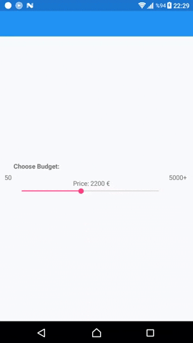
PROPERTIES:
- Value: (double) Current Selected Value, (this can be used TwoWayBinding)
- Title: (string) Title of slider
- ValueSuffix: (string) Suffix to be displayed near Value on Floating Label
- ValuePrefix: (string) Prefix to be displayed near Value on Floating Label
- MinValue: (double) Sliders' minimum value
- MaxValue: (double) Sliders' maximum value
- MaxValue: (double) Sliders' increment value
- TextColor: (Color) Color of Texts
- DisplayMinMaxValue: (bool) Visibility of Minimum and Maximum value
SelectionView
Presents options to user to choose. This view didn't created to static usage. You should Bind a model List as ItemSource, or if you don't use MVVM you can set in page's cs file like below. (You can override ToString method to fix display value or I'll add displayMember property soon.)
SAMPLE:
<?xml version="1.0" encoding="utf-8" ?>
<ContentPage xmlns="http://xamarin.com/schemas/2014/forms"
             xmlns:x="http://schemas.microsoft.com/winfx/2009/xaml"
             xmlns:local="clr-namespace:Sample.InputKit"
             xmlns:input="clr-namespace:Plugin.InputKit.Shared.Controls;assembly=Plugin.InputKit"
             x:Class="Sample.InputKit.MainPage">

    <StackLayout Spacing="12" Padding="10,0" VerticalOptions="CenterAndExpand">

        <input:SelectionView x:Name="selectionView" />

    </StackLayout>
</ContentPage>
public partial class MainPage : ContentPage
	{
		public MainPage()
		{
			InitializeComponent();
            selectionView.ItemSource = new[]
            {
                "Option 1","Option 2","Option 3","Option 4","Option 5","Option 6","Option 7","Option 8"
            };
		}
	}

You may use a object list as ItemSource, You can make this. Don't forget override ToString() method in your object.
sample object:
  public class SampleClass
    {
        public int Id { get; set; }
        public string Name { get; set; }
        public override string ToString() => Name;
    }
Usage:
public partial class MainPage : ContentPage
	{
		public MainPage()
		{
			InitializeComponent();
           selectionView.ItemSource = new[]
            {
                new SampleClass{ Name = "Option 1", Id = 1 },
                new SampleClass{ Name = "Option 2", Id = 2 },
                new SampleClass{ Name = "Option 3", Id = 3 },
                new SampleClass{ Name = "Option 4", Id = 4 },
                new SampleClass{ Name = "Option 5", Id = 5 },
                new SampleClass{ Name = "Option 6", Id = 6 },
                new SampleClass{ Name = "Option 7", Id = 7 },
                new SampleClass{ Name = "Option 8", Id = 8 },
            };
		}
	}
PROPERTIES:
- ItemSource: (IList) List of options
- SelectedItem: (object) Selected Item from ItemSource
- ColumnNumber: (int) Number of columng of this view
Did you like ?

Your coffee keeps me awake while developing projects like this. 👍☕