AnimaApp / Auto Layout
Projects that are alternatives of or similar to Auto Layout
📐 Responsive Design for Sketch
.gif)
Auto-Layout is a plugin for Sketch that enables designers to design fully responsive artboards.
☝️ Features
- 📍 Pins (Constraints) - Learn more
- 🗄 Stacks (Flexbox) - Learn more
- ⚡️ Updates in real time when dragging layers
- 🖥 Easily generate an overview of all screen sizes
- 💎 Supports Symbols
- 📱 Supports Web/iOS/Android
- 🚀 Export a live, responsive website using Launchpad plugin (included)
📺 Videos
📝 Blog posts
🏃🏼 Install with Sketch Runner
- With Sketch Runner, just go to the
installcommand and search forAuto Layout. Runner allows you to manage plugins and do much more to speed up your workflow in Sketch. Download Runner here.

Installation via Sketch Plugin Manager:
- In the 'Catalog' tab of the Sketch Plugin Manager window, click in the 'Search' field and type 'Auto Layout', to filter the list.
- You will see the 'Auto Layout' plugin listed at the top of the list. Click the 'Instal' button inside it.
📖 Documentation
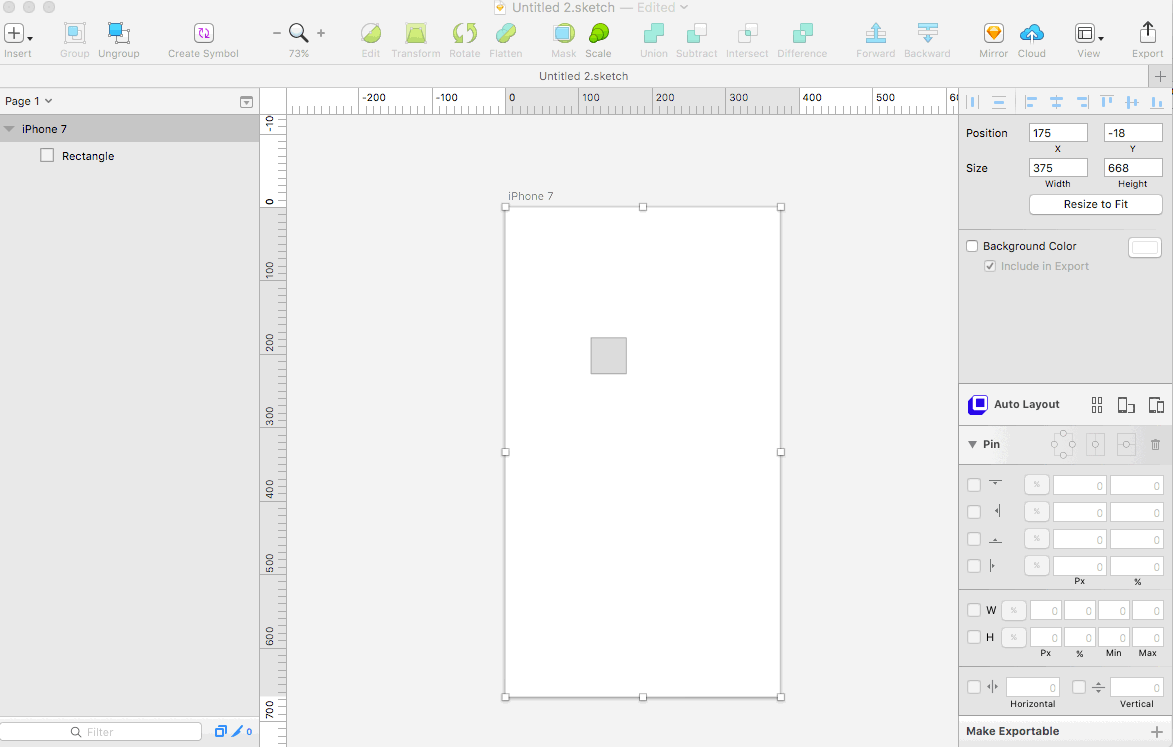
Pins
Simple

Simple pinning allows to pin a layer to its parent with the following:
- Top
- Right
- Bottom
- Left
- Center Horizontally
- Center Vertically
When selecting a pin, Auto-Layout will set the pin constant value as the current pixel value.
For example if a layer is 20px from the right and you select Pin to Right, the right pin constant value will be set to 20px.
Once a pin is set, Auto-Layout will enforce the pin value when the artboard is resized.
For example if you pinned a layer to the right by 20px, you can resize the artboard by dragging its right side and you'll notice the layer always stays 20px from the right.

Pin to Parent
- A
Layeris always pinned to itsParent - A parent can be either an
Artboardor aGroup - Pinning betweein siblins can be achieved using
Stacks
Layer in an Artboard

Layer in a Group

Advanced

- To reveal the advanced pinning panel click
Pins - You can pin a layer either by
pixelsor bypercent. -
Pixelsvalues are in the left text boxes,Percentvalues are in the right text boxes. - Use the
Togglebutton to select which type of pinning.

Pinning by Pixels

Pinning by Percent

Size

Width & Height
You can set a Layer width and height by checking the width and height checkboxes.
When you check the width or height box, Auto-Layout will set the current value as the constraint value.
The taken value will be either by pixels or by percent, depending on the current toggle state.
Min & Max
You can set the miniumum or maximum value of the width or the height of a Layer
Once set, the layer width or height will never exceed the min/max values, no matter what the Artboard size is.
To keep the layer pinned to the left rather from the right, set the width to % and uncheck Right pin.
Custom Height
In some cases you want to extend the height of an artboard further than the default platform screen sizes, in order to show how the design looks when the user scrolls down.
Auto-Layout will automatically recognize artboards that do not have default screen sizes and will never decrease their height to less than their original height.
Center

- A centered
Layeris always centered to itsParent - A parent can be either an
Artboardor aGroup
Center Horizontally
You can center a layer horizontally to its parent.
Center Vertically
You can center a layer vertically to its parent.
Stacks
What is a Stack?
A Stack is a special type of Group that defines the layout of its child Layers.

A Stack Group icon has a special Blue color and an indicator of its Direction.
How to Stack?
To Stack layers or groups, select them and click the Stack button in Auto-Layout panel.
Stack Properties
A Stack has 3 properties:
- Direction: Defines if stacking of child Layers is Horizontal or Vertical.
- Alignment: Can be Top/Center/Bottom/Spread
- Spacing: Defines the spacing between each child Layer.
Direction
Defines if stacking of child Layers is Horizontal or Vertical.

Alignment
Can be Top/Center/Bottom/Spread

Spacing
Defines the spacing between each child Layer.

Stack Nesting
Stacks can be nested

Examples
Scaling Text Background

Tutorials
Walkthrough Video (29:09) by Pablo Stanley

Walkthrough Video (7:36) by Chris Slowik


Dynamic Buttons Blog Post by Giusè

Orientation

You can toggle all artboards by clicking the Orientation toggle button.

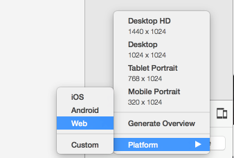
Presets
Presets are pre-defined Artboard sizes of real world screen sizes devices.
Once you've defined Auto-Layout on your design, you can easily change Artboard sizes to these presets.
iOS
| Device | Width | Height | Scale |
|---|---|---|---|
| iPhone 4 | 320 | 480 | 2 |
| iPhone SE | 320 | 568 | 2 |
| iPhone 7 | 375 | 667 | 2 |
| iPhone 7+ | 414 | 736 | 3 |
| iPad Air | 768 | 1024 | 2 |
| iPad Pro | 1024 | 1366 | 2 |
**
Scalemeans that the number of pixels is multiplied according to the scale value.**
- For example in iPhone 7 the screen size is 375x667 points, but 750x1334 actual pixels since Scale is 2.
Android
| Device | Width | Height |
|---|---|---|
| Android Phone | 360 | 640 |
| Android Tablet 7' | 600 | 960 |
| Android Tablet 9' | 768 | 1024 |
| Android Desktop | 1280 | 850 |
Web
| Device | Width | Height |
|---|---|---|
| Desktop HD | 1440 | 1024 |
| Desktop | 1024 | 1024 |
| Tablet Portrait | 768 | 1024 |
| Mobile Portrait | 320 | 1024 |
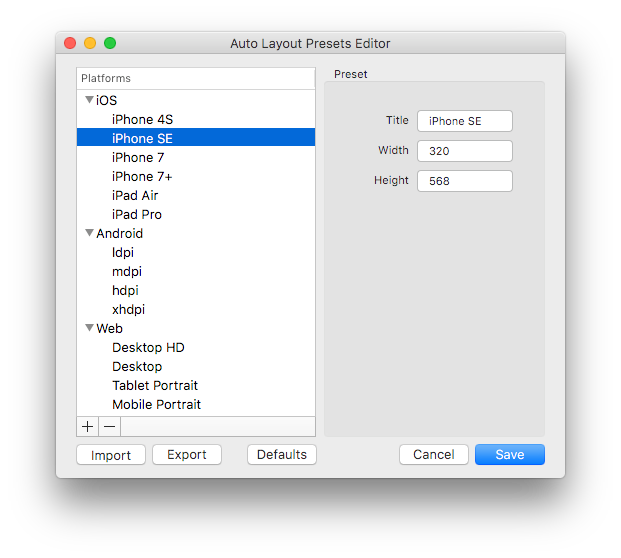
Custom
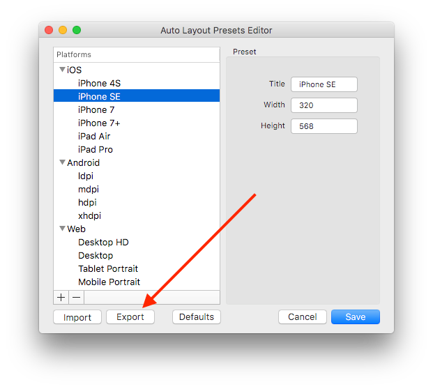
Presets Editor
The Plugin comes with a default collection of presets mentioned above. However you can easily add, edit, import and export your own presets.
Import
- Click “Platform” -> “Custom”
- The “Presets Editor” shows up, click “Import”
- Navigate and select the collection json file
- Done!
Export
So you’ve made the effort to create a perfect collection of presets and now your colleagues are jealous. Lucky enough you can become the hero of the day by just exporting your collection and sharing it with them.
Keyboard Shortcuts
Present Keyboard Shortcuts settings


You can use the Default shortcuts or assign your own.
