kmaasrud / Awesome Obsidian
Licence: cc0-1.0
🕶️ Awesome stuff for Obsidian
Stars: ✭ 918
Labels
Projects that are alternatives of or similar to Awesome Obsidian
Tenancy
Run multiple websites using the same Laravel installation while keeping tenant specific data separated for fully independent multi-domain setups.
Stars: ✭ 916 (-0.22%)
Mutual labels: hacktoberfest
Laravel Sri
Subresource Integrity hash generator for laravel
Stars: ✭ 23 (-97.49%)
Mutual labels: hacktoberfest
Dlang
[MIRROR] D programming language ebuild repository
Stars: ✭ 24 (-97.39%)
Mutual labels: hacktoberfest
Bezier Envelope For Inkscape
The Bezier Envelope Extension for Inkscape
Stars: ✭ 21 (-97.71%)
Mutual labels: hacktoberfest
Kuberhealthy
A Kubernetes operator for running synthetic checks as pods. Works great with Prometheus!
Stars: ✭ 920 (+0.22%)
Mutual labels: hacktoberfest
Replayzero
Record local web traffic on your laptop and generate functional API tests, utilizing open source industry standards like Karate and Gatling
Stars: ✭ 24 (-97.39%)
Mutual labels: hacktoberfest
Laminas Cli
Console command runner, exposing commands written in Laminas MVC and Mezzio components and applications
Stars: ✭ 25 (-97.28%)
Mutual labels: hacktoberfest
Hazelcast Hibernate
A distributed second-level cache for Hibernate
Stars: ✭ 24 (-97.39%)
Mutual labels: hacktoberfest
Dancer Plugin Auth Extensible
Authentication framework for Dancer-based web applications
Stars: ✭ 22 (-97.6%)
Mutual labels: hacktoberfest
Knifecycle
Manage your NodeJS processes's lifecycle automatically with an unobtrusive dependency injection implementation.
Stars: ✭ 24 (-97.39%)
Mutual labels: hacktoberfest
Rladies Brasil
Lista de meetups online de diferentes capítulos da R-Ladies no Brasil.
Stars: ✭ 25 (-97.28%)
Mutual labels: hacktoberfest
Meteor Roles
Authorization package for Meteor, compatible with built-in accounts packages
Stars: ✭ 916 (-0.22%)
Mutual labels: hacktoberfest
Apostrophe Documentation
Documentation for the ApostroheCMS open-souce ecosystem
Stars: ✭ 23 (-97.49%)
Mutual labels: hacktoberfest
Sivar Utils
TS/JS utils para el desarrollo de sistemas salvadoreños 🇸🇻
Stars: ✭ 25 (-97.28%)
Mutual labels: hacktoberfest

A curated list of awesome themes and plugins for Obsidian.
Table of contents
Handy tools
| Name | Description | Credits |
|---|---|---|
| Markdownload | A Firefox and Google Chrome extension to clip websites and download them into a readable markdown file. | deathau |
| Copy Selection as Markdown | Firefox add-on to copy a selection or link as formatted Markdown | 0x6b |
| Notion to Obsidian converter | Simple script to convert exported Notion notes to Obsidian | connertennery |
| Yarle - Yet Another Rope Ladder from Evernote | Node.js app to convert exported Evernote notes to Markdown (Obsidian) | akosbalasko |
| Oboe - Obsidian to HTML converter | Command line tool that converts an Obsidian vault into a vault of HTML files. Useful for publishing a vault as a static website. | kmaasrud |
| Obsidian Clipper | An unofficial Obsidian clipper for Chrome, that allows you to easily clip a selection to a note in Obsidian | jplattel |
| Obsidian Starter Templates | A set of Markdown templates for common Obsidian use cases | masonlr, sharpevo and mtomas7 |
Themes
Most themes should be available through the Community Themes pane in Obsidian's settings. If not, enable Custom CSS under Plugins, download obsidian.css from the desired repository and place it in the vault root.
| Name | Description | Image | Credits |
|---|---|---|---|
| Official Dracula theme | A dark theme hosted by the official Dracula guys |  |
dracula, andybyers21 and zenorocha |
| 80s Neon | A retro-future 80s inspired theme for Obsidian. |  |
deathau |
| Base2Tone | A theme for Obsidian based on http://base2t.one/ with default hues from http://simurai.com/duotone-dark-sky-syntax/. |  |
deathau |
| Clean theme | A minimal and clean theme designed to be clutter-free and easy on the eye. |  |
kmaasrud |
| OneDark Theme | This theme is based on One Dark Pro and One Dark Pro is based on Atom's default One Dark theme. Currently only supports Dark mode. |  |
pionxzh |
| Dracula | A dark theme for Obsidian. |  |
jarodise |
| Comfort Color Dark Theme | A dark theme for Obsidian. | 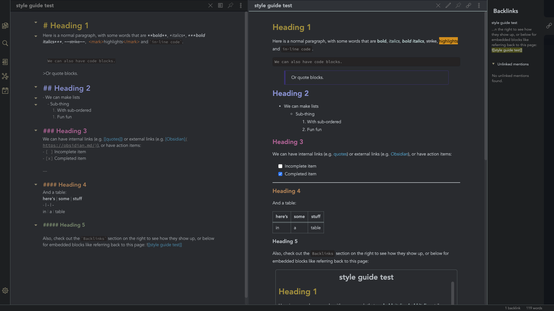 |
obsidian-ezs |
| Gruvbox Theme | This is a gruvbox theme for Obsidian. It supports both light and dark modes. | 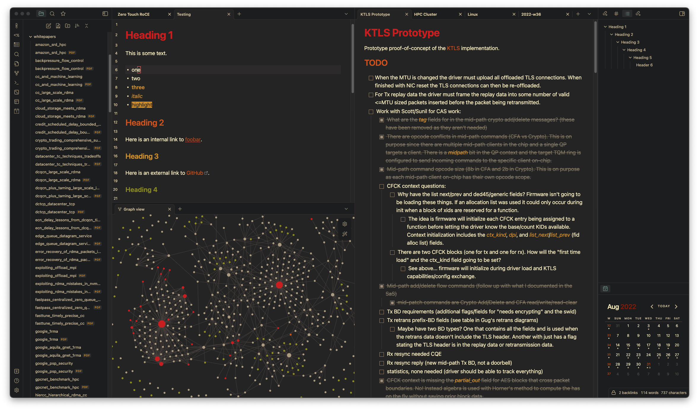 |
insanum |
| Gastown | A light theme for Obsidian. | 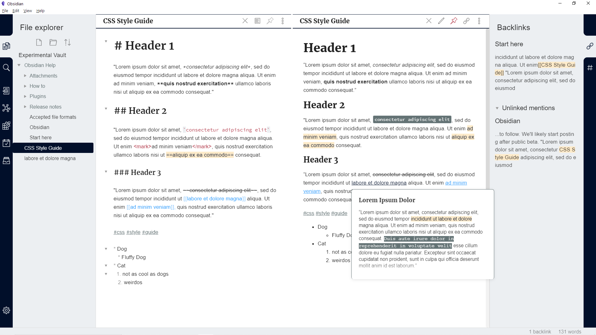 |
dogwaddle |
| Ursa | A light and dark theme for Obsidian featuring "zen mode" with collapsing side panels and improved single pane viewing. | 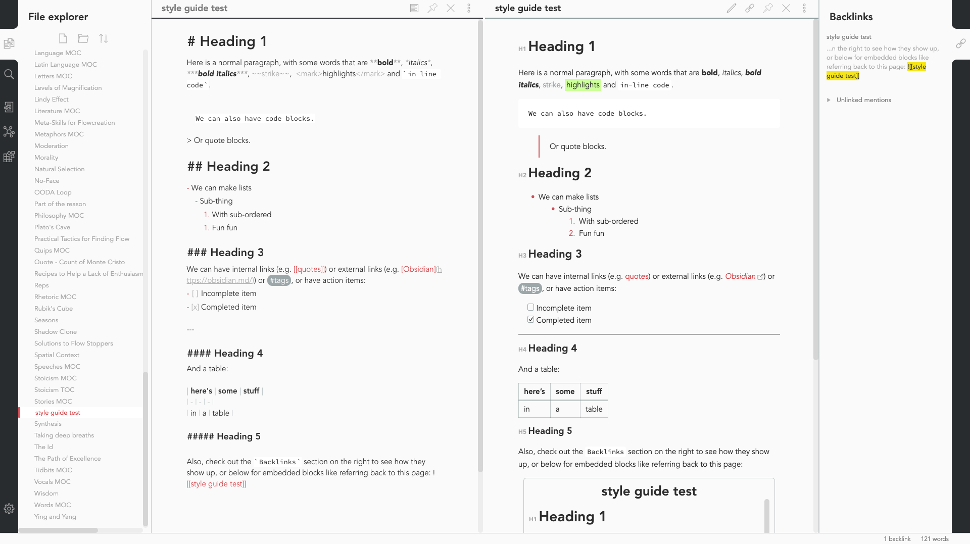 |
obsidian-ezs |
| Obsidian Solarized | This is just a recolor based on the solarized color scheme. |  |
Slowbad |
| Red Graphite | A light theme for Obsidian, based on Bear.app's Red Graphite theme. |  |
seanwcom |
| Obsidian + Nord | A Nord-based theme for Obsidian, only supporting dark mode |  |
insanum |
CSS Tweaks
Small tweaks to add to your obsidian.css file
- Andy Matuschak mode
- Collapsing sidebar
- Bullet point relationship lines
- Task List Preview relationship line Correction
- Auto-fading UI
- Hyphenation and Justification
- Enlarge Image on Hover
- Nicer Check Boxes
- Stylish Block Quotes
- Bigger Link Popup Preview
- Custom icons differing files and folders
- Tag Pills
- Outliner For The Outline and File Explorer
- Make subtler folding gutter arrows
- Better bullet points in edit mode
- Bigger popup windows
Andy Matuschak mode
CSS
/* everything under .mod-root now. Don't want Andy messing with sidebars */
/* also, Andy only makes sense for vertical splits, at the root level, right? */
.mod-root.workspace-split.mod-vertical {
  overflow-x:auto;
  --header-width: 36px; /*  div {
  min-width: calc(700px + var(--header-width)); /* /* shift sticky position, so titles will stack up to the left /
/ This will currently stack to a maximum of 10 before resetting */
.mod-root.workspace-split.mod-vertical > div:nth-child(10n-8) { left: calc(var(--header-width) * 0); }
.mod-root.workspace-split.mod-vertical > div:nth-child(10n-7) { left: calc(var(--header-width) * 1); }
.mod-root.workspace-split.mod-vertical > div:nth-child(10n-6) { left: calc(var(--header-width) * 2); }
.mod-root.workspace-split.mod-vertical > div:nth-child(10n-5) { left: calc(var(--header-width) * 3); }
.mod-root.workspace-split.mod-vertical > div:nth-child(10n-4) { left: calc(var(--header-width) * 4); }
.mod-root.workspace-split.mod-vertical > div:nth-child(10n-3) { left: calc(var(--header-width) * 5); }
.mod-root.workspace-split.mod-vertical > div:nth-child(10n-2) { left: calc(var(--header-width) * 6); }
.mod-root.workspace-split.mod-vertical > div:nth-child(10n-1) { left: calc(var(--header-width) * 7); }
.mod-root.workspace-split.mod-vertical > div:nth-child(10n+0) { left: calc(var(--header-width) * 8); }
.mod-root.workspace-split.mod-vertical > div:nth-child(10n+1) { left: calc(var(--header-width) * 9); }
/* now it's time for the fancy vertical titles */
/* first we'll add a bit of gap for the title to sit inside of */
.workspace-leaf-content {
padding-left: var(--header-width);
position: relative;
}
/* this is where the magic happens */
.view-header {
writing-mode: vertical-lr;
border-right: 1px solid var(--background-secondary-alt);
border-left: 2px solid var(--background-secondary-alt);
border-top: none;
border-bottom: none;
height: auto;
width: var(--header-width);
position: absolute;
left:0;
top:0;
bottom:0;
}
/* active titles have different border colours */
.workspace-leaf.mod-active .view-header {
border-right: 2px solid var(--interactive-accent);
border-bottom: none;
}
/* unset the title container height and swap padding */
.view-header-title-container {
height: unset;
padding-left: unset;
padding-top: 5px;
}
/* fix the long-title-obscuring shadows */
.view-header-title-container:after {
width: 100%;
height: 30px;
top:unset;
bottom: 0;
background: linear-gradient(to bottom, transparent, var(--background-secondary));
}
.workspace-leaf.mod-active .view-header-title-container:after {
background: linear-gradient(to bottom, transparent, var(--background-primary-alt));
}
/* swap the padding/margin around for the header and actions icons */
.view-header-icon, .view-actions {
padding: 10px 5px;
}
.view-action {
margin: 8px 0;
}
/* get rid of the gap left by the now-missing horizontal title */
.view-content {
height: 100%;
}
/* make the fake drop target overlay have a background so you can see it. /
/ TODO: figure out how the fake target overlay works so we can put the title back, too */
.workspace-fake-target-overlay {
background-color: var(--background-primary);
}
Credits to deathau
Collapsing sidebar
CSS
.side-dock-ribbon.mod-left.is-collapsed:not(:hover), .side-dock-ribbon.mod-right.is-collapsed:not(:hover) {
  width: 15px !important;
  opacity: 0;
}
.side-dock-ribbon {
  transition-property: width, opacity;
}
Credits to kmaasrud
Bullet point relationship lines
CSS
.cm-hmd-list-indent .cm-tab, ul ul { position: relative; }
.cm-hmd-list-indent .cm-tab::before, ul ul::before {
 content:'';
 border-left: 1px solid rgba(0, 122, 255, 0.25);
 position: absolute;
}
.cm-hmd-list-indent .cm-tab::before { left: 0; top: -5px; bottom: -4px;
}
ul ul::before { left: -11px; top: 0; bottom: 0;
}
Credits to deathau
Task List Preview relationship line Correction
CSS
.contains-task-list::before {
  left: 10px ;
}
Credits to d00b
Auto-fading UI
Auto-fading note controls
.view-header:not(:hover) .view-actions {
  opacity: 0.1;
  transition: opacity .25s ease-in-out;
}
Auto-fading status bar
.status-bar:not(:hover) .status-bar-item {
  opacity: 0.25;
  transition: opacity .25s ease-in-out;
}
Subtler folding gutter arrows
.CodeMirror-foldgutter-folded:after,
.CodeMirror-foldgutter-open:after {
  opacity: 0.5;
  font-size: 60%;
}
.CodeMirror-foldgutter-folded:hover:after,
.CodeMirror-foldgutter-open:hover:after {
opacity: 1;
}
.CodeMirror-foldgutter-folded:after {
content: "\25BA";
}
.CodeMirror-foldgutter-open:after {
content: "\25BC";
}
Credits to Rumen Dimitrov
Hyphenation and Justification
CSS
.cm-s-obsidian,
.markdown-preview-view {
  text-align: justify;
  hyphens: auto;
}
Credits to Boyd
Enlarge Image on Hover
CSS
.markdown-preview-view img {
  display: block;
  margin-top: 20pt;
  margin-bottom: 20pt;
  margin-left: auto;
  margin-right: auto;
  width: 50%; /* experiment with values */
  transition: transform 0.25s ease;
}
.markdown-preview-view img:hover {
-webkit-transform: scale(1.8); /* experiment with values */
transform: scale(2);
}
Credits to Den
Nicer Check Boxes
CSS
/* Round checkbxes in preview and editor */
input[type=checkbox], .cm-formatting-task {
    -webkit-appearance: none;
    appearance: none;
    border-radius: 50%;
    border: 1px solid var(--text-faint);
    padding: 0;
    vertical-align: middle;
}
.cm-s-obsidian span.cm-formatting-task {
color: transparent;
width: 1.25em !important;
height: 1.25em;
display: inline-block;
}
input[type=checkbox]:focus{
outline:0;
}
input[type=checkbox]:checked, .cm-formatting-task.cm-property {
background-color: var(--text-accent-hover);
border: 1px solid var(--text-accent-hover);
background-position: center;
background-size: 70%;
background-repeat: no-repeat;
background-image: url('data:image/svg+xml; utf8, ');
}
Credits to Kepano
Stylish Block Quotes
CSS
blockquote:before {
  font: 14px/20px italic Times, serif;
  content: "“";
  font-size: 3em;
  line-height: 0.1em;
  vertical-align: -0.4em;
}
blockquote p {
  display: inline;
}
/* Remove blockquote left margin */
blockquote {
  margin-inline-start: 0;
}
Credits to Théry Fouchter
Bigger Link Popup Preview
CSS
/*============ bigger link popup preview ================*/
.popover.hover-popover {
    transform: scale(0.8); /* makes the content smaller */
    max-height: 800px;    /* was 300 */
    min-height: 100px;
    width: 500px;     /* was 400 */
}
Credits to Cannibalox
Custom icons differing files and folders
CSS
/* Emoji */
/*.nav-file-title-content::before { content: '🗒 '; }
.nav-folder-title-content::before { content: '📂 '; }*/
/* Flat font /
/ Requires: https://icomoon.io/#icons-icomoon/liga-font */
.nav-folder-children .nav-file-title-content:first-child::before {
content: "\e924  ";
font-family: "IcoMoon-Free";
}
.nav-folder-children .nav-folder-title-content::before {
content: "\e930  ";
font-family: "IcoMoon-Free";
}
Credits to deathau
Tag Pills
CSS
/* ====== Tag Pills ======== */
.tag:not(.token) {
	background-color: var(--text-accent);
	border: none;
	color: white;
	font-size: 11px;
	padding: 1px 8px;
	text-align: center;
	text-decoration: none;
	display: inline-block;
	margin: 0px 0px;
	cursor: pointer;
	border-radius: 14px;
}
.tag:not(.token):hover {
	color: white;
	background-color: var(--text-accent-hover);
}
.tag[href^="#obsidian"] {
	background-color: #4d3ca6;
}
.tag[href^="#important"] {
	background-color: red;
}
.tag[href^="#complete"] {
	background-color: green;
}
.tag[href^="#inprogress"] {
	background-color: orange;
}
Credits to uzerper
Outliner For The Outline and File Explorer
CSS
.outline .collapsible-item-children {
  margin-left: 20px;
  border-left: 1px solid var(--faded-aqua);
  border-radius: 4px;
  transition:all 0.5s ease-in-out;
}
.outline .collapsible-item-children:hover {
  border-left-color: var(--faded-aqua);
}
.nav-folder-children .nav-folder-children {
  margin-left: 20px;
  padding-left: 0;
  border-left: 1px solid var(--faded-aqua);
  border-radius: 4px;
  transition:all 0.5s ease-in-out;
}
.nav-folder-children .nav-folder-children:hover {
  border-left-color: var(--faded-aqua);
}
Credits to Shamama and Wonton
Make subtler folding gutter arrows
CSS
.CodeMirror-foldgutter-folded:after,
.CodeMirror-foldgutter-open:after {
  opacity: 0.5;
  font-size: 60%;
}
.CodeMirror-foldgutter-folded:hover:after,
.CodeMirror-foldgutter-open:hover:after {
opacity: 1;
}
.CodeMirror-foldgutter-folded:after {
content: "\25BA";
}
.CodeMirror-foldgutter-open:after {
content: "\25BC";
}
Credits to rsdimitrov
Better bullet points in edit mode
CSS
div:not(.CodeMirror-activeline)>.CodeMirror-line span.cm-formatting-list-ul {
color: transparent;
position: relative;
}
div:not(.CodeMirror-activeline)>.CodeMirror-line span.cm-formatting-list-ul:after {
content: "•";
position: absolute;
top: -6px;
left: 4px;
color: var(--bright-aqua);
font-family: sans-serif;
font-size: 20px;
}
Credits to Piotr
Bigger popup windows
CSS
.popover.hover-popover {
transform: scale(0.8); /* makes the content smaller /
max-height: 800px;
min-height: 50px;
width: 500px;
overflow: overlay; / new added */
}
.popover.hover-popover .markdown-embed  {
height: 100%;
}
.popover.hover-popover.is-loaded .markdown-embed .markdown-embed-content .markdown-preview-view{
padding: 10px 10px 10px 16px; /*16px  two pop magin */
}
Credits to Echo
Note that the project description data, including the texts, logos, images, and/or trademarks,
for each open source project belongs to its rightful owner.
If you wish to add or remove any projects, please contact us at [email protected].