Caroumesh


Caroumesh is a React component to display your 3d models in a Carousel-like fashion inside your application, using three.js and react-three-fiber.
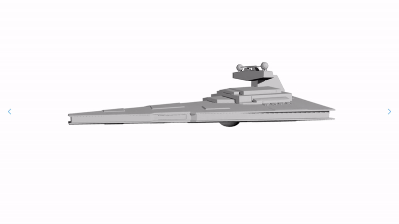
Table of contents
Installation
To install Caroumesh execute the following command in your React project:
npm install caroumeshYou can also download it from the Caroumesh npm website.
The package and all of its dependencies should be installed.
Getting started
Import the React components from the package.
import { Caroumesh, Model } from 'caroumesh';Add them to your render function inside your application.
<Caroumesh>
  <Model src="Star destroyer.gltf" />
</Caroumesh>
You can view a live example and a live demo to better understand how to use this package and what the end result is.
Components
Caroumesh
The Caroumesh component is the parent component that sets up the canvas on which to display the meshes.
<Caroumesh> ... </Caroumesh>It accepts the following props:
shadows?: boolean; // enable shadows
controls?: boolean; // orbit controls to zoom, rotate and pan around model
radius?: number; // radius of carousel (brings meshes closer / further together)
effects?: boolean; // enables SSAO and HueSaturation (negatively affects FPS)
stats?: boolean; // display FPS (useful for debugging)
animationTime?: number; // transition animation time in ms (1s = 1000ms)
theme?: string; // color theme of controls (left / right arrows)
width?: string; // width CSS property
height?: string; // height CSS property
backgroundColor?: string; // background color
border?: string; // border CSS property
borderRadius?: string; // border-radius CSS property
style?: React.CSSProperties; // any extra CSS properties
The component will take the entire space of the parent by default. Also while
developping your application, you can use the stats prop to evaluate
performance and see how adding models or lights may affect your FPS.
The Left Arrow and Right Arrow keybinds can be used to rotate to the
previous or next model inside the Caroumesh.
If you have set the controls prop, you can use the following keybinds on your
mouse and keyboard to control the scene:
| Keybind | Action |
|---|---|
| Mouse Left (Hold) | Rotate |
| Shift or Ctrl + Mouse Left (Hold) | Pan |
| Scroll wheel | Zoom |
| Space | Reset view |
Model
The Model component will load a mesh / model onto the Caroumesh component.
<Caroumesh>
  <Model> ... </Model>
</Caroumesh>
It accepts the following props:
src: string; // source gltf / glb file
shadows?: boolean; // enable shadows on model
offset?: Vector3; // offset model
scale?: number | Vector3; // scale model
rotation?: Vector3; // rotate model
You can add as many models as you like inside of a Caroumesh, just keep in mind that it does affect performance. It is also possible to display a single model, or none at all.
Important: The src prop string should be the relative path to the gltf or
glb file of your model. It is recommended you compress your models into glb
files with draco compression, to reduce load, with the following command:
npx gltf-pipeline -i model.gltf -o model.glb -dYou can use the offset, scale and rotation props in order to place your
model wherever you like.
Important: Use offset prop to offset model instead of position prop.
The latter is set by this package and setting it manually may lead to unwanted
results.
Lights
The Caroumesh component comes by default with a three point light setup, with casting shadows to illuminate your models. If you want to setup your own light setup you can use the Lights component.
<Caroumesh>
  <Lights> ... </Lights>
</Caroumesh>
Inside of this component you have to add react-three-fiber light components. These are all the possible light components you can use:
<spotLight />
<pointLight />
<rectAreaLight />
<hemisphereLight />
<directionalLight />
<ambientLight />
You can find the documentation of three.js, for more information about what props these components use.
You can add as many lights as you want, though, again, keep in mind more lights leads to heavier load, thus to worse performance.
CaroumeshContainer
The CaroumeshContainer component is useful for catching any errors that could occur when building your application. It is by no means necessary, but can come in handy during development. You can wrap your Caroumesh component with it.
<CaroumeshContainer>
  <Caroumesh> ... </Caroumesh>
</CaroumeshContainer>
It will display what the error that occurred where your Caroumesh should be located inside your app (not inside the console) and possibly the cause and potential fix for that error.
If you are using create-react-app, you don't have to use this component because an integrated error logger is already set up.
Upcoming releases
The next releases would present the following features:
- Allow importing JSX models
- Display textual information for each model (title and description)
Links
- Caroumesh npm website
- Caroumesh live example
- Caroumesh live demo
- three.js
- react-three-fiber
- create-react-app
Thank you for using Caroumesh !
// import { Caroumesh, Model } from './index';
// export default { // title: 'Test', // component: Caroumesh, // };
// const CaroumeshTemplate = (args) => { // return (
// ); // };
// export const DefaultCaroumesh = CaroumeshTemplate.bind({});
// export const StyledCaroumesh = CaroumeshTemplate.bind({}); // StyledCaroumesh.args = { // shadows: true, // controls: true, // stats: true, // theme: 'dodgerblue', // };