googlecreativelab / Creatability Components
Programming Languages
Projects that are alternatives of or similar to Creatability Components
Creatability Accessible Web Components
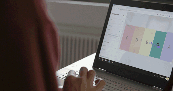
Creatability is a set of experiments made in collaboration with creators and allies in the accessibility community. They explore how creative tools – drawing, music, and more – can be made more accessible using web and AI technology. We hope they inspire others to make new projects, so we've started open-sourcing components here for anyone to use. Note this repo is under development. Contributions welcome!
Basics
Copy the packaged file in dist/acc-components.js into your html file and you will receive the following HTML elements:
-
<acc-button>- standard button -
<acc-content>- a container for main content. Easily pairs with inputs such as<acc-pose-input>and displays webcam for using body as cursor input. -
<acc-group>- a group of UI controls -
<acc-input-mode-select>- used to select the current input method (i.e. mouse/keyboard/touch or body pose). -
<acc-item>- data used to populate an<acc-select>dropdown or an<acc-radio-group>. -
<acc-mouse-input>- an input that combines mouse/keyboard/touch into one normalized input. -
<acc-optgroup>- similar to<optgroup>a method of nesting within an<acc-select> -
<acc-pose-input>- an element providing easy tracking of a selected body part to use as a cursor input. -
<acc-radio-group>- a group of radio buttons -
<acc-range>- a slider / range element -
<acc-select>- a select / dropdown element -
<acc-side-panel>- collapsable panel that you can place UI components in, also includes tabbable "skip to content" shortcut. -
<acc-slide>- data to use as a slide within<acc-slideshow> -
<acc-slideshow>- a slideshow with next/previous navigation -
<acc-snackbar>- a floating temporary UI notification system. Ideal for use with ARIA-LIVE. -
<acc-toggle>- similar to a checkbox
Usage
A simple example of including the library then supporting mouse/keyboard and body tracking inputs.
    <body>
        <!-- webcomponents-loader loads polyfills only for browsers not supporting Shadow DOM -->
        <script src="//cdnjs.cloudflare.com/ajax/libs/webcomponentsjs/2.0.2/webcomponents-loader.js"></script>
        <script src="dist/acc-components.min.js"></script>

        <acc-input-mode-select>
            <acc-mouse-input amplification="10"></acc-mouse-input>
            <acc-pose-input smoothing="0.5" selected></acc-pose-input>
        </acc-input-mode-select>

        <script>
            const inputSelector = document.querySelector('acc-input-mode-select');

            // all of the input's events bubble up to the selector
            inputSelector.addEventListener('input', function onInput(event){
                const input = event.target;
                // position mapped to the content's coordinate space
                // by default this is document.body, it can be set to any
                // element with inputSelector.contentElement = htmlElement;
                // or <acc-input-mode-select contentselector="#content">
                // exists on individual inputs as well
                const x = input.contentX;
                const y = input.contentY;
            }
        </script>
    </body>
In pure JavaScript these elements behave like normal HTMLElement's:
const input = document.createElement('acc-pose-input');
//or use document.querySelector('acc-pose-input')

input.addEventListener('input', (event)=>{
    console.log(event.target.position);
});

//this triggers the loading and initialization of any resources
input.initialize();
Input Event Cycle
All input types dispatch the following events:
-
'initializing'when the input begins to load and initialize any necessary resources. -
'ready'when the input has completed initializing and is now operating -
'input'dispatched every time the input has a new value -
'stop'dispatched if the input has stopped such as by switching inputs or callinginput.stop(). -
'change'dispatched when an attribute/property changes values
Side Panel and Content
Quickly scaffold an application with a collapsable sidebar and content area that resizes accordingly and can display webcam when in use.
<acc-side-panel label="My Application">
    <acc-group>
        <acc-input-mode-select contentselector="#main-content">
            <acc-mouse-input amplification="10" enablekeyboard></acc-mouse-input>
            <acc-pose-input amplification="3" multiplier="1.01" smoothing="0.75" part="nose"></acc-pose-input>
        </acc-input-mode-select>
    </acc-group>
</acc-side-panel>

<!-- mounted attribute tells the element to be fullscree minus side-panel width -->
<acc-content id="main-content" webcamopacity="0.25" grayscale mounted>
</acc-content>
Snackbar
Snackbar is meant to be a temporary notification UI. Snackbar is ideal for ARIA Live Regions. To use as a Live Region YOU must add the aria-live attribute to the element directly in the HTML. When its message changes (or show() is invoked) it will display for its set duration in seconds. Typically there is only one per application, the code below is for demonstration purposes.
<acc-snackbar id="snackbar-1" duration="5" aria-live="polite" dismissable>
    <strong>Example 1</strong> will show for 5 seconds every time this content changes or until "DISMISS" is clicked
</acc-snackbar>

<acc-snackbar duration="0" aria-live="assertive" dismissable error>
    <strong>Example 2</strong> will show up indefinitely until "DISMISS" is clicked and will be styled boldly as an error alert.
</acc-snackbar>

<acc-snackbar aria-live="polite">
    <strong>Example 3</strong> will show up for 4 seconds every time its content changes.
</acc-snackbar>


<script>

    setTimeout(function() {
        // changing a snackbar's content will trigger it to show up again
        // and with aria-live it will be read by screen readers when changed
        const snack1 = document.querySelectorAll('#snackbar-1');
        snack1.innerHTML = `
            <img alt="A heart icon" src="https://upload.wikimedia.org/wikipedia/commons/thumb/c/c8/Love_Heart_symbol.svg/1000px-Love_Heart_symbol.svg.png" width="32">
            <div style="display: inline-block; transform: translate(0, -50%); padding-left: 8px;">
                <strong>Example 1 updated</strong> this changed message will get read by screen readers.
            </div>`;
    }, 10000);

</script>
Tutorial
The tutorial element gives you a simple slide show. It extends AbstractModal so it can be added to the screen by adding an "open" attribute. Each of the <acc-slide> children will be rendered as a slide-show.
<acc-tutorial>
    <acc-slide
        video="assets/s1.mp4"
        alt="don't forget to add alt text for the video"
        caption="This experiment lets you combine speech and music in a fun way."></acc-slide>
    <acc-slide
        caption="Just type some words, then set them into your own melody."
        video="assets/s2.mp4"></acc-slide>
    <acc-slide
        caption="You can change the melody using your mouse or keyboard."
        video="assets/s3.mp4"></acc-slide>
    <acc-slide
        caption="Just play around – try different voices, scales, and more."
        video="assets/s4.mp4"></acc-slide>
</acc-tutorial>
Contributors
This is not an official Google product