CSS Element Queries

Element Queries is a polyfill adding support for element based media-queries to all new browsers (incl. IE7+). It allows not only to define media-queries based on window-size but also adds 'media-queries' functionality depending on element (any selector supported) size while not causing performance lags due to event based implementation.
It's a proof-of-concept event-based CSS element dimension query with valid CSS selector syntax.
Features:
- no performance issues since it listens only on size changes of elements that have element query rules defined through css. Other element query polifills only listen on
window.onresizewhich causes performance issues and allows only to detect changes via window.resize event and not inside layout changes like css3 animation, :hover, DOM changes etc. - no interval/timeout detection. Truly event-based through integrated ResizeSensor class.
- automatically discovers new DOM elements. No need to call javascript manually.
- no CSS modifications. Valid CSS Syntax
- all CSS selectors available. Uses regular attribute selector. No need to write rules in HTML/JS.
- supports and tested in webkit, gecko and IE(10+)
min-width,min-height,max-widthandmax-heightare supported so far- works with any layout modifications: HTML (innerHTML etc), inline styles, DOM mutation, CSS3 transitions, fluid layout changes (also percent changes), pseudo classes (:hover etc.), window resizes and more
- no Javascript-Framework dependency (works with jQuery, Mootools, etc.)
- Works beautiful for responsive images without FOUC
More demos and information: http://marcj.github.io/css-element-queries/
Examples
Element Query
.widget-name h2 {
    font-size: 12px;
}

.widget-name[min-width~="400px"] h2 {
    font-size: 18px;
}

.widget-name[min-width~="600px"] h2 {
    padding: 55px;
    text-align: center;
    font-size: 24px;
}

.widget-name[min-width~="700px"] h2 {
    font-size: 34px;
    color: red;
}
As you can see we use the ~= attribute selector.
Since this css-element-queries polyfill adds new element attributes on the DOM element
(<div class="widget-name" min-width="400px 700px"></div>) depending on your actual CSS and element's dimension,
you should always use this attribute selector (especially if you have several element query rules on the same element).
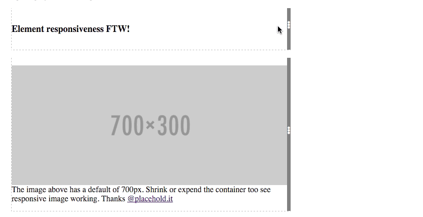
<div class="widget-name">
   <h2>Element responsiveness FTW!</h2>
</div>
Responsive image
    <div data-responsive-image>
        <img data-src="http://placehold.it/350x150"/>
        <img min-width="350" data-src="http://placehold.it/700x300"/>
        <img min-width="700" data-src="http://placehold.it/1400x600"/>
    </div>
Include the javascript files at the bottom and you're good to go. No custom javascript calls needed.
<script src="src/ResizeSensor.js"></script>
<script src="src/ElementQueries.js"></script>
See it in action:
Here live http://marcj.github.io/css-element-queries/.
Module Loader
If you're using a module loader you need to trigger the event listening or initialization yourself:
var ElementQueries = require('css-element-queries/src/ElementQueries');

 //attaches to DOMLoadContent
ElementQueries.listen();

//or if you want to trigger it yourself.
// Parse all available CSS and attach ResizeSensor to those elements which have rules attached
// (make sure this is called after 'load' event, because CSS files are not ready when domReady is fired.
ElementQueries.init();
Issues
- So far does not work on
imgand other elements that can't contain other elements. Wrapping with adivworks fine though (See demo). - Adds additional hidden elements into selected target element and forces target element to be relative or absolute.
- Local stylesheets do not work (using
file://protocol). - If you have rules on an element that has a css animation, also add
element-queries. E.g..widget-name { animation: 2sec my-animation, 1s element-queries;}. We use this to detect new added DOM elements automatically.
License
MIT license. Copyright Marc J. Schmidt.