dbilgili / Custom Reactjs Dropdown Components
Programming Languages
Projects that are alternatives of or similar to Custom Reactjs Dropdown Components
This package features two custom dropdown menu components for ReactJS.
WARNING: Breaking changes take effect from version 1.1.7. If you are using any of the earlier versions, refer to the previous README files.
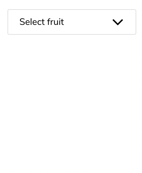
| Single-selection | Multi-selection |
|---|---|
 |
 |
| Single-selection searchable | Multi-selection searchable |
 |
 |
Installation
npm install --save reactjs-dropdown-component
Usage
Import the component you want to use;
import { DropdownMultiple, Dropdown } from 'reactjs-dropdown-component';
If you are using NextJS, import them dynamically instead;
import dynamic from 'next/dynamic';

const Dropdown = dynamic(
  async () => {
    const module = await import('reactjs-dropdown-component');
    const DD = module.Dropdown;

    return ({ forwardedRef, ...props }) => <DD ref={forwardedRef} {...props} />;
  },
  { ssr: false },
);

const DropdownMultiple = dynamic(
  async () => {
    const module = await import('reactjs-dropdown-component');
    const DDM = module.DropdownMultiple;

    return ({ forwardedRef, ...props }) => <DDM ref={forwardedRef} {...props} />;
  },
  { ssr: false },
);
The shape of the objects in the data array should be as follows:
const locations = [
  {
    label: 'New York',
    value: 'newYork',
  },
  {
    label: 'Oslo',
    value: 'oslo',
  },
  {
    label: 'Istanbul',
    value: 'istanbul',
  }
];
Use a function to pass to onChange prop.
For <Dropdown> component item is an object, whereas for <DropdownMultiple> it is an array of objects.
  onChange = (item, name) => {
    ...
  }
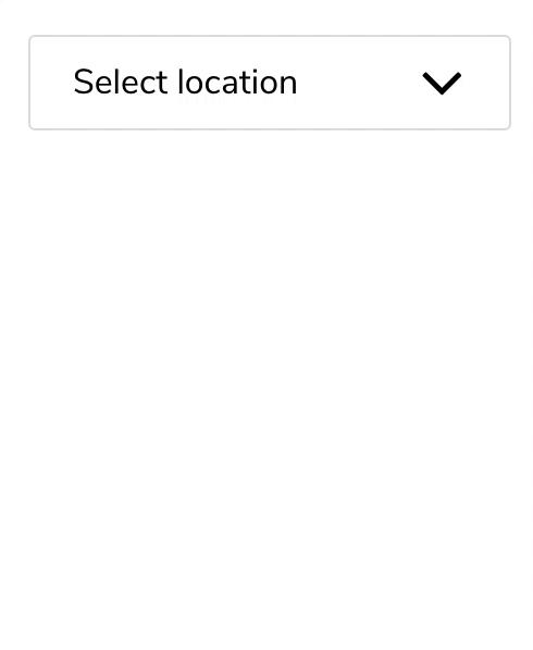
Finally use the components as follows:
<Dropdown
  name="location"
  title="Select location"
  list={locations}
  onChange={this.onChange}
/>

<DropdownMultiple
  name="location"
  title="Select location"
  titleSingular="location"
  list={locations}
  onChange={this.onChange}
/>
Note that when multiple options are selected in <DropdownMultiple>, titleSingular value automatically becomes the plural form of the noun. If you want to use a custom plural title, define titlePlural as well.
<DropdownMultiple
  name="location"
  title="Velg sted"
  titleSingular="Sted"
  titlePlural="Steder"
  list={locations}
  onChange={this.onChange}
/>
Search functionality
Using searchable prop enables the search bar.
Pass an array of strings corresponding to place holder and not found message respectively.
<Dropdown
  name="location"
  title="Select location"
  searchable={["Search for location", "No matching location"]}
  list={locations}
  onChange={this.onChange}
/>
Selecting item(s) by default
Use the select prop to define the initally selected item(s).
For <Dropdown>
select={{value: 'istanbul'}}
For <DropdownMultiple>
select={[{value: 'oslo'}, {value: 'istanbul'}]}
Calling internal functions
Pass a ref and use it to call the internal functions.
For <Dropdown>
<Dropdown
  ref={this.dropdownRef}
  ...
/>

this.dropdownRef.current.selectSingleItem({ value: 'oslo' });
this.dropdownRef.current.clearSelection();
For <DropdownMultiple>
<DropdownMultiple
  ref={this.dropdownRef}
  ...
/>

this.dropdownRef.current.selectMultipleItems([
  { value: 'istanbul' }
  { value: 'oslo' },
]);

this.dropdownRef.current.selectAll();
this.dropdownRef.current.deselectAll();
Custom styling
Use the following keys in an object passed to styles prop
wrapper
header
headerTitle
headerArrowUpIcon
headerArrowDownIcon
checkIcon
list
listSearchBar
scrollList
listItem
listItemNoResult
Example:
<Dropdown
  name="location"
  title="Select location"
  list={locations}
  onChange={this.onChange}
  styles={{
    headerTitle: { color: 'red' }
  }}
/>
Note that styles prop is meant for basic styling. Use stylesheet by targeting the specific class names for more complicated stylings.
Use id prop to set an additional class name to every element in the dropdown menu. That way you can style multiple dropdown menus with different stylings rules.
In order to define your own arrow and check icons, use arrowUpIcon, arrowDownIcon and checkIcon props. These props accept an element type.