ReinBentdal / Division
Programming Languages
Projects that are alternatives of or similar to Division
Division

Simple to use yet powerfull style widgets with syntax inspired by CSS.
Please check out styled_widget which is a replacement of Division!
The true power of this package is a combination of its features. Flutter widgets are designed to combine both the styling widgets and the structural widgets together when building apps. This package tries to decouple style from structure. This results in much more readable code. Another strong point of this package is the ease of animations.
⚠️ If you encounter an issue or have any feedback which you think could improve Division, please open an issue here
Built with Division
| App designer, Code | Code |
|---|---|
 |
 |
Getting Started
This is the two main widgets included in Division
Parent(
  child: Widget,
  style: ParentStyle,
  gesture: Gestures,
);
Txt(
  String,
  style: TxtStyle,
  gesture: Gestures,
);
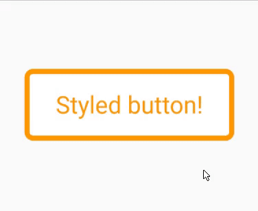
Basic example
Import
import 'package:division/division.dart';
Code
bool pressed = false;

final buttonStyle = (pressed) => TxtStyle()
  ..alignment.center()
  ..background.color(pressed ? Colors.orange : Colors.white)
  ..textColor(pressed ? Colors.white : Colors.orange)
  ..borderRadius(all: 5)
  ..border(all: 3, color: Colors.orange)
  ..padding(vertical: 10, horizontal: 15)
  ..ripple(true)
  ..animate(150, Curves.easeOut);

Gestures buttonGestures() =>
    Gestures()..isTap((isPressed) => setState(() => pressed = isPressed));

@override
Widget build(BuildContext context) {
  return Txt(
    'Styled button!',
    style: buttonStyle(pressed),
    gesture: buttonGestures(),
  );
}
Result
Documentation
All current and future Division widgets share a common style base.
Core style methods
Animate
..animate([int duration, Curve curve = Curves.linear])
A powerful style method. Whenever a style property changes, the widget will animate between the two states (given the style property is compatibel with animations).
duration in ms
Alignment
..alignment.[alignment] // alignment.topCenter()
The widget alignment
Content alignment
..alignmentContent.[alignment] // alignment.topCenter()
Alignment of the child.
Padding
..padding({double all,
      double horizontal,
      double vertical,
      double top,
      double bottom,
      double left,
      double right})
All properties work together. padding(all: 10, top: 30) is equivilent to padding(top: 30, bottom: 10, left: 10, right: 10)
Margin
..margin({double all,
      double horizontal,
      double vertical,
      double top,
      double bottom,
      double left,
      double right})
All properties work together. margin(all: 10, top: 30) is equivilent to margin(top: 30, bottom: 10, left: 10, right: 10)
Background color
..background.color(Color)
..background.hex(xxxxxx)
..background.rgba(int, int, int, [double])
color format options: hex('#xxxxxx'), rgba(int, int, int, double) or [Color].
Background image
..background.image(
      {String url,
      String path,
      ColorFilter colorFilter,
      ImageProvider<dynamic> imageProveder,
      BoxFit fit,
      AlignmentGeometry alignment = Alignment.center,
      ImageRepeat repeat = ImageRepeat.noRepeat})
Eighter the [url] or the [path] has to be specified. [url] is for network images and [path] is for local images.
Background blur
..background.blur(double blur)
Blurs the background. Can be used for example to achieve a "frosted glass" effect:
StyleClass()
  ..background.blur(10)
  ..background.rgba(255,255,255,0.15)
Does not work together with rotate().
Background blend mode
..background.blendMode(BlendMode blendMode)
Algorithms for blending background
Linear gradient
..linearGradient({AlignmentGeometry begin = Alignment.left,
      AlignmentGeometry end = Alignment.right,
      @required List<Color> colors,
      TileMode tileMode = TileMode.clamp,
      List<double> stops})
Radial gradient
..radialGradient(
    {AlignmentGeometry center = Alignment.center,
    @required double radius,
    @required List<Color> colors,
    TileMode tileMode = TileMode.clamp,
    List<double> stops})
Sweep gradient
..sweepGradient(
    {AlignmentGeometry center = Alignment.center,
    double startAngle = 0.0,
    @required double endAngle,
    @required List<Color> colors,
    TileMode tileMode = TileMode.clamp,
    List<double> stops})
In the style widget constructor, specify what angle calculation format you want to use.
Opacity
..opacity(double opacity)
Opacity applied on the whole widget.
Value must not be negative.
Border
..border(
      {double all,
      double left,
      double right,
      double top,
      double bottom,
      Color color = const Color(0xFF000000),
      BorderStyle style = BorderStyle.solid})
Choose between all, left, right, top and bottom. all works together with the other properties.
color format options: hex('#xxxxxx'), rgb(int, int, int), rgba(int, int, int, double) or [Color].
Border radius
..borderRadius(
      {double all,
      double topLeft,
      double topRight,
      double bottomLeft,
      double bottomRight})
It is valid to use all together with single sided properties. Single sided properties will trump over the all property.
See also [circle] for creating circular widgets.
Circle
..circle([bool enable = true])
Makes the widget circular
Box shadow
..boxShadow(
      {Color color = const Color(0x33000000),
      double blur = 0.0,
      Offset offset = Offset.zero,
      double spread = 0.0})
See [elevation] for a different way of defining a box shadow.
Elevation
..elevation(
      double elevation,
      {double angle = 0.0,
      Color color = const Color(0x33000000),
      double opacity = 1.0})
Elevates the widget with a boxShadow. [opacity] is a relative constant
Scale
..scale(double ratio)
Scale the widget
Offset
..offset([double dx, double dy])
Offsets the widget
Rotate
..rotate(double angle)
Rotates the widget.
By default one turn equals the value 1.0. To change to radians: StyleClass(useRadians: true).
Ripple
..ripple(bool enable, {dynamic splashColor, dynamic highlightColor})
Material ripple effect applied on tap.
Overflow
..overflow.visible({Axis direction = Axis.vertical})
..overflow.scrollable({Axis direction = Axis.vertical})
..overflow.hidden()
Change child overflow behaviour. Choose the overflow direction with the [direction] parameter.
Width, minWidth, maxWidth, Height, minHeight, maxHeight
..[type](double dimension)
Parent
Parent(
  style: ParentStyle,
  gesture: Gestures,
  child: Widget
)
As the name suggests this widget is a simple styled widget which takes a child.
ParentStyle
// format
ParentStyle()
  ..[style method]

// example
ParentStyle()
  ..width(100)
  ..padding(all: 10)
  ..elevation(5)
Add
..add(ParentStyle parentStyle, {bool override = false})
Combines style from two styled widgets.
Clone
..ParentStyle().clone()
This will clone the ParentStyle widget. This is usefull if you for example want to add more style to a widget without modifying the initial style.
Txt
Txt(
  String,
  style: TxtStyle,
  gesture: Gestures,
)
As the name suggests this widget is a simple styled widget which takes a String as its child.
This widget enables text styling with the TxtStyle widget. This also has the possibility to make the widget editable.
TxtStyle
// format
TxtStyle()
  ..[style method]

// example
TxtStyle()
  ..width(100)
  ..padding(all: 10)
  ..textColor(Colors.blue)
  ..bold()
Editable
..editable(bool enable,
      {TextInputType keyboardType,
      String placeholder,
      bool obscureText = false,
      int maxLines,
      void Function(String) onChange,
      void Function(bool focus) onFocusChange,
      void Function(TextSelection, SelectionChangedCause) onSelectionChanged,
      void Function() onEditingComplete,
      FocusNode focusNode})
This makes the widget editable, just like a TextField, its just much easier to style
Text align
..textAlign.center()
Font weight
..fontWeight(FontWeight fontWeight)
A shorthand to make the text bold:
..bold([bool enable])
Italic
..italic([bool enable])
Font family
..fontFamily(String font, {List<String> fontFamilyFallback})
Text color
..textColor(Color textColor)
Max lines
..maxLines(int maxLines)
Letter spacing
..letterSpacing(double space)
Word spacing
..wordSpacing(double space)
Text decoration
..textDecoration(TextDecoration decoration)
Text shadow
..textShadow({Color color = const Color(0x33000000),
    double blur = 0.0,
    Offset offset = Offset.zero})
Text elevation
..textElevation(double elevation,
    {double angle = 0.0,
    Color color = const Color(0x33000000),
    double opacity = 1.0})
Add
..add(TxtStyle txtStyle, {bool override = false})
This adds together two TxtStyles. The override property specifies if already defined properties should be overrided.
Clone
..TxtStyle().clone()
This will clone the TxtStyle widget. This is usefull if you for example want to add more style to a widget without modifying the initial style.
Gestures
isTap
..isTap((isTapped) => setState(() => pressed = isTapped))
Called whenever the tap state on the widget changes.
This replaces the use of onTapDown, onTapUp and onTapCancel together.
Other
..onTap()
..onTapUp()
..onTapCancel()
..onDoubleTap()
..onTapDown()
..onLongPress()
..onLongPressStart()
..onLongPressEnd()
..onLongPressMoveUpdate()
..onLongPressUp()
..onVerticalDragStart()
..onVerticalDragEnd()
..onVerticalDragDown()
..onVerticalDragCancel()
..onVerticalDragUpdate()
..onHorizontalDragStart()
..onHorizontalDragEnd()
..onHorizontalDragCancel()
..onHorizontalDragUpdate()
..onHorizontalDragDown()
..onForcePressStart()
..onForcePressEnd()
..onForcePressPeak()
..onForcePressUpdate()
..onPanStart()
..onPanEnd()
..onPanCancel()
..onPanDown()
..onPanUpdate()
..onScaleStart()
..onScaleEnd()
..onScaleUpdate()
Examples and best practices
Decoupling style from structure
final ParentStyle cardStyle = ParentStyle()
  ..height(175)
  ..padding(horizontal: 20.0, vertical: 10)
  ..alignment.center()
  ..background.hex('#3977FF')
  ..borderRadius(all: 20.0)
  ..elevation(10, color: hex('#3977FF'));

Widget build(BuildContext context) {
  return Parent(
    style: cardStyle,
    child: Widget,
  );
}
Variable dependent style
final Color color = Colors.blue;

final cardStyle = (color) => ParentStyle()
  ..height(175)
  ..padding(horizontal: 20.0, vertical: 10)
  ..alignment.center()
  ..background.color(color)
  ..borderRadius(all: 20.0)
  ..elevation(10, color: color);

Widget build(BuildContext context) {
  return Parent(
    style: cardStyle(color),
    child: Widget,
  );
}
Animated widgets
bool pressed = false;

final cardStyle = (pressed) => ParentStyle()
  ..height(175)
  ..padding(horizontal: 20.0, vertical: 10)
  ..alignment.center()
  ..borderRadius(all: 20.0)
  ..animate(200, Curves.easeOut)
  ..background.color(pressed ? Colors.white : Colors.black)
  ..elevation(pressed ? 10 : 20);

Widget build(BuildContext context) {
  return Parent(
    style: cardStyle(pressed),
    gesture: Gestures()
      ..isTap((isPressed) => setState(() => pressed = isPressed)),
    child: Widget,
  );
}
or
bool pressed = false;

final cardStyle = (pressed) => ParentStyle()
  ..height(175)
  ..padding(horizontal: 20.0, vertical: 10)
  ..alignment.center()
  ..borderRadius(all: 20.0)
  ..animate(200, Curves.easeOut)
  ..background.color(pressed ? Colors.white : Colors.black)
  ..elevation(pressed ? 10 : 20);

Gestures cardGesture() => Gestures()
  ..isTap((isPressed) => setState(() => pressed = isPressed));

Widget build(BuildContext context) {
  return Parent(
    style: cardStyle(pressed),
    gesture: cardGesture(),
    child: Widget,
  );
}