-
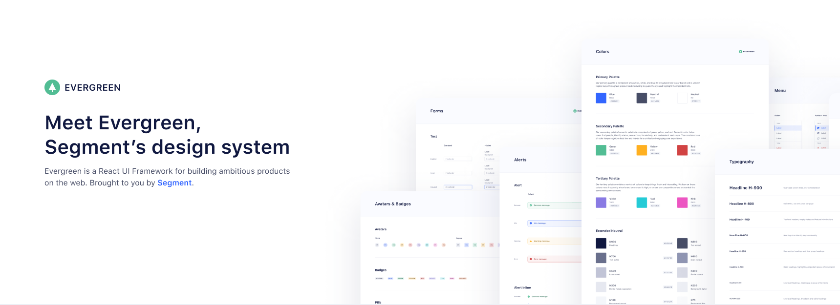
Works out of the box. Evergreen contains a set of polished React components that work out of the box.
-
Flexible & composable. Evergreen components are built on top of a React UI Primitive for endless composability.
-
Enterprise-grade. Evergreen features a UI design language for enterprise-grade web applications.
Documentation & Community
Evergreen v5 to v6 Migration guide
Evergreen v5 to v6 migration guide
Install and use components
evergreen-ui package:
$ yarn add evergreen-ui
# or
$ npm install --save evergreen-ui
A working version, assuming you are using something like Create React App, might look like this:
import React from 'react'
import ReactDOM from 'react-dom'
import { Button } from 'evergreen-ui'

ReactDOM.render(<Button>I am using 🌲 Evergreen!</Button>, document.getElementById('root'))
Core values of 🌲 Evergreen
-
Evergreen is built on the belief that you can never predict all future requirements, only prepare for it. Instead of creating fixed configurations that work today, Evergreen promotes building systems that anticipate new and changing design requirements.
-
Evergreen is built on the belief that things should work out of the box with smart defaults, but also offer full control when needed. For example, Evergreen uses CSS-in-JS and builds on top of the Box component in ui-box.
-
Evergreen is built on the belief that using Evergreen and contributing to Evergreen should be a pleasant experience. We prioritize documentation and all the tools for a solid developer experience. We advocate respect and inclusivity in our writings and interactions.
FAQ
Theming support?
Evergreen supports a robust theming layer out of the box. You can check out these docs for more information regarding theming in Evergreen.
How does Server Side Rendering (SSR) work?
Evergreen offers easy Server Side Rendering (SSR) and automatic hydration.
Evergreen bundles 2 CSS-in-JS solutions, from glamor and ui-box. To make it super easy to do server side rendering and hydration, Evergreen exposes a extractStyles() function that will do SSR for both at once.
- How to use it with Next.js in the ssr-next example app.
- How to use it with GatsbyJS
Contributing to Evergreen
🍴 Step 1. Fork this repository
In order to contribute to Evergreen, you need to fork this repo, and develop on your own local clone.
If you don't know how to do so, follow this guide!
📖 Step 2. Get storybook up and running
First, move into your local cloned repository with the help of cd, after that install your node_modules with:
$ yarn
To actually start seeing the components you have to run React Storybook with the command:
$ yarn dev
Now go to http://localhost:6006 in your browser.
🛠 Step 3. Make your change
Now you can start developing! All of the components are under the src directory and associated code changes will automatically be reflected in StoryBook.
If necessary, we encourage you to update the documentation so Evergreen users will be aware of your new features/changes.
In order to run the documentation page locally, run these commands in your terminal:
$ yarn build
$ cd docs
$ yarn install
$ yarn dev
Now you can visit http://localhost:3000/ in your browser.
Documentation code is under the docs directory. A big portion of these docs are written in MDX, if you've never used MDX before, check out these docs.
🏆 Step 4. Making your pull request
Once you're done with making your changes, push everything to your local repository's branch.
From here, you can open up a pull request from your forked repository's branch into segmentio/evergreen's master branch.
In your PR description, explain the changes you made, why you made them, how to test them, and anything that might be a point of interest.
Once you create your PR, it will be reviewed and hopefully merged quickly!
🥂 Step 5. Pat yourself on the back
Congrats, you're officially an Evergreen contributor!
🤓 Scripts explained
Inside the package.json there are a bunch of scripts that this repo uses
to run the project in development and to build the project.
Below you can read a description of each script.
-
yarn dev: Starts the development React Storybook. -
yarn test: Lints the JavaScript files using XO and then runs the unit tests using AVA. -
yarn build: Builds all of the JavaScript files using Babel. -
yarn clean: removes all untracked files (git clean -Xdf). -
yarn release: Releases new version of Evergreen (requires MFA via npm as a collaborator) -
yarn create-package: This command scaffolds a package with no specific boilerplate. It's useful for creating utilities.
For the following command:
yarn create-package utils
The following file tree will be generated:
/src/utils
├── /src/
└── index.js
yarn create-package:components: This command scaffolds a package with React component(s) boilerplate.
You can pass one or more components to this command.
For the following command:
yarn create-package:components typography Text Heading
The following file tree will be generated:
/src/typography
├── /src/
|   │── Text.js
|   └── Heading.js
├── /stories/
│   └── index.stories.js
└── index.js
🎉 Contributors
We will add you to the list if you make any meaningful contribution!
- Jeroen Ransijn
- Roland Warmerdam
- Ben McMahon
- Matt Shwery
- Colin Lohner
- Allen Kleiner
- Chris Chuck
- ... many other on the Segment team and open-source contributors
This project is maintained by Segment
Please take a look at the contributing guide to better understand what to work on.
👏 Respect earns Respect
Please respect our Code of Conduct, in short:
- Using welcoming and inclusive language
- Being respectful of differing viewpoints and experiences
- Gracefully accepting constructive criticism
- Focusing on what is best for the community
- Showing empathy towards other community members
License
Evergreen is released under the MIT license. The BlueprintJS icons are licensed under a custom Apache 2.0 license.
Copyright © 2021 Segment.io, Inc.

