All Projects → mikaelvesavuori → Figmagic Example

mikaelvesavuori / Figmagic Example

Using Figmagic (simplifying design token generation and asset extraction) with Webpack 5, React 16, Styled Components.

Programming Languages

typescript
32286 projects

Projects that are alternatives of or similar to Figmagic Example

Pup
The Ultimate Boilerplate for Products.
Stars: ✭ 563 (+1421.62%)
Mutual labels:  example, boilerplate, styled-components
Styled React Boilerplate
Minimal & Modern boilerplate for building apps with React & styled-components
Stars: ✭ 198 (+435.14%)
Mutual labels:  webpack4, boilerplate, styled-components
Razzle Material Ui Styled Example
Razzle Material-UI example with Styled Components using Express with compression
Stars: ✭ 117 (+216.22%)
Mutual labels:  example, boilerplate, styled-components
Webpack Boilerplate
A minimal webpack 5 boilerplate with only Babel, SASS and lodash (optional) on board
Stars: ✭ 404 (+991.89%)
Mutual labels:  webpack4, boilerplate
React Redux Boilerplate
Awesome React Redux Workflow Boilerplate with Webpack 4
Stars: ✭ 307 (+729.73%)
Mutual labels:  webpack4, boilerplate
Figmagic
Generate design tokens, export graphics, and extract design token-driven React components from your Figma documents.
Stars: ✭ 320 (+764.86%)
Mutual labels:  tokens, ux
React Firebase Starter
Boilerplate (seed) project for creating web apps with React.js, GraphQL.js and Relay
Stars: ✭ 4,366 (+11700%)
Mutual labels:  boilerplate, styled-components
Design System Utils
👩‍🎨 Access your design tokens with ease
Stars: ✭ 465 (+1156.76%)
Mutual labels:  tokens, styled-components
React Redux Saga Boilerplate
Starter kit with react-router, react-helmet, redux, redux-saga and styled-components
Stars: ✭ 535 (+1345.95%)
Mutual labels:  boilerplate, styled-components
Minimal React Webpack Babel Setup
The minimal React, Webpack, Babel Setup. You want to get beyond create-react-app?
Stars: ✭ 777 (+2000%)
Mutual labels:  webpack4, boilerplate
React Boilerplate
🔥 A highly scalable, offline-first foundation with the best developer experience and a focus on performance and best practices.
Stars: ✭ 28,151 (+75983.78%)
Mutual labels:  webpack4, styled-components
Styled System
⬢ Style props for rapid UI development
Stars: ✭ 7,126 (+19159.46%)
Mutual labels:  tokens, styled-components
React Bolt
⚡ The most simple & robust boilerplate for your React projects.
Stars: ✭ 298 (+705.41%)
Mutual labels:  boilerplate, styled-components
Vue Electron Template
An Electron & Vue.js template with Hot-reloading enabled and common Vue plugins, dev, debug and build scripts configured.
Stars: ✭ 260 (+602.7%)
Mutual labels:  webpack4, boilerplate
Js Library Boilerplate Basic
Javascript Minimal Starter Boilerplate - Webpack 5 🚀, Babel 7, UMD, Unit Testing
Stars: ✭ 354 (+856.76%)
Mutual labels:  webpack4, boilerplate
Welcome Ui
Customizable design system of @wttj with react • styled-components • styled-system • reakit
Stars: ✭ 256 (+591.89%)
Mutual labels:  ux, styled-components
Madara
✍️ A way for people to manage their tasks.
Stars: ✭ 17 (-54.05%)
Mutual labels:  styled-components, ux
Html Sass Babel Webpack Boilerplate
Webpack 4 + Babel + ES6 + SASS + HTML Modules + Livereload
Stars: ✭ 35 (-5.41%)
Mutual labels:  webpack4, boilerplate
React Starter Kit
React, Redux, Webpack, Material UI, Boostrap 4, Code Splitting, HMR
Stars: ✭ 229 (+518.92%)
Mutual labels:  webpack4, boilerplate
design-system
Nulogy Design System
Stars: ✭ 61 (+64.86%)
Mutual labels:  styled-components, tokens

Figmagic Example

This repository is a demo of Figmagic. In this project you're going to see how a project running Webpack, React and Styled Components might use tokens. There are pre-compiled tokens available under /tokens.

Figmagic Example Demo

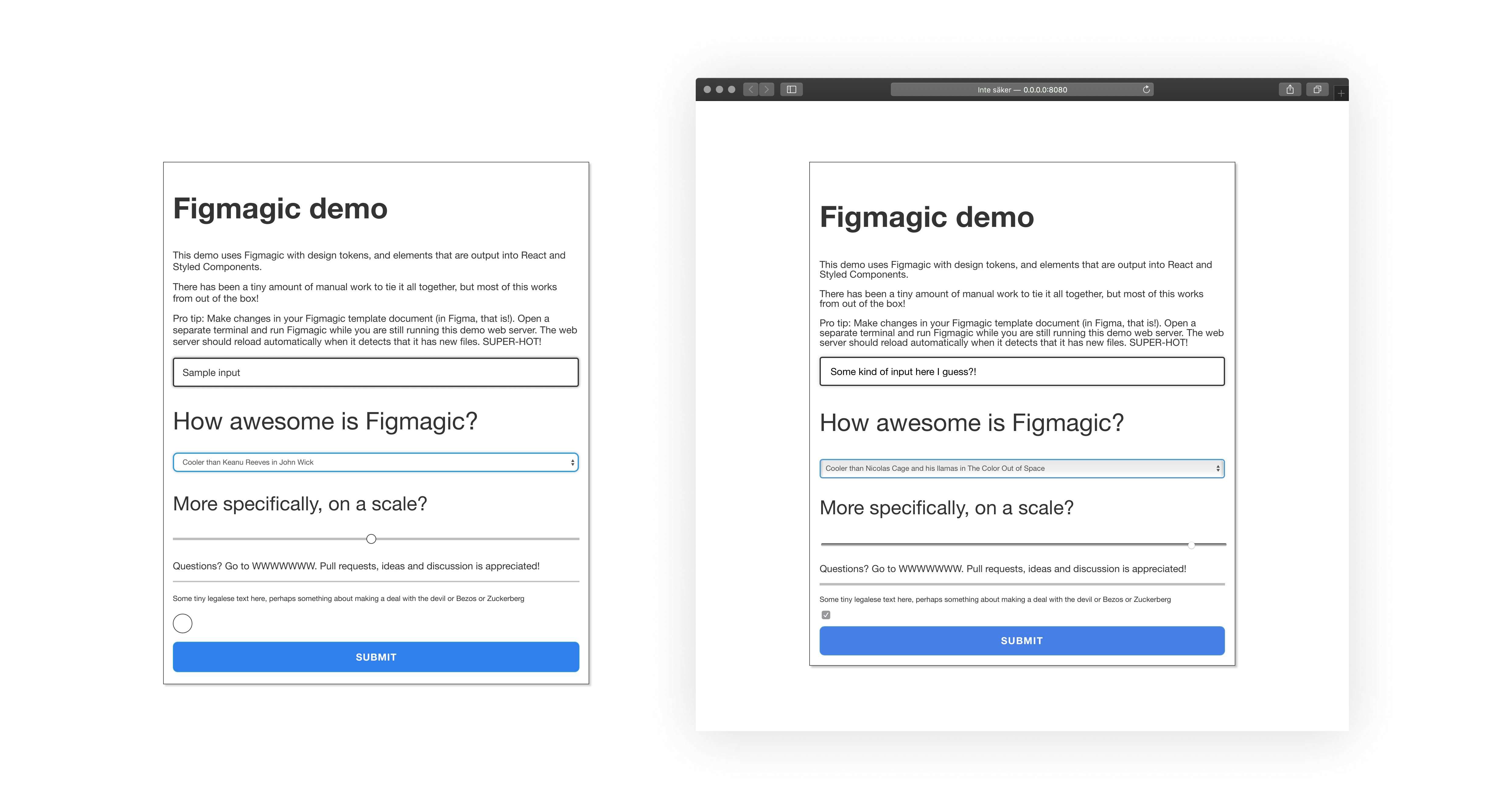
Figmagic Example Demo: On the left is a big Figma component assembled of a number of "Elements", Figmagic-compliant components that can be output into code. On the right is the React-composed version of those after just a few minutes of coding and closing elements correctly.

Note that this demo is not meant to fully style and do all of the things in the Figma document. I wanted to straddle a middle-of-the-road solution where I did the least work possible to get it working with React and style only a few of the most obvious and helpful elements, like setting disabled state on the button and checkbox.

Freshly pulled assets are under elements, tokens and graphics. The modified elements are contained under src/elements.

The Figmagic template design system is available at https://www.figma.com/community/file/821094451476848226. That's the file providing the tokens seen here.

Installation

  • Run yarn or npm install inside of the repository to install all dependencies
  • Start the project by running yarn start or npm start
  • To sync graphics, run yarn figmagic:graphics or npm run figmagic:graphics
  • To sync elements, run yarn figmagic:elements or npm run figmagic:elements
  • To sync all of it, run yarn figmagic:sync or npm run figmagic:sync
  • Start Storybook with yarn storybook or npm run storybook

Using Figmagic for your own files

  • You will need to have a Figma file set up correctly (see above demo file)
  • You will also need to have a Figma API key
  • Set your URL and token in a file called .env in the root of your project (such as in this one, if you want to get started right away)
  • Clone Figmagic, install it with yarn setup or npm setup
  • Run the command figmagic in your project directory
  • To run local Figmagic with arguments, it could be done like npm run figmagic -- --debug -f em to set debug mode and grabbing fonts in em units

Read more on the Figma developer site if you need any further information.

How much work was added after doing a clean pull from the Figmagic demo template?

These changes should outline all of the (mostly minor) amendments done to a set of freshly-pulled elements:

  • Remove texts from H1-H6 + Paragraph + Microcopy + Select
  • Close input elements (Slider, Input, Checkbox)
  • Add className=”Normal” to Button so it picks the Normal style
  • Add props and event handling for demo form functionality
  • Add disabled styling to Checkbox and Button
  • Write a component (DemoForm) that composes the individual elements as per the component in the template
  • Minor changes due to the nature of Typescript.
Note that the project description data, including the texts, logos, images, and/or trademarks, for each open source project belongs to its rightful owner. If you wish to add or remove any projects, please contact us at [email protected].