darioielardi / Flutter_speed_dial
Programming Languages
Projects that are alternatives of or similar to Flutter speed dial
Flutter Speed Dial - REBOOT
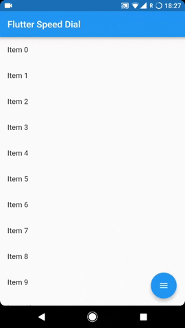
Flutter package to render a Material Design Speed Dial.
Usage
See Example Code or Example Usage for more info.
The SpeedDial widget is built to be placed in the Scaffold.floatingActionButton argument, replacing the FloatingActionButton widget.
It's not possible to set its position with the Scaffold.floatingActionButtonLocation argument, but it's possible to set right/bottom margin with the marginEnd and marginBottom arguments (default to 16) to place the button anywhere in the screen.
Using the Scaffold.bottomNavigationBar the floating button will be always placed above the bar, so the BottomAppBar.hasNotch should be always false.
Nullsafety is availabile from version 3.0.5 ( It is also backward compatible, meaning you can use it with not null safe code too )
Labels
SpeedDial and its child all have label. SpeedDial takes any Widget as label. It also have activeLabel property by which you can specify the label which is shown when SpeedDial is open. It also comes with its labelTransitionBuilder which defaults to fade transition.
Also Every child button have label property which accepts String which can be styled by using labelStyle.
If the label parameter is not provided the label will be not rendered.
Animated Icon
The main floating action button child can set with the icon parameter, you can animate that icon by setting activeIcon paramater, It have four relatable paramters:
-
icon&activeIcontakes anIconDatawidget -
iconThemetakes its theme which includes color and size
however if you want to use an Animated icon by specifying AnimatedIconData then you can use AnimatedIcon, it has two specific parameters:
-
animatedIcontakes anAnimatedIconDatawidget -
animatedIconThemetakes its theme
The package will handle the animation by itself.
Hide on Scroll
Another possibility is to make the button hide on scroll with a curve animation, with a visible parameter to set dynamically based on the scroll direction. See the example project for more info.
Close on WillPop
Although it doesn't magically closes when you press back button, but requires a easier setup to enable this functionality, here are the steps that you need to do to enable that:
- Add a value Notifier inside your widgets build context where your speedDial is placed like below.
ValueNotifier<bool> isDialOpen = ValueNotifier(false);
- Then you need to add a property to your speedDial known as openCloseManually like below.
openCloseDial: isDialOpen,
- Add a will Pop in your body or anywhere where you want and then simply add the following line in its onWillPop element.
WillPopScope(
  onWillPop: () async {
    if (isDialOpen.value) {
      isDialOpen.value = false;
      return false;
    }
    ...other checks here
  }
  child: ...your child goes here
)
Example Usage
Widget build(BuildContext context) {
  return Scaffold(
    floatingActionButton: SpeedDial(
      /// both default to 16
      marginEnd: 18,
      marginBottom: 20,
      // animatedIcon: AnimatedIcons.menu_close,
      // animatedIconTheme: IconThemeData(size: 22.0),
      /// This is ignored if animatedIcon is non null
      icon: Icons.add,
      activeIcon: Icons.remove,
      // iconTheme: IconThemeData(color: Colors.grey[50], size: 30),
      /// The label of the main button.
      // label: Text("Open Speed Dial"),
      /// The active label of the main button, Defaults to label if not specified.
      // activeLabel: Text("Close Speed Dial"),
      /// Transition Builder between label and activeLabel, defaults to FadeTransition.
      // labelTransitionBuilder: (widget, animation) => ScaleTransition(scale: animation,child: widget),
      /// The below button size defaults to 56 itself, its the FAB size + It also affects relative padding and other elements
      buttonSize: 56.0,
      visible: true,
      /// If true user is forced to close dial manually
      /// by tapping main button and overlay is not rendered.
      closeManually: false,
      /// If true overlay will render no matter what.
      renderOverlay: false,
      curve: Curves.bounceIn,
      overlayColor: Colors.black,
      overlayOpacity: 0.5,
      onOpen: () => print('OPENING DIAL'),
      onClose: () => print('DIAL CLOSED'),
      tooltip: 'Speed Dial',
      heroTag: 'speed-dial-hero-tag',
      backgroundColor: Colors.white,
      foregroundColor: Colors.black,
      elevation: 8.0,
      shape: CircleBorder(),
      // orientation: SpeedDialOrientation.Up,
      // childMarginBottom: 2,
      // childMarginTop: 2,
      children: [
        SpeedDialChild(
          child: Icon(Icons.accessibility),
          backgroundColor: Colors.red,
          label: 'First',
          labelStyle: TextStyle(fontSize: 18.0),
          onTap: () => print('FIRST CHILD'),
          onLongPress: () => print('FIRST CHILD LONG PRESS'),
        ),
        SpeedDialChild(
          child: Icon(Icons.brush),
          backgroundColor: Colors.blue,
          label: 'Second',
          labelStyle: TextStyle(fontSize: 18.0),
          onTap: () => print('SECOND CHILD'),
          onLongPress: () => print('SECOND CHILD LONG PRESS'),
        ),
        SpeedDialChild(
          child: Icon(Icons.keyboard_voice),
          backgroundColor: Colors.green,
          label: 'Third',
          labelStyle: TextStyle(fontSize: 18.0),
          onTap: () => print('THIRD CHILD'),
          onLongPress: () => print('THIRD CHILD LONG PRESS'),
        ),
      ],
    ),
  );
}
Issues & Feedback
Please file an issue to send feedback or report a bug,
If you want to ask a question or suggest an idea then you can open an discussion.
Thank you!
Contributing
Every pull request is welcome.