Pyozer / Introduction_screen
Programming Languages
Projects that are alternatives of or similar to Introduction screen
IntroductionScreen 
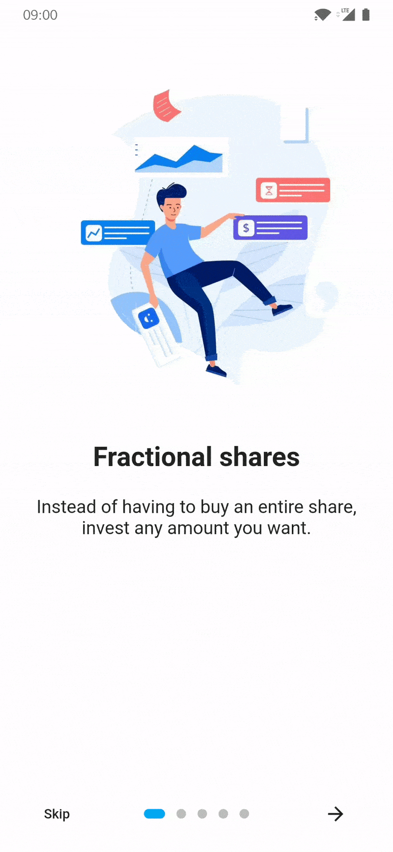
Introduction screen allow you to have a screen at launcher for example, where you can explain your app. This Widget is customizable (more in the future) with a great design.
Introduction_screen use another package, dots_indicator, that I also created.
Installation
You just need to add introduction_screen as a dependency in your pubspec.yaml file.
dependencies:
  introduction_screen: ^2.0.0
Example
In these example, listPagesViewModel is the list of pages. A page is base on PageViewModel. See example of a PageViewModel below.
PageViewModel
Simple page
This example only define title, body and an image (you can define any widget)
PageViewModel(
  title: "Title of first page",
  body: "Here you can write the description of the page, to explain someting...",
  image: Center(
    child: Image.network("https://domaine.com/image.png", height: 175.0),
  ),
)
Page with custom colors
This example show you how to define the color of the page
PageViewModel(
  title: "Title of first page",
  body: "Here you can write the description of the page, to explain someting...",
  image: Center(child: Image.asset("res/images/logo.png", height: 175.0)),
  decoration: const PageDecoration(
    pageColor: Colors.blue,
  ),
)
Page with custom text style
This example show you how to define another TextStyle for the title and the body
PageViewModel(
  title: "Title of first page",
  body: "Here you can write the description of the page, to explain someting...",
  image: const Center(child: Icon(Icons.android)),
  decoration: const PageDecoration(
    titleTextStyle: TextStyle(color: Colors.orange),
    bodyTextStyle: TextStyle(fontWeight: FontWeight.w700, fontSize: 20.0),
  ),
)
Page with a footer, like a button
This example show you how to define a page with a footer, like a Button
PageViewModel(
  title: "Title of first page",
  body: "Here you can write the description of the page, to explain someting...",
  image: const Center(child: Icon(Icons.android)),
  footer: RaisedButton(
    onPressed: () {
      // On button presed
    },
    child: const Text("Let's Go !"),
  ),
);
Page with widget body
This example show you how to define a page with a body as Widget and not a simple String
You can to the same this for title, with titleWidget parameter.
PageViewModel(
  title: "Title of first page",
  bodyWidget: Row(
    mainAxisAlignment: MainAxisAlignment.center,
    children: const [
      Text("Click on "),
      Icon(Icons.edit),
      Text(" to edit a post"),
    ],
  ),
  image: const Center(child: Icon(Icons.android)),
);
IntroductionScreen
Note :
If you not provide next parameter, the Next button will be not displayed.
If you want to display a skip button, you must add skip parameter and showSkipButton: true.
The done parameter is required.
Simple intro screen
Simple intro screen
IntroductionScreen(
  pages: listPagesViewModel,
  done: const Text("Done", style: TextStyle(fontWeight: FontWeight.w600)),
  onDone: () {
    // When done button is press
  },
); //Material App
Intro screen with skip button
IntroductionScreen(
  pages: listPagesViewModel,
  onDone: () {
    // When done button is press
  },
  showSkipButton: true,
  skip: const Text("Skip"),
  done: const Text("Done", style: TextStyle(fontWeight: FontWeight.w600)),
);
Intro screen with custom button text and dots indicators
IntroductionScreen(
  pages: listPagesViewModel,
  onDone: () {
    // When done button is press
  },
  onSkip: () {
    // You can also override onSkip callback
  },
  showSkipButton: true,
  skip: const Icon(Icons.skip_next),
  next: const Icon(Icons.next),
  done: const Text("Done", style: TextStyle(fontWeight: FontWeight.w600)),
  dotsDecorator: DotsDecorator(
    size: const Size.square(10.0),
    activeSize: const Size(20.0, 10.0),
    activeColor: theme.accentColor,
    color: Colors.black26,
    spacing: const EdgeInsets.symmetric(horizontal: 3.0),
    activeShape: RoundedRectangleBorder(
      borderRadius: BorderRadius.circular(25.0)
    )
  ),
);
Intro screen with custom button colors
When one of the colors such as skipColor is defined, color will be ignored.
IntroductionScreen(
  pages: listPagesViewModel,
  done: const Text("Done", style: TextStyle(fontWeight: FontWeight.w600)),
  color: Colors.orange,
  skipColor: Colors.red,
  doneColor: Colors.green,
  nextColor: Colors.blue,
  onDone: () {
    // When done button is press
  },
);
Others parameters
There is other possibles parameters that you can add :
- Freeze the scroll, by adding
freeze: trueparameter. - Hide dots indicators, by adding
isProgress: falseparameter. - Duration of scrolling animation, by adding
animationDuration: 400parameter. - Global background color, by adding
globalBackgroundColor: Colors.blueparameter. - Initial page, by adding
initialPage: 1parameter. - Hide next button, by adding
showNextButton: falseparameter. - Skip button flex, by adding
skipFlex: 1parameter. (Set 0 to disable Expanded behaviour) - Dots indicator flex, by adding
dotsFlex: 1parameter. (Set 0 to disable Expanded behaviour) - Next/Done button flex, by adding
nextFlex: 1parameter. (Set 0 to disable Expanded behaviour) - Animation type between pages, by adding
curveparameter.