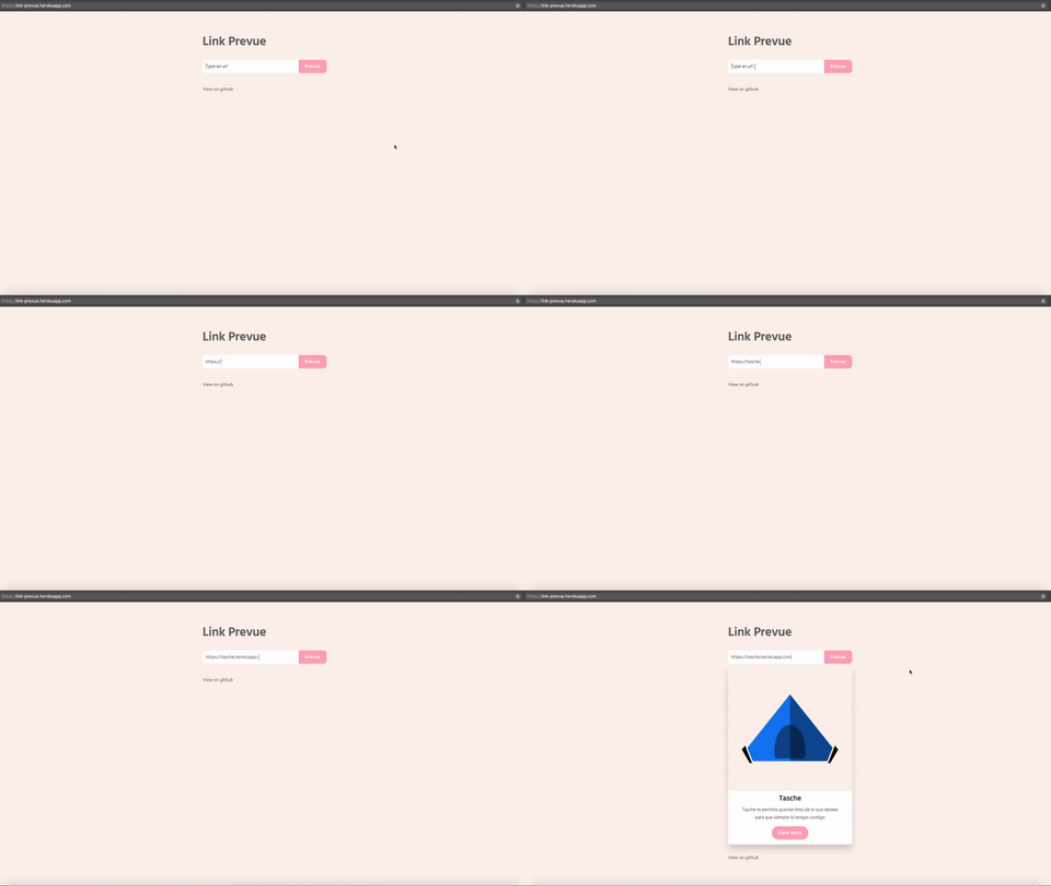
nivaldomartinez / Link Prevue
Licence: mit
Vue component for generate a link preview
Stars: ✭ 186
Projects that are alternatives of or similar to Link Prevue
Gatsby Source Prismic Graphql
Gatsby source plugin for Prismic GraphQL
Stars: ✭ 144 (-22.58%)
Mutual labels: preview
Link Preview Generator
Get preview data (a title, description, image, domain name) from a url. Library uses puppeteer headless browser to scrape the web site.
Stars: ✭ 98 (-47.31%)
Mutual labels: preview
Preview Email
Automatically opens your browser to preview Node.js email messages sent with Nodemailer. Made for Lad!
Stars: ✭ 112 (-39.78%)
Mutual labels: preview
Plantuml Previewer.vim
Vim / Neovim plugin for preview PlantUML
Stars: ✭ 119 (-36.02%)
Mutual labels: preview
Swiftlinkpreview
It makes a preview from an URL, grabbing all the information such as title, relevant texts and images.
Stars: ✭ 1,216 (+553.76%)
Mutual labels: preview
Gatsby Source Sanity
Gatsby source plugin for building websites using Sanity.io as a backend.
Stars: ✭ 160 (-13.98%)
Mutual labels: preview
Atom Asciidoc Preview
⚛ AsciiDoc preview for the Atom editor.
Stars: ✭ 136 (-26.88%)
Mutual labels: preview
Albumcamerarecorder
一个高效的多媒体支持操作库,可多方面的简单配置操作相册、拍照、录制、录音等功能。也支持配套使用的展示图片、视频、音频的九宫格功能。 (An efficient multimedia support operation library, can be a variety of simple configuration operation album, photo, recording, recording and other functions.Also support supporting the use of the display of pictures, video, audio of the nine grid function.)
Stars: ✭ 106 (-43.01%)
Mutual labels: preview
Vue Live
A component to demo components, inspired by react-live
Stars: ✭ 123 (-33.87%)
Mutual labels: preview
Kodeweave
HTML/CSS/JS and Markdown Playground For Web Designers and Developers
Stars: ✭ 87 (-53.23%)
Mutual labels: preview
Preview In Browser
A Sketch plugin to properly view your design in browser
Stars: ✭ 153 (-17.74%)
Mutual labels: preview
Abmediaview
Media view which subclasses UIImageView, and can display & load images, videos, GIFs, and audio and from the web, and has functionality to minimize from fullscreen, as well as show GIF previews for videos.
Stars: ✭ 79 (-57.53%)
Mutual labels: preview
Markdown Preview.nvim
markdown preview plugin for (neo)vim
Stars: ✭ 2,858 (+1436.56%)
Mutual labels: preview
Hellocamera2
Android 自定义相机: 可定制的 UI, 压缩到指定分辨率级别, 裁剪指定区域, 大图预览. (Android custom camera: Customizable UI, compress to specific resolution level, clip specific area programmatically, picture preview, usage of Camera / Camera2 API.)
Stars: ✭ 134 (-27.96%)
Mutual labels: preview
link-prevue
A flexible component for generating a link preview
Intallation
npm install link-prevue
Basic usage
Javascript
import LinkPrevue from 'link-prevue'

new Vue({
  el: '#app',
  components: {
    LinkPrevue
  }
})
HTML
<div id="app">
  <link-prevue url="https://vuejs.org/"></link-prevue>
</div>
👍
Custom card
To use a custom card, set your own html code between the aperture tag and the close tag of component. Using the scoped slot.
<div id="app">
  <link-prevue url="https://vuejs.org/">
    <template slot-scope="props">
      <div class="card" style="width: 20rem;">
        <img class="card-img-top" :src="props.img" :alt="props.title" />
        <div class="card-block">
          <h4 class="card-title">{{props.title}}</h4>
          <p class="card-text">{{props.description}}</p>
          <a v-bind:href="props.url" class="btn btn-primary">More</a>
        </div>
      </div>
    </template>
  </link-prevue>
</div>
Custom loading indicator
To use a custom loading indicator, use the loading slot.
<div id="app">
  <link-prevue url="https://vuejs.org/">
    <template slot="loading">
      <!-- set your custom loading -->
      <h1>Loading...</h1>
    </template>
  </link-prevue>
</div>
Custom button handler
For custom button handler use the onButtonClick property, like.
HTML
<div id="app">
  <link-prevue url="https://vuejs.org/" :onButtonClick="onClick"></link-prevue>
</div>
Javascript
import LinkPrevue from 'link-prevue'

export default {
  components:{
    LinkPrevue
  },
  methods: {
    onClick(prevue) {
      console.log('click', prevue.images, prevue.title, prevue.url, prevue.description)
    }
  }
}
Props API
link-prevue have the following props for customize the component
| Prop | Type | Required | Default Value | Description |
|---|---|---|---|---|
| url | String | yes | undefined | Site url for generate link preview |
| onButtonClick | Function | no | undefined | Function for a custom button handler, params => prevue
|
| cardWidth | String | no | '400px' | Card width, accept px and %
|
| showButton | Boolean | no | true | Render card button |
| apiUrl | String | no | https://link-prevue-api-v2.herokuapp.com/preview/ | Custom API url check this |
API REST
link-prevue use an API REST for retrieve link data if you want to use your own API REST check this.
License
This code is distributed under the terms and conditions of the MIT license.
Donate

Address: 0xd0177a8D356A757Cb65E64222bD41132fC6ee571
Note that the project description data, including the texts, logos, images, and/or trademarks,
for each open source project belongs to its rightful owner.
If you wish to add or remove any projects, please contact us at [email protected].


