ScoutYin / Ly Tab
Licence: mit
A better mobile touch-swappable reusable component for Vue 2.0
Stars: ✭ 281
Programming Languages
javascript
184084 projects - #8 most used programming language
Projects that are alternatives of or similar to Ly Tab
Vue Swatches
🎨 Help the user picking beautiful colors!
Stars: ✭ 456 (+62.28%)
Mutual labels: ui-components, vue-components
Vuetify
🐉 Material Component Framework for Vue
Stars: ✭ 33,085 (+11674.02%)
Mutual labels: ui-components, vue-components
Reactivesearch
Search UI components for React and Vue: powered by appbase.io / Elasticsearch
Stars: ✭ 4,531 (+1512.46%)
Mutual labels: ui-components, vue-components
Coreui Vue
Over 90 Bootstrap based Vue.js components and directives. CoreUI React.js UI Components. CoreUI for Vue.js replaces and extends the Bootstrap javascript. Components have been built from scratch as true Vue components, without jQuery and unneeded dependencies.
Stars: ✭ 318 (+13.17%)
Mutual labels: ui-components, vue-components
Heyui
🎉UI Toolkit for Web, Vue2.0 http://www.heyui.top
Stars: ✭ 2,373 (+744.48%)
Mutual labels: ui-components, vue-components
Atui
A Vue.js 2.0 UI Toolkit for Web
Stars: ✭ 674 (+139.86%)
Mutual labels: ui-components, vue-components
Awesome Ui Component Library
Curated list of framework component libraries for UI styles/toolkit
Stars: ✭ 702 (+149.82%)
Mutual labels: ui-components, vue-components
Vuestic Admin
Free and Beautiful Vue 3 Admin Template
Stars: ✭ 8,398 (+2888.61%)
Mutual labels: ui-components, vue-components
Storefront Ui
Customization-first, performance-oriented and elegant UI framework for eCommerce (and not only) based on Vue.js and Google Retail UX Playbook. Made with 💚 by Vue Storefront team and contributors.
Stars: ✭ 1,827 (+550.18%)
Mutual labels: ui-components, vue-components
Vue Mobiledoc Editor
A lightweight and customizable editor that allows you to embed rich content using Vuejs components.
Stars: ✭ 73 (-74.02%)
Mutual labels: ui-components, vue-components
vuestic-ui
Free and Open Source UI Library for Vue 3 🤘
Stars: ✭ 1,501 (+434.16%)
Mutual labels: vue-components, ui-components
Vue Ui Framework
My personal collection of Vue UI framework
Stars: ✭ 245 (-12.81%)
Mutual labels: ui-components, vue-components
osiris
🎨 A Vue.js 2.0 universal responsive UI component library
Stars: ✭ 36 (-87.19%)
Mutual labels: vue-components, ui-components
Tonic
A Low Profile Component Framework. Stable, Minimal, Auditable, and Build-Tool-Free.
Stars: ✭ 265 (-5.69%)
Mutual labels: ui-components
Stylefy
Clojure(Script) library for styling user interface components with ease.
Stars: ✭ 273 (-2.85%)
Mutual labels: ui-components
Vue Patterns
Useful Vue patterns, techniques, tips and tricks and helpful curated links.
Stars: ✭ 2,898 (+931.32%)
Mutual labels: vue-components
Mui Vue2
mui+mint+vue2.x+vue-router+vuex+webpack最终打包成原生apk的app项目,样式使用vue移动端mint ui框架,原生手机能力偏重于mui框架,欢迎star!
Stars: ✭ 278 (-1.07%)
Mutual labels: vue-components
Vue Turbolinks
A Vue mixin to fix Turbolinks caching
Stars: ✭ 272 (-3.2%)
Mutual labels: vue-components
Formvuelar
Vue form components with server-side validation in mind
Stars: ✭ 263 (-6.41%)
Mutual labels: vue-components
Ly-tab


A better mobile touch-swappable reusable component for Vue 2.0
一个用于移动端的可触摸滑动具有回弹效果的可复用Vue组件
demo效果
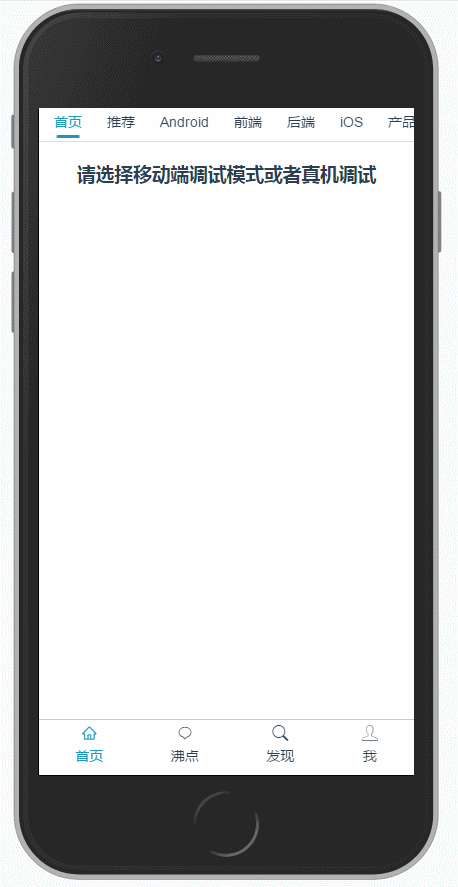
clone该仓库到本地可查看演示demo
Installation
npm i ly-tab -S
or
yarn add ly-tab
Usage
import Vue from 'vue'
import LyTab from 'ly-tab'

Vue.use(LyTab)
// 之后便可在全局使用了
Example
ly-tab 2.x版本(推荐安装最新版本)使用方法:
<ly-tab
    v-model="selectedId"
    :items="items"
    :options="options">
</ly-tab>
export default {
  data () {
    return {
      selectedId: 0,
      items: [
        {label: '首页'},
        {label: '推荐'},
        {label: 'Android'},
        {label: '前端'},
        {label: '后端'},
        {label: 'iOS'},
        {label: '产品'},
        {label: '人工智能'},
        {label: '设计'}
      ],
      options: {
        activeColor: '#1d98bd'
        // 可在这里指定labelKey为你数据里文字对应的字段
      },
    }
  }
}
ly-tab 1.x版本使用方法:
<ly-tab
  v-model="selectedId"
  activeColor="#1d98bd">
  <ly-tab-item
    v-for="(item, index) in items"
    :key="index">
    {{item.label}}
  </ly-tab-item>
</ly-tab>
export default {
  data () {
    return {
      selectedId: 0,
      items: [
        {label: '首页'},
        {label: '推荐'},
        {label: 'Android'},
        {label: '前端'},
        {label: '后端'},
        {label: 'iOS'},
        {label: '产品'},
        {label: '人工智能'},
        {label: '设计'}
      ]
    }
  }
}
版本差异
2.x版本相较于1.x版本:
- 简化了使用复杂度
- 配置项传入方式采用Object方式传入,即options的绑定值为一个Object
- 新增滑条动画效果
- 增加item切换时(非fixBottom)位置调整(动画),使当前激活的item尽量显示在中间
- 不再依赖scss及相关依赖
CHANGELOG
可选的配置项:
从2.0版本开始,配置项采用Object方式传入,1.x版本采用单个配置传入方式
| 配置项 | 类型 | 描述 | 默认值 |
|---|---|---|---|
| labelKey | String | 指定item的文字部分在item对象中的key | label |
| lineWidth | Number | fixBottom为false时tabbar底部滑条高度 | 1px |
| activeColor | String | 激活状态下字体以及滑条颜色 | red |
| fixBottom | Boolean | 是否固定在视图底部 | false |
| additionalX | Number | 近似等于超出边界时最大可拖动距离 | 50px |
| reBoundExponent | Number | 惯性回弹指数(值越大,幅度越大,惯性回弹距离越长) | 10 |
| sensitivity | Number | 惯性滑动时的灵敏度(值越小,阻力越大),可近似认为手松开后速度减为零所需时间 | 1000ms |
| reBoundingDuration | Number | 回弹动画duration | 360ms |
事件
| 事件名 | 参数 | 描述 |
|---|---|---|
| change | item, index | 当前点击的item以及索引值 |
Build Setup
# install dependencies
npm install
# or
yarn

# serve with hot reload at localhost:8080
npm run dev
# or
yarn dev
License
MIT
Note that the project description data, including the texts, logos, images, and/or trademarks,
for each open source project belongs to its rightful owner.
If you wish to add or remove any projects, please contact us at [email protected].