zawadz88 / Materialpopupmenu
Programming Languages
Projects that are alternatives of or similar to Materialpopupmenu
Material Popup Menu 
This library allows to create simple popup menus programmatically with a nice type-safe builder syntax in Kotlin. Menus can be divided into separate sections with optional headers and contain icons.
Download (from JCenter)
implementation 'com.github.zawadz88.materialpopupmenu:material-popup-menu:4.1.0'
Getting started
To create a popup menu with a single section from an anchor view:
    fun onSingleSectionWithIconsClicked(view: View) {
        val popupMenu = popupMenu {
            section {
                item {
                    label = "Copy"
                    icon = R.drawable.abc_ic_menu_copy_mtrl_am_alpha //optional
                    callback = { //optional
                        Toast.makeText(this@LightActivity, "Copied!", Toast.LENGTH_SHORT).show()
                    }
                }
                item {
                    labelRes = R.string.label_paste
                    iconDrawable = ContextCompat.getDrawable(this@LightActivity, R.drawable.abc_ic_menu_paste_mtrl_am_alpha) //optional
                    callback = { //optional
                        Toast.makeText(this@LightActivity, "Text pasted!", Toast.LENGTH_SHORT).show()
                    }
                }
                item {
                    label = "Select all"
                    icon = R.drawable.abc_ic_menu_selectall_mtrl_alpha //optional
                }
            }
        }

        popupMenu.show(this@LightActivity, view)
    }
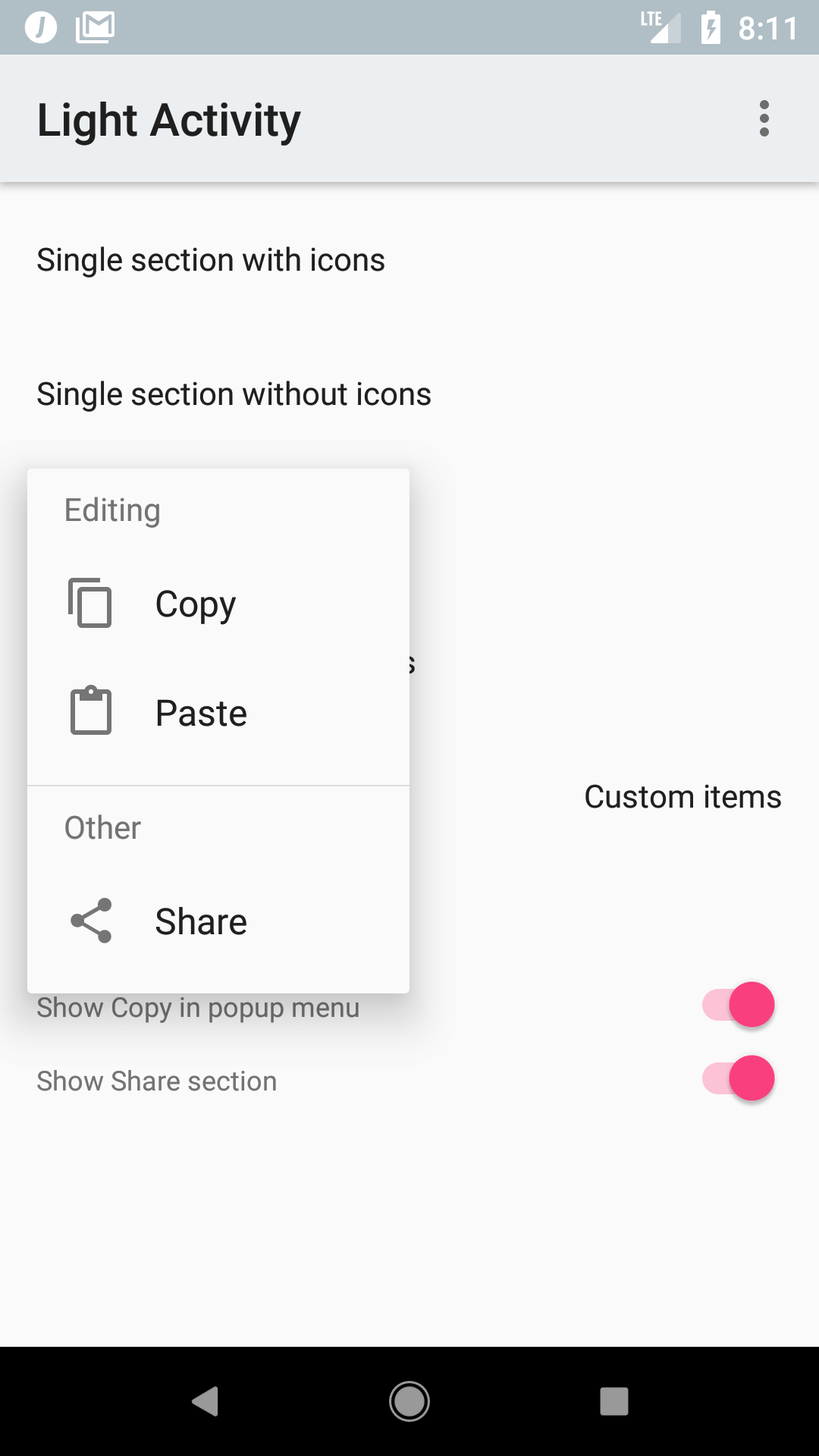
To create a popup menu with 2 sections and a section title in the second one:
    fun onSingleSectionWithIconsClicked(view: View) {
        val popupMenu = popupMenu {
            section {
                item {
                    label = "Copy"
                    icon = R.drawable.abc_ic_menu_copy_mtrl_am_alpha
                    callback = {
                        Toast.makeText(this@LightActivity, "Copied!", Toast.LENGTH_SHORT).show()
                    }
                }
                item {
                    labelRes = R.string.label_paste
                    icon = R.drawable.abc_ic_menu_paste_mtrl_am_alpha
                    callback = {
                        Toast.makeText(this@LightActivity, "Text pasted!", Toast.LENGTH_SHORT).show()
                    }
                }
            }
            section {
                title = "Other"
                item {
                    label = "Select all"
                    icon = R.drawable.abc_ic_menu_selectall_mtrl_alpha
                }
            }
        }

        popupMenu.show(this@LightActivity, view)
    }
Supported features
- Showing popup menus with a builder pattern
- Separator between popup menu sections
- Section headers
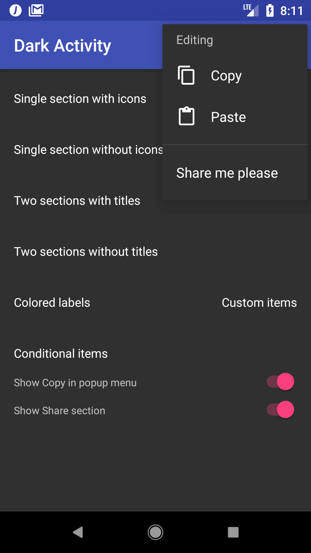
- Light and dark styles
- Custom view items
- Setting item label text color & icon color for each individual item
- Setting custom popup background color
- Customizing default popup style via theme attribute
- Adding additional offsets to where the dialog should be shown
- Keeping popup open after clicking on item
- Dimming background behind popup
- Customizing popup width, padding & offsets
- Displaying an icon at the end of each item which indicates a nested submenu
Custom views
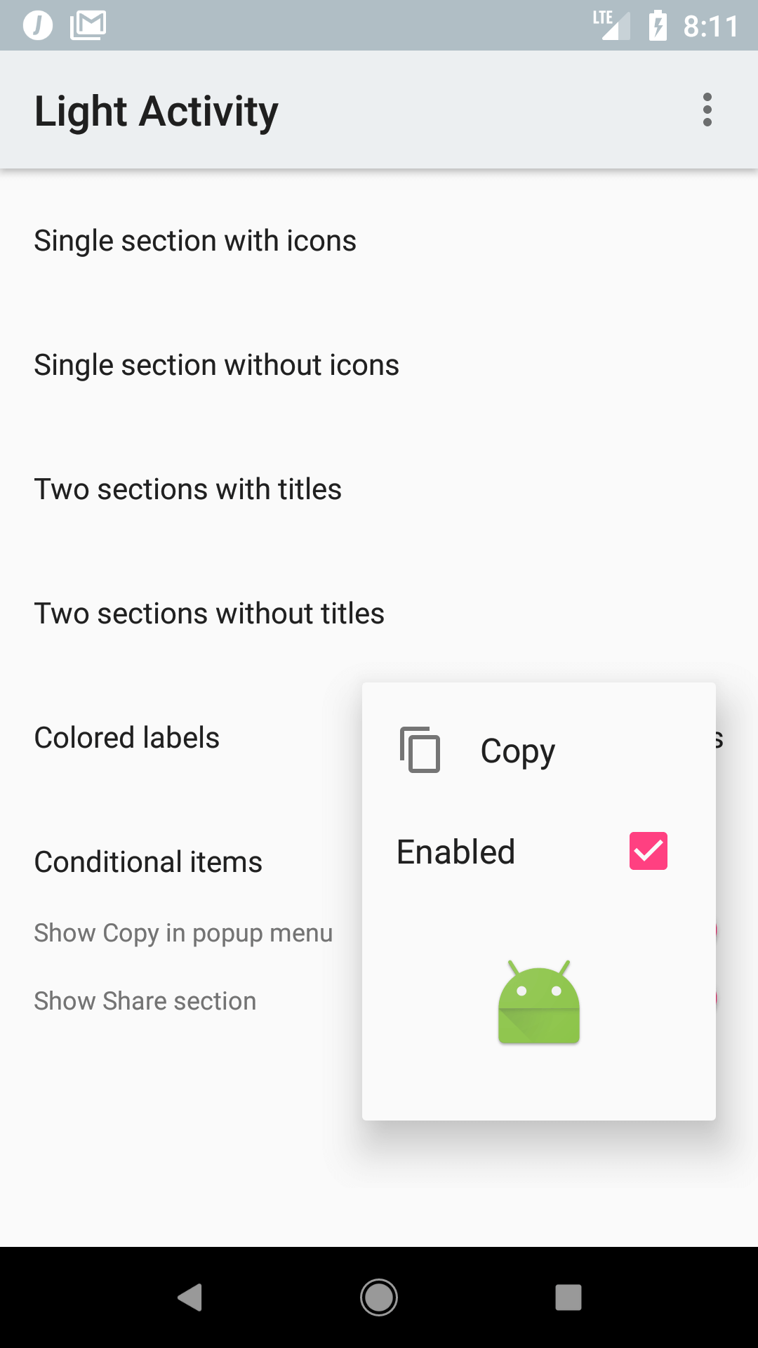
You can use your own layouts for displaying the items in each section alongside the default layouts provided by the library. E.g.:
    fun onCustomItemsClicked(view: View) {
        val popupMenu = popupMenu {
            dropdownGravity = Gravity.END
            section {
                item {
                    label = "Copy"
                    icon = R.drawable.abc_ic_menu_copy_mtrl_am_alpha
                    callback = {
                        Toast.makeText(this@LightActivity, "Copied!", Toast.LENGTH_SHORT).show()
                    }
                }
                customItem {
                    layoutResId = R.layout.view_custom_item_checkable
                    viewBoundCallback = { view ->
                        val checkBox: CheckBox = view.findViewById(R.id.customItemCheckbox)
                        checkBox.isChecked = true
                    }
                    callback = {
                        Toast.makeText(this@LightActivity, "Disabled!", Toast.LENGTH_SHORT).show()
                    }
                }
                customItem {
                    layoutResId = R.layout.view_custom_item_large
                }
            }
        }

        popupMenu.show(this@LightActivity, view)
    }
Custom colors
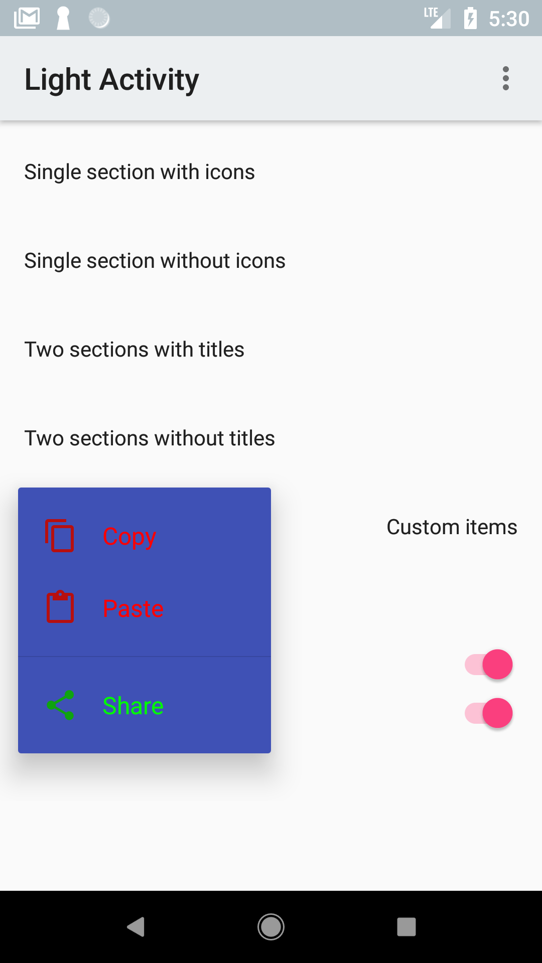
To achieve the above you need to set labelColor and iconColor on each item in a section as shown here:
    fun onCustomColorsClicked(view: View) {
        val popupMenu = popupMenu {
            style = R.style.Widget_MPM_Menu_Dark_CustomBackground
            section {
                item {
                    label = "Copy"
                    labelColor = ContextCompat.getColor(this@LightActivity, R.color.red)
                    icon = R.drawable.abc_ic_menu_copy_mtrl_am_alpha
                    iconColor = ContextCompat.getColor(this@LightActivity, R.color.dark_red)
                    callback = {
                        Toast.makeText(this@LightActivity, "Copied!", Toast.LENGTH_SHORT).show()
                    }
                }
                item {
                    label = "Paste"
                    labelColor = ContextCompat.getColor(this@LightActivity, R.color.red)
                    icon = R.drawable.abc_ic_menu_paste_mtrl_am_alpha
                    iconColor = ContextCompat.getColor(this@LightActivity, R.color.dark_red)
                    callback = {
                        Toast.makeText(this@LightActivity, "Text pasted!", Toast.LENGTH_SHORT).show()
                    }
                }
            }
            section {
                item {
                    label = "Share"
                    labelColor = ContextCompat.getColor(this@LightActivity, R.color.green)
                    icon = R.drawable.abc_ic_menu_share_mtrl_alpha
                    iconColor = ContextCompat.getColor(this@LightActivity, R.color.dark_green)
                    callback = {
                        shareUrl()
                    }
                }
            }
        }

        popupMenu.show(this@LightActivity, view)
    }
To change the popup background color you need to create a custom style and pass it under style to the popup builder above.
E.g. to use the primary color you could define the style like this:
<resources>
    <style name="Widget.MPM.Menu.Dark.CustomBackground">
        <item name="android:colorBackground">@color/colorPrimary</item>
    </style>
</resources>
Documentation
HTML documentation of the current version of the library is available here.
Third Party Bindings
React Native
You may now use this library with React Native via the module here
FAQ
I want to use the library but I don't know Kotlin
Kotlin is extremely easy to use if you already know Java. Check out the official documentation - it's really great!
I have not migrated to AndroidX. Can I use this library?
If you're still using legacy Android Support libraries you can use version 2.2.0. AndroidX is supported by default since 3.0.0.
Can I use this library on Jelly Bean?
Up to 3.4.0 minimum supported version was API 16 (Jelly Bean) so you can use that version. Since 4.0.0 minimum supported version is API 19 (Kitkat).

