TonnyL / Light
Licence: mit
🍭 The usual Snackbar, but elegant
Stars: ✭ 542
Programming Languages
kotlin
9241 projects
Projects that are alternatives of or similar to Light
Cafebar
An upgraded Snackbar for Android that provides more options and easy to use
Stars: ✭ 142 (-73.8%)
Mutual labels: material-design, ui-components, material-components, snackbar
Smart Webcomponents
Web Components & Custom Elements for Professional Web Applications
Stars: ✭ 110 (-79.7%)
Mutual labels: material-design, ui-components, material-components
Material Backdrop
A simple solution for implementing Backdrop pattern for Android
Stars: ✭ 221 (-59.23%)
Mutual labels: material-design, ui-components, material-components
Vuetify
🐉 Material Component Framework for Vue
Stars: ✭ 33,085 (+6004.24%)
Mutual labels: material-design, ui-components, material-components
Svelte Materialify
A Material UI Design Component library for Svelte heavily inspired by vuetify.
Stars: ✭ 351 (-35.24%)
Mutual labels: material-design, ui-components, material-components
Material
A lightweight Material Design library for Angular based on Google's Material Components for the Web.
Stars: ✭ 143 (-73.62%)
Mutual labels: material-design, ui-components, material-components
Snacky
Snacky is a small library to help you adding a Snackbar to your android project.
Stars: ✭ 482 (-11.07%)
Mutual labels: material-design, ui-components, snackbar
React Md
React material design - An accessible React component library built from the Material Design guidelines in Sass
Stars: ✭ 2,284 (+321.4%)
Mutual labels: material-design, material-components
Bottomsheet
BottomSheet dialog library for Android
Stars: ✭ 219 (-59.59%)
Mutual labels: material-design, material-components
Android Iconics
Android-Iconics - Use any icon font, or vector (.svg) as drawable in your application.
Stars: ✭ 4,916 (+807.01%)
Mutual labels: material-design, material-components
Materialbanner
A library that provides an implementation of the banner widget from the Material design.
Stars: ✭ 241 (-55.54%)
Mutual labels: material-design, material-components
Material Components Web
Modular and customizable Material Design UI components for the web
Stars: ✭ 15,931 (+2839.3%)
Mutual labels: material-design, material-components
Ej2 Javascript Ui Controls
Syncfusion JavaScript UI controls library offer more than 50+ cross-browser, responsive, and lightweight HTML5 UI controls for building modern web applications.
Stars: ✭ 256 (-52.77%)
Mutual labels: material-design, ui-components
React Material Components Web
React wrapper of Google's Material Components Web
Stars: ✭ 184 (-66.05%)
Mutual labels: material-design, material-components
Material Components Android
Modular and customizable Material Design UI components for Android
Stars: ✭ 13,128 (+2322.14%)
Mutual labels: material-design, material-components
Material Admin
Free Material Admin Template
Stars: ✭ 219 (-59.59%)
Mutual labels: material-design, material-components
Materialdesign2
A beautiful app designed with Material Design 2 using Android X.
Stars: ✭ 170 (-68.63%)
Mutual labels: material-design, material-components
Materialnavigationview Android
📱 Android Library to implement Rich, Beautiful, Stylish 😍 Material Navigation View for your project with Material Design Guidelines. Easy to use.
Stars: ✭ 168 (-69%)
Mutual labels: material-design, material-components
Quasar
Quasar Framework - Build high-performance VueJS user interfaces in record time
Stars: ✭ 20,090 (+3606.64%)
Mutual labels: material-design, material-components
Elm Mdc
Elm port of the Material Components for the Web CSS/JS library
Stars: ✭ 338 (-37.64%)
Mutual labels: material-design, material-components
Light
The usual Snackbar, but elegant. Inspired by Toasty.
Screenshots
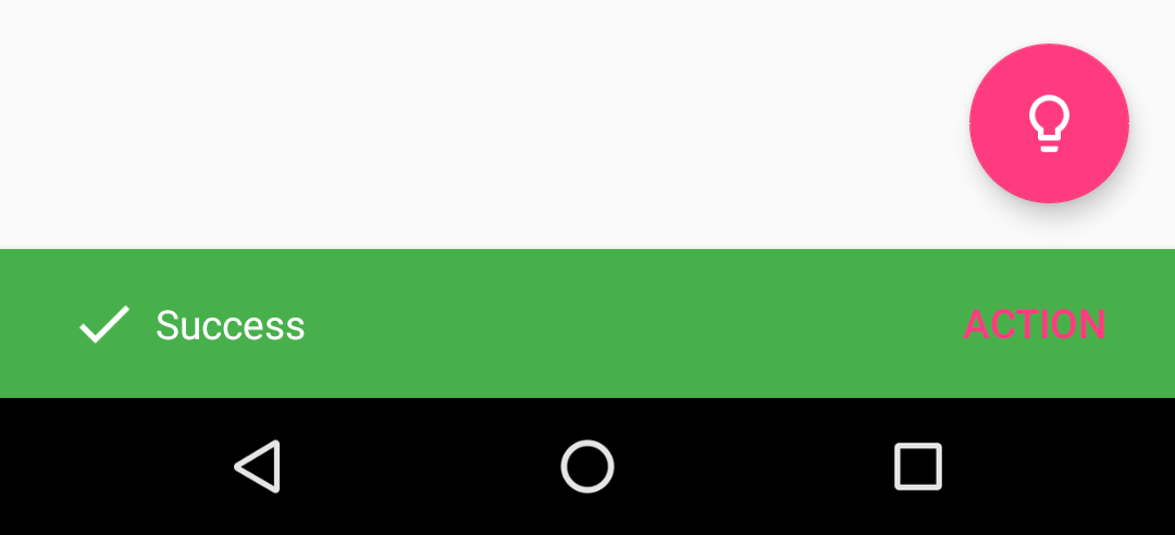
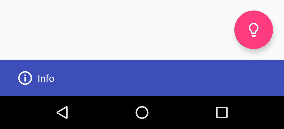
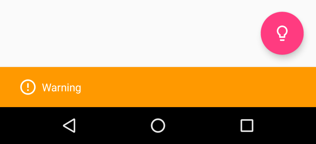
| success | Info | warning |
|---|---|---|
 |
 |
 |
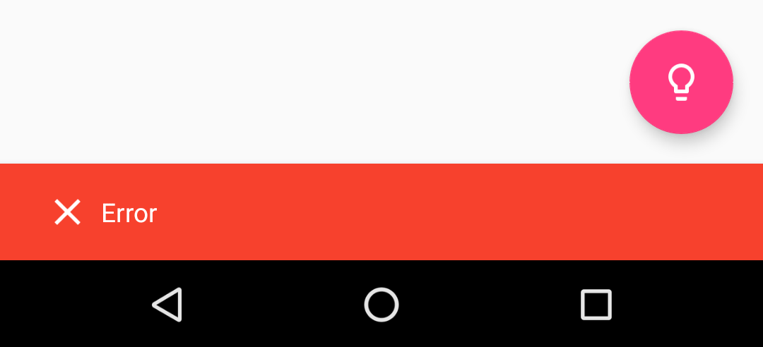
| Error | Normal | Custom |
|---|---|---|
 |
 |
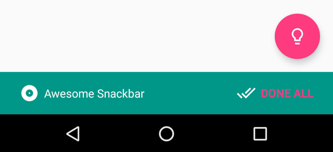 |
Download
Gradle
Add the code below to your root build.gradle file (NOT your module build.gradle file, check here for an example).
allprojects {
    repositories {
        jcenter()
    }
}
Add the code below to your module's build.gradle file:
dependencies {
	implementation 'io.github.tonnyl:light:latest_version'
}
Maven
<dependency>
  <groupId>io.github.tonnyl</groupId>
  <artifactId>light</artifactId>
  <version>latest_version</version>
  <type>pom</type>
</dependency>
Usage
Each method always returns a Snackbar object, so you can customize the Snackbar much more. DO NOT FORGET TO CALL THE show() METHOD!
- To display a success Snackbar:
// Kotlin
import io.github.tonnyl.light.success

success(fab, "Success", Snackbar.LENGTH_SHORT)
	.setAction("Action", {
		Toast.makeText([email protected], "Hello, Light!", Toast.LENGTH_SHORT).show()
	})
	.show()
// Java
Light.success(fab, "Success", Snackbar.LENGTH_SHORT)
	.setAction("Action", v ->
		Toast.makeText(SettingsActivity.this, "Hello, Light!", Toast.LENGTH_SHORT).show())
	.show());
- To display an info Snackbar:
// Kotlin
import io.github.tonnyl.light.info

info(fab, "Info", Snackbar.LENGTH_SHORT).show()
// Java
Light.info(fab, "Info", Snackbar.LENGTH_SHORT).show());
- To display a warning Snackbar:
// Kotlin
import io.github.tonnyl.light.warning

warning(fab, "Warning", Snackbar.LENGTH_SHORT).show()
// Java
Light.warning(fab, "Warning", Snackbar.LENGTH_SHORT).show());
- To display an error Snackbar:
// Kotlin
import io.github.tonnyl.light.error

error(fab, "Error", Snackbar.LENGTH_SHORT).show()
// Java
Light.error(fab, "Error", Snackbar.LENGTH_SHORT).show());
- To display the usual Snackbar:
// Kotlin
import io.github.tonnyl.light.normal

normal(fab, "Normal", Snackbar.LENGTH_SHORT).show()
// Java
Light.normal(fab, "Normal", Snackbar.LENGTH_SHORT).show();
- You can also create your own Snackbar in custom-designed style:
// Kotlin
import io.github.tonnyl.light.make

make(
	fab, // // The view to find a parent from.
	"Awesome Snackbar", // The message to show.
	Snackbar.LENGTH_INDEFINITE, // How long to display the message.
	R.drawable.ic_album_white_24dp, // The left icon of message to show.
	R.color.color_cyan, // The background color of Snackbar.
	android.R.color.white, // The color of text to show.
	R.drawable.ic_done_all_white_24dp,
	R.color.colorAccent) // The left icon of action text.
	.setAction("Done all", {
		// Do whatever you want to do.
		Toast.makeText([email protected], "Hello, Light!", Toast.LENGTH_SHORT).show()
	})
	.show()
// Java
Light.make(
	fab,
	"Awesome Snackbar",
	Snackbar.LENGTH_SHORT,
	R.drawable.ic_album_white_24dp,
	R.color.color_cyan,
	android.R.color.white,
	R.drawable.ic_done_all_white_24dp,
	R.color.colorAccent)
	.setAction("Done all", v ->
		Toast.makeText(SettingsActivity.this, "Hello, Light!", Toast.LENGTH_SHORT).show())
	.show());
Extra
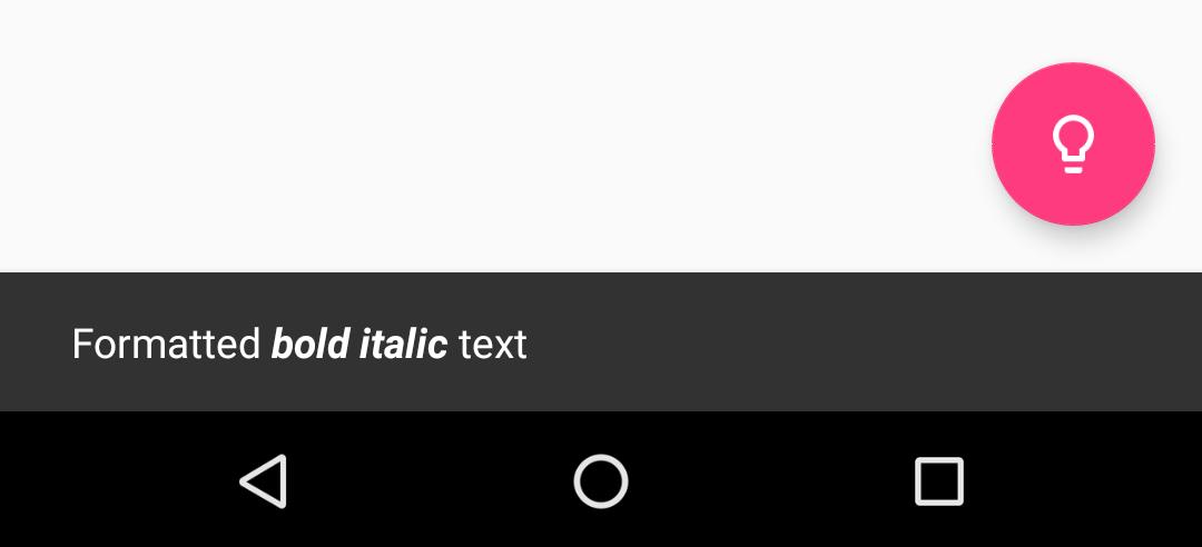
You can pass formatted text to Light!
Pull Request
Have some new ideas or find a bug? Do not hesitate to open an issue and make a pull request.
License
Light is under an MIT license. See the LICENSE file for more info.
Note that the project description data, including the texts, logos, images, and/or trademarks,
for each open source project belongs to its rightful owner.
If you wish to add or remove any projects, please contact us at [email protected].


