md-editor-v3


English | 中文
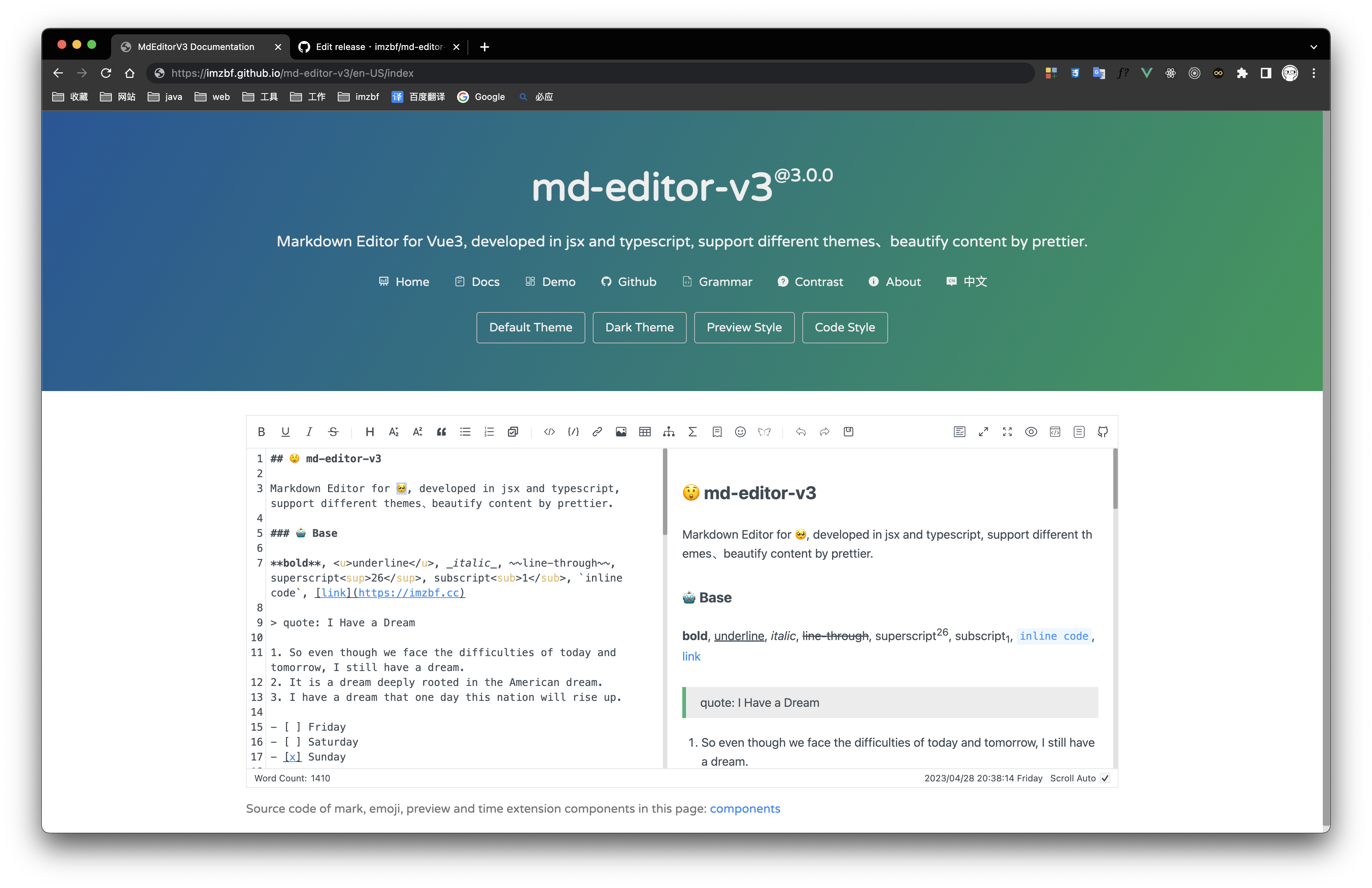
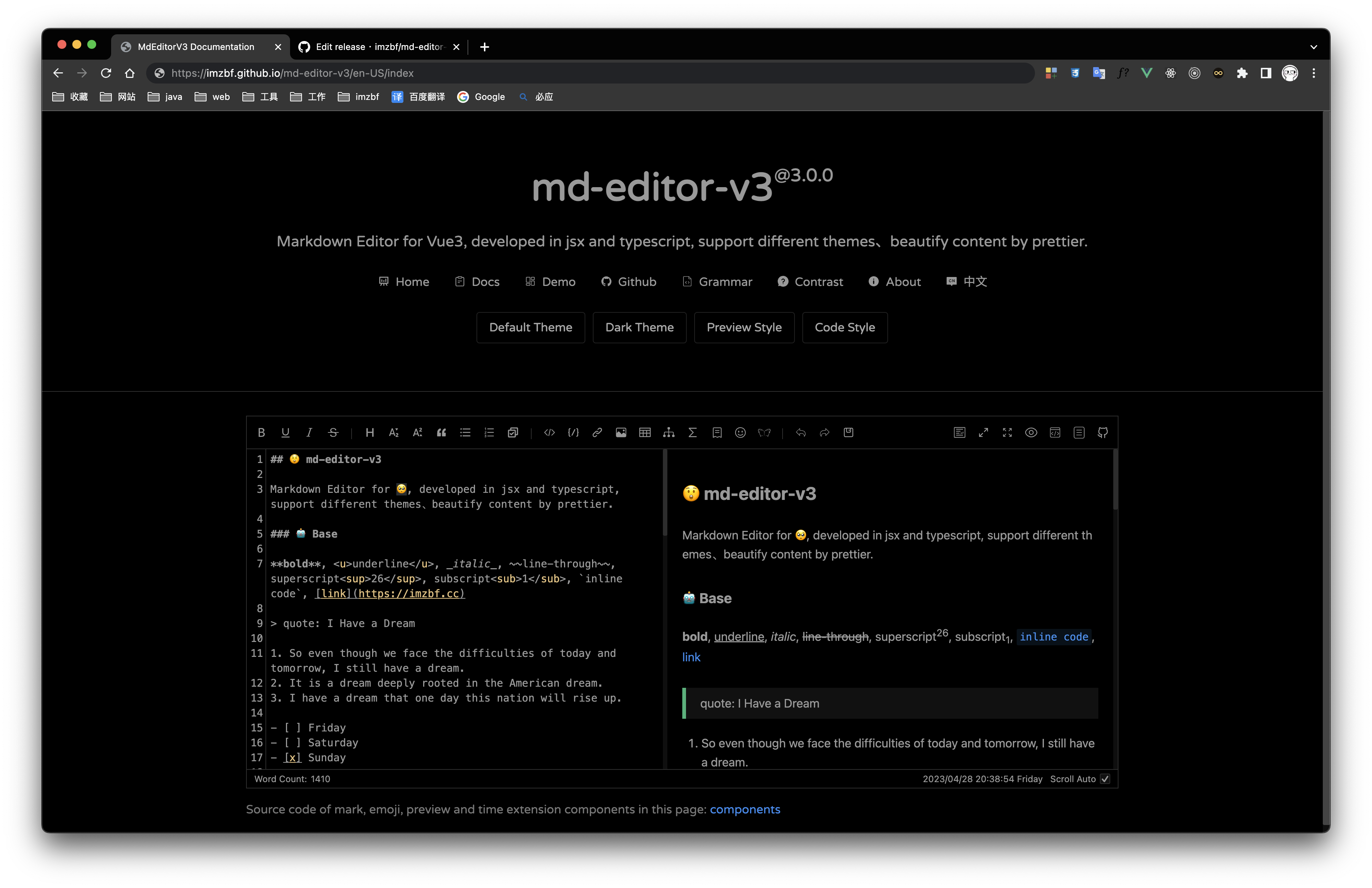
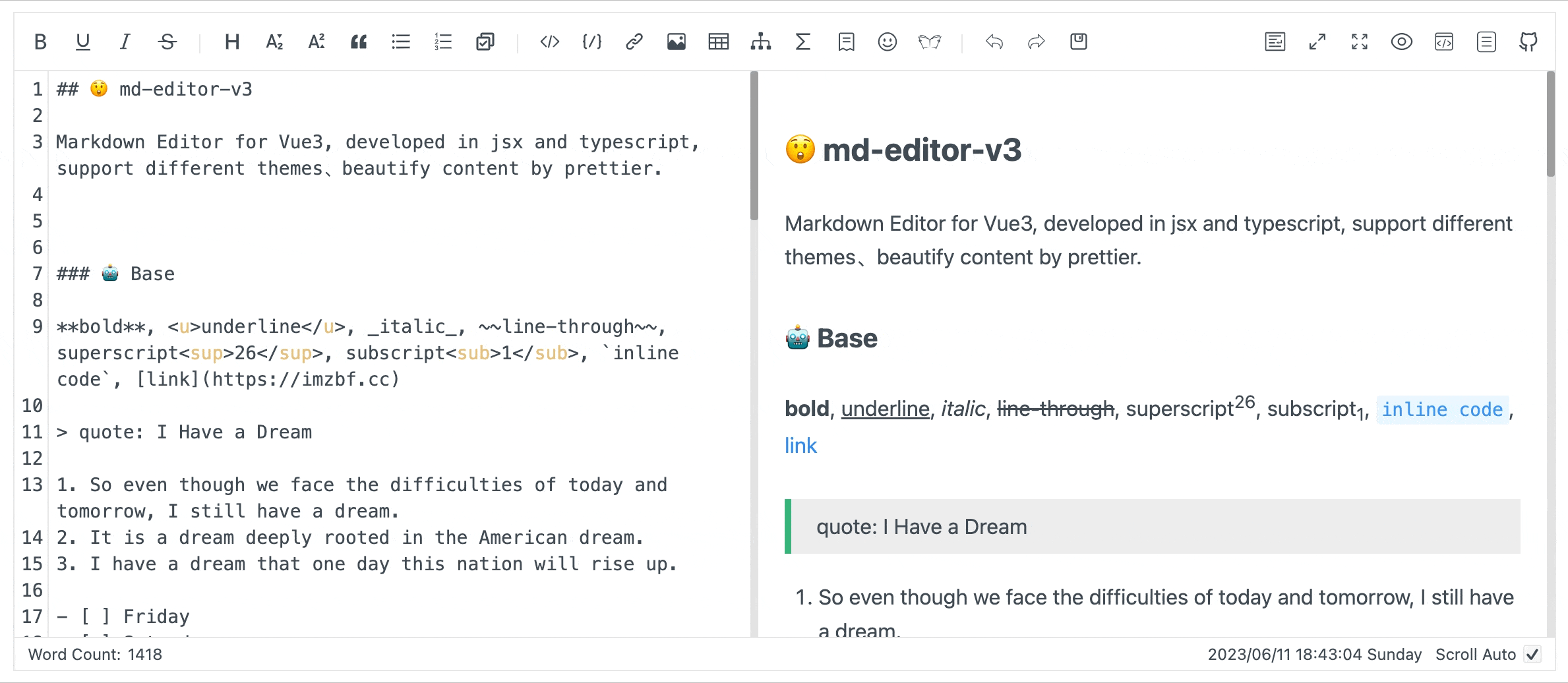
Markdown editor for vue3, developed in jsx and typescript.
-
Documentation and example: Go
-
Use it online: Go
-
The same series editor for react: md-editor-rt
Features
- Toolbar, screenfull or screenfull in web pages and so on.
- Themes, Built-in default and dark themes.
- Shortcut key for editor.
- Beautify your content by
prettier(only for markdown content, not the code and other text). - Multi-language, build-in Chinese and English(default: Chinese).
- Upload picture, paste or clip the picture and upload it.
- Render article directly(no editor, no event listener, only preview content).
- Preview themes,
defalut,vuepress,github,cyanosis,mk-cute,smart-bluestyles(not identical). It can be customized also(Refer to example page). mermaid(>=1.8.0),katexmathematical formula(>=1.9.0).- Customize the toolbar as you like.
Install
yarn add md-editor-v3Usage
<template>
  <md-editor v-model="text" preview-only />
</template>

<script setup>
import { ref } from 'vue';
import MdEditor from 'md-editor-v3';
import 'md-editor-v3/lib/style.css';

const text = ref('# Hello Editor');
</script>
Preview
| Default theme | Dark theme | Preview only |
|---|---|---|
 |
 |
 |
mark and emoji extensions
Apis
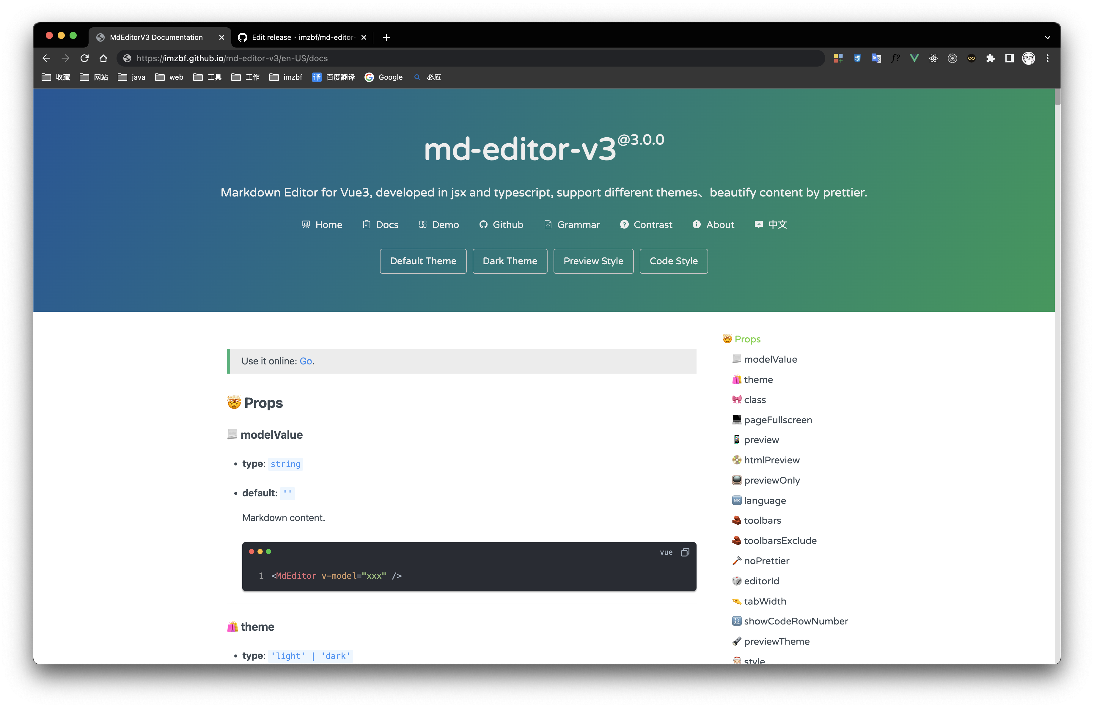
Props
| name | type | default | description |
|---|---|---|---|
| modelValue | string | '' | Markdown content, use v-model in vue template |
| theme | 'light' | 'dark' | 'light' | Editor theme |
| class | string | '' | |
| historyLength | number | 10 | The max length of history(if it is too big, editor will use more RAM) |
| pageFullScreen | boolean | false | Screenfull in web page |
| preview | boolean | true | Preview content in editor |
| htmlPreview | boolean | false | Preview html in editor |
| previewOnly | boolean | false | Only render article content, no toolbar, no edit area |
| language | string | 'zh-CN' | Build-in language('zh-CN','en-US') |
| toolbars | Array<ToolbarNames | number> | [toolbars] | Show contents of toolbar, all keyssee toolbars below |
| toolbarsExclude | Array<ToolbarNames | number> | [] | Don't show contents of toolbar, all keystoolbars |
| noPrettier | boolean | false | Use prettier to beautify content or not |
| editorId | string | 'md-editor-v3' | Editor id, it is used when there are more than two editors in the same page |
| tabWidth | number | 2 | One tab eq some spaces |
| showCodeRowNumber | boolean | false | Show row number for code block or not |
| previewTheme | 'default' | 'github' | 'vuepress' | 'mk-cute' | 'smart-blue' | 'cyanosis' | 'default' | Preview theme, can be customized |
| style | string | CSSProperties | {} | Editor inline style |
| tableShape | [number, number] | [6, 4] | Preset the size of the table, [columns, rows] |
| noMermaid | boolean | false | Use mermaid or not |
| placeholder | string | '' | |
| noKatex | boolean | false | Use katex or not |
| codeTheme | 'atom' | 'a11y' | 'github' | 'gradient' | 'kimbie' | 'paraiso' | 'qtcreator' | 'stackoverflow' | 'atom' | Highlight code style, can be customized also |
| markedHeadingId | (text: string, level: number, index: number) => string | (text) => text | H1-H6 ID generator |
| sanitize | (html: string) => string | (html) => html | Sanitize the html, prevent XSS |
| footers | Array<'markdownTotal' | '=' | 'scrollSwitch' | number> | ['markdownTotal', '=', 'scrollSwitch'] | Show contents of footer, they are divided by '='. Set it to [] to hidden footer |
| scrollAuto | boolean | true | Scroll default setting |
| noIconfont | boolean | false | Not append iconfont script, download and import it by yourself |
| formatCopiedText | (text: string) => string | (text: string) => text | Format copied code |
[toolbars]
[
  'bold',
  'underline',
  'italic',
  '-',
  'strikeThrough',
  'title',
  'sub',
  'sup',
  'quote',
  'unorderedList',
  'orderedList',
  '-',
  'codeRow',
  'code',
  'link',
  'image',
  'table',
  'mermaid',
  'katex',
  '-',
  'revoke',
  'next',
  'save',
  '=',
  'pageFullscreen',
  'fullscreen',
  'preview',
  'htmlPreview',
  'catalog',
  'github'
];
After v1.6.0, You can sort the toolbar as you like, split tools by
'-', the left and right toolbars are divided by'='!
After v1.10.0, you can customize the toolbar. To display them, put index of
defToolbarsintotoolbars(this is not standard), for more usage, please refer to docs.
[StaticTextDefaultValue]
Expand language, you need to replace all the content here:
export interface ToolbarTips {
  bold?: string;
  underline?: string;
  italic?: string;
  strikeThrough?: string;
  title?: string;
  sub?: string;
  sup?: string;
  quote?: string;
  unorderedList?: string;
  orderedList?: string;
  codeRow?: string;
  code?: string;
  link?: string;
  image?: string;
  table?: string;
  mermaid?: string;
  katex?: string;
  revoke?: string;
  next?: string;
  save?: string;
  prettier?: string;
  pageFullscreen?: string;
  fullscreen?: string;
  catalog?: string;
  preview?: string;
  htmlPreview?: string;
  github?: string;
  '-'?: string;
  '='?: string;
}

export interface StaticTextDefaultValue {
  // Toolbar hover tips(html title)
  toolbarTips?: ToolbarTips;
  // H1-H6 dropdown menu item
  titleItem?: {
    h1?: string;
    h2?: string;
    h3?: string;
    h4?: string;
    h5?: string;
    h6?: string;
  };
  imgTitleItem?: {
    link: string;
    upload: string;
    clip2upload: string;
  };
  // The modal tips of add link or upload picture
  linkModalTips?: {
    title?: string;
    descLable?: string;
    descLablePlaceHolder?: string;
    urlLable?: string;
    UrlLablePlaceHolder?: string;
    buttonOK?: string;
  };
  // The modal tips of clip the picture, v1.2.0
  clipModalTips?: {
    title?: string;
    buttonUpload?: string;
  };
  copyCode?: {
    text?: string;
    successTips?: string;
    failTips?: string;
  };
  mermaid?: {
    flow?: string;
    sequence?: string;
    gantt?: string;
    class?: string;
    state?: string;
    pie?: string;
    relationship?: string;
    journey?: string;
  };
  katex?: {
    // formula inline
    inline: string;
    // formula block
    block: string;
  };
  footer?: {
    markdownTotal: string;
    scrollAuto: string;
  };
}
Slots
| name | type | default | description |
|---|---|---|---|
| defToolbars | Array<DropdownToolbar | NormalToolbar | ModalToolbar> | null | Custom toolbar in DropdownToolbar, NormalToolbar or ModalToolbar |
| defFooters | Array<string | VNode | JSX.Element> | null | Custom footer |
NormalToolbar example:
<template>
  <md-editor>
    <template #defToolbars>
      <normal-toolbar title="mark" @onClick="handler">
        <template #trigger>
          <svg class="md-icon" aria-hidden="true">
            <use xlink:href="#icon-mark"></use>
          </svg>
        </template>
      </normal-toolbar>
    </template>
  </md-editor>
</template>

<script setup>
import MdEditor from 'md-editor-v3';

const NormalToolbar = MdEditor.NormalToolbar;

const handler = () => {
  console.log('NormalToolbar clicked!');
};
</script>
Events
| name | param | description |
|---|---|---|
| onChange | value: string |
Content changed event(bind to oninput of textarea) |
| onSave | value: string |
Save content event, ctrl+sand click button will be triggered also |
| onUploadImg | files: Array<File>, callback: (urls: Array<string>) => void |
Upload picture event, when picture is uploading the modal will not close, please provide right urls to the callback function |
| onHtmlChanged | html: string |
Compile markdown successful event, you can use it to get the html code |
| onGetCatalog | list: Array<HeadList> |
Get catalog of article |
| onError | err: { name: string; message: string } |
Catch run-time error, Cropper, fullScreen and prettier are used when they are not loaded |
Config
Use MdEditor.config(option: ConfigOption) to reconfigure renderer.
-
markedRenderer:
(renderer: RewriteRenderer) => RewriteRendererOpen target page in a new browser window:
MdEditor.config({
  markedRenderer(renderer) {
    renderer.link = (href, title, text) => {
      return `<a href="${href}" title="${title}" target="_blank">${text}</a>`;
    };

    return renderer;
  }
});
Reference: https://marked.js.org/using_pro#renderer, RewriteRenderer extends Renderer and rewrites heading, now provides index as the fifth parameter.
-
markedExtensions:
Array<marked.TokenizerExtension & marked.RendererExtension>import MdEditor from 'md-editor-v3'; MdEditor.config({ markedExtensions: [your extension] });
Reference: https://marked.js.org/using_pro#extensions
-
markedOptions:
marked.MarkedOptionsDo not render
<br>on a single line break:import MdEditor from 'md-editor-v3'; MdEditor.config({ markedOptions: { breaks: false } });
Reference: https://marked.js.org/using_advanced#options
-
editorConfig: Add more languages, reset
mermaidtemplate or delay rendering time:import MdEditor from 'md-editor-v3'; MdEditor.config({ editorConfig: { languageUserDefined: { lang: StaticTextDefaultValue }, mermaidTemplate: { flow: `flow tempalte`, ...more }, // Default 500ms. It is set to 0ms when preview only and not set. renderDelay: 500 } });
-
editorExtensions: Config some dependency libraries, like highlight..
import MdEditor from 'md-editor-v3';

MdEditor.config({
  editorExtensions: { iconfont: 'https://xxx.cc' }
});
[EditorExtensions]
import MdEditor from 'md-editor-v3';

interface EditorExtensions {
  highlight?: {
    instance?: any;
    js?: string;
    css?: {
      [key: string]: {
        light: string;
        dark: string;
      };
    };
  };
  prettier?: {
    standaloneJs?: string;
    parserMarkdownJs?: string;
  };
  cropper?: {
    instance?: any;
    js?: string;
    css?: string;
  };
  iconfont?: string;
  screenfull?: {
    instance?: any;
    js?: string;
  };
  mermaid?: {
    instance?: any;
    js?: string;
  };
  katex?: {
    instance?: any;
    js?: string;
    css?: string;
  };
}
Shortcut Key
| key | function | description |
|---|---|---|
| TAB | insert space | Insert space, the length eq tabWidth, default: 2, support multiline |
| SHIFT + TAB | delete space, setting is the same as Tab | |
| CTRL + C | copy | When selected, copy the selected content. When not selected, copy the content of the current line |
| CTRL + X | shear | When selected, cut the selected content. When not selected, cut the current line |
| CTRL + D | delete | When selected, delete the selected content. When not selected, delete the current line |
| CTRL + S | save | Trigger onSave event |
| CTRL + B | bold text | **bold** |
| CTRL + U | underline | <u>underline</u> |
| CTRL + I | italic | *italic* |
| CTRL + 1-6 | h1-h6 | # title |
| CTRL + ↑ | superscript | <sup>superscript</sup> |
| CTRL + ↓ | subscript | <sub>subscript</sub> |
| CTRL + Q | quote | > quote |
| CTRL + O | ordered list | 1. ordered list |
| CTRL + L | link | [link](https://github.com/imzbf/md-editor-v3) |
| CTRL + Z | withdraw | Withdraw history in editor, not the function of system |
| CTRL + SHIFT + S | line-through | ~line-through~ |
| CTRL + SHIFT + U | unordered list | - unordered list |
| CTRL + SHIFT + C | code block | |
| CTRL + SHIFT + I | picture |  |
| CTRL + SHIFT + Z | forward | Forward history in editor, not the function of system |
| CTRL + SHIFT + F | Beautify | |
| CTRL + ALT + C | code row | |
| CTRL + SHIFT + ALT + T | table | |table| |
Components
They are used as attributes of the editor component, eg: Editor.DropdownToolbar. For more examples, refer to document.
NormalToolbar
Editor.NormalToolbar
-
props
title:string, not necessary, title of toolbar.
-
events
onClick:(e: MouseEvent) => void, necessary.
-
slots
trigger:string | JSX.Element, necessary, it is usually an icon, which is displayed on the toolbar.
DropdownToolbar
Editor.DropdownToolbar
-
props
title:string, not necessary, title of toolbar.visible:boolean, necessary.
-
events
onChange:(visible: boolean) => void, necessary.
-
slots
trigger:string | JSX.Element, necessary, it is usually an icon, which is displayed on the toolbar.overlay:string | JSX.Element, necessary, content of dropdown box.
ModalToolbar
Editor.ModalToolbar
-
props
title:string, not necessary, title of toolbar.modalTitle:string, not necessary, title of the Modal.visible:boolean, necessary, visibility of Modal.width:string, not necessary, width of Modal, defaultauto.height:string, same aswidth.showAdjust:boolean, not necessary, visibility of fullscreen button.isFullscreen:boolean, necessary whenshowAdjust = true, status of fullscreen.
-
events
onClick:() => void, necessary.onClose:() => void, necessary, close event.onAdjust:(val: boolean) => void, fullscreen button click event.
-
slots
trigger:string | JSX.Element, necessary, it is usually an icon, which is displayed on the toolbar.overlay:string | JSX.Element, necessary, content of Modal.
MdCatalog
Editor.MdCatalog
-
props
editorId:string, necessary, same as editor'seditorId, used to register listening events.class:string, not necessary.markedHeadingId:MarkedHeadingId, not necessary, same as editor.scrollElement:string | HTMLElement, not necessary, it is an element selector when its type is string. WhenpreviewOnlyeqtrue, it is usually set todocument.documentElement.theme:'light' | 'dark', not necessary, provide it when you want to change theme online, it is the same as Editortheme.offsetTop:number, not necessary, highlight current item of catalogs when title isoffsetToppixels from the top, defalut 20.
-
events
onClick:(e: MouseEvent, t: TocItem) => void, not necessary.
Examples
Jsx Template
import { defineComponent, reactive } from 'vue';
import MdEditor from 'md-editor-v3';
import 'md-editor-v3/lib/style.css';

export default defineComponent({
  setup() {
    const md = reactive({
      text: '# Hello Editor'
    });
    return () => (
      <MdEditor modelValue={md.text} onChange={(value) => (md.text = value)} />
    );
  }
});
Upload Picture
Tips: When you paste and upload GIF, it will upload a static picture. So you should upload it by file system!
<template>
  <md-editor v-model="text" @onUploadImg="onUploadImg" />
</template>

<script setup>
import { ref } from 'vue';
import MdEditor from 'md-editor-v3';
import 'md-editor-v3/lib/style.css';

const text = ref('# Hello Editor');

const onUploadImg = async (files, callback) => {
  const res = await Promise.all(
    files.map((file) => {
      return new Promise((rev, rej) => {
        const form = new FormData();
        form.append('file', file);

        axios
          .post('/api/img/upload', form, {
            headers: {
              'Content-Type': 'multipart/form-data'
            }
          })
          .then((res) => rev(res))
          .catch((error) => rej(error));
      });
    })
  );

  callback(res.map((item) => item.data.url));
};
</script>
Change Styles
.css-vars(@isDark) {
  --md-color: if(@isDark, #999, #222);
  --md-hover-color: if(@isDark, #bbb, #000);
  --md-bk-color: if(@isDark, #000, #fff);
  --md-bk-color-outstand: if(@isDark, #111, #f6f6f6);
  --md-bk-hover-color: if(@isDark, #1b1a1a, #f5f7fa);
  --md-border-color: if(@isDark, #2d2d2d, #e6e6e6);
  --md-border-hover-color: if(@isDark, #636262, #b9b9b9);
  --md-border-active-color: if(@isDark, #777, #999);
  --md-modal-mask: #00000073;
  --md-scrollbar-bg-color: if(@isDark, #0f0f0f, #e2e2e2);
  --md-scrollbar-thumb-color: if(@isDark, #2d2d2d, #0000004d);
  --md-scrollbar-thumb-hover-color: if(@isDark, #3a3a3a, #00000059);
  --md-scrollbar-thumb-avtive-color: if(@isDark, #3a3a3a, #00000061);
}

.md {
  .css-vars(false);
}

.md-dark {
  .css-vars(true);
}
Change background color in dark mode:
.md-dark {
  --md-bk-color: #333 !important;
}