React Native UI Kit
React Native components based on React UI Kit
Offical documentation of React UI Kit Native made for React Native applications and you can easily use the components in your project. A lot of predefined styles & properties so it's perfectly fit for prototyping of your app UI.
Support: [email protected]
Setup
Install & usage
- Install local module with react-ui-kit-native (it will also download all required dependencies)
npm install react-ui-kit-native --save- Use any component you want, all available props are available separately for each component below in this documentation. For example:
import React from 'react';
import { Button } from 'react-ui-kit-native';

export default class MyButton extends React.Component {
  render() {
    return (
      <Button full primary rounded label="My button" />
    );
  }
}
Components
List of available components:
| Status | Type | Component | Description |
|---|---|---|---|
| button | Button |
react-native TouchableOpacity component with predefined styles & props |
|
| button | Link |
react-native Text & Linking component with predefined properties |
|
| input | Input |
react-native TextInput component with predefined styles & props |
|
| input | Select |
react-native-modal-dropdown module with predefined styles |
|
| input | Checkbox |
react-native Switch component with predefined styles & props |
|
| input | Datepiker |
react-native DatePickerIOS & DatePickerAndroid component with predefined styles & props |
|
| input | Progress |
react-native ProgressViewIOS & ProgressBarAndroid component with predefined styles & props |
|
| view | Block |
react-native View component with predefined styles & props |
|
| view | Container |
react-native View component with predefined styles & props |
|
| view | Text |
react-native Text component with predefined styles & props |
|
| view | Icon |
react-native-vector-icons module with predefined props |
|
| view | Image |
react-native Image component with predefined styles & props |
|
| view | Badge |
react-native View component with predefined styles & props |
|
| view | Label |
react-native View component with predefined styles & props |
|
| view | Tabs |
react-native TabBarIOS component with predefined styles & props |
|
| view | List |
react-native ScrollView component with predefined styles & props |
|
| view | Menu |
react-native ScrollView component with predefined styles & props |
Button
| PROP | TYPE | DEFAULT | DESCRIPTION |
|---|---|---|---|
| color | string | #FFFFFF |
Specifies a text color |
| size | number | 16 |
Specifies a fontSize size |
| label | string | null | Specifies a string for the button text |
| icon | bool | null | Specifies an icon name - check Icon component |
| family | bool | null | Specifies an icon family - check Icon component |
| loading | bool | false |
Disable touch/press events and render ActivityIndicator |
| full | bool | false |
Set the width of the component to 80% from the total width of the screen |
| opacity | number | 0.8 |
Determines what the activeOpacity of the Button should be when touch is active |
| basic | bool | false |
Include styles.basic with backgroundColor: #FFFFFF, borderColor: #45547e █ |
| bold | bool | false |
Determines whether the styles.bold should be included |
| border | bool | false |
Determines whether the styles.border should be included |
| rounded | bool | false |
Determines whether the styles.basic should be included |
| primary | bool | false |
Include styles.primary with backgroundColor: #7CB527 █ |
| secondary | bool | false |
Include styles.secondary with backgroundColor: #FF3D57 █ |
| tertiary | bool | false |
Include styles.tertiary with backgroundColor: #7857A9 █ |
| style | View style | {} |
Add style properties for better customization |
For more properties visit TouchableOpacity props
Link
| PROP | TYPE | DEFAULT | DESCRIPTION |
|---|---|---|---|
| color | string | color: #323642 █ |
Specifies a text color |
| href | string | null | A link (web URL, email, contact etc.) |
| onPress | func | () => {} |
Called when the touch is released |
| style | View style | {} |
Add style properties for better customization |
Input
| PROP | TYPE | DEFAULT | DESCRIPTION |
|---|---|---|---|
| color | string | #293042 █ |
Specifies a text color |
| placeHolderColor | string | #5E6D95 █ |
Specifies a placeholderTextColor |
| bgColor | string | #FFFFFF |
Specifies a backgroundColor color |
| rounded | bool | false |
Determines whether the styles.rounded should be included |
| type | string | default |
One of 'default', 'email-address', 'numeric', 'phone-pad', 'number-pad', 'decimal-pad' for keyboardType |
| help | string | null | Specifies a string or node for the text positioned between label and input |
| left | bool | true |
Positioning the icon on the left |
| right | bool | false |
Positioning the icon on the right |
| transparent | bool | false |
Determines whether the styles.transparent should be included |
| borderless | bool | false |
Determines whether the styles.borderless should be included |
| border | bool | false |
Determines whether the styles.border should be included |
For more properties visit TextInput props
Text
| PROP | TYPE | DEFAULT | DESCRIPTION |
|---|---|---|---|
| h1 | bool | false | styles.h1 with fontSize size of 112 |
| h2 | bool | false | styles.h2 with fontSize size of 56 |
| h3 | bool | false | styles.h3 with fontSize size of ~45 |
| h4 | bool | false | styles.h4 with fontSize size of ~34 |
| h5 | bool | false | styles.h5 with fontSize size of ~24 |
| title | bool | false | styles.title with fontSize size of ~20 |
| subtitle | bool | false | styles.subtitle with fontSize size of 16 |
| caption | bool | false | styles.caption with fontSize size of 12 |
| size | number | 14 |
Specifies a fontSize size of 14 |
| color | string | #808080 █ |
Specifies a text color #808080 |
| thin | bool | false | Set the fontWeight to 100 |
| bold | bool | false | Set the fontWeight to 300 |
| light | bool | false | Set the fontWeight to bold |
| italic | bool | false | Set the fontStyle to italic |
| align | bool | null | Specifies a textAlign |
For more properties visit Text props
Icon
| PROP | TYPE | DEFAULT | DESCRIPTION |
|---|---|---|---|
| color | string | #808080 █ |
Specifies an Icon color COLOR_DEFAULT #808080 |
| size | number | 16 |
Specifies a fontSize size, BASE_SIZE 16px |
| name | string | null` | What icon to show, for more example see Icon Explorer |
| family | string | null` | One of the sets from Bundled Icon Sets |
For more properties visit react-native-vector-icons
Image
| PROP | TYPE | DEFAULT | DESCRIPTION |
|---|---|---|---|
| avatar | string | false |
Based on image width & height will add borderRadius with value of minimum between WIDTH & HEIGHT |
| width | number | null | Add WIDTH to image style |
| height | number | null | Add HEIGHT to image style |
| size | number | null | width & height changed using: tiny divided by 2, small divided by 1.25 or large multiplied by 2 |
| source | string | null | Image source (either a remote URL or a local file resource). |
For more properties visit Image props
Examples
A list of example screens based on the above components:
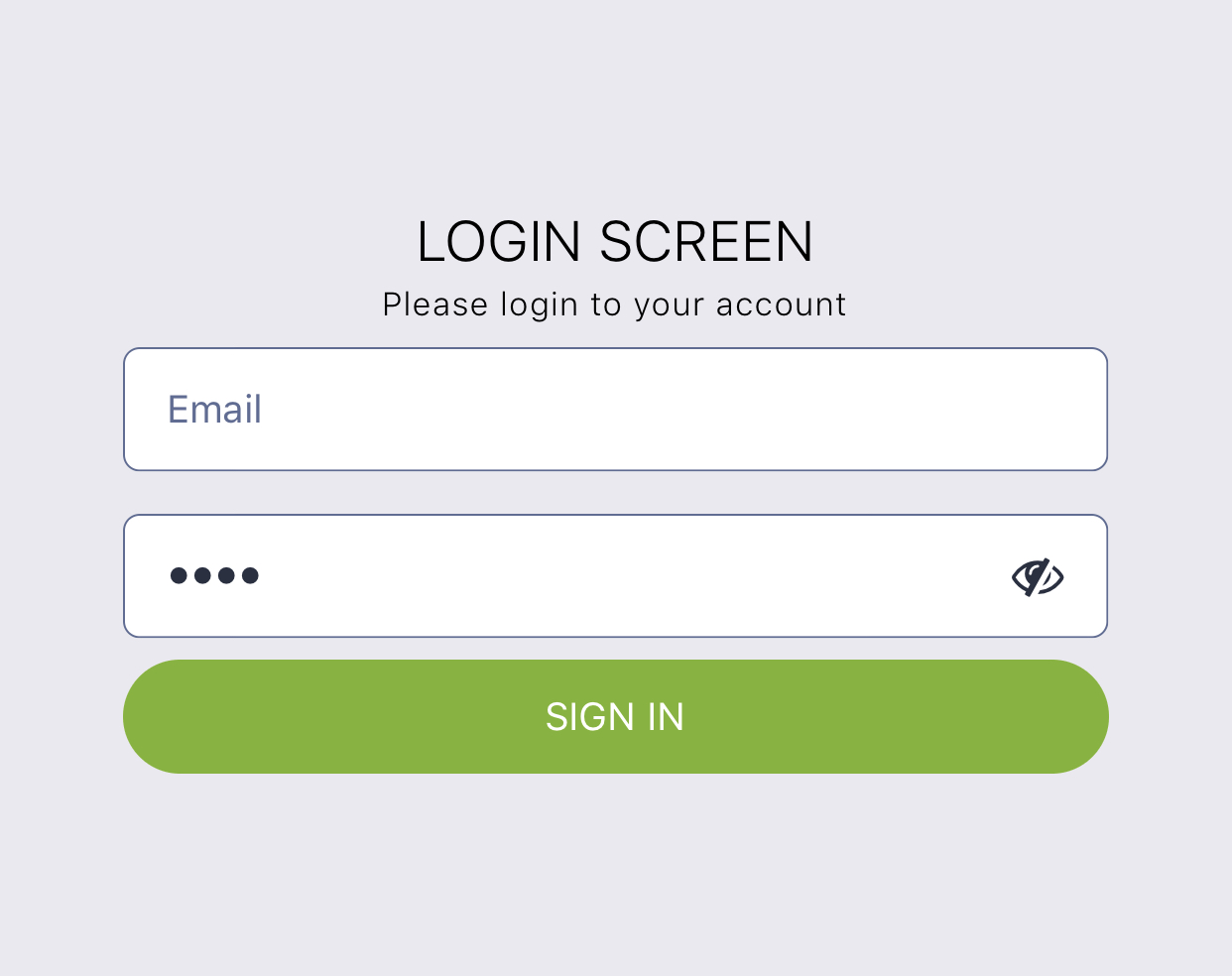
Login
import React from 'react';
import { Block, Button, Input, Text } from 'react-ui-kit-native';

export default class LoginScreen extends React.Component {
  render() {
    return (
      <Block flex middle>
        <Text title light color="#000">
          LOGIN SCREEN
        </Text>
        <Text caption thin color="#000">
          Please login to your account
        </Text>
        <Input placeholder="Email" />
        <Input password placeholder="Password" />
        <Button full primary rounded label="SIGN IN" />
      </Block>
    );
  }
}
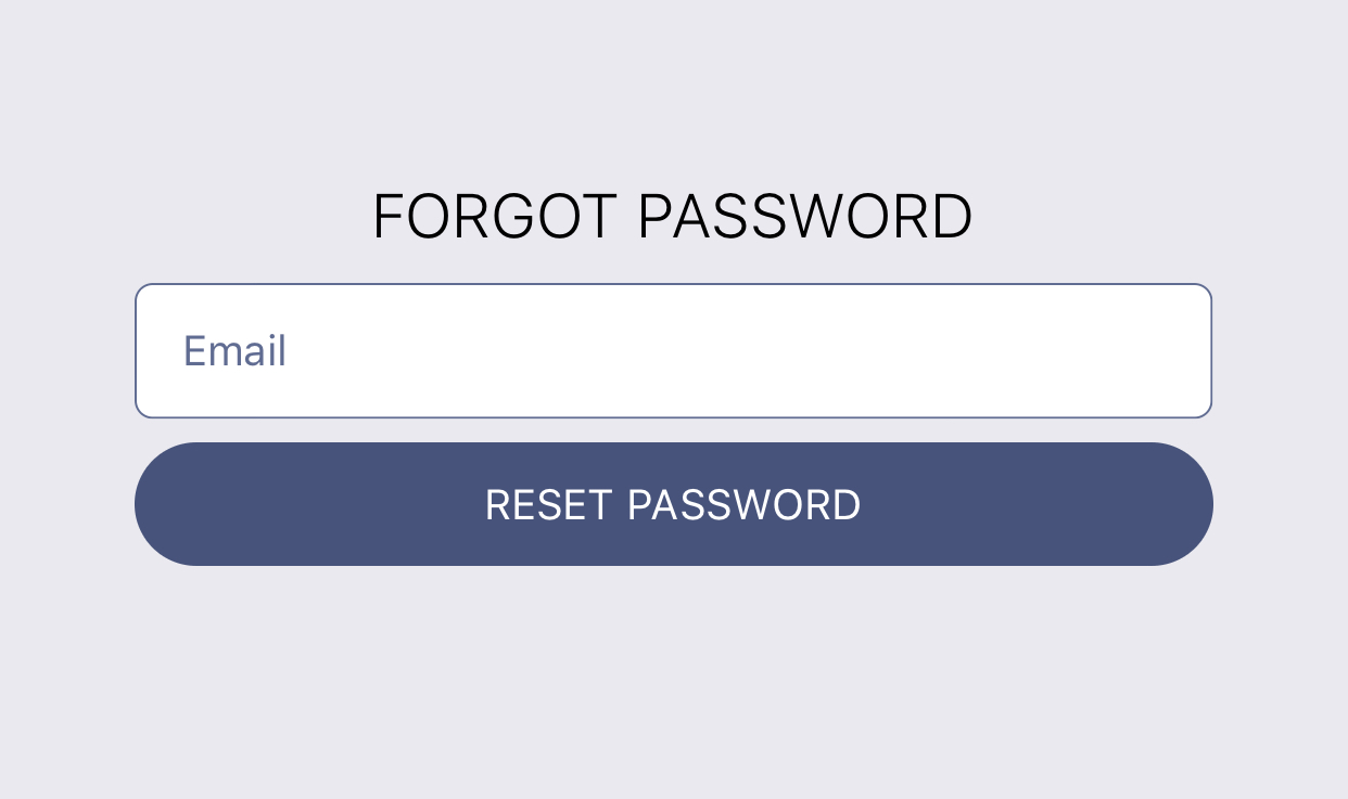
Forgot
import React from 'react';
import { Block, Button, Input, Text } from 'react-ui-kit-native';

export default class LoginScreen extends React.Component {
  static navigationOptions = {
    header: null,
  };

  render() {
    return (
      <Block flex middle>
        <Text title light color="#000">
          FORGOT PASSWORD
        </Text>
        <Input placeholder="Email" />
        <Button full rounded label="RESET PASSWORD" />
      </Block>
    );
  }
}
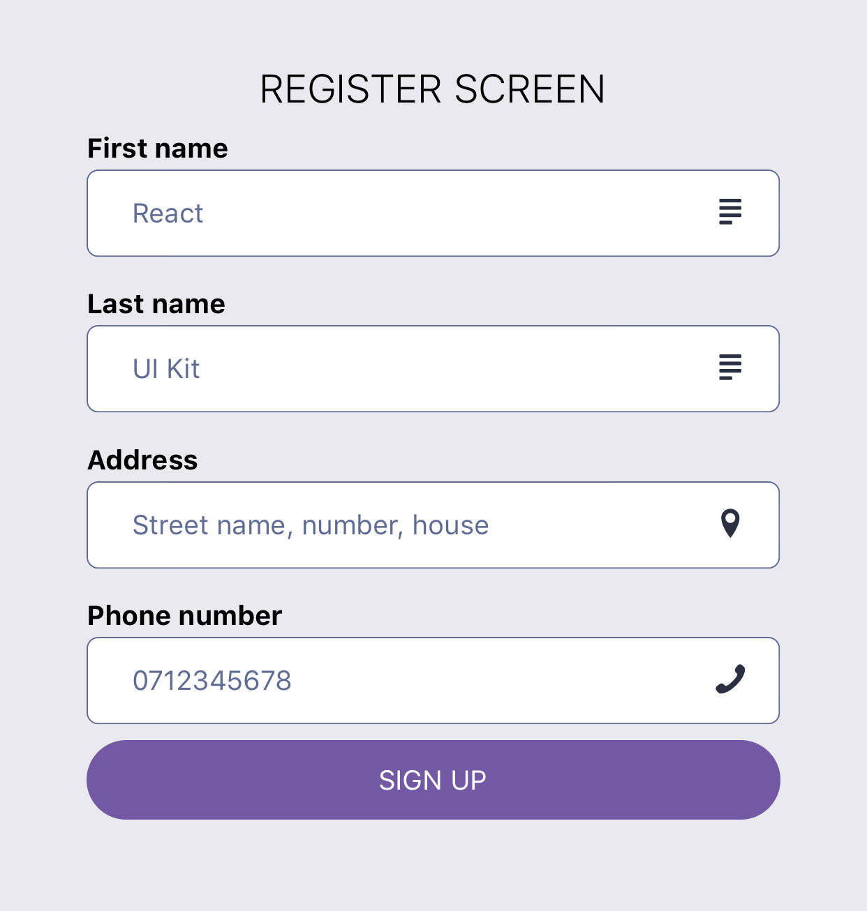
Register
import React from 'react';
import { Block, Button, Input, Text } from 'react-ui-kit-native';

export default class RegisterScreen extends React.Component {
  render() {
    return (
      <Block fluid flex middle>
        <Text title light color="#000">
          REGISTER SCREEN
        </Text>
        <Input label="First name" placeholder="React" right icon="text" family="Entypo" />
        <Input label="Last name" placeholder="UI Kit" right icon="text" family="Entypo" />
        <Input
          right
          icon="location-pin"
          family="Entypo"
          label="Address"
          placeholder="Street name, number, house"
        />
        <Input
          right
          icon="phone"
          family="Entypo"
          type="phone-pad"
          label="Phone number"
          placeholder="0712345678"
        />
        <Button full rounded tertiary label="SIGN UP" />
      </Block>
    );
  }
}
Profile
import React from 'react';
import { StyleSheet, Image } from 'react-native';
import { Block, Text } from 'react-ui-kit-native';

class ProfileScreen extends React.Component {
  render() {
    const { profile } = this.props;

    return (
      <Block fluid flex middle style={styles.profile}>
        <Text h5 light color="#000">{profile.fullname}</Text>
        <Image source={{ uri: profile.avatar }} style={styles.avatar} />
        <Text subtitle light>{`${profile.city}, ${profile.country}`}</Text>
        <Text bold>{profile.email}</Text>
      </Block>
    );
  }
}

ProfileScreen.defaultProps = {
  profile: {
    fullname: `React UI Kit`,
    city: `London`,
    country: `United Kingdom`,
    email: `[email protected]`,
    avatar: `https://react-ui-kit.com/assets/img/react-ui-kit-logo.png`,
  },
};

export default ProfileScreen;

const styles = StyleSheet.create({
  profile: {
    paddingTop: 15,
    backgroundColor: '#fff',
  },
  avatar: {
    width: 200,
    height: 200,
    resizeMode: 'contain',
  },
});
Work in progress
- export components style as
stylesfor easy import - create
theme HoCwith default theme.js
Contribution
Have an idea for a new component or Screen? Just contact us at [email protected] and will add it to our list.


