nativescript-textinputlayout
Android Material Design TextInputLayout for NativeScript
Android TextInputLayout Documentation
iOS SkyFloatingLabelTextField Documentation
NO LONGER MAINTAINED
When I built this plugin, I was exploring NativeScript a lot in my spare time for fun. I currently do not have the spare time I used to have, so I will no longer be maintaining this plugin. PRs are welcome, or if you wish to take over maintenance submit an issue with your information and I'll contact you.
- Bradley
Usage
Install the plugin by running this command in your project root:
tns plugin add nativescript-textinputlayout
The android and iOS implementations, while very similar in effect, have several differences. The below sections break up usage by platform.
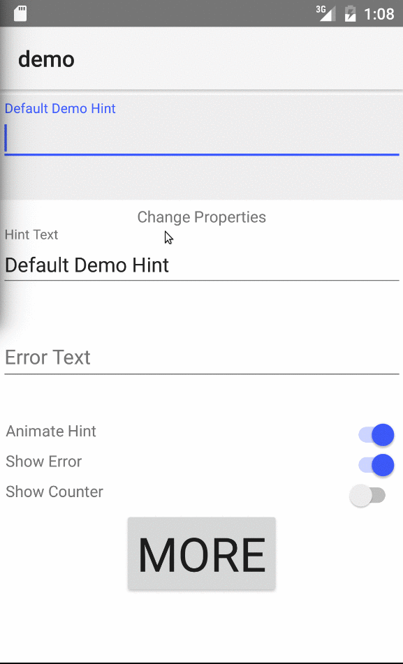
Android
<Page xmlns="http://schemas.nativescript.org/tns.xsd" xmlns:TIL="nativescript-textinputlayout">
    <StackLayout>
        <!--TIL with all possible attrs via bindings-->
        <TIL:TextInputLayout class="demo-text-input-layout"
            hint="{{ hint }}"
            error="{{ error }}"
            errorEnabled="{{ isErrorEnabled }}"
            hintAnimationEnabled="{{ isHintAnimationEnabled }}"
            hintTextAppearance="SpecialTextInputLayout"
            errorTextAppearance="SpecialErrorTextInputLayout"
            counterEnabled="{{ isCounterEnabled }}">

            <!--ONE child element can be added, MUST be either TextField or TextView-->
            <TextField text="{{ demoText }}" />
        </TIL:TextInputLayout>

        <!--TIL with just a static hint-->
        <TIL:TextInputLayout hint="Hint Text">
            <TextField text="" />
        </TIL:TextInputLayout>
    </StackLayout>
</Page>
Attributes
| Name | Description | Value Type | Default |
|---|---|---|---|
| hint | Text that shows up in the hint, and floating label | String | "" |
| error | Text that will display as error message and make the widget look invalid | String | "" |
| errorEnabled | Whether or not an error is enabled for the widget. If no error, it won't pad the bottom so much. However, if you set the error attr, it auto-sets this property under the hood to true | Boolean | false |
| hintAnimationEnabled | Whether or not the 'float' action of the label should be animated | Boolean | true |
| hintTextAppearance | Name of the style definition to apply to the floating label | String | "" |
| errorTextAppearance | Name of the style definition to apply to the error message | String | "" |
| counterEnabled | Whether or not a char counter should display in bottom-right of widget | Boolean | false |
Styling
Several of the styles for the TextInputLayout need to be declared in the Theme for your app. This top-level set of styles will apply to the entire app. One way to do this is to have a style defined whose parent is AppTheme (the theme that NativeScript generates) and then set the app to use the new theme by updating the AndroidManifest.xml file. There are examples of this in the Demo.
There is one property that you can use to style the floating label. It's power is limited - it only applies when the field is focused - but it's something. Simply create a style rule, such as the one below, and set the TextInputLayout's hintTextAppearance property to the name of that style rule (see sample TextInputLayout XML above):
<!-- app/App_Resources/Android/values/appStyles.xml -->
<resources xmlns:android="http://schemas.android.com/apk/res/android">
    <style name="SpecialTextInputLayout" parent="@android:style/TextAppearance">
        <item name="android:textColor">#F9D02A</item>
        <item name="android:textSize">12dp</item>
    </style>
    <style name="SpecialErrorTextInputLayout" parent="@android:style/TextAppearance">
        <item name="android:textColor">#FF0000</item>
        <item name="android:textSize">12dp</item>
    </style>
</resources>
Demo
To run the demo locally, run the following commands from the root folder after pulling down this repo:
npm run setup and npm run demo.android
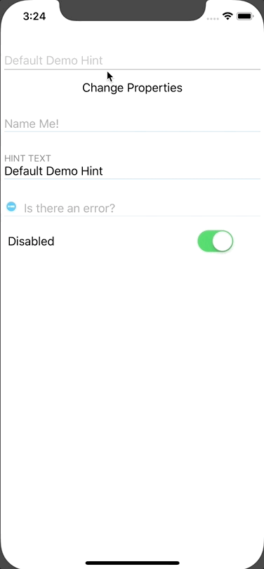
iOS
The pod in use - pod 'SkyFloatingLabelTextField', '~> 3.3.0' - for the iOS functionality actually allows for a bit nicer markup as it extends UITextField, which NativeScript already has a wrapper for. So, instead of a TextInpuLayout that wraps a TextField, we just need a single element and we get to take advantage of all the normal TextField bindings that comes from NativeScript! Note, however, that there are two different kinds of inputs:
TextInputLayout- standard input with floating label, error message capability, etc..TextInputLayoutWithIcon- same as above, with addition of an icon and icon-related properties..
NOTE: This pod relies on Swift 3.0, so I ended up using the NativeScript Swift 3.0 Plugin for this.
<TIL:TextInputLayout
    hint="{{ hint }}"
    isEnabled="{{ isEnabled }}"
    disabledColor="#c3c3c3"
    error="{{ error }}"
    text="{{ demoText }}"
    title="{{ title }}"
    color="{{ error ? '#aa0000' : '#d745ff' }}"
    tintColor="#d745ff"
    lineColor="#d745ff"
    selectedTitleColor="#ff45ca"
    selectedLineColor="#7a45ff"
    lineHeight="1.25"
    selectedLineHeight="3.5" />

<TIL:TextInputLayoutWithIcon
    hint="Is there an error?"
    text="{{ error }}"
    iconFont="{{ iconFont }}"
    iconText="{{ iconText }}"
    iconColor="#48c8ff"
    selectedIconColor="#aa0000"
    iconMarginLeft="2"
    iconMarginBottom="2"
    iconRotationDegrees="45"
    title="Error Text"
    tintColor="#48c8ff"
    lineColor="#48c8ff"
    selectedTitleColor="#6348ff"
    selectedLineColor="#48ff7f"
    lineHeight="0.5"
    selectedLineHeight="1" />
Attributes
Note: Any properties relating to color must be a value that is valid to pass to NativeScript's Color constructor
Note: Any properties relating to icon apply only to the TextInputLayoutWithIcon widget and will not do anything on the regular TextInputLayout widget.
| Name | Description | Value Type | Default |
|---|---|---|---|
| hint | Text that shows up in the text field's placeholder area | String | "" |
| isDisabled | Dictates if field is disabled | Boolean | false |
| disabledColor | Field overall color (label, underline, text) when it's disabled | String | "" |
| error | Text that will display as error message and make the widget look invalid | String | "" |
| title | Text that will display in the 'floating label' when there is a value in the field (hint value used if nothing supplied) |
String | "" |
| tintColor | Color of the blinking cursor when field focused | String | "" |
| lineColor | Color of the line underneath the field | String | "" |
| selectedTitleColor | Color of the floating label when field is selected | String | "" |
| selectedLineColor | Color of the line underneath the field when field is selected | String | "" |
| lineHeight | Thickness of the line underneath the field (set to 0 for no line at all) | Number | 1 |
| iconFont | UIFont to use for the icon. Easiest way is to use the ui/styling/font module and create the font: Font.default.withFontFamily("FontAwesome").withFontSize(16).getUIFont(null)) |
UIFont | null |
| iconText | Unicode value to pass to the icon. NOTE: I was only able to get this to work by binding it to a view model rather than passing the value in directly: i.e. viewModel.set('iconText', '\uf06a') vs iconText="" |
String | "" |
| iconColor | Color of the icon | String | "" |
| selectedIconColor | Color of the icon when field focused | String | "" |
| iconMarginLeft | Margin on the left of the icon | Number | pod's default |
| iconMarginBottom | Margin on the bottom of the icon | Number | pod's default |
| iconRotationDegrees | Amount to rotate the icon | Number | pod's default |
Demo
To run the demo locally, run the following commands from the root folder after pulling down this repo:
npm run setup and npm run demo.ios
Attributions
Nathanael Anderson - He helped me with what (LayoutBase, ContentView, View, ...) to subclass off of and helped me understand more of the nuances of each.
Brad Martin - I used his {N} plugins as guides for this one, and pestered him when I had questions.
Nathan Walker - I followed his tutorial in setting up this plugin.