

Overview
Fixes and Features Added in Version 3.4
This release has been authored by Jürgen Holzer
Fixes and Features Added in Version 3.3.1
This release has been authored by heartacker
Fixes and Features Added in Version 3.3
Bug Fixes
This release has been authored by Jürgen Holzer
Fixes and Features Added in Version 3.3
Bug Fixes
- Add AbstractBaseUpDown MinWidth virtual property
- do not adjust the control panel length when use mouse to drap the control of displayLength
Fixes and Features Added in Version 3.2
Bug Fixes
- Add AbstractBaseUpDown MinWidth virtual property
- do not adjust the control panel length when use mouse to drap the control of displayLength
Features Added
-
WaterMark support Use the Watermark binding to display a default string (when the user deletes all characters in the textbox portion) to hint at the expected input format.
-
add support command binding Use the new Command binding to process the event when the user clicks on the Up/Dowm button of the UpDown Control.
This release has been authored by heartacker and Ryan Weldin
Features Added in Version 3.1
-
addr support update value when lostfocus,Fixes #36 #38 Please use the
IsUpdateValueWhenLostFocusproperty. -
support align the value to left/center/right #41 Please use the
HorizontalContentAlignmentproperty. -
add support to force trigger the ValueChanged event with ctrl+enter #39 Please use Control+Enter to trigger a value changed event without having to actually change a value. This shortcut cannot be configured out.
-
support disable editingTip Fixes #37 #43 Please use the
EnableValidatingIndicatorproperty. -
fix: the cursor will focus to the PART_Measuring_Element by mistake #44
This release has been authored by heartacker
Features Added in Version 3.0
-
Display and Edit of Hex values
-
Text portion editing can be:
- Cancelled with Escape key or can be
- Okay'ed with Enter Key
-
The Edit TextBox displays during editing a Red or Green indicator (in upper left corner) depending on whether current text is:
- a valid number (GREEN) or
- not valid number (RED)
-
Dependency Features Added:
- IsLargeStepEnabled
- FormatString
- NumberStyle
-
Improved Style/Template
Thanx for contributing go to heartacker
More Features
This library implements numeric up down WPF controls to edit a value:
- by dragging the mouse vertically/horizontally (see recording below) or
- by clicking up/down arrow (repeat) buttons or
- up/down or left right cursor keys or
- spinning mousewheel up down on mouseover or
- editing a textbox
Each control implementation is specific for a certain .Net data type:
| Data Type | Control |
|---|---|
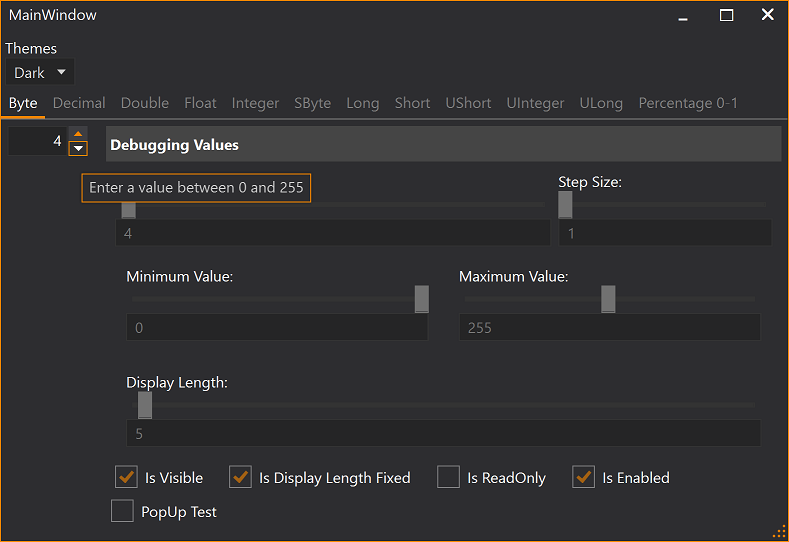
| byte | ByteUpDown control |
| decimal | DecimalUpDown control |
| double | DoubleUpDown control |
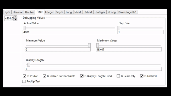
| float | FloatUpDown control |
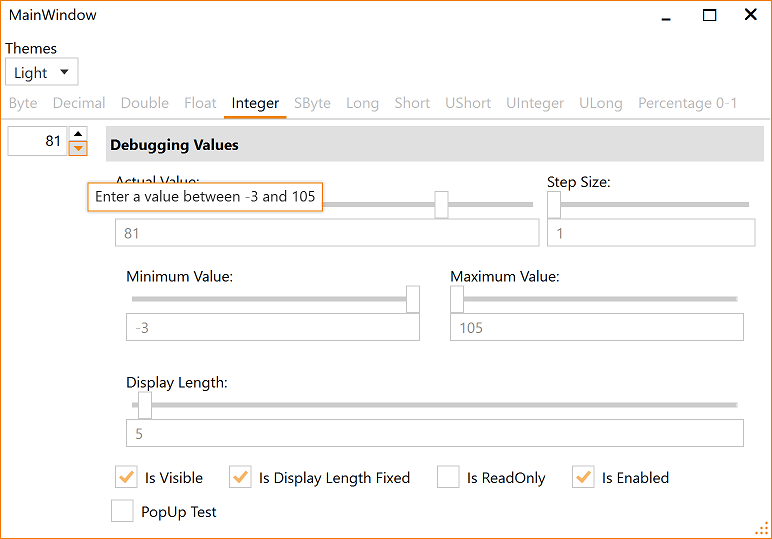
| integer | IntegerUpDown control |
| long | LongUpDown control |
| sbyte | SbyteUpDown control |
| short | ShortUpDown control |
| ushort | UshortUpDown control |
| uint | UintUpDown control |
| ulong | UlongUpDown control |
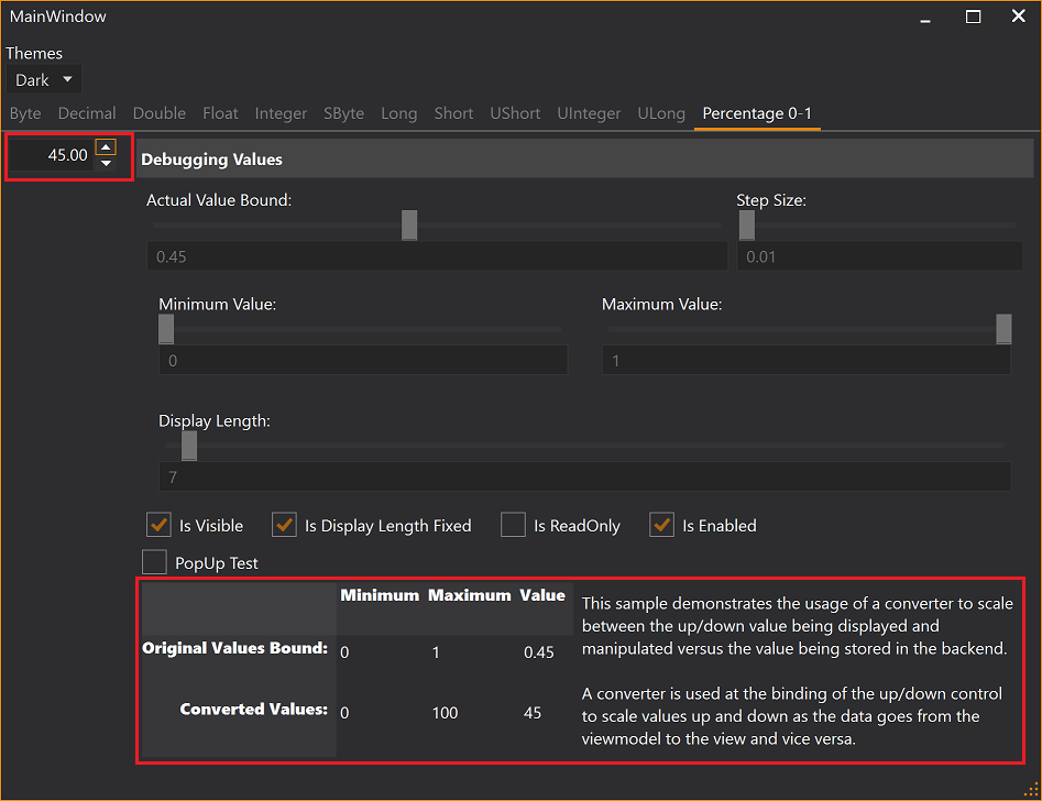
Percentages can be edit at [0-100] while backend viewmodels handles [0-1] values, see FactorToDoubleConverter and PercentageUpDownDemo in demo clients at project site.
Controls are fully themeable. Project site contains demos for:
- Dark/Light theme and
- Generics theme test clients.
More Features:
- Small Increments and Decrements can be configured to be 1 or any greater value than 1.
- Large Small Increments and Decrements can be configured to be 10 or any other value greater 1.
- The width of the control can be configured to be fixed (textbox will scroll inside when text is too large)
- Up/Down button is disabled when min or max limit is already reached
- Up/Down button can be configured to be invisible
- Mouse drag mode for editing value can be enabled/disabled
- SelectAll on GotFocus of TextBox
- IsReadOnly property disables the textbox portion but leaves all other funtions for Increment/Decrement available
LargeStepSize and StepSize
There are mouse and keyboard input methods that support 2 different configurable increment/decrement values.
Mouse Drag Mode
The user can hover the mouse over the textbox portion of the control and:
- left click/drag vertically or
- left click/drag horizontally
to change the current value with the size configured in StepSize or LargeStepSize dependency property.
Mouse Wheel
The user can hover the mouse over the textbox portion and spin the mouse wheel with:
- no modifier key pressed or
- a modifier key pressed
to change the current value with the size configured in StepSize or LargeStepSize dependency property.
The modifier key for changing the value with LargeStepSize can be configured in the MouseWheelAccelaratorKey dependency property.
Cursor Keys
The user can click into the textbox portion of the control and:
- press cursor left or right or
- press cursor up and down
to change the current value with the size configured in StepSize or LargeStepSize dependency property.
Demo Applications
There is a demo application that shows the usage of the control (Light/Black themes enabled) and documents the features, such as, the ability to configure a minimum and maximum value that can be used to keep the resulting value within a given bound.
Theming
Load Light or Dark brush resources in you resource dictionary to take advantage of existing definitions.
    <ResourceDictionary.MergedDictionaries>
        <ResourceDictionary Source="/NumericUpDownLib;component/Themes/DarkBrushs.xaml" />
</ResourceDictionary.MergedDictionaries> <ResourceDictionary.MergedDictionaries>
<ResourceDictionary Source="/NumericUpDownLib;component/Themes/LightBrushs.xaml" />
</ResourceDictionary.MergedDictionaries>These definitions do not theme all controls used within this library. You should use a standard theming library, such as:
- MahApps.Metro,
- MLib, or
- MUI
to also theme standard elements, such as, button and textblock etc.
Visit the project's Wiki for more details.