playcanvas / Pcui
Programming Languages
Projects that are alternatives of or similar to Pcui
PCUI - User interface component library for the web
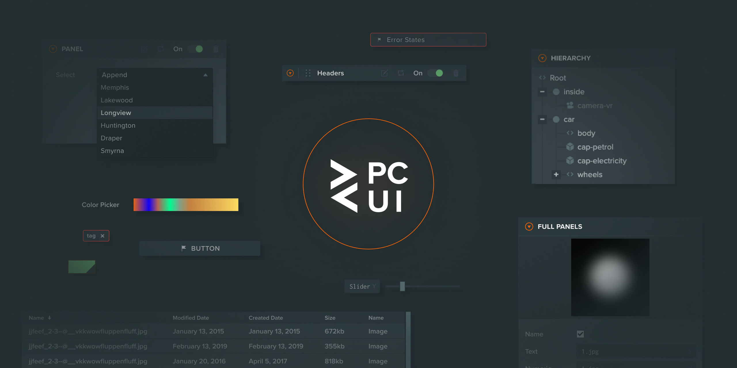
This library enables the creation of reliable and visually pleasing user interfaces by providing fully styled components that you can use directly on your site. The components are useful in a wide range of use cases, from creating simple forms to building graphical user interfaces for complex web tools.
A full guide to using the PCUI library can be found here.
Storybook
If you wish to view which components are available in this library, you can run Storybook. It allows you to browse the entire collection of components. Each component page also includes component documentation and allows you to test each component in all of it's configuration states.
Run Storybook as follows:
npm install
npm run storybook
Getting Started
To build the component library, run the following in the projects directory:
npm install
npm run build
This will build the entire library to the output path dist. The various parts of the library will be available to import from that path:
- ES6 Components:
dist/pcui.js - React Components:
dist/pcui-react.js - Data Binding:
dist/pcui-binding.js
You can then import the ES6 components into your own .js files and use them as follows:
import { Label } from 'dist/pcui.js';

const helloWorldLabel = new Label({
    text: 'Hello World'
});
If you are more familar with react, you can import react elements into your own .jsx files and use them as follows:
import { Label } from 'dist/pcui-react.js';

const helloWorldLabel = () => <Label text="Hello World" />;
Including your own font
PCUI uses four css classes to add styled fonts to the various components. These are .font-regular, .font-bold, .font-thin and .font-light. You can use your own font with PCUI by adding font-family css rules to these classes on your webpage. For example:
.font-regular, .font-bold, .font-thin, .font-light {
    font-family: 'Helvetica Neue', Arial, Helvetica, sans-serif;
}
Data Binding
The pcui library offers a data binding layer that can be used to synchonise data across multiple components. It offers two way binding to a given observer object, so updates made in a component are reflected in the observers data and distributed out to all other subscribed components. A simple use case is shown below:
In this example the created label will start with Hello World as it's text value. When a user enters a value into the text input, the label will be updated with the new value.
import { BindingObserversToElement, BindingElementToObservers, Observer } from 'dist/pcui-binding.js';
import { Label, TextInput } from 'dist/pcui.js';

// create a new observer for a simple object which contains a text string
const observer = new Observer({text: 'Hello World'});
// create a label which will listen to updates from the observer
const label = new Label({
    binding: new BindingObserversToElement()
});
// link the observer to the label, telling it to use the text variable as its value
label.link(observer, 'text');
// create a text input which will send updates to the observer
const textInput = new TextInput({
    binding: new BindingElementToObservers()
});
// link the observer to the label, telling it to set the text variable on change
textInput.link(observer, 'text');
Observers can also be bound bi-directionally, in which case an element can both send and receive updates through its observer. The following example shows a two way binding between two text inputs, where either input can update the value of the other. It's been written in react to showcase binding with react components:
import { BindingTwoWay, Observer } from 'dist/pcui-binding.js';
import { TextInput } from 'dist/pcui-react.js';

// create a new observer for a simple object which contains a text string
const observer = new Observer({text: 'Hello World'});
// create two text inputs, which can both send and receive updates through the linked observer
const TextInput1 = () => <TextInput binding={new BindingTwoWay()} link={{ observer, path: 'text'} />;
const TextInput2 = () => <TextInput binding={new BindingTwoWay()} link={{ observer, path: 'text'} />;
Development
Each component exists in its own folder within the ./src/components directory. They each contain:
-
index.js: The pcui element itself, which is exported to thepcuinamespace. -
component.jsx: A react wrapper for the element, currently used to display the element in Storybook. -
index.stories.jsx: The Storybook entry for this component.
Locally developed components can be viewed & tested by running the Storybook app, as mentioned in the previous section.