power-distribution-card


The Lovelace Card for visualizing power distributions.

Table of Contents
-
Installation
-
Configuration
Presets
Simple Configuration
YAML Configuration
Animation Options
Center Panel
Advanced Configuration
-
FAQs
Installation
Installation via HACS 
- Make sure the HACS custom component is installed and working.
- Search for
power-distribution-cardand add it through HACS - Refresh home-assistant.
Manual installation
- Download the latest release of the power-distribution-card
- Place the file in your
config/wwwfolder - Include the card code in your
ui-lovelace-card.yaml
resources:
  - url: /local/power-distribution-card.js
    type: module
Or alternatively set it up via the UI:
Configuration -> Lovelace Dashboards -> Resources (TAB)
For more guidance check out the docs.
Configuration
Presets
Every Sensor you want to add has to use one of the Presets. You can add as many of these as you want.

|

|

|

|

|

|

|

|

|

|

|
| battery | car_charger | consumer | grid | home | hydro | pool | producer | solar | wind | heating |
| Any Home Battery e.g. E3dc, Powerwall | Any Electric Car Charger | A custom home power consumer | The interface to the power grid | Your Home's power consumption | Hydropower setup like Turbulent | pool heater or pump | custom home power producer | Power coming from Solar | Power coming from Wind | Radiators |
The presets consumer and producer enable to add any custom device into your Card with just a bit of tweaking.
Simple Configuration 🛠️
With Version 2.0 a Visual Editor got introduced.
You can find the Card in your Card Selector probably at the bottom.
From there on you can configure your way to your custom Card.
The easiest way to get your Card up and running, is by defining the entities for the presets directly.

! Please Check for every Sensor: positive sensor values = production, negative values = consumption
! If this is the other way around in your Case, check the `invert_value` setting (Advanced Configuration)!

Placeholder
By submitting an empty entity_id and preset, you will generate a plain transparent placeholder item which can be used to further customize your layout.

YAML Only
If you are a real hardcore YAML connoisseur here is a basic example to get things started:
type: 'custom:power-distribution-card'
title: Title
animation: flash
entities:
  - entity: sensor.e3dc_home
    preset: home
  - entity: sensor.e3dc_solar
    preset: solar
  - entity: sensor.e3dc_battery
    preset: battery
center:
  type: bars
  content:
    - preset: autarky
      name: autarky
    - preset: ratio
      name: ratio
You can find all options for every entity here. If you want to further modify the center panel youz can find the documentation here.
Animation
For the animation you have 3 options: flash, slide, none
type: 'custom:power-distribution-card'
animation: 'slide'
Center Panel
For customizing the Center Panel you basically have 3 Options:
None 🕳️
the void
Bars 📊
Bars have the following Settings:
| Setting | type | example | description |
|---|---|---|---|
bar_color |
string | red, #C1C1C1 | You can pass any string that CSS will accept as a color. |
bar_bg_color |
string | red, #C1C1C1 | The Background Color of the Bar. You can pass any string that CSS will accept as a color. |
entity |
string | sensor.ln_autarky | You can specify the entity_id here aswell. |
invert_value |
bool | false | This will invert the value recieved from HASS. This affects calculations aswell! |
name |
string | Eigenstrom | Feel free to change the displayed name of the element. |
preset |
'ratio' 'autarky' 'custom' | all in type | Option to autocalc ratio/autarky. |
tap_action |
Action Config | Configuration | Single tap action for item. |
double_tap_action |
Action Config | Configuration | Double tap action for item. |
unit_of_measurement |
string | W , kW | Default: %; The Unit of the sensor value. Should be detected automatically! |
Cards 🃏

Cards couldn't yet be included in the Visual editor in a nice way. I am working on it though. Feel free to open a Issue with suggestions.
To add a card you can simply replace the center part in the Code Editor. Be aware though: While you can switch between none and card without any issues, switching to Bars will override your settings.
For example you could insert a glance card:
center:
  type: card
  content:
    type: glance
    entities:
      - sensor.any_Sensor
Entity Configuration ⚙️
There are alot of settings you can customize your sensors with:
| Setting | type | example | description |
|---|---|---|---|
attribute |
string | deferredWatts | A Sensor can have multiple attributes. If one of them is your desired value to display, add it here. |
arrow_color |
object | {smaller:'red'} | You can Change the Color of the arrow dependant on the value. (Bigger, Equal and Smaller) |
calc_excluded |
boolean | true | If the Item should be excluded from ratio/autarky calculations |
color_threshold |
number | 0, -100, 420.69 | The value at which the coloring logic your switch on. (default: 0) |
decimals |
number | 0, 2 | The Number of Decimals shown. (default: 2) |
display_abs |
boolean | false | The displayed values are Absolute normally. You can change that here. |
double_tap_action |
Action Config | Configuration | Double tap action for item. |
entity |
string | sensor.e3dc_grid | You can specify the entity_id here aswell. |
hide_arrows |
bool | true | Toggeling the visibility od the arrows. |
icon |
string | mdi:dishwasher | Why not change the displayed Icon to any MDI one? |
icon_color |
object | {smaller:'red'} | You can Change the Color of the icon dependant on the value. (Bigger, Equal and Smaller) |
invert_arrow |
bool | true | This will change the arrows direction to the oposite one. |
invert_value |
bool | false | This will invert the value recieved from HASS. This affects calculations aswell! |
name |
string | dishwasher | Feel free to change the displayed name of the element. |
secondary_info_attribute |
string | min_temp | Requires Entity. Instead of Sensor, the Attribute Value gets displayed. |
secondary_info_entity |
string | sensor.e3dc_grid | entity_id of the secondary info sensor |
secondary_info_replace_name |
bool | true | This will replace the name of the item with the secondary info. |
tap_action |
Action Config | Configuration | Single tap action for item. |
threshold |
number | 2 | Ignoring all abolute values smaller than threshold. |
unit_of_display |
string | W , kW , adaptive | The Unit the value is displayed in (default: W). Adaptive will show kW for values >= 1kW |
unit_of_measurement |
string | W , kW | The Unit of the sensor value. Should be detected automatically! |
This could look something like:
entities:
  - decimals: 2
    display_abs: true
    name: battery
    unit_of_display: W
    consumer: true
    icon: 'mdi:battery-outline'
    producer: true
    entity: sensor.e3dc_battery
    preset: battery
    icon_color:
      bigger: 'green'
      equal: ''
      smaller: 'red'
Preset features
The Presets battery and grid have some additional features which allow some further customization.
For the Battery the icon can display the state of charge and the grid preset can have a small display with power sold and bought from the grid.
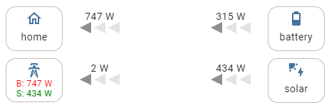
If one of those presets is selected there will be additional options in the visual editor. If you prefer yaml, here are all extra options which can be set per item:
| Setting | type | example | description |
|---|---|---|---|
battery_percentage_entity |
string | sensor.xyz | Sensor containing the battery charge percentage from 0 to 100 |
grid_buy_entity |
string | sensor.xyz | Sensor containing the imported power from the grid |
grid_sell_entity |
string | sensor.xyz | Sensor containing the sold power towards the grid |
FAQs ❓
What the heck are these autarky and ratio calculating?
So basically these bar-graphs are nice indicators to show you:
- the autarky of your home (Home Production like Solar / Home Consumption)
- the ratio / share of produced electricity used by the home (The Germans call it
Eigenverbrauchsanteil😉 )
kW and kWh is not the Same!
I know... In this case usability is more important and the user has to decide if he is ok with that.
If you find a Bug or have some suggestions, let me know here!
If you like the card, consider starring it.