ingrammicro / Puzzle Tokens
Licence: gpl-3.0
Batch create, manage and update Sketch styles and symbols using SCSS/LESS
Stars: ✭ 90
Programming Languages
javascript
184084 projects - #8 most used programming language
Projects that are alternatives of or similar to Puzzle Tokens
Html Sketchapp Cli
Quickly generate Sketch libraries from HTML documents and living style guides, powered by html-sketchapp
Stars: ✭ 631 (+601.11%)
Mutual labels: sketch-plugin, design-systems
React Redux Antdesign Webpack Starter
react + redux + ant design + react-router 4 + webpack 4 starter
Stars: ✭ 44 (-51.11%)
Mutual labels: sass, less
Design System Components
🛠 Component code and tests for the Australian Government design system
Stars: ✭ 696 (+673.33%)
Mutual labels: design-systems, sass
Rollup Plugin Postcss
Seamless integration between Rollup and PostCSS.
Stars: ✭ 507 (+463.33%)
Mutual labels: sass, less
Moo Css
模块化面向对象的css写法规范策略。适用于大中小型C端项目样式开发,旨在提高开发和维护效率。
Stars: ✭ 79 (-12.22%)
Mutual labels: sass, less
Madge
Create graphs from your CommonJS, AMD or ES6 module dependencies
Stars: ✭ 5,635 (+6161.11%)
Mutual labels: sass, less
Three Dots
🔮 CSS loading animations made by single element.
Stars: ✭ 912 (+913.33%)
Mutual labels: sass, less
Vscode Stylelint
A Visual Studio Code extension to lint CSS/SCSS/Less with stylelint
Stars: ✭ 260 (+188.89%)
Mutual labels: sass, less
Stylelint
A mighty, modern linter that helps you avoid errors and enforce conventions in your styles.
Stars: ✭ 9,350 (+10288.89%)
Mutual labels: sass, less
Rocssti
RÖCSSTI : pour démarrer vos CSS avec la patate !
Stars: ✭ 46 (-48.89%)
Mutual labels: sass, less
Style Resources Module
Nobody likes extra @import statements!
Stars: ✭ 485 (+438.89%)
Mutual labels: sass, less
Design Systems
A Sketch app plugin that help you find out popular design systems and download official Sketch UI kit.
Stars: ✭ 83 (-7.78%)
Mutual labels: sketch-plugin, design-systems
Fontisto
The iconic font and CSS toolkit. Fontisto gives you scalable vector icons that can instantly be customized: size, color, drop shadow and anything that can be done with the power of CSS.
Stars: ✭ 413 (+358.89%)
Mutual labels: sass, less
Sync.sketchplugin
Keep your design team in sync!
Stars: ✭ 357 (+296.67%)
Mutual labels: sketch-plugin, design-systems
Html Sketchapp
HTML to Sketch export solution
Stars: ✭ 1,811 (+1912.22%)
Mutual labels: sketch-plugin, design-systems
design-tokens-plugin
Support end of life! Delivering consistent Design System. A Sketch plugin that exports Design Tokens to JSON format. You can export colors, typography, icons and utilis. A must-have tool for design system project.
Stars: ✭ 100 (+11.11%)
Mutual labels: design-systems, sketch-plugin
Vue Spa
vue-spa : vue + vue-router + axios + vuex + vux 快速成型移动端项目,直接使用。欢迎star
Stars: ✭ 46 (-48.89%)
Mutual labels: sass, less
Cessie
Transpile your CSS bundle to support CSS variables, calc, and future CSS for legacy browsers.
Stars: ✭ 81 (-10%)
Mutual labels: sass, less
Puzzle Tokens
Puzzle Tokens is a Sketch plugin to specify and apply design tokens (in LESS or SCSS format) to Sketch layers (with shared styles) with auto styles preview generation.
Check this article to get a detailed overview with examples and join Spectrum Chat for live talk
Installation
- Download zip file
- Unarchive and install
- Download and install Node.js
- Instal less or sass using the following Terminal commands:
sudo -s
npm i less -g
npm i sass -g
- Now you're good to go!
Usage
- Download Example 1.
- Open Library.sketch file in Sketch.app
- Run Plugins > Puzzle Tokens > Apply Design Tokens menu command
- Specify LESS file according to screenshot
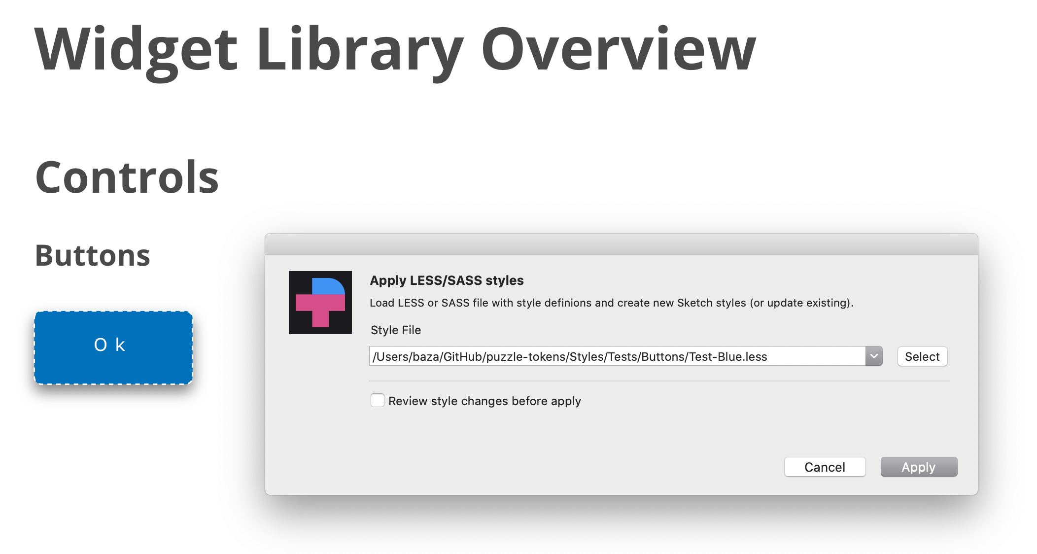
- Repeat the same operation, but select "tokens-blue.less" file. See how styles and widgets look now.
Features
The following CSS styles are supporting.
// Text Layers

.TextStyle {
    // Sketch only styles
    pt-paragraph-spacing:  23.33;
    -pt-text-size-behaviour: fixed-size;    // or "auto-height" or  "auto-width"

    // CSS native styles
    font-size:             12px;
    font-family:           "Open Sans";     // or "Open Sans","Times New Roman"
    font-weight:           bold;            // or extra-light, light, regular, medium, semibold, bold OR fa-solid (special trick to define FontAwesome solid icon)
    font-style:            italic;          // or normal
    line-height:           1.0;             // or 1.2 or 1.5 or any other mulitplier for font-size OR 10px
    color:                 #FFFFFF;         // HEX value OR any other CSS-compatible color values, such as red or black OR color variable name in double quotes
    opacity:               63%;             // supported "63%" or "0.42"
    text-transform:        uppercase;       // "uppercase", "lowercase", "none"
    text-decoration:       underline;       // "underline", "line-through"
    text-align:            left;            // "left", center", "right", "justify"
    vertical-align:        top;             // "top", "middle", "bottom"
    letter-spacing:        10px;            // <value>px OR "normal"
}

// Shape layers

.ShapeStyle {
    // SKETCH only properties
    border-position:       center;    // center OR inside OR outside
    border-line-end:            butt;      // butt / round / projecting
    border-line-join:           miter;     // miter / round / bevel
    border-start-arrowhead:     openarrow; // none / openarrow / filledarrow / opencircle / filledcircle / opensquare / filledsquare
    border-end-arrowhead:       openarrow; // none / openarrow / filledarrow / opencircle / filledcircle / opensquare / filledsquare
    -pt-border-update:          true;  // Use it if you want to replace an existing border, instead of adding a new one.
    -pt-fill-update:            true;  // Use it if you want to replace an existing fill, instead of adding a new one.

    /// CSS native properties
    background-color:      #B0AFB1;
    background-color:      linear-gradient(45deg, #000000,#B0AFB4);
    background-color:      linear-gradient(134deg, #004B3A 0%, #2D8B61 51%, #9BD77E 100%);
    background-color:      "mycolors/color01"; // assign color variable
    opacity:               63%;       // "63%" or "0.42"
    border-color:          #000000;
    border-color:          linear-gradient(45deg, #000000,#B0AFB4);
    border-color:          linear-gradient(134deg, #004B3A 0%, #2D8B61 51%, #9BD77E 100%);
    border-color:          "mycolors/color01"; // assign color variable
    border-width:          2px;
    border-style:          dotted;    // dotted OR dashed

    box-shadow:            none; // Clear any existing shadows from the layer style.
    box-shadow:            0 10px 20px 2 #FF00FF;
    box-shadow:            inset 0 10px 20px 2 rgba(0,0,0,0.1);
    box-shadow:            0 10px 20px 2 rgba(0,0,0,0.1), inset 0 10px 20px 2 rgba(0,0,0,0.1);
    -pt-shadow-update:          true;  // Use it if you want to replace any previous shadows, instead of adding a new one.

    mix-blend-mode:         normal; // normal / darken / multiply / color-burn / lighten / screen / color-dodge / overlay / difference
                                    // exclusion / hue / saturation / color / luminosity

    // !!ATTENTION!!
    // Shared styles don't include radius property,
    // still you can set the radius-border for a style.
    // Border radius will be reapplied to layers
    // through style assigned to it. You can also
    // apply it to the layers or symbols directly.

    border-radius:         5px;
    border-radius:         5px 5px 0 0;
}

// Text & Shape Layer Common Properties
.Style{
    // Sketch only styles
    -pt-layer-type:          text; // "layer" or "text" // Usefull to help PT to understnand the type of the layer
    -pt-pin-left:            true; // "true" or "false
    -pt-pin-right:           true; // "true" or "false
    -pt-pin-top:             true; // "true" or "false
    -pt-pin-bottom:          true; // "true" or "false
    -pt-fix-size-height:     true; // "true" or "false
    -pt-fix-size-width:      true; // "true" or "false
    -pt-skip-missed:         true: // "true" or "false // Usefull to skip style if no layer
                                                       // found without an error
    -pt-resize-symbol:      true:  //  resize layer owner (symbol master) to a layer size

    // The following properties are not a part of shared styles.
    // Bu you can set these properties for a shared style.
    // These properties will be reapplied to layers
    // through style assigned to it. You can also
    // apply it to the layers or symbols directly.

    width:                  100px;
    height:                 100px;

    margin-top:             10px;
    margin-left:            20px;
    margin-right:           20px;
    margin-bottom:          10px;

    // By default, margin is set relative to the layer's containing artboard or page.
    // (Specifically, the layer is moved so that it is positioned inside the artboard/
    // page at the specified margin. In the example above, the top-left corner of the
    // layer is set to x:10 and y:20 of the containing artboard.)
    //
    // If you prefer to set the margin  relative to another layer (for example, to set
    // the text layer of a button within the boundaries of the button's background
    // layer style), use the "-pt-margin-relative-to" property shown below.

    -pt-margin-relative-to: "layer name"; // set margin values relative to the specified
                                          // layer. The specified layer must be a sibling
                                          // (at the same level in a group, artboard, or
                                          // symbol) of the layer to which you are
                                          // applying the margin styles. If not specified,
                                          // margin will be set relative to the artboard
                                          // or page
    -pt-margin-resize:      true;         // if true, resize the "margin-relative-to"
                                          // layer to "fit" the size of the current layer,
                                          // plus the specified margin. This will make
                                          // the "margin-relative-to" layer surround
                                          // the current layer at exactly the requested
                                          // margin.


    -pt-valign:                     middle; // middle / top / bottom : align vertically inside a parent
}

// Group & SymbolMaster Properties
#Group{
    -pt-smartlayout:         LeftToRight; // LeftToRight OR HorizontallyCenter OR RightToLeft OR TopToBottom
                                          // OR VerticallyCenter OR BottomToTop OR None
}

// Group, SymbolMaster and Artboard Properties
#Symbol{
    -pt-fit-content:        true;        // Resize to fit content
}

// SymbolMaster properties
#Symbol{
    -pt-resize-instances:   true;        // Resize all instances of a symbol; the same as
                                         // clicking Sketch's "Shrink instance to fit
                                         // content" button in the Overrides section of
                                         // the instance. (This reapplies SmartLayout,
                                         // useful when you change the size of a symbol.)
}

// Symbol Instance Properties
#Card .IconButton {                      // Path to a symbol-instance layer

    // You can change the symbol source for a symbol override (for example, to switch
    // the icon displayed in a symbol instance). Usage is:
    // -pt-override-symbol: ('AffectedLayerName', '#Path #To #New #Symbol');
    //
    // In the example shown here, the Card symbol has a symbol instance in a layer named
    // IconButton. If that IconButton instance has a symbol override in layer RightIcon,
    // you can set the icon to a new icon by sharing its Puzzle Tokens path like so:

    -pt-override-symbol:    ('RightIcon ', '#Icons #Arrows #RightArrow');

    // Set the path to 'none' to disable the symbol override and show nothing at all.
}

#Image{
    // Required Properties
    image:                 ~"images/new-logo.jpg";  // OR transparent
    // Optional Properties
    border-color:          white;
    border-width:          3px;
    box-shadow:            0 10px 20px 2 #FF00FF;
    width:                 100px;  // OR 50 %
    height:                100px;  // OR 50 %
    top:                   11px;
    bottom:                22px;
    left:                  2px;
    right:                 33px;
}
You can look into more examples to get familiar with the plugin.
Supported Targets
You can update the following Sketch objects.
// Update shared style
.MyStyles .Group .Style1{
    color: #FFFFFF;
}

// Update symbol child style properties
#MySymbols #Buttons #Submit{
    .Text{
        color: #FFFFFF;
    }
}

// Update artboard child style properties
#MyArtboard #Group1{
    .Rectangle{
        color: #FFFFFF;
    }
}

// Assign shared style to artboard/symbol child
#MySymbols #Buttons #Submit{
    .Text{
        sktext-style: "MyStyle/Group/Style1";
    }
    .Back{
        sklayer-style: "MyStyle/Group/Back";
    }
}

// Update color variables  !!!!!!!! DONT USE GRADIENTS FOR COLOR VARIABLES. SKETCH WILL CRASH !!!!!
.--COLORS-{
    .primary{
        color:                                      black;
    }
    .secondary{
        color:                                      grey;
    }
}
Special Tricks for Selector Names
- To start a style or symbol name from a number just add --PT- prefix. So, "--PT-1 Style" will be transformed to "1 Style".
- To start a style or symbol name from a dot just use -DOT- special keyword. So, "-DOT-Style" will be transformed to ".Style"
- To use a space inside a style or symbol name you can uses a space (but formally it will not be a CSS compartible notation) or replace space by __ .So "My__First__Style" wil be transformed to "My First Style
Required Style Properties
To apply text style you need to defined at least one of the following properites:
- color
- font-family
- font-size
- font-weight
- text-transform
- text-align
- vertical-align
- pt-paragraph-spacing
For layer style:
- background-color
- border-color
- box-shadow
- border-radius
- opacity
To create _image:
- image
To assign shared style to layer:
- sklayer-style
- sktext-style
Sketch versions supported
Some styles, such as text font/transformation/etc require Sketch 53 or later. You're safe using the latest stable Sketch version to get the plugin working.
Demos
https://www.dropbox.com/s/f25cfsm26vgeu62/Recording1.mov?dl=0
Note that the project description data, including the texts, logos, images, and/or trademarks,
for each open source project belongs to its rightful owner.
If you wish to add or remove any projects, please contact us at [email protected].