QGIS visualization workshop
2021 QGIS visualization workshop
Author: Topi Tjukanov, Gispo Ltd.
Parts of this workshop are based on my blog post about the QGIS Temporal Controller and visualization methods.
The workshop was first held in September 2020 and further developer for ISSonVis 2021. It aims to cover many different tips and tricks for QGIS visualization. After this workshop participants should be able to:
- Import shared visualization resources (e.g. palettes, styles) to QGIS
- Have a good understanding of how expressions work in QGIS and how they can be used in data-driven visualizations
- How to make animated maps using QGIS either with Temporal Controller or PyQGIS
This repository contains the main building blocks of a visualization workshop workshop, but is not intended to be 100% self-study.
Prerequisites
Workshop is designed to work with QGIS 3.14.15 or newer. You can download latest QGIS version here.
Basic knowledge on using QGIS and working with spatial data helps.
Workshop
QGIS cartography tricks with expressions
What makes a beautiful map and an informative visualization? The answer is not straightforward and especially trying to cover both aspects on a single map can be very difficult. Few general tips for making impactful visualizations:
- Don’t add unnecessary elements on your map. Even ditch (or at least simplify) the background map if you can. Don’t forget that you can change your project background color and black is always cool.
- Experiment with colors and blending modes. Just like with any static map, these really give that extra touch to your outputs. Choosing the right colors is a key factor in making stunning cartography. An excellent resource to help you with that is this blog post by Datawrapper.
- Use expressions and dynamic styling. We will cover those later.
At the other end of the scale with spatial visualizations are the rustic old artistic maps whereas in the other end are the polished and clean dashboards. Trying to replicate the look and feel of old maps with modern tools is much more difficult than the latter. If we look at an example (source), we can pinpoint few things which make the map pleasing to the eye: the somewhat random locations of the symbols, a simple color palette and few different fonts which work well together.
Randomness can be inserted to QGIS visualizations easily with expressions which will be covered in this workshop later, but also through a few ready made tools. One thing to try out is the random So a bit of noise in your maps can make them look very different and more personal.
Expressions in QGIS are "SQL'ish" way to select, filter and process data. It is extremely powerful way not only to do basic data operations but also to use in visualization.
Basic expression dialog you will see all around the software looks like this:
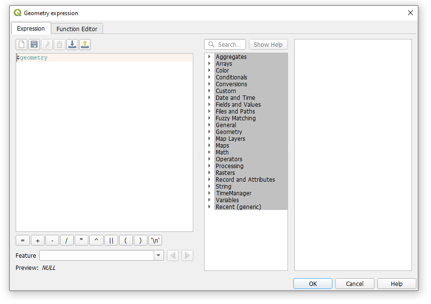
The Function List inside expressions contains functions as well as fields and values loaded from your data. In the Expression window you see the calculation expressions you create with the Function List. For the most commonly used operators, see Operators.
Browse through the functions list. Do you have an idea what those could be used for? Check out the Aggregate category. Can you think of an use case for those?
Add a layer from the data folder and open the layer symbolody from properties. Then change the style to Geometry Generator and try the following expression to create lines from polygons:
make_line(point_n( oriented_bbox(  $geometry  ),2),
   point_n( oriented_bbox(  $geometry  ),3))
What kind of results do you get?
An example of a bit longer expression with few QGIS extra flavors can be seen in the Qlimt style and the geometry generator expression.
with_variable('my_geom',
CASE WHEN
 num_geometries( $geometry)>1
 THEN
   geometry_n(  $geometry,  @geometry_part_num)
  ELSE
    $geometry
  END,
  with_variable('shape',rand(1,4),
  CASE WHEN
  @shape =1
  THEN
  minimal_circle( @my_geom )
  WHEN
  @shape =2
  THEN
  oriented_bbox( @my_geom )
  WHEN
  @shape =3
  THEN
  oriented_bbox( @my_geom )
  WHEN
  @shape =4
  THEN
   simplify(@my_geom, rand(1,20))
  END))
Note when writing expressions that fields name should be double-quoted. Values or string should be simple-quoted.
Try adding the finland_municipalities.geojson file from the data folder to your project and create a geometry generator style for it and paste the expression above to the layer. Try editing the style and see how the shapes change.
Importing visualization resources
Most of the resources QGIS uses for visualization is XML-based or text based. This means that exporting and importing data is relatively easy. First add layer from the data folder to your QGIS project (e.g. the countries dataset)
I have shared some of my QGIS resources to a separate repository.
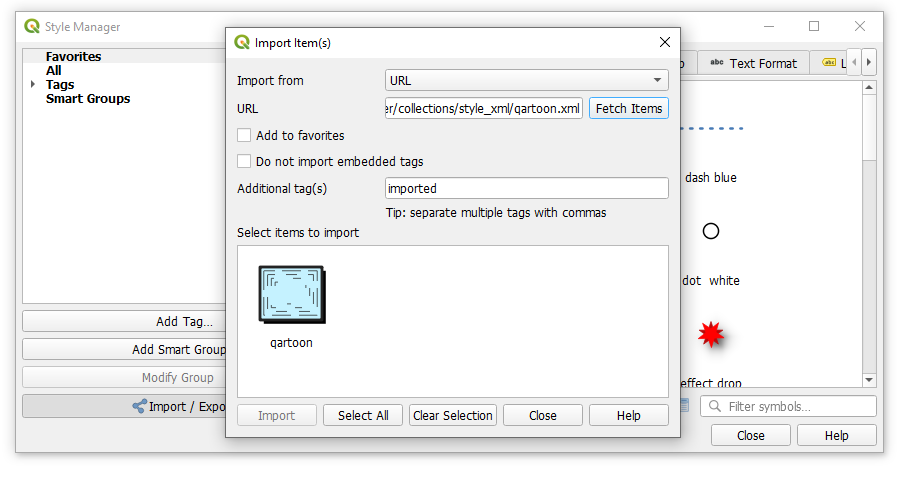
QGIS community has also released a centralized QGIS style collection. Via the style hub you can search and use some of the awesome styles published there.
Try to import a few styles from the QGIS style collection and apply those to your layers.
QGIS Temporal Controller
From version 3.14 onwards QGIS has had a functionality to visualize temporal data better called Temporal Controller. Previously this has been possible with the Time Manager plugin.
You need to acquire a vector dataset with some information about time and preferably in a valid way. In QGIS the basic valid datetime format is YYYY-MM-DD hh:mm:ss, but the Temporal Controller can work also only with date information (e.g. . YYYY-MM-DD). Read more about different types to represent date and time from my old blog post. Temporal Controller configuration offers you the following options:
- Fixed time range. Here you can manually select when ALL the features of the layer will be drawn on the map. This option doesn’t require the data to have any date or time fields. Could be helpful e.g. with a background layer in your animation.
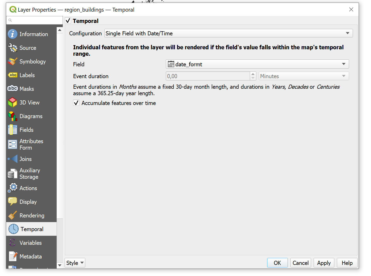
- Single field with Date/Time. This option only requires one attribute and set the event duration manually for all features. See more below.
- Separate Fields for Start and End Date/Time. Your data should have two attributes with start and end times. Individual features that interact with the maps temporal extent will be rendered.
- Separate Fields for Start and Event Duration. Like the ones above, this also works on individual features, but event duration should be read from the data.
- Start and End Date/Time from Expressions. If your data does not have a valid datetime column you can use this option to make one form existing fields.
- Redraw Layer Only. Like the first option, but layer gets redrawn on every frame. The first option and this are probably the biggest changes compared to the Time Manager plugin. This basically allows you to redraw layers even without a temporal attribute. You can for example use random values here that change on every frame or parse out seconds from. You can get some crazy ideas by applying the ideas from this presentation by Nyall Dawson.
The data folder contains a shapefile with all the buildings in the Helsinki region called region_buildings.shp. . Add this to your project and open up the layer properties and find the Temporal tab.
After this you need to activate the Temporal Controller panel in your project (the clock icon) and turn on the animated view (the green button). The animated view allows you to browse back and forth with the building data and see how the region has developed.
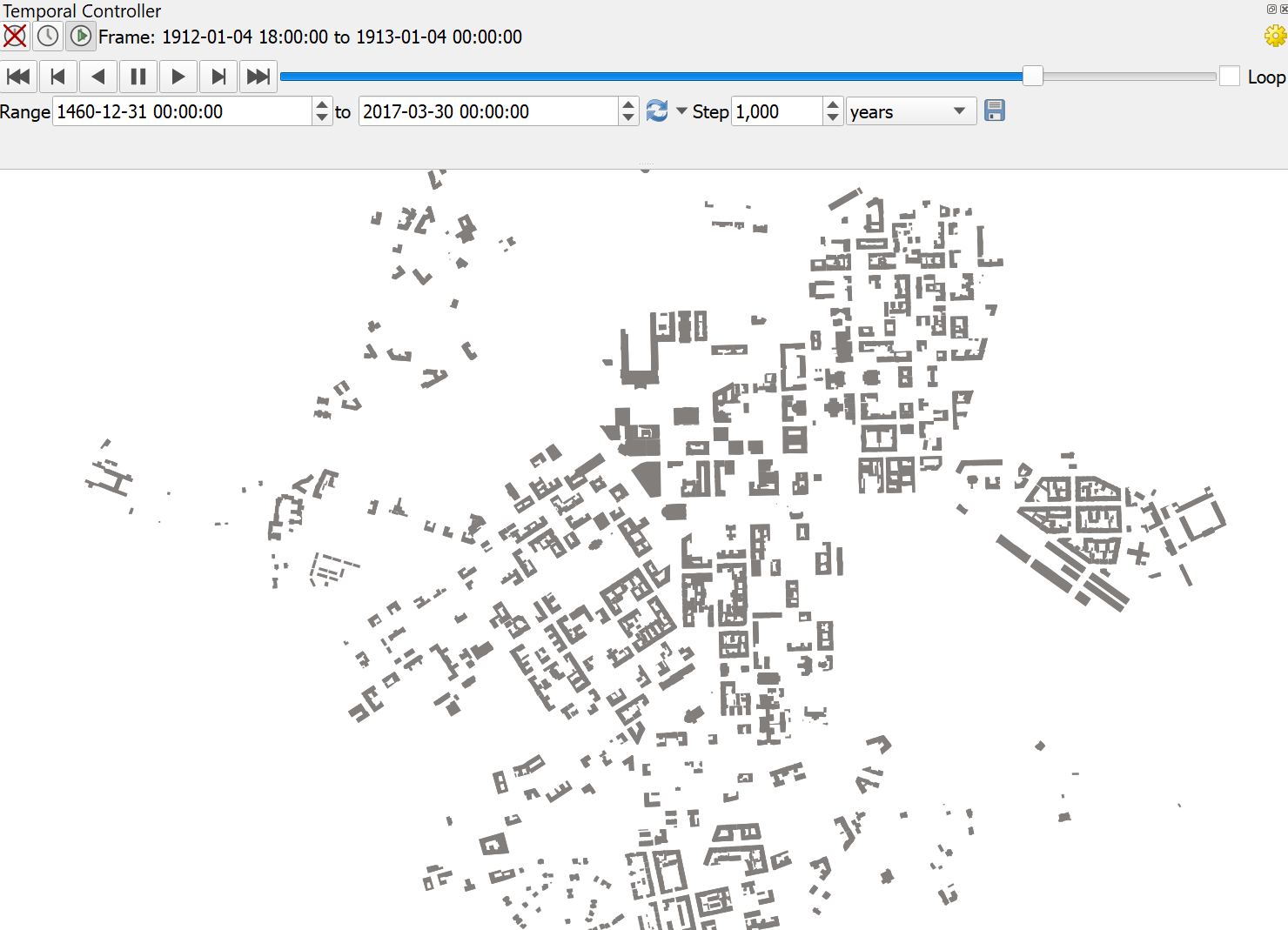
If there was also a dataset with demolished buildings this could be even more informative and interesting. This could be exported in to an animated gif or a video. If you want to add some basemaps to your QGIS, check out this script.
Try to visualize the buildings in an informative way. What kind of information is important when building this type of animation?
Creating a dashboard with QGIS
Dashboards seem to be a thing currently in data visualization. So let's jump on the bandwagon and try to build one using QGIS. First thing a dashboard needs is data that is updating on regular basis. In this example we will use ship locations form the Digitraffic API.
QGIS can read an API that returns valid GeoJSON directly from an URL without needing to save it to disk first. You can try that out by opening up the Data Source Manager and pasting this layer in there: https://meri.digitraffic.fi/api/v1/locations/latest
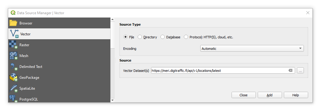
This should load a GeoJSON layer to your project in a few seconds. In the data we are interested in the following attributes:
- mmsi: ship identification number
- sog: speed over ground
- cog: course over ground
- timestampExternal: an epoch timestamp
The API also returns some really old features, so you can first filter those out from the screen by adding a filter to the layer with a nice round epoch:
"timestampExternal">1615000000000
Even better way is to do the filtering already in the query, so try adding the following layer to your project:
https://meri.digitraffic.fi/api/v1/locations/latest?from=1615000000000|layername=OGRGeoJSON
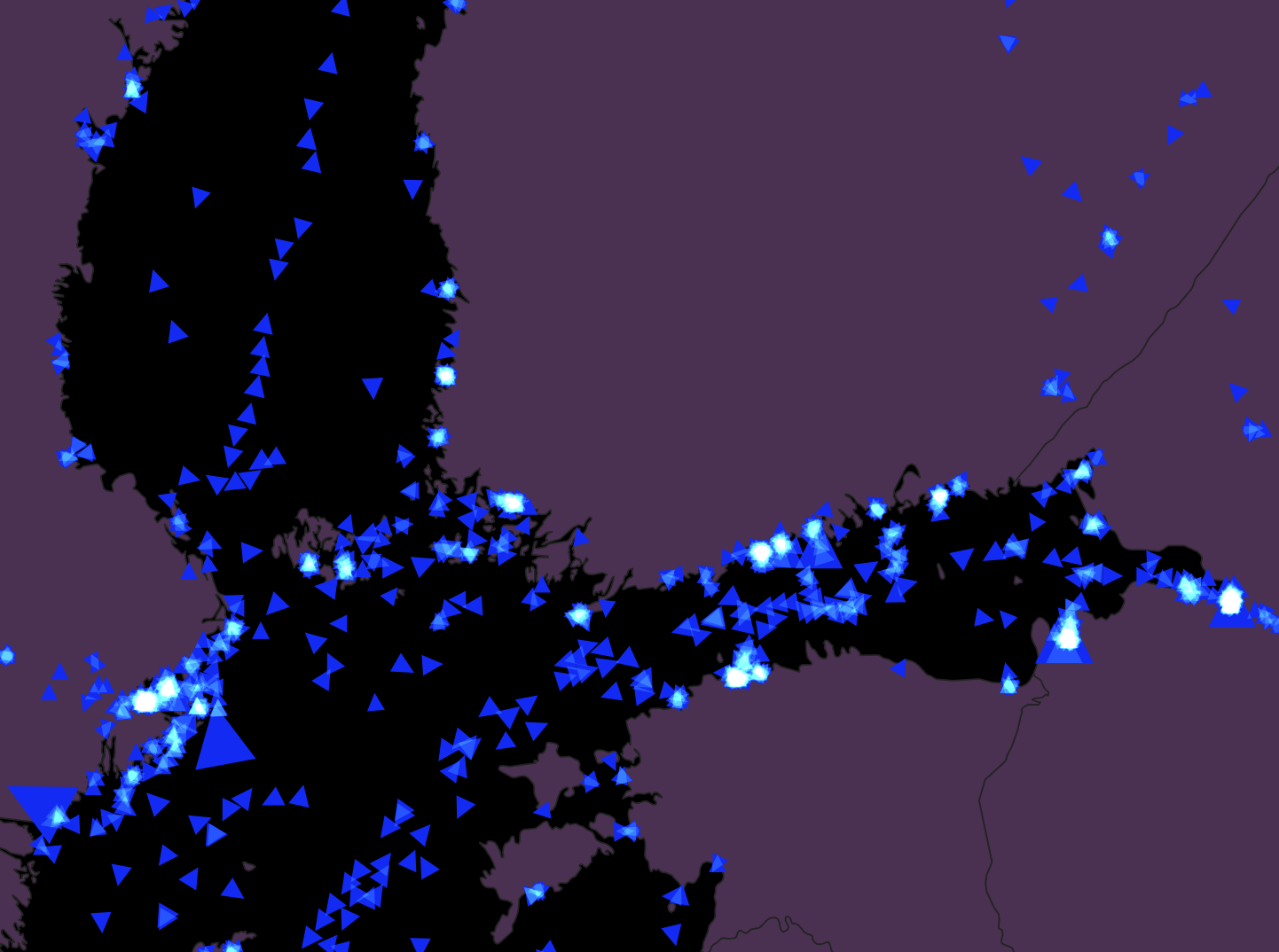
First thing you need to do for a real dashboard look is to set the project background color to black. You can do this from project properties. Next up we need to start working with expressions and use them in styling. Open up the symbol size expression dialog here:
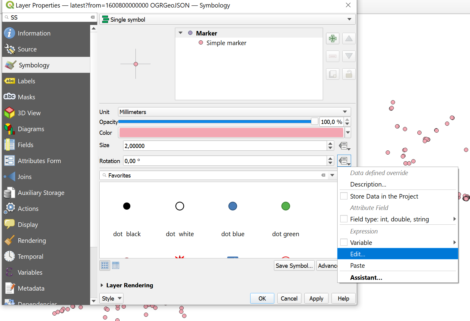
To make the ships scaled by their speed value, insert the following expression to the dialog:
2 + ("sog"/20)
To rotate the symbols we can use another attribute from the data. Open again the expression dialog from the small black arrow and enter the following expression as the value:
"cog"
Use your styling skills to make it look like a dashboard. Change the project CRS if necessary and add background information if necessary.
As a last step, to make the data update automatically, we can use PyQGIS to reload the source on regular intervals. Get the autoupdate_ships.py from the scripts forlder (Big thanks to Keith Jenkins!) and open it up in the Python console (Ctrl + Alt+ P).
This scipt updates a layer based on the name. So first we have to rename the ship layer to ship_autoUpdate. Leave it running and admire your dashboard. For the ultimate look you should press Ctrl+ Shift + Tab to enter map only mode.
Conclusions
This repository is work in progress. It was first created in September 2020 and the idea is to iterate the contents further in later workshops. PR's and issues (e.g. on content proposals) are welcome!