RangeUISlider


An iOS range selection slider compatible with UIKit and SwiftUI. Developed using autolayout and highly customizable using @IBDesignabled and @IBInspectable or programmatically. It support also RTL (right to left) languages automatically out of the box.
Installation
There are three ways to install RangeUISlider in your project: manual installation, as a stand-alone framework or using cocoapods.
Manual installation
To manually install RangeUISlider simply drag and drop all the file contained in the Source folder inside your project.
Framework
RangeUISlider is available also as a framework. To install it follow the standard procedure used to install a custom cocoa touch framework:
- drag the RangeUISlider.xcodeproj inside your project
- add it to the Embedded Binaries/Linked Frameworks and Libraries section of your project.
See the RangeUISliderDemo demo project/target for an example of the setup of the framework.
CocoaPods
RangeUISlider is also available as a pod on CocoaPods. Add the dependency to your Podfile similar to the following:
target 'MyApp' do
    pod 'RangeUISlider', '~> 3.0'
end
and then run pod install (or pod update).
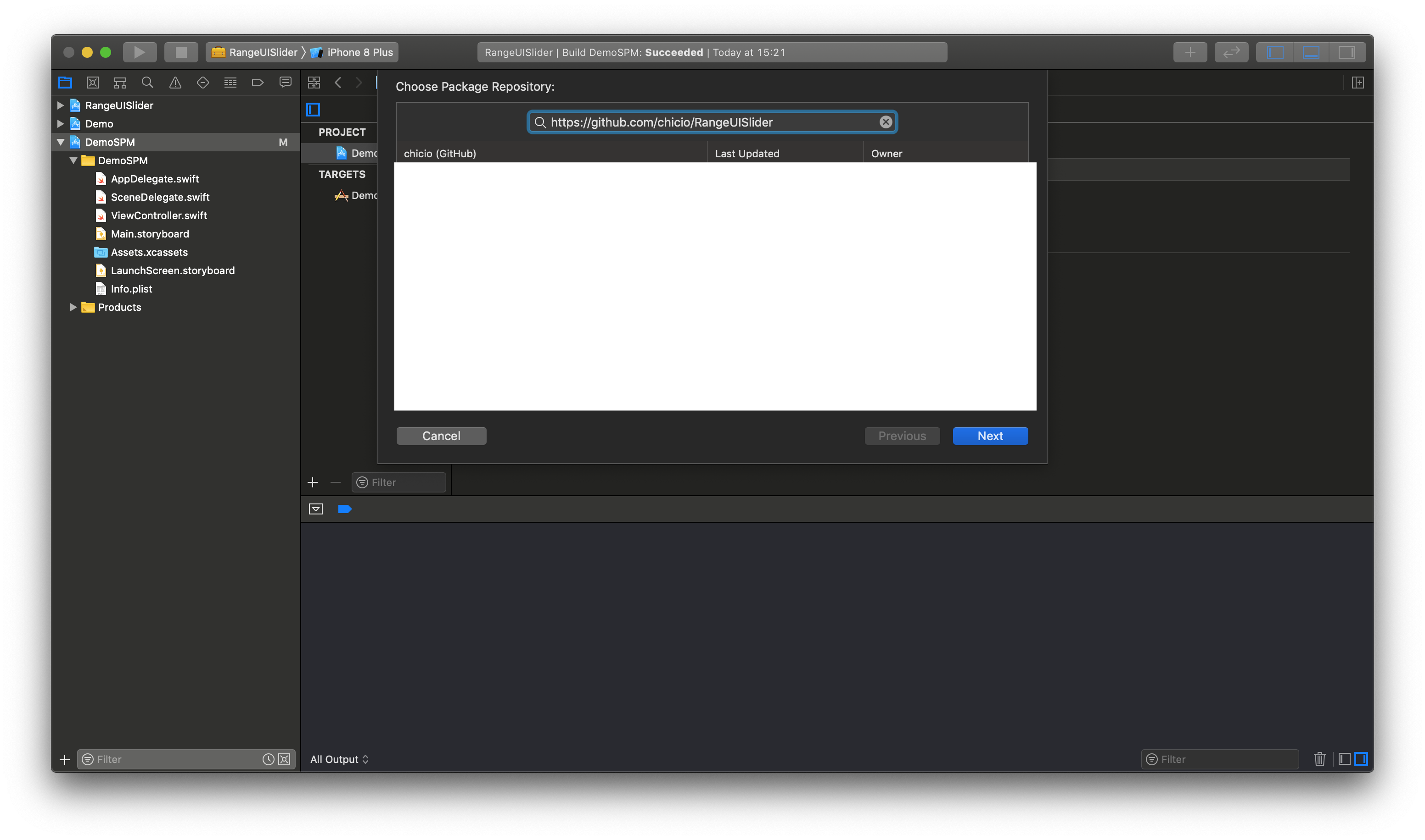
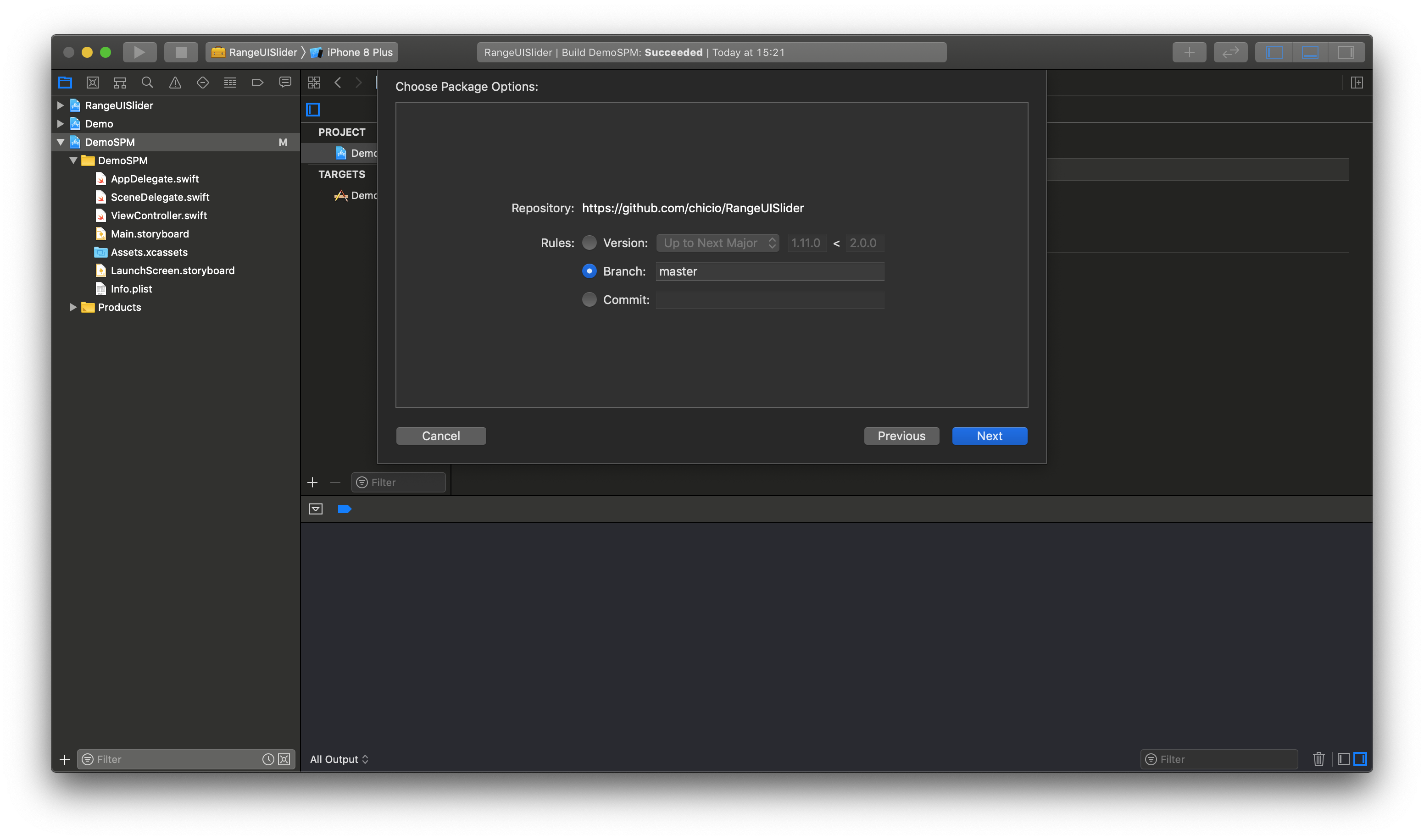
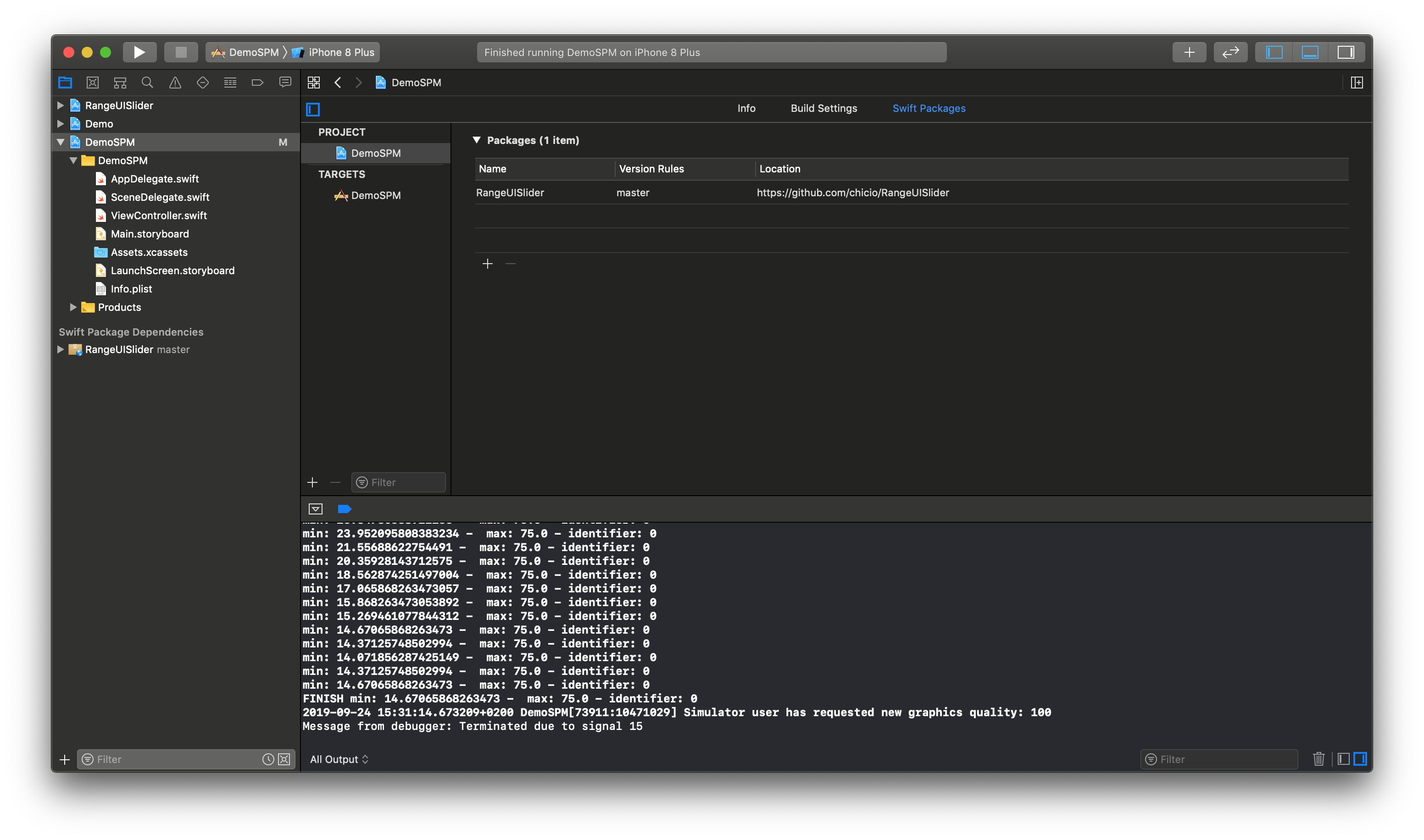
Swift Package Manager (SPM)
RangeUISlider is also available as a SPM package. Add it from the project configuration using the Github repository url. Choose master or a tag. If you choose the tag it must be >= 1.11.0.
Usage
You can use RangeUISlider in three ways:
- in a
UIKitproject using Interface Builder (thanks to@IBDesignableand@IBInspectable) - in a
UIKitproject programmatically - in a
SwiftUIproject using theRangeSliderwrapper created usingUIViewRepresentable
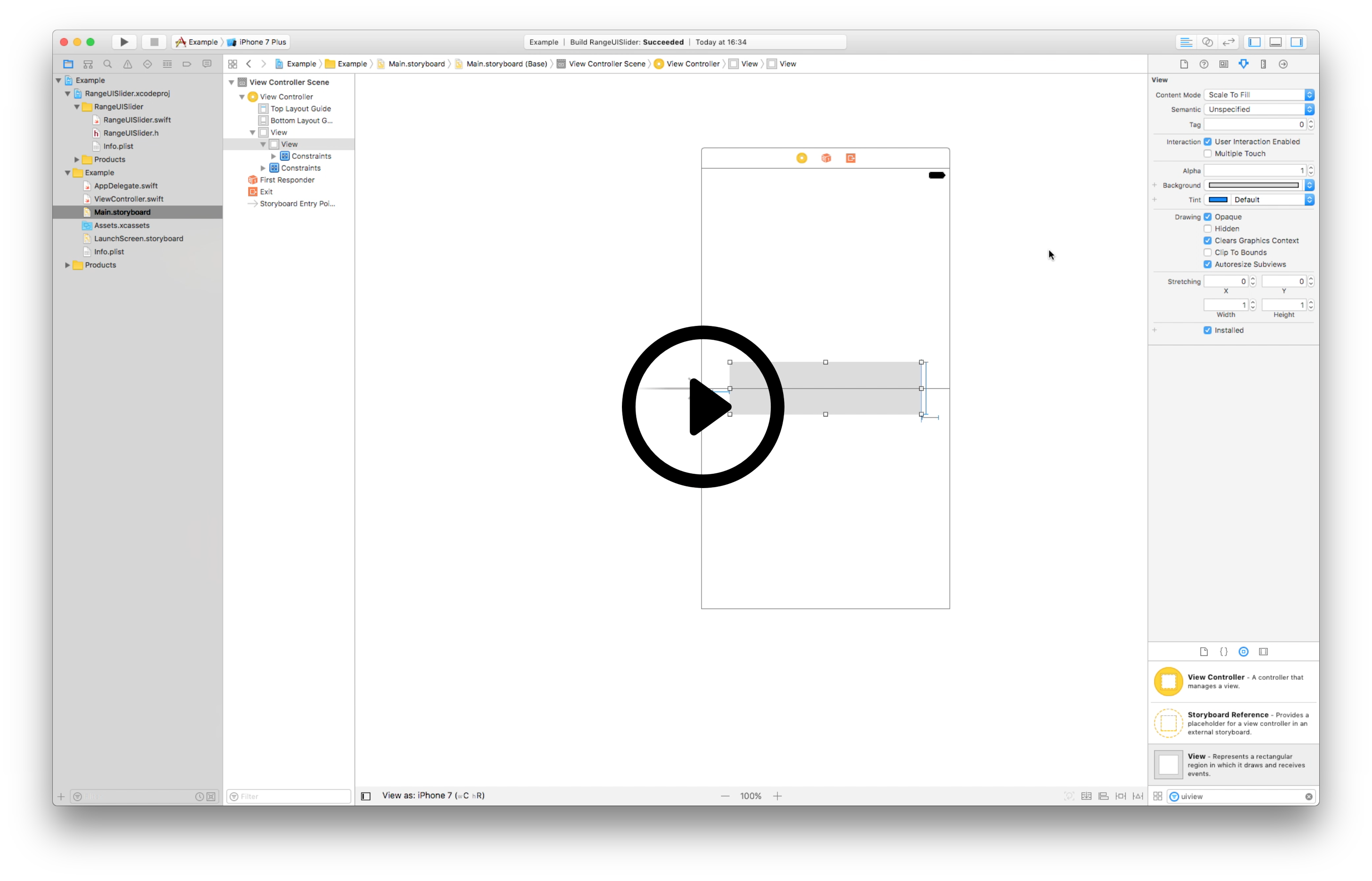
Interface builder
To levearege the power of the RangeUISlider in interface builder:
- drag a UIView into you storyboard
- set
RangeUISlideras custom class of that view- IMPORTANT: set also the Module to RangeUISlider if you used cocoapods or the framework version during installation
- start editing it using interface builder (and levearage the power of
@IBDesignabledand@IBInspectable)
Here you can find a video tutorial for the setup with Interface Builder.
Programmatic
You can also use RangeUISlider as a programmatic UI component by setting all the property you need in your code. Take a look at the RangeUISliderDemo project to see multiple example (e.g. take a look at this contrroller. In particular, remember to set translatesAutoresizingMaskIntoConstraints = false for the slider to use autolayout. Below you can find a simple example.
override func viewDidLoad() {
    // ...other code

    super.viewDidLoad()
    rangeSlider = RangeUISlider(frame: CGRect(origin: CGPoint(x: 20, y: 20), size: CGSize(width: 100, height: 50)))
    rangeSlider.translatesAutoresizingMaskIntoConstraints = false
    rangeSlider.delegate = self
    rangeSlider.barHeight = 20
    rangeSlider.barCorners = 10
    rangeSlider.leftKnobColor = #colorLiteral(red: 0.5725490451, green: 0, blue: 0.2313725501, alpha: 1)
    rangeSlider.leftKnobWidth = 40
    rangeSlider.leftKnobHeight = 40
    rangeSlider.leftKnobCorners = 20
    rangeSlider.rightKnobColor = #colorLiteral(red: 0.5725490451, green: 0, blue: 0.2313725501, alpha: 1)
    rangeSlider.rightKnobWidth = 40
    rangeSlider.rightKnobHeight = 40
    rangeSlider.rightKnobCorners = 20
    self.view.addSubview(rangeSlider)

    // ...other code
}
SwiftUI
You can use RangeUISlider in a SwiftUI application/screen by leveraging the RangeSlider wrapper created using UIViewRepresentable. Below you can find a small example of the usage in a simple screen. You can find more example in the RangeUISliderDemo demo project (look here).
var body: some View {
        VStack {
            // ...other code

            RangeSlider(minValueSelected: <binding value>, maxValueSelected: <binding value>)
                .leftKnobColor(Color(#colorLiteral(red: 0.5725490451, green: 0, blue: 0.2313725501, alpha: 1)))
                .leftKnobWidth(40)
                .leftKnobHeight(40)
                .leftKnobCorners(20)
                .rightKnobColor(Color(#colorLiteral(red: 0.5725490451, green: 0, blue: 0.2313725501, alpha: 1)))
                .rightKnobWidth(40)
                .rightKnobHeight(40)
                .rightKnobCorners(20)

             // ...other code
        }
}
Access range values
You can access the range values in two ways, depending on the fact that you're using RangeUISlider in a UIKit or SwiftUI view:
- for
UIKit, useRangeUISliderDelegateand the delegate property - for
SwiftUI, use theRangeSlider.minValueSelectedandRangeSlider.maxValueSelectedbinding values
UIKit - RangeUISliderDelegate
To get the current values from the slider in a UIKit project, set the slider delegate property. The delegate of RangeUISlider must implement the RangeUISliderDelegate protocol, that has three methods:
/**
 Calls the delegate when the user has started the change of the range.
 */
 @objc optional func rangeChangeStarted()

/**
 Calls the delegate when the user is changing the range by moving the knobs.

 - parameter minValueSelected: the minimum value selected.
 - parameter maxValueSelected: the maximum value selected.
 - parameter slider: the slider on which the range has been modified.
 */
 @objc optional func rangeIsChanging(minValueSelected: CGFloat, maxValueSelected: CGFloat, slider: RangeUISlider)

/**
 Calls the delegate when the user has finished the change of the range.

 - parameter minValueSelected: the minimum value selected.
 - parameter maxValueSelected: the maximum value selected.
 - parameter slider: the slider on which the range has been modified.
 */
 @objc func rangeChangeFinished(minValueSelected: CGFloat, maxValueSelected: CGFloat, slider: RangeUISlider)
SwiftUI - Binding values
You can access the values of the slider in a SwiftUI project by passing two bindings properties to the RangeSlider init. See the example below.
struct SwiftUIHostingView: View {
    @State private var minValueSelected: CGFloat = 10
    @State private var maxValueSelected: CGFloat = 40

    var body: some View {
        VStack {
            RangeSlider(minValueSelected: self.$minValueSelected, maxValueSelected: self.$maxValueSelected)
                .scaleMinValue(5)
                .scaleMaxValue(80)
                .defaultValueLeftKnob(10)
                .defaultValueRightKnob(40)
                .leftKnobWidth(40)
                .leftKnobHeight(40)
                .leftKnobCorners(20)
                .rightKnobColor(Color(#colorLiteral(red: 0.5725490451, green: 0, blue: 0.2313725501, alpha: 1)))
                .rightKnobWidth(40)
                .rightKnobHeight(40)
                .rightKnobCorners(20)
        }
    }
}
Change knob current values programmatically (only UIKit)
You can also change the values of the slider knobs by calling this two API:
func changeLeftKnob(value: CGFloat)to change programmatically the left knob valuefunc changeRightKnob(value: CGFloat)to change programmatically the right knob value
The value passed to these methods should be in the slider range values (see the next section of the documentation to understand how to customize the slider range). Take a look at the example in the ChangeProgrammaticViewController contained in the demo project to understand how to use these API.
Customizable properties
This is the list of the RangeUISlider customizable properties directly from Interface Builder/programmatically (UIKit) or by using the RangeSlider access modifiers (SwiftUI):
- identifier of the slider (Int )
- range minimum value (CGFloat)
- range maximum value (CGFloat)
- step increment value (CGFloat)
- default starting value left knob (CGFloat)
- default starting value right knob (CGFloat)
- range selected color
- range selected image (override range selected color property)
- range selected edge inset top, left, bottom, right (used only if range selected image has been setted)
- range selected gradient color 1 (override range selected color and image)
- range selected gradient color 1 (override range selected color and image)
- range selected gradient start point (used only if range selected gradients color has been choosed)
- range selected gradient end point (used only if range selected gradients color has been choosed)
- range not selected color
- range not selected image (override range not selected color property)
- range not selected edge inset top, left, bottom, right (used only if range not selected image has been setted)
- range not selected gradient color 1 (override range not selected color and image)
- range not selected gradient color 1 (override range not selected color and image)
- range not selected gradient start point (used only if range not selected gradients color has been choosed)
- range not selected gradient end point (used only if range not selected gradients color has been choosed)
- left knob width
- left knob height
- left knob corners radius
- left knob color
- left knob image (override color)
- left knob shadow opacity
- left knob shadow color
- left knob shadow offset
- left knob shadow radius
- left knob gradient color 1 (override left knob color and image)
- left knob gradient color 2 (override left knob color and image)
- left knob gradient start point (used only if left knob gradients color has been choosed)
- left knob gradient end point (used only if left knob gradients color has been choosed)
- left knob border width
- left knob border color
- right knob width
- right knob height
- right knob corners radius
- right knob color
- right knob image (override color)
- right knob shadow opacity
- right knob shadow color
- right knob shadow offset
- right knob shadow radius
- right knob gradient color 1 (override right knob color and image)
- right knob gradient color 2 (override right knob color and image)
- right knob gradient start point (used only if right knob gradients color has been choosed)
- right knob gradient end point (used only if right knob gradients color has been choosed)
- right knob border width
- right knob border color
- bar height
- bar leading distance from container view
- bar trailing distance from container view
- bar corners
- bar shadow opacity
- bar shadow color
- bar shadow offset
- bar shadow radius
- bar border width
- bar border color
- show knobs labels
- knobs label top position
- knobs label font size
- knobs label font color
- knobs label number of decimal
Documentation
You can find the complete api documentation on fabrizioduroni.it.
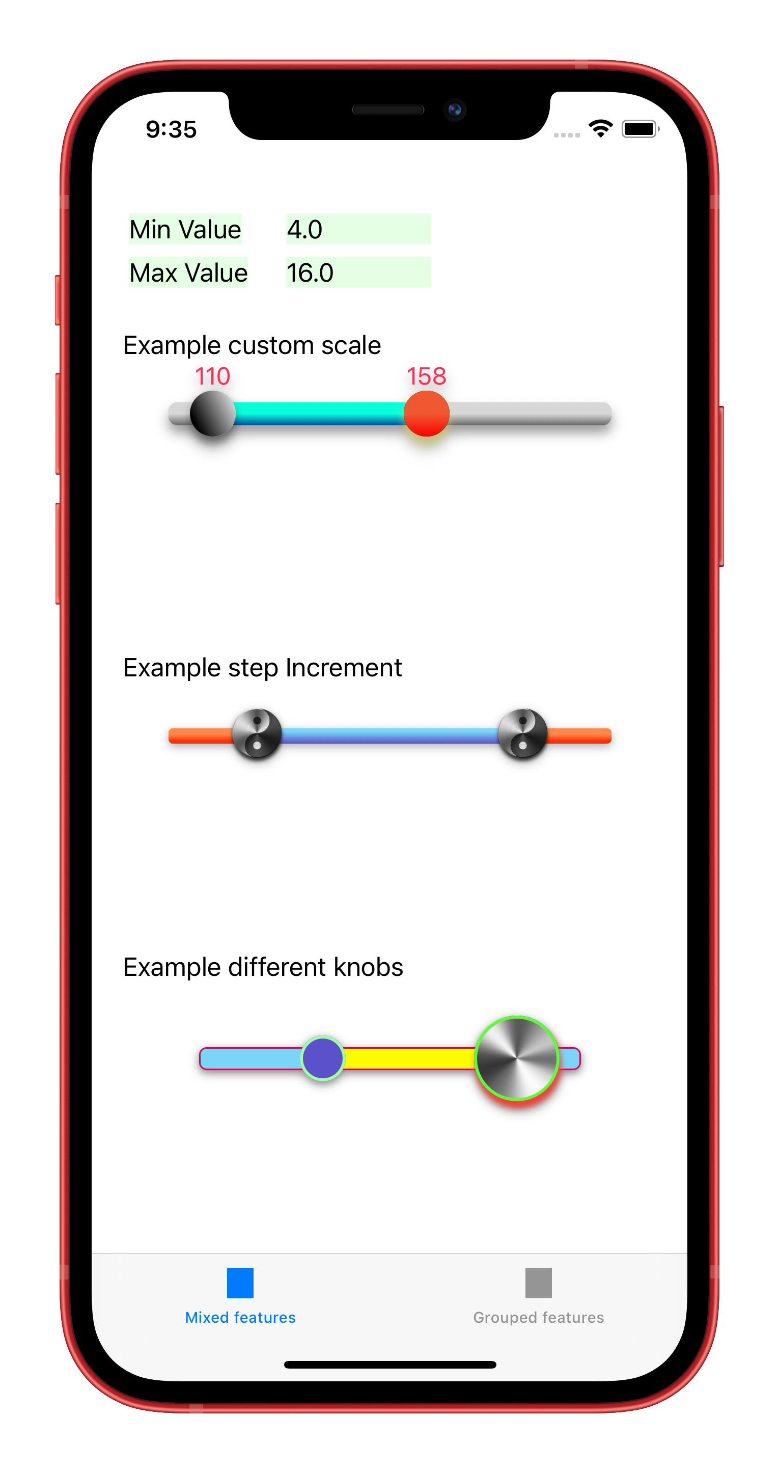
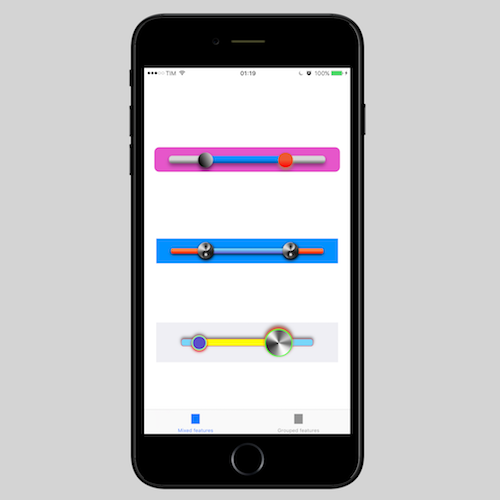
Examples
In the following screenshot you can find some examples of the level of customization that it is possible to reach. You can find this examples in the demo project.