All Projects → divyanshu013 → React Animated Weather

divyanshu013 / React Animated Weather

Licence: mit
Animated weather component for React inspired by Skycons http://darkskyapp.github.io/skycons/ ☀️

Programming Languages

javascript
184084 projects - #8 most used programming language

Projects that are alternatives of or similar to React Animated Weather

Reactprimer
React component prototyping tool that generates fully connected class component code.
Stars: ✭ 743 (+2085.29%)
Mutual labels:  react-component
React Input Number
React number input component
Stars: ✭ 7 (-79.41%)
Mutual labels:  react-component
React Notie
Simple notifications for react
Stars: ✭ 27 (-20.59%)
Mutual labels:  react-component
React Insta Stories
A React component for Instagram like stories
Stars: ✭ 777 (+2185.29%)
Mutual labels:  react-component
Sparkline
Lightweight React sparklines ✨ 📈
Stars: ✭ 19 (-44.12%)
Mutual labels:  react-component
React Planner
✏️ A React Component for plans design. Draw a 2D floorplan and navigate it in 3D mode.
Stars: ✭ 846 (+2388.24%)
Mutual labels:  react-component
Awesome React Components
Curated List of React Components & Libraries.
Stars: ✭ 28,626 (+84094.12%)
Mutual labels:  react-component
React Colorful
🎨 A tiny (2,5 KB) color picker component for React and Preact apps
Stars: ✭ 951 (+2697.06%)
Mutual labels:  react-component
React Visual Diff
React component for rendering the diff of two React elements
Stars: ✭ 22 (-35.29%)
Mutual labels:  react-component
React Absolute Grid
An absolutely positioned, animated, filterable, sortable, drag and droppable, ES6 grid for React.
Stars: ✭ 910 (+2576.47%)
Mutual labels:  react-component
React Toastify
React notification made easy 🚀 !
Stars: ✭ 8,113 (+23761.76%)
Mutual labels:  react-component
Base
React-UI-Kit - frontend library with ReactJS components
Stars: ✭ 18 (-47.06%)
Mutual labels:  react-component
React Facial Feature Tracker
React Component for Facial Feature Recognition based on the clmtracker
Stars: ✭ 13 (-61.76%)
Mutual labels:  react-component
React Lazy Load Image Component
React Component to lazy load images and components using a HOC to track window scroll position.
Stars: ✭ 755 (+2120.59%)
Mutual labels:  react-component
React Prismazoom
A pan and zoom component for React, using CSS transformations.
Stars: ✭ 29 (-14.71%)
Mutual labels:  react-component
React Maskedinput
Masked <input/> React component
Stars: ✭ 700 (+1958.82%)
Mutual labels:  react-component
Ui Box
Blazing Fast React UI Primitive
Stars: ✭ 847 (+2391.18%)
Mutual labels:  react-component
React Splide
The Splide component for React.
Stars: ✭ 32 (-5.88%)
Mutual labels:  react-component
React Grid Carousel
React responsive carousel component w/ grid layout
Stars: ✭ 29 (-14.71%)
Mutual labels:  react-component
React Hanko
A Japanese hanko component for React.js
Stars: ✭ 14 (-58.82%)
Mutual labels:  react-component

React Animated Weather

Animated weather component for React inspired by Skycons http://darkskyapp.github.io/skycons/ ☀️

Build Status npm npm

React Animated Weather

Installation

React Animated Weather is available as a node package. Get it via yarn or npm:

yarn add react-animated-weather

-or-

npm install react-animated-weather

If using npm < 5, you might want to save to your package.json:

npm install --save react-animated-weather

react-animated-weather also has peer dependencies on react, react-dom and prop-types.

Usage

Import the ReactAnimatedWeather component:

import ReactAnimatedWeather from 'react-animated-weather';

Sample usage:

import React from 'react';
import ReactAnimatedWeather from 'react-animated-weather';

const defaults = {
  icon: 'CLEAR_DAY',
  color: 'goldenrod',
  size: 512,
  animate: true
};

const App = () => (
  <ReactAnimatedWeather
    icon={defaults.icon}
    color={defaults.color}
    size={defaults.size}
    animate={defaults.animate}
  />
);

export default App;

Props:

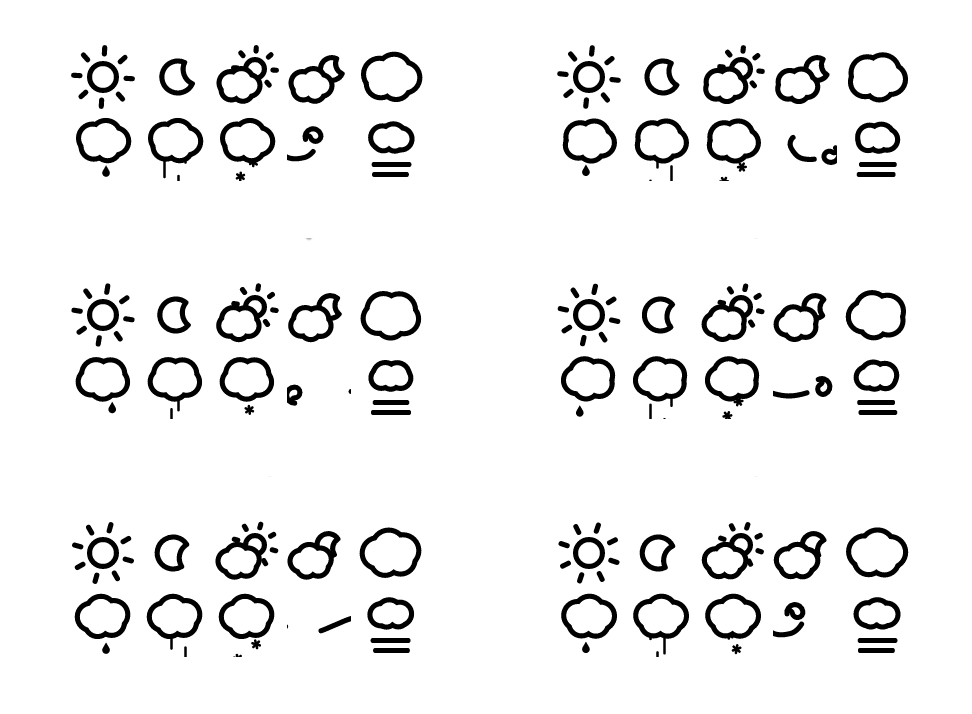
  • icon: Takes a string to display the corresponding icon out of the following

    • CLEAR_DAY
    • CLEAR_NIGHT
    • PARTLY_CLOUDY_DAY
    • PARTLY_CLOUDY_NIGHT
    • CLOUDY
    • RAIN
    • SLEET
    • SNOW
    • WIND
    • FOG
  • color: Pass a color value or hex code to color the weather component, if not passed, by default black is picked

  • size: Pass a number to size the weather component in pixels, if not passed, by default 64 is set as the size

  • animate: Pass a boolean value, if true (by default), the weather component will animate and if false, the weather component will remain static without any animation

Here are the default props used by ReactAnimatedWeather component:

ReactAnimatedWeather.defaultProps = {
  animate: true,
  size: 64,
  color: 'black'
};

ReactAnimatedWeather.propTypes = {
  icon: PropTypes.oneOf([
    'CLEAR_DAY',
    'CLEAR_NIGHT',
    'PARTLY_CLOUDY_DAY',
    'PARTLY_CLOUDY_NIGHT',
    'CLOUDY',
    'RAIN',
    'SLEET',
    'SNOW',
    'WIND',
    'FOG'
  ]).isRequired,
  animate: PropTypes.bool,
  size: PropTypes.number,
  color: PropTypes.string
};

Development

I've added a storybook for the component since it has a small number of props and the storybook interface is quite good for testing out the component. You can fire up the storybook by running:

yarn storybook

-or-

npm run storybook

Motivation

I got inspired to write this component from darkskyapp's Skycons. It makes use of the <canvas> element to render beautiful animated weather components.

Working with <canvas> in virtual DOM is a bit tricky. ReactAnimatedWeather uses a ref to refer to the DOM holding the <canvas> element and render the weather component on componentDidMount().

If you've found any bugs, please open an issue on github.

Note that the project description data, including the texts, logos, images, and/or trademarks, for each open source project belongs to its rightful owner. If you wish to add or remove any projects, please contact us at [email protected].