vaheqelyan / React Awesome Popover
A smart popover component with animation support for ReactJS
Stars: ✭ 192
Programming Languages
javascript
184084 projects - #8 most used programming language
Projects that are alternatives of or similar to React Awesome Popover
Tippyjs
Tooltip, popover, dropdown, and menu library
Stars: ✭ 9,433 (+4813.02%)
Mutual labels: popover
React Native Modal Popover
React-Native pure JS popover that uses Modal
Stars: ✭ 151 (-21.35%)
Mutual labels: popover
Bootstrap Popover Picker
Generic Bootstrap plugin template for building selector components with popovers.
Stars: ✭ 95 (-50.52%)
Mutual labels: popover
Electron Menubar
Boilerplate for electron menubar application with PopOver with React + Webpack
Stars: ✭ 145 (-24.48%)
Mutual labels: popover
Popover
Angular CDK Popover, no default style, examples using @angular/material
Stars: ✭ 156 (-18.75%)
Mutual labels: popover
Tippyjs React
React component for Tippy.js (official)
Stars: ✭ 1,081 (+463.02%)
Mutual labels: popover
React Popper Tooltip
A React hook to effortlessly build smart tooltips.
Stars: ✭ 149 (-22.4%)
Mutual labels: popover
Driver.js
A light-weight, no-dependency, vanilla JavaScript engine to drive the user's focus across the page
Stars: ✭ 13,154 (+6751.04%)
Mutual labels: popover
Carol Xamarin
A minimal and beautiful lyrics app for macOS built with Xamarin and C#
Stars: ✭ 97 (-49.48%)
Mutual labels: popover
React Popper
🍿⚛Official React library to use Popper, the positioning library
Stars: ✭ 2,173 (+1031.77%)
Mutual labels: popover
Hugo Bootstrap Premium
Hugo appernetic bootstrap premium theme
Stars: ✭ 82 (-57.29%)
Mutual labels: popover
Material Ui Popup State
boilerplate for common Material-UI Menu, Popover and Popper use cases
Stars: ✭ 186 (-3.12%)
Mutual labels: popover
Sheeeeeeeeet
Sheeeeeeeeet is a Swift library for creating menus, custom action sheets, context menus etc.
Stars: ✭ 1,177 (+513.02%)
Mutual labels: popover
React Layer Stack
Layering system for React. Useful for popover/modals/tooltip/dnd application
Stars: ✭ 152 (-20.83%)
Mutual labels: popover
React Native Popover View
A well-tested, adaptable, lightweight <Popover> component for react-native
Stars: ✭ 191 (-0.52%)
Mutual labels: popover
Mcpicker Ios
McPicker is a customizable, closure driven UIPickerView drop-in solution with animations that is rotation ready.
Stars: ✭ 186 (-3.12%)
Mutual labels: popover
React Native List Popover
Popover to render a selectable list
Stars: ✭ 168 (-12.5%)
Mutual labels: popover
Starting with v5.0.0, this component is no longer based on Popper.js, which used react-popper. to use react-popper based popover you must use version 4.1.0
React-awesome-popover
Installation
via NPM
npm i react-awesome-popover
via CDN (unpkg)
https://unpkg.com/[email protected]/build/index.umd.js
UMD library exposed as ReactAwesomePopover
const Popover = ReactAwesomePopover;
Example
ReactDOM.render(
  <Popover>
    <button>The Target</button>
    <div>The content</div>
  </Popover>,
  document.body
);
The component supports server-side rendering
You can also use nested popovers
ReactDOM.render(
  <Popover>
    <button>The Target</button>
    <div>
      ...
      <Popover>
        <button>The Target</button>
        <div>
          ...
          <Popover>
            <button>The Target</button>
            <div>The content</div>
          </Popover>
          ...
        </div>
      </Popover>
      ...
    </div>
  </Popover>,
  document.body
);
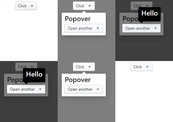
Performing an animation
<Popover>
  <button>Click</button>
  <Motion defaultStyle={{ opacity: 0 }} style={{ opacity: spring(1) }}>
    {style => {
      return (
        <div style={style}>
          <h3>Popover</h3>
        </div>
      );
    }}
  </Motion>
</Popover>
You can also use as a tooltip.
Very simple!.
<Popover>
  <button>The Target</button>
  <div>
    Lorem ipsum dolor sit amet, consectetur adipisicing elit. Voluptatibus error
    laudantium incidunt vitae dignissimos praesentium nesciunt,
    <Popover action="hover" placement="top">
      <b>pariatur provident natus</b>
      <div>Wow man</div>
    </Popover>
    aperiam, corporis, quo libero sapiente recusandae! Distinctio deserunt dolor
    sequi, i
  </div>
</Popover>
Props
| Prop | Type | Description | Default |
|---|---|---|---|
| arrow | Boolean | If false, the arrow is removed |
true |
| placement | String | The placement of the popover.top-start,top-center,top-end,left-start,left-center,left-end,right-start,right-center,right-end,bottom-start,bottom-center,bottom-end
|
auto |
| action | String |
click or hover. Supports touch event |
click |
| onOpen | Function | The callback is called when the content is mounted | |
| onClose | Function | The callback is called after the content is unmounted from the dom | |
| open | Boolean | Whether the popover is visible. Passing this prop puts the popover in controlled mode. To make the popover completely manageable, you must pass the null value to the action prop |
false |
| zIndex | Number | Initial number for zIndex | 1000 |
| overlayColor | String | Set the background color of an overlay element | rgba(0,0,0,0.5) |
| arrowPropss | Object | Pass any prop to the div element that wraps the arrow | {} |
| preventDefault | Boolean | Cancels the event if it is cancelable, meaning that the default action that belongs to the event will not occur.more | false |
| stopPropagation | Boolean | Stops the bubbling of an event to parent elements, preventing any parent event handlers from being executed. more | false |
Note that the project description data, including the texts, logos, images, and/or trademarks,
for each open source project belongs to its rightful owner.
If you wish to add or remove any projects, please contact us at [email protected].


