bulenttastan / React Native List Popover
Licence: mit
Popover to render a selectable list
Stars: ✭ 168
Programming Languages
javascript
184084 projects - #8 most used programming language
Projects that are alternatives of or similar to React Native List Popover
Rsselectionmenu
An elegant selection list or dropdown menu for iOS with single or multiple selections.
Stars: ✭ 271 (+61.31%)
Mutual labels: list, popover
React Native Popover View
A well-tested, adaptable, lightweight <Popover> component for react-native
Stars: ✭ 191 (+13.69%)
Mutual labels: component, popover
React Laag
Hooks to build things like tooltips, dropdown menu's and popovers in React
Stars: ✭ 568 (+238.1%)
Mutual labels: component, popover
React Swipeable List
Swipeable list component for React.
Stars: ✭ 86 (-48.81%)
Mutual labels: list, component
Javascriptstuff Db
Lists of JavaScript resources: tools, tutorials, starter projects, example code, etc.
Stars: ✭ 163 (-2.98%)
Mutual labels: list
Awesome Computer History
An Awesome List of computer history videos, documentaries and related folklore
Stars: ✭ 2,149 (+1179.17%)
Mutual labels: list
Ruby Bookmarks
Ruby and Ruby on Rails bookmarks collection
Stars: ✭ 1,972 (+1073.81%)
Mutual labels: list
Vue Info Card
Simple and beautiful card component with an elegant spark line, for VueJS.
Stars: ✭ 159 (-5.36%)
Mutual labels: component
Vue Backtotop
A Back-to-top component for Vue.js, which scroll page to the top when clicked
Stars: ✭ 168 (+0%)
Mutual labels: component
Mime
The MIME component allows manipulating MIME types.
Stars: ✭ 2,174 (+1194.05%)
Mutual labels: component
React Trading Ui
Component library for trading applications 😰📉💸
Stars: ✭ 166 (-1.19%)
Mutual labels: component
React Native Modals
A react native modals library. Swipeable. Highly customizable. Support multi modals & Support custom animation. For IOS & Android.
Stars: ✭ 2,013 (+1098.21%)
Mutual labels: component
React Jobs
Asynchronously resolve data for your components, with support for server side rendering.
Stars: ✭ 167 (-0.6%)
Mutual labels: component
Things Calendar
Simple but elegant datepicker for the web — inspired by Things for mac
Stars: ✭ 165 (-1.79%)
Mutual labels: component
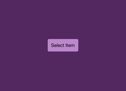
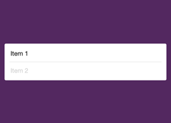
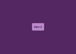
React-Native List Popover
Popover is a great way to show a list of items for users to choose from. With component you can add a very simple pop over screen with a list of items as the child component and access the selected item from the parent component. It is a very easy way of adding a list of options to the UI.
The main properties to send from the parent component:
-
listlist of items to choose from -
isVisibleindicator that makes the popover visible or not -
onClickcallback function that takes anitemparameter to handle the click operation -
onClosecallback function to set the isVisible to false to close the popover
Screenshots
| Before | List Popover | Selected |
|---|---|---|
 |
 |
 |
Usage
import React from 'react';
import {StyleSheet, Text, View, TouchableHighlight} from 'react-native';
import ListPopover from 'react-native-list-popover';

const items = ['Item 1', 'Item 2'];

export default class App extends React.Component {
  constructor(props) {
    super(props);
    this.state = {
      isVisible: false
    };
  }

  render() {
    return (
      <View style={styles.container}>
        <TouchableHighlight
          style={styles.button}
          onPress={() => this.setState({isVisible: true})}>
          <Text>{this.state.item || 'Select'}</Text>
        </TouchableHighlight>
        <ListPopover
          list={items}
          isVisible={this.state.isVisible}
          onClick={(item) => this.setState({item: item})}
          onClose={() => this.setState({isVisible: false})}/>
      </View>
    );
  }
}

const styles = StyleSheet.create({
  container: {
    flex: 1,
    alignItems: 'center',
    backgroundColor: '#532860',
    justifyContent: 'center',
  },
  button: {
    backgroundColor: '#b8c',
    borderRadius: 4,
    marginLeft: 10,
    marginRight: 10,
    padding: 10,
  },
});
Note that the project description data, including the texts, logos, images, and/or trademarks,
for each open source project belongs to its rightful owner.
If you wish to add or remove any projects, please contact us at [email protected].