Detaysoft / React Chat Elements
Licence: mit
Reactjs chat elements chat UI, react chat components
Stars: ✭ 565
Programming Languages
javascript
184084 projects - #8 most used programming language
Projects that are alternatives of or similar to React Chat Elements
React Chat Ui
🙊 A library of React components for building chat UI's.
Stars: ✭ 424 (-24.96%)
Mutual labels: chat, ui-components, react-components
light-ui
A lightly React UI library
Stars: ✭ 38 (-93.27%)
Mutual labels: react-components, ui-components
dashkit-ui
UI Components built on React.
Stars: ✭ 17 (-96.99%)
Mutual labels: react-components, ui-components
React Awesome Slider
React content transition slider. Awesome Slider is a 60fps, light weight, performant component that renders an animated set of production ready UI general purpose sliders with fullpage transition support for NextJS and GatsbyJS. 🖥️ 📱
Stars: ✭ 2,343 (+314.69%)
Mutual labels: ui-components, react-components
Coreui React
CoreUI React.js UI Components. CoreUI for React.js replaces and extends the Bootstrap javascript. Components have been built from scratch as true React.js hook components, without jQuery and unneeded dependencies.
Stars: ✭ 239 (-57.7%)
Mutual labels: ui-components, react-components
NIM iOS UIKit
网易云信 iOS UI 组件,提供聊天界面,文本消息,图片消息,语音消息,视频消息,地理位置消息,自定义消息(阅后即焚)等消息示例。#推荐客户得比特币/京东卡,现在推荐使用网易云信,最低得0.02BTC或3000元京东卡/单,点击参与:https://yunxin.163.com/promotion/recommend
Stars: ✭ 1,371 (+142.65%)
Mutual labels: chat, ui-components
React Step Progress Bar
A library to create stunning progress bars and steps in React 🌡
Stars: ✭ 140 (-75.22%)
Mutual labels: ui-components, react-components
Chakra Ui
⚡️ Simple, Modular & Accessible UI Components for your React Applications
Stars: ✭ 22,745 (+3925.66%)
Mutual labels: ui-components, react-components
Airframe React
Free Open Source High Quality Dashboard based on Bootstrap 4 & React 16: http://dashboards.webkom.co/react/airframe
Stars: ✭ 3,659 (+547.61%)
Mutual labels: ui-components, react-components
Rimble Ui
React components that implement Rimble's Design System.
Stars: ✭ 357 (-36.81%)
Mutual labels: ui-components, react-components
Ej2 React Ui Components
Syncfusion React UI components library offer more than 50+ cross-browser, responsive, and lightweight react UI controls for building modern web applications.
Stars: ✭ 166 (-70.62%)
Mutual labels: ui-components, react-components
Primereact
The Most Complete React UI Component Library
Stars: ✭ 2,393 (+323.54%)
Mutual labels: ui-components, react-components
Nim ios uikit
网易云信 iOS UI 组件,提供聊天界面,文本消息,图片消息,语音消息,视频消息,地理位置消息,自定义消息(阅后即焚)等消息示例。#推荐客户得比特币,首次推荐得0.02BTC,连续推荐得0.03BTC/单,上不封顶。点击参与https://yunxin.163.com/promotion/recommend
Stars: ✭ 1,326 (+134.69%)
Mutual labels: chat, ui-components
Styled Bootstrap
💅🏻 A styled-component implementation of Bootstrap
Stars: ✭ 154 (-72.74%)
Mutual labels: ui-components, react-components
clarity-react
React Components for VMware Clarity UI and Clarity Design
Stars: ✭ 33 (-94.16%)
Mutual labels: react-components, ui-components
Re Jok
A React UI Component library built with styled-components
Stars: ✭ 102 (-81.95%)
Mutual labels: ui-components, react-components
Jafar
🌟!(Just another form application renderer)
Stars: ✭ 107 (-81.06%)
Mutual labels: ui-components, react-components
Reactivesearch
Search UI components for React and Vue: powered by appbase.io / Elasticsearch
Stars: ✭ 4,531 (+701.95%)
Mutual labels: ui-components, react-components


react-chat-elements
Reactjs chat elements
Install
npm install react-chat-elements --save
For React Native
Step 1: Install react-chat-elements
npm install react-chat-elements --save
If you have already installed react-native-vector-icons as a dependency for your project you can skip this step. Otherwise run the following command:
Step 2: Install react-native-vector-icons
npm i --save react-native-vector-icons
Link:
react-native link react-native-vector-icons
If you have any issues installing react-native-vector-icons, check out their installation guide here.
Imports
// RCE CSS
import 'react-chat-elements/dist/main.css';
// MessageBox component
import { MessageBox } from 'react-chat-elements';
React Native
// MessageBox component
import { MessageBox } from 'react-chat-elements/native';
Components
- ChatItem
- MessageBox
- SystemMessage
- MessageList
- ChatList
- Input
- Button
- Popup
- SideBar
- Navbar
- Dropdown
- Avatar
- LocationMessage
- SpotifyMessage
- MeetingItem
- MeetingList
ChatItem Component
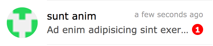
import { ChatItem } from 'react-chat-elements'

<ChatItem
    avatar={'https://facebook.github.io/react/img/logo.svg'}
    alt={'Reactjs'}
    title={'Facebook'}
    subtitle={'What are you doing?'}
    date={new Date()}
    unread={0} />
ChatItem props
| prop | default | type | description |
|---|---|---|---|
| avatar | none | string | ChatItem avatar photo url |
| avatarFlexible | false | boolean | flexible ChatItem avatar photo |
| alt | none | string | ChatItem avatar photo alt text |
| title | none | string | ChatItem title |
| subtitle | none | string | ChatItem subtitle |
| date | none | date | ChatItem date |
| dateString | none | string | ChatItem represents dateString or timeagojs(now, date) |
| unread | 0 | int | ChatItem unread count |
| onClick | none | function | ChatItem on click |
| onContextMenu | none | function | ChatItem on context menu |
| statusColor | none | color | ChatItem status color |
| statusColorType | badge | string | ChatItem status color type (encircle, badge) |
| statusText | none | color | ChatItem status text |
| lazyLoadingImage | none | image path | lazy loading image |
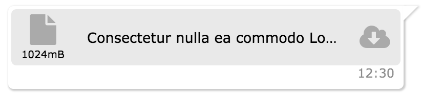
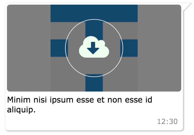
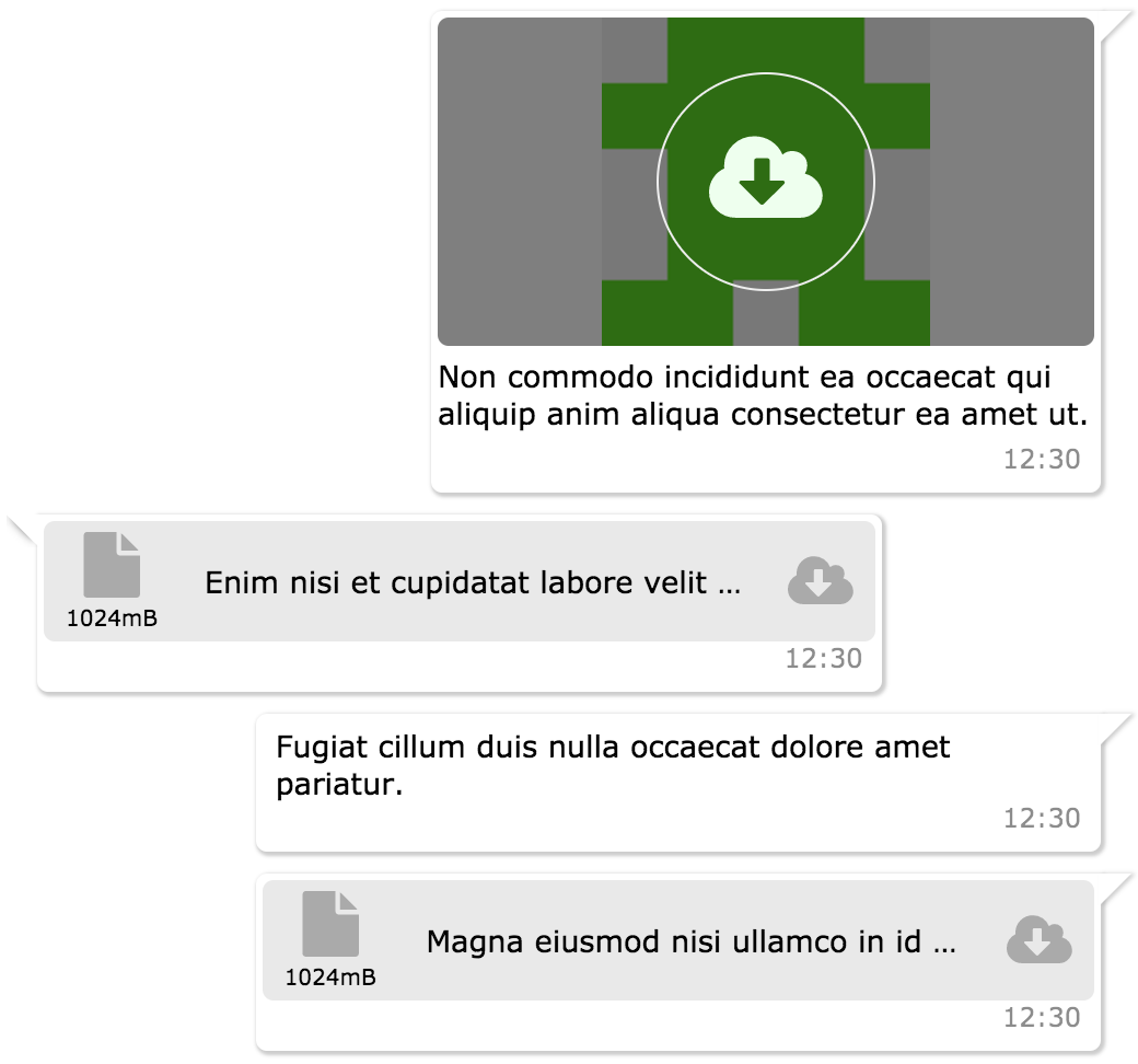
MessageBox Component
| file | photo | text | location | video | audio |
|---|---|---|---|---|---|
 |
 |
 |
 |
 |
 |
import { MessageBox } from 'react-chat-elements'

<MessageBox
    position={'left'}
    type={'photo'}
    text={'react.svg'}
    data={{
        uri: 'https://facebook.github.io/react/img/logo.svg',
        status: {
            click: false,
            loading: 0,
        }
    }}/>
MessageBox props
| prop | default | type | description |
|---|---|---|---|
| id | i (index) | string | message box id |
| position | left | string | message box position |
| type | text | string | message type (text, photo, file, location, spotify, video, audio) |
| text | none | string | message text |
| title | none | string | message title |
| titleColor | none | string(color) | message title color |
| data | {} | object | message data |
| date | new Date() | Date | message date |
| dateString | none | string | message represents dateString or timeagojs(now, date) |
| onClick | none | function | message on click (message(object) is returned) |
| onOpen | none | function | message on open (file or photo) (message(object) is returned) |
| onDownload | none | function | message on download (file or photo) (message(object) is returned) |
| onLoad | none | function | message on load photo |
| onPhotoError | none | function | message on error photo |
| onTitleClick | none | function | message title on click event |
| onForwardClick | none | function | message forward on click event |
| onReplyClick | none | function | message reply on click event |
| onMeetingMessageClick | none | function | meeting message on click event |
| onMeetingTitleClick | none | function | meeting title message on click event |
| onMeetingVideoLinkClick | none | function | meeting video link message on click event |
| onReplyMessageClick | none | function | reply message on click event |
| onMeetingMoreSelect | none | function | message list item onMeetingMoreSelect event, gets 3 parameters: message item, index of item, event |
| onContextMenu | none | function | message contextmenu click event |
| forwarded | none | boolean | message forward icon |
| replyButton | none | boolean | message reply icon |
| status | none | string | message status info (waiting, sent, received, read) |
| notch | true | boolean | message box notch |
| avatar | none | url | message box avatar url |
| renderAddCmp | none | function (component) | adding custom components to message box |
| copiableDate | false | boolean | message box date text copiable |
| focus | false | boolean | used in message focus feature in MessageList component, makes style of the component focused |
| onMessageFocused | none | function | makes focus value false after the message becomes focus |
| reply | none | object | reply data |
Reply Message Component
import { MessageBox } from 'react-chat-elements'

<MessageBox
    reply={{
        photoURL: 'https://facebook.github.io/react/img/logo.svg',
        title: 'elit magna',
        titleColor: '#8717ae',
        message: 'Aliqua amet incididunt id nostrud',
    }}
    onReplyMessageClick={() => console.log('reply clicked!')}
    position={'left'}
    type={'text'}
    text={'Tempor duis do voluptate enim duis velit veniam aute ullamco dolore duis irure.'}/>

MeetingMessage Component
import { MeetingMessage } from 'react-chat-elements'

<MeetingMessage
    subject={'New Release'}
    title={'in ullamco'}
    date={new Date()}
    collapseTitle={'Commodo aliquip'}
    participants={[
        {
            id: '1',
            title: 'Facebook',
        },
        .
        .
        .
    ]}
    dataSource={[
        {
            id: '1',
            avatar: 'https://facebook.github.io/react/img/logo.svg',
            message: 'Lorem ipsum dolor sit amet.',
            title: 'Elit magna',
            avatarFlexible: true,
            date: new Date(),
            event: {[
                title: 'Toplantı sona erdi!',
                avatars={[
                    src: 'https://facebook.github.io/react/img/logo.svg'
                ]}
            ]}
            record: {[
                avatar: 'https://facebook.github.io/react/img/logo.svg',
                title: 'Arama',
                savedBy: 'Kaydeden: Elit magna',
                time: new Date(),
            ]}
        },
        .
        .
        .
    ]} />
MeetingMessage props
| prop | default | type | description |
|---|---|---|---|
| subject | none | string | Meeting messagee |
| title | none | string | Meeting title |
| date | new Date() | Date | Meeting date |
| collapseTitle | none | string | Meeting subtitle |
| participants | [] | array | Meeting participant array |
| moreItems | none | array | message more items |
| dataSource | [] | array | meeting list array |
| onClick | none | function | meeting message on click event (message(object) is returned) |
| onMeetingTitleClick | none | function | meeting title message on click event (message(object) is returned) |
| onMeetingVideoLinkClick | none | function | meeting video link message on click event (message(object) is returned) |
| onMeetingMoreSelect | none | function | message list item onMeetingMoreSelect event, gets 3 parameters: message item, index of item, event |
SystemMessage Component
import { SystemMessage } from 'react-chat-elements'

<SystemMessage
    text={'End of conversation'}/>
SystemMessage props
| prop | default | type | description |
|---|---|---|---|
| text | none | string | message text |
MessageList Component
import { MessageList } from 'react-chat-elements'

<MessageList
    className='message-list'
    lockable={true}
    toBottomHeight={'100%'}
    dataSource={[
        {
            position: 'right',
            type: 'text',
            text: 'Lorem ipsum dolor sit amet, consectetur adipisicing elit',
            date: new Date(),
        },
        .
        .
        .
    ]} />
MessageList props
| prop | default | type | description |
|---|---|---|---|
| className | none | string | optional message list className |
| dataSource | [] | array | message list array |
| lockable | false | boolean | It locks to scroll position when the dataSource has been changed |
| toBottomHeight | 300 | int or string(only '100%') | If the toBottomHeight property's value higher than bottom value of the scrollbar when the data source has been changed Scrollbar goes to bottom at the end of the page. If the toBottomHeight property's value has been set '100%', scrollbar goes to bottom at the end of the page when the data source has been changed. |
| onClick | none | function | message list item on click (message(object) is returned) |
| onOpen | none | function | message list item on open (file or photo) (message(object) is returned) |
| onDownload | none | function | message list item on download (file or photo) (message(object) is returned) |
| onScroll | none | function | message list onScroll event |
| onForwardClick | none | function | message list item onForwardClick event |
| onReplyClick | none | function | message list item onReplyClick event |
| onReplyMessageClick | none | function | message list item onReplyMessageClick event |
| downButton | true | boolean | message list scroll to bottom button |
| downButtonBadge | none | boolean | message list downButton badge content |
| onDownButtonClick | none | function | message list onDownButtonClick |
| onContextMenu | none | function | message list item onContextMenu event, gets 3 parameters: message item, index of item, event |
| onPhotoError | none | function | message list item on error photo |
ChatList Component
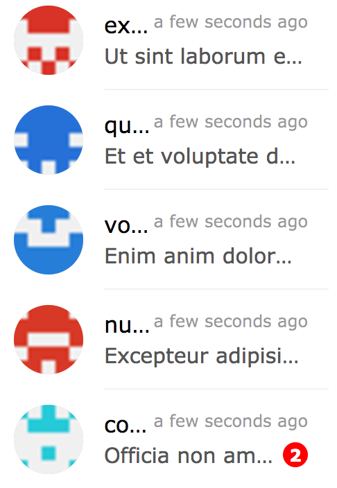
import { ChatList } from 'react-chat-elements'

<ChatList
    className='chat-list'
    dataSource={[
        {
            avatar: 'https://facebook.github.io/react/img/logo.svg',
            alt: 'Reactjs',
            title: 'Facebook',
            subtitle: 'What are you doing?',
            date: new Date(),
            unread: 0,
        },
        .
        .
        .
    ]} />
ChatList props
| prop | default | type | description |
|---|---|---|---|
| className | none | string | optional chat list className |
| dataSource | [] | array | chat list array |
| onClick | none | function | chat list item on click (chat(object) is returned) |
| onContextMenu | none | function | chat list item on context menu (chat(object) is returned) |
| onAvatarError | none | function | chat list item on error avatar img |
| lazyLoadingImage | none | image path | lazy loading image |
Input Component
import { Input } from 'react-chat-elements'

<Input
    placeholder="Type here..."
    multiline={true}
    rightButtons={
        <Button
            color='white'
            backgroundColor='black'
            text='Send'/>
    }/>

// Clear text, e.g.:
// For pure components, use inputRef instead of this.inputRef

inputRef = React.createRef();
// ...
<Input
    ref={el => (this.inputRef = el)}
    placeholder="Type here..."/>
// ...
this.inputRef.clear();
Input props
| prop | default | type | description |
|---|---|---|---|
| className | none | string | optional input className |
| placeholder | none | string | input placeholder text |
| defaultValue | none | string | input default value |
| onChange | none | function | input onChange function |
| multiline | false | bool | input is textarea |
| autoHeight | true | bool | input auto height |
| minHeight | 25 | int | input min height |
| maxHeight | 200 | int | input max height |
| inputStyle | none | object | inputStyle object |
| leftButtons | none | object(component) | left buttons component |
| rightButtons | none | object(component) | right buttons component |
| ref | none | function | input or textarea ref |
| maxlength | none | int | input or textarea maxlength |
| onMaxLengthExceed | none | function | called when max length exceed |
| autofocus | false | bool | input autofocus |
Button Component
import { Button } from 'react-chat-elements'

<Button
    text={'click me!'} />
Button props
| prop | default | type | description |
|---|---|---|---|
| type | none | string | button type (outlined, transparent) |
| disabled | none | string | button is disabled? |
| text | none | string | button text |
| buttonRef | none | function | button ref |
| title | none | string | button title |
Popup Component
import { Popup } from 'react-chat-elements'

<Popup
    show={this.state.show}
    header='Lorem ipsum dolor sit amet.'
    headerButtons={[{
        type: 'transparent',
        color:'black',
        text: 'close',
        onClick: () => {
            this.setState({show: false})
        }
    }]}
    text='Lorem ipsum dolor sit amet, consectetur adipisicing elit. Voluptatem animi veniam voluptas eius!'
    footerButtons={[{
        color:'white',
        backgroundColor:'#ff5e3e',
        text:"Vazgeç",
    },{
        color:'white',
        backgroundColor:'lightgreen',
        text:"Tamam",
    }]}/>
Popup props
| prop | default | type | description |
|---|---|---|---|
| show | false | bool | popup visible |
| header | none | string | popup title (header) message |
| headerButtons | none | array | popup title (header) buttons |
| text | none | string | popup content (center) message |
| color | #333 | string (color) | popup content message color |
| footerButtons | none | array | popup footer buttons |
| renderHeader | none | function (component) | render header function |
| renderContent | none | function (component) | render content function |
| renderFooter | none | function (component) | render footer function |
SideBar Component
import { SideBar } from 'react-chat-elements'

<SideBar
    top={
        <div>'TOP' area</div>
    }
    center={
        <div>'CENTER' area</div>
    }
    bottom={
        <div>'BOTTOM' area</div>
    }/>
SideBar props
| prop | default | type | description |
|---|---|---|---|
| type | light | string | sidebar style type (eg: light, dark) |
| top | none | component | sidebar top component |
| center | none | component | sidebar center component |
| bottom | none | component | sidebar bottom component |
Navbar Component
import { Navbar } from 'react-chat-elements'

<Navbar
    left={
        <div>'LEFT' area</div>
    }
    center={
        <div>'CENTER' area</div>
    }
    right={
        <div>'RIGHT' area</div>
    }/>
Navbar props
| prop | default | type | description |
|---|---|---|---|
| type | light | string | navbar style type (eg: light, dark) |
| left | none | component | navbar left component |
| center | none | component | navbar center component |
| right | none | component | navbar right component |
Dropdown Component
import { Dropdown } from 'react-chat-elements'

<Dropdown
    buttonProps={{
        text: 'Dropdown',
    }}
    items={[
        {
            icon: {
                component: icon,
                float: 'left',
                color: 'red',
                size: 22,
            },
            text: 'lorem'
        },
        {
            icon: {
                component: icon,
                float: 'left',
                color: 'purple',
                size: 22,
            },
            text: 'ipsum'
        },
        {
            text: 'dolor'
        },
    ]}/>
Dropdown props
| prop | default | type | description |
|---|---|---|---|
| animationType | none | string | fade or default |
| animationPosition | nortwest | string | animation start position (nortwest, norteast, southwest, southeast) |
| items | none | array | dropdown items array |
| onSelect | none | function | item on select |
| buttonProps | none | object | button properties |
Avatar Component
import { Avatar } from 'react-chat-elements'

<Avatar
    src={'https://facebook.github.io/react/img/logo.svg'}
    alt={'logo'}
    size="large"
    type="circle flexible"/>
Avatar props
| prop | default | type | description |
|---|---|---|---|
| src | none | image | image src |
| alt | none | string | image alt description |
| size | default | string | image size. default (25px), xsmall(30px), small(35px), medium(40px), large(45px), xlarge (55px) |
| type | default | string | types: default, circle, rounded(border radius 5px), flexible |
| letterItem | none | object | avatar to be a letter |
| sideElement | none | component | avatar side element |
| onError | none | component | avatar img onerror |
| lazyLoadingImage | none | image path | lazy loading image |
LocationMessage Component
import { LocationMessage } from 'react-chat-elements'

<LocationMessage
    data={{
        latitude: '37.773972',
        longitude: '-122.431297',
        // staticURL: '<optional>',
        // mapURL: '<optional>'
    }}/>
LocationMessage props
| prop | default | type | description |
|---|---|---|---|
| src | none | image | image src |
| apiKey | none | string | google staticmap api key |
| zoom | 14 | int | google staticmap zoom level |
| markerColor | red | string | google staticmap marker color |
| data | {} | object | message data |
| target | _blank | string | image a tag target prop |
| onOpen | none | function | image on open |
SpotifyMessage Component
import { SpotifyMessage } from 'react-chat-elements'

<SpotifyMessage
    theme='white'
    view='coverart'
    uri={'spotify:user:spotify:playlist:3rgsDhGHZxZ9sB9DQWQfuf'}/>
SpotifyMessage props
| prop | default | type | description |
|---|---|---|---|
| uri | none | uri | spotify uri |
| theme | black | string | spotify theme color (black or white) |
| view | list | string | spotify view type (list or coverart) |
| data | {} | object | message data |
| width | 300 | int | spotify embed width |
| height | 380 | int | spotify embed height |
MeetingItem Component

import { MeetingItem } from 'react-chat-elements'

<MeetingItem
    subject={'New Release!!!'}
    avatars={[
        {
            src: 'https://facebook.github.io/react/img/logo.svg'
        }
    ]}
    onMeetingClick={console.log}
    onShareClick={console.log}
    onCloseClick={console.log}/>
MeetingItem props
| prop | default | type | description |
|---|---|---|---|
| subject | none | string | MeetingItem subject |
| subjectLimit | 60 | int | MeetingItem subject text limit |
| date | none | date | MeetingItem date |
| dateString | none | string | MeetingItem represents dateString or timeagojs(now, date) |
| lazyLoadingImage | none | image path | lazy loading image |
| closable | true | boolean | MeetingItem closable |
| onClick | none | function | MeetingItem on click |
| onMeetingClick | none | function | MeetingItem on meeting click |
| onShareClick | none | function | MeetingItem on share click |
| onCloseClick | none | function | MeetingItem on close click |
| avatars | none | date | MeetingItem avatars |
| avatarLimit | 5 | date | MeetingItem avatars limit |
| audioMuted | true | boolean | MeetingItem audio muted |
| audioSource | null | string | MeetingItem audio source |
MeetingList Component


import { MeetingList } from 'react-chat-elements'

<MeetingList
    className='meeting-list'
    dataSource={[
        {
            id: '1',
            subject: 'New Release',
            date: new Date(),
            avatars: [{
               src: 'https://facebook.github.io/react/img/logo.svg',
            }]
        },
        .
        .
        .
    ]} />
MeetingList props
| prop | default | type | description |
|---|---|---|---|
| className | none | string | optional meeting list className |
| dataSource | [] | array | meeting list array |
| onClick | none | function | meeting list item on click (meeting(object) is returned) |
| onMeetingClick | none | function | meeting list item on meeting click (meeting(object) is returned) |
| onShareClick | none | function | meeting list item on share click (meeting(object) is returned) |
| onCloseClick | none | function | meeting list item on close click (meeting(object) is returned) |
| onContextMenu | none | function | meeting list item on context menu (meeting(object) is returned) |
| onAvatarError | none | function | meeting list item on error avatar img |
| lazyLoadingImage | none | image path | lazy loading image |
Note that the project description data, including the texts, logos, images, and/or trademarks,
for each open source project belongs to its rightful owner.
If you wish to add or remove any projects, please contact us at [email protected].