Turkyden / React Darkreader
Licence: mit
🌓 A React Hook for adding a dark / night mode to your site.
Stars: ✭ 104
Programming Languages
typescript
32286 projects
Projects that are alternatives of or similar to React Darkreader
Next Dark Mode
🌑 Enable dark mode for Next.js apps
Stars: ✭ 133 (+27.88%)
Mutual labels: dark-theme, night-mode
Turn-Off-the-Lights-Chrome-extension
Chrome extension
Stars: ✭ 81 (-22.12%)
Mutual labels: night-mode, dark-theme
Deluminate
An extension for Google Chrome (and Chromium) that inverts the luminance of websites.
Stars: ✭ 211 (+102.88%)
Mutual labels: dark-theme, night-mode
Jxtheme
A powerful and lightweight and customization theme/skin library for iOS 9+ in swift. 主题、换肤、暗黑模式
Stars: ✭ 220 (+111.54%)
Mutual labels: dark-theme, night-mode
Slack Theme Cli
A CLI tool for changing Slack's desktop app colors
Stars: ✭ 256 (+146.15%)
Mutual labels: dark-theme, night-mode
Jekyll Theme Yat
🎨 Yet another theme for elegant writers with modern flat style and beautiful night/dark mode.
Stars: ✭ 113 (+8.65%)
Mutual labels: dark-theme, night-mode
wluma
Automatic brightness adjustment based on screen contents and ALS
Stars: ✭ 290 (+178.85%)
Mutual labels: night-mode, dark-theme
Darkreader
Dark Reader Chrome and Firefox extension
Stars: ✭ 12,052 (+11488.46%)
Mutual labels: dark-theme, night-mode
dark-mode
Dark Mode - Chrome extension. Relax your eyes at night and day.
Stars: ✭ 63 (-39.42%)
Mutual labels: night-mode, dark-theme
DiscordNight
An actual Dark/Nightmode Theme for Discord/BetterDiscord
Stars: ✭ 86 (-17.31%)
Mutual labels: night-mode, dark-theme
Turn-Off-the-Lights-Firefox-extension-WebExtensions
Firefox extension (WebExtensions)
Stars: ✭ 19 (-81.73%)
Mutual labels: night-mode, dark-theme
Midnight Lizard
Сustom color schemes for all websites
Stars: ✭ 406 (+290.38%)
Mutual labels: dark-theme, night-mode
Chakra Ui
⚡️Simple, Modular & Accessible UI Components for your React Applications
Stars: ✭ 295 (+183.65%)
Mutual labels: dark-theme, react-components
Whatsapp Desktop Dark
Dark mode for WhatsApp desktop official version (Windows & macOS)
Stars: ✭ 664 (+538.46%)
Mutual labels: dark-theme, night-mode
Libreoffice Breezedark
Icons, color palette and color scheme for LibreOffice
Stars: ✭ 90 (-13.46%)
Mutual labels: dark-theme
Ui
React Styled Components with bootstrap grid system
Stars: ✭ 89 (-14.42%)
Mutual labels: react-components
Re Jok
A React UI Component library built with styled-components
Stars: ✭ 102 (-1.92%)
Mutual labels: react-components
Covid 19 Tracker
Android app to track COVID-19 cases in India and globally.
Stars: ✭ 96 (-7.69%)
Mutual labels: dark-theme
English | 简体中文
React Darkreader
🌓 A React Hook for adding a dark / night mode to your site inspired by darkreader
Live Demo ✨ https://react-darkreader.vercel.app
Getting Started
Install with yarn
yarn add react-darkreader
Or you can
npm install react-darkreader
Or inject the script at your page by jsdelivr CDN
<script src="https://cdn.jsdelivr.net/npm/[email protected]/dist/index.min.js"></script>
🚀 Usage
You can import the darkmode as a react component.
import React from 'react';
import Darkreader from 'react-darkreader';

export default () => <Darkreader />;
You can also create darkmode by the react hook useDarkreader
import React from 'react';
import { Switch, useDarkreader } from 'react-darkreader';

export default () => {
  const [isDark, { toggle }] = useDarkreader(false);

  return <Switch checked={isDark} onChange={toggle} />;
};
📔 API
Component
<Darkreader
  defaultDarken
  theme={/** Theme options **/}
  fixes={/** Contains fixes for the generated theme **/}
  onChange={isDark => {
    /** Callback for change **/
  }}
/>
Hook
const [isDark, { toggle, collectCSS }] = useDarkreader(defaultDarken, theme?, fixes?)
with a toggle button as ui.
<Switch checked={isDark} onChange={toggle} />
Result
| Params | Description | Type |
|---|---|---|
| isDark | The status of current darkmode, support true, false
|
boolean |
| toggle | The function for toggling the darkmode. | () => void |
| collectCSS | The async function for collecting the css of darkmode. | async () => Promise<string> |
Params
| Params | Description | Type | Default |
|---|---|---|---|
| defaultDarken | The default status of the darkreader | boolean |
false |
| theme | The options of darkreader Theme refered to index.d.ts → | Partial<Theme> |
- |
| fixes | Contains fixes for the generated theme refered to index.d.ts → | DynamicThemeFix |
- |
🔢 Coming Soon
- [x] add the material design styling in switch
- [ ] followSystemColorScheme
- [ ] localstorge
- [ ] playground for editing the config online
🔨 Contribute
Install dependencies,
$ npm i
Start the dev server,
$ npm start
Build documentation,
$ npm run docs:build
Build library via father-build,
$ npm run build
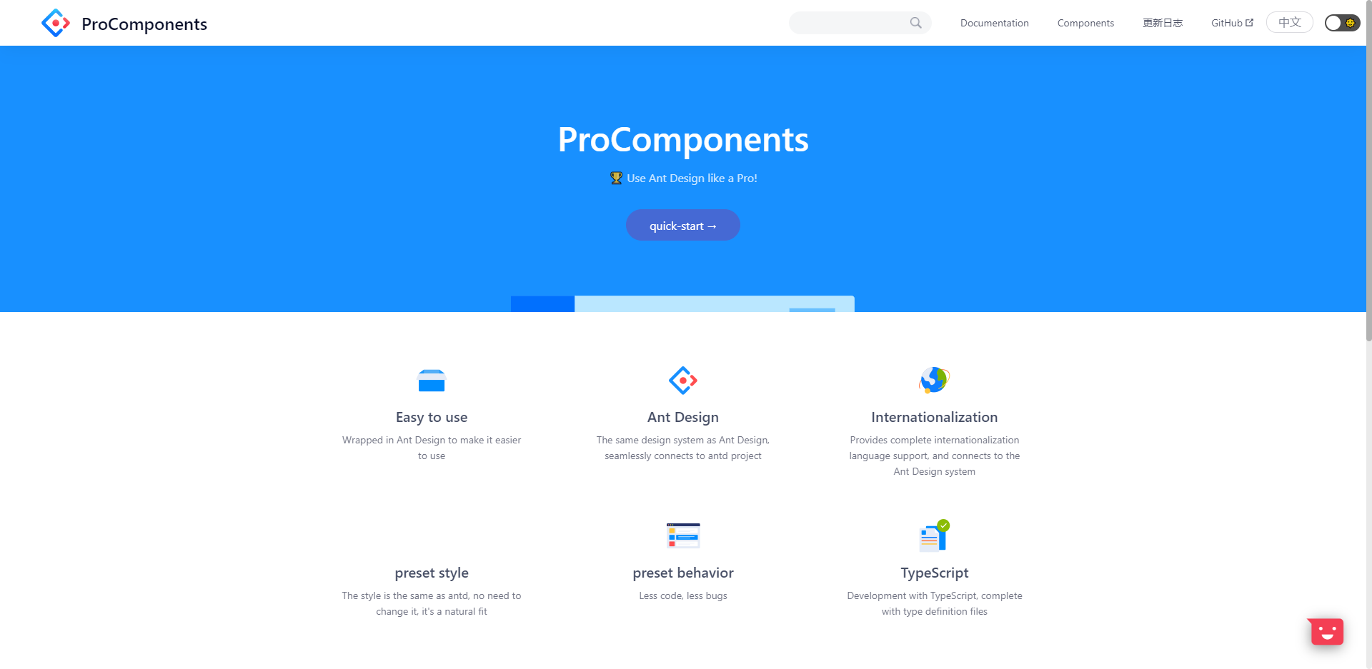
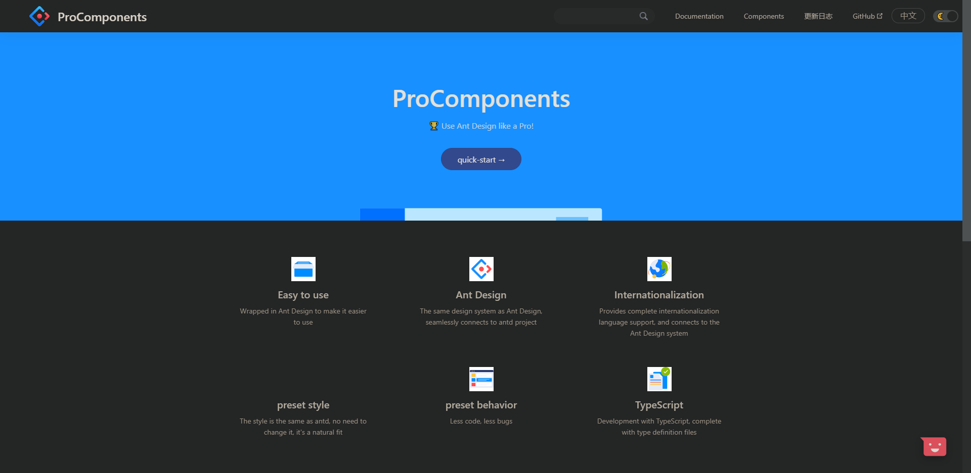
🥇 Who is using
| Ant Design Pro Components Light | Ant Design Pro Components Dark |
|---|---|
 |
 |
❤️ Contributors
Thanks goes to these people (emoji key):
|
Turkyden 💻📖🚇⚠️ |
chenshuai2144 💻🚇⚠️ |
KnowsCount 📖 |
License
Note that the project description data, including the texts, logos, images, and/or trademarks,
for each open source project belongs to its rightful owner.
If you wish to add or remove any projects, please contact us at [email protected].


