React Discord Message
React components to easily build and display fake Discord messages on your webpages.
If you use Vue in your project, you should use vue-discord-message. If you want to use web components instead, use wc-discord-message!
yarn add @danktuary/react-discord-message
# or npm install @danktuary/react-discord-message
# browser build also available: https://unpkg.com/@danktuary/react-discord-message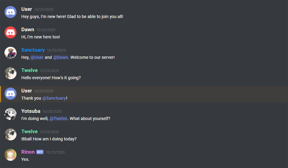
import React from 'react';
import { DiscordMention, DiscordMessage, DiscordMessages } from '@danktuary/react-discord-message';

export default function App() {
	return (
		<DiscordMessages>
			<DiscordMessage>
				Hey guys, I'm new here! Glad to be able to join you all!
			</DiscordMessage>
			<DiscordMessage author="Dawn" avatar="red">
				Hi, I'm new here too!
			</DiscordMessage>
			<DiscordMessage author="Sanctuary" avatar="https://i.imgur.com/0TeacfY.png" roleColor="#0099ff">
				Hey, <DiscordMention /> and <DiscordMention>Dawn</DiscordMention>. Welcome to our server!
			</DiscordMessage>
			<DiscordMessage author="Twelve" avatar="https://i.imgur.com/Mc0F0Hf.png" roleColor="#15b153">
				Hello everyone! How's it going?
			</DiscordMessage>
			<DiscordMessage author="User">
				Thank you <DiscordMention highlight={true}>Sanctuary</DiscordMention>!
			</DiscordMessage>
			<DiscordMessage author="Yotsuba" avatar="https://i.imgur.com/amw0MGJ.png">
				I'm doing well, <DiscordMention>Twelve</DiscordMention>. What about yourself?
			</DiscordMessage>
			<DiscordMessage author="Twelve" avatar="https://i.imgur.com/Mc0F0Hf.png" roleColor="#15b153">
				!8ball How am I doing today?
			</DiscordMessage>
			<DiscordMessage bot={true} author="Rinon" avatar="https://i.imgur.com/axQ9wJl.png" roleColor="violet">
				Yes.
			</DiscordMessage>
		</DiscordMessages>
	)
}
Features
- Design modeled after Discord itself
- Comfy and compact mode support
- Dark and light themes support
- Set the message author's username, avatar (use defaults or provide your own), role color, and "bot" tag status
- Display fake user, role, and channel mentions
- Complete embed support
- Simple syntax!
Installation
Package managers
If you're using a package manager, you can install it like normal.
yarn add @danktuary/react-discord-message
# or npm install @danktuary/react-discord-message
Import it and then use the components in your JSX.
import React from 'react'
import { DiscordMessage, DiscordMessages } from '@danktuary/react-discord-message'

export default function App() {
	return (
		<DiscordMessages>
			<DiscordMessage>
				Hey guys, I'm new here! Glad to be able to join you all!
			</DiscordMessage>
			<DiscordMessage author="Dawn" avatar="red">
				Hi, I'm new here too!
			</DiscordMessage>
		</DiscordMessages>
	)
}
Browser build
If you want to use the browser build, you can pull it in via unpkg, along with the other necessary files.
<body>
	<div id="root"></div>
	<script crossorigin src="https://unpkg.com/react@17/umd/react.development.js"></script>
	<script crossorigin src="https://unpkg.com/react-dom@17/umd/react-dom.development.js"></script>
	<script src="https://unpkg.com/@babel/standalone/babel.min.js"></script>
	<script src="https://unpkg.com/@danktuary/react-discord-message@^1.0.0/dist/index.min.js"></script>
	<script type="text/babel">
		const { DiscordMessage, DiscordMessages } = ReactDiscordMessage

		ReactDOM.render((
			<DiscordMessages>
				<DiscordMessage>
					Hey guys, I'm new here! Glad to be able to join you all!
				</DiscordMessage>
				<DiscordMessage author="Dawn" avatar="red">
					Hi, I'm new here too!
				</DiscordMessage>
			<DiscordMessages>
		), document.getElementById('root'))
	</script>
</body>
Do note that using a package manager is recommended.
Usage
The syntax is kept fairly simple. Here's a basic example of a regular conversation:
<DiscordMessages>
	<DiscordMessage>
		Hey guys, I'm new here! Glad to be able to join you all!
	</DiscordMessage>
	<DiscordMessage author="Dawn" avatar="red">
		Hi, I'm new here too!
	</DiscordMessage>
	<DiscordMessage author="Sanctuary" avatar="https://i.imgur.com/0TeacfY.png" roleColor="#0099ff">
		Hey, <DiscordMention /> and <DiscordMention>Dawn</DiscordMention>. Welcome to our server!
	</DiscordMessage>
</DiscordMessages>
Context options
After installation, you can use the <DiscordOptionsContext> component to configure the plugin to your liking through the following settings.
import React from 'react'
import {
	DiscordDefaultOptions
	DiscordMessage,
	DiscordMessages,
	DiscordOptionsContext,
} from '@danktuary/react-discord-message'

// Extend the default options in order to provide your own
const discordOptions = {
	...DiscordDefaultOptions,
	// ...
}

export default function App() {
	return (
		<DiscordOptionsContext.Provider value={discordOptions}>
			<DiscordMessages>
				<DiscordMessage>...</DiscordMessage>
			</DiscordMessages>
			<DiscordMessages>
				<DiscordMessage>...</DiscordMessage>
			</DiscordMessages>
		</DiscordOptionsContext.Provider>
	)
}
Default font
By default, this package uses the Google Fonts CDN to pull in the Roboto font. This isn't the same font Discord uses, so if you want to provide your own, you can override the CSS.
/* index.css */
.discord-messages {
	font-family: 'Your Font', sans-serif;
}
Avatar shortcuts
The current avatar shortcut strings available are "blue" (default), "gray", "green", "orange", and "red". These shortcuts map to the following image links:
{
	"blue": "https://cdn.discordapp.com/attachments/654503812593090602/665721745466195978/blue.png",
	"gray": "https://cdn.discordapp.com/attachments/654503812593090602/665721746569166849/gray.png",
	"green": "https://cdn.discordapp.com/attachments/654503812593090602/665721748431306753/green.png",
	"orange": "https://cdn.discordapp.com/attachments/654503812593090602/665721750201434138/orange.png",
	"red": "https://cdn.discordapp.com/attachments/654503812593090602/665721752277483540/red.png"
}
If you want to add to or override the shortcuts, you can set them via the avatars property.
const discordOptions = {
	...DiscordDefaultOptions,
	avatars: {
		...DiscordDefaultOptions.avatars,
		'default': DiscordDefaultOptions.avatars.green,
		jojo: 'https://i.imgur.com/BOlehTj.jpg',
	},
}
Profile shortcuts
Sometimes you'll want to use the same message data across multiple messages. You can do so by providing an object of profiles.
const discordOptions = {
	...DiscordDefaultOptions,
	profiles: {
		sanc: {
			author: 'Sanctuary',
			avatar: 'https://i.imgur.com/0TeacfY.png',
		},
		rinon: {
			author: 'Rinon',
			avatar: 'https://i.imgur.com/axQ9wJl.png',
			bot: true,
			roleColor: '#ee82ee',
		},
	},
}
And then in your JSX:
export default function App() {
	return (
		<DiscordOptionsContext.Provider value={discordOptions}>
			<DiscordMessages>
				<DiscordMessage profile="rinon">
					Welcome to our server, <DiscordMention profile="sanc" />!
				</DiscordMessage>
				<DiscordMessage profile="sanc">
					Hey, glad to be here!
				</DiscordMessage>
			</DiscordMessages>
		</DiscordOptionsContext.Provider>
	)
}
Components notes
Below are notes for a few certain components. If you want to see what props each component has, check the propTypes property within in the respective components inside the /src/components/ folder.
DiscordMessages component
This is a wrapper for any child <DiscordMessage> component. It must be used in order for messages to display properly.
DiscordMention component
If the default slot is left empty, the mention will be rendered as 'User', 'Role', or 'channel', depending on the type prop given.
DiscordEmbed component
An embed that can be attached to the end of your messages. The default slot is used for the embed's description. The footer slot is used for the footer text.
To ensure the embed gets displayed correctly inside your message, be sure to give it the proper slot attribute.
<DiscordMessage>
	Hi, I'm part of the normal message content.
	<DiscordEmbed slot="embeds" color="#0099ff">
		Hi, I'm part of the embed message content.
	</DiscordEmbed>
</DiscordMessage>
EmbedFields component
A wrapper for any child <DiscordEmbedField> components. Must be used in order for fields to display properly. To ensure the embed fields gets displayed correctly inside your embed, be sure to give it the proper slot attribute.
<DiscordMessage>
	<DiscordEmbed slot="embeds">
		Hi, I'm part of the embed message content.
		<DiscordEmbedFields slot="fields">
			{/* Embed fields go here */}
		</DiscordEmbedFields>
	</DiscordEmbed>
</DiscordMessage>
EmbedField component
At least 2 consecutive fields need to be marked as inline in order for them to actually display next to each other. The maximum amount of inline fields is 3.
<DiscordMessage>
	<DiscordEmbed slot="embeds">
		Hi, I'm part of the embed message content.
		<DiscordEmbedFields slot="fields">
			<DiscordEmbedField fieldTitle="Inline field" inline={true}>
				Field content.
			</DiscordEmbedField>
			<DiscordEmbedField fieldTitle="Inline field" inline={true}>
				Field content.
			</DiscordEmbedField>
		</DiscordEmbedFields>
	</DiscordEmbed>
</DiscordMessage>