jacklam718 / React Native Button Component
Licence: mit
A Beautiful, Customizable React Native Button component for iOS & Android
Stars: ✭ 513
Programming Languages
javascript
184084 projects - #8 most used programming language
Projects that are alternatives of or similar to React Native Button Component
MGS.Electronics
Unity plugin for make button switch, knob switch and rocker element in scene.
Stars: ✭ 12 (-97.66%)
Mutual labels: button
Segmentedbutton
Segmented Control with animation for Android API 12+
Stars: ✭ 352 (-31.38%)
Mutual labels: button
Shinebutton
This is a UI lib for Android. Effects like shining.
Stars: ✭ 4,105 (+700.19%)
Mutual labels: button
Dragfloatingactionbutton
一个可以随处拖曳FloatingActionButton,边缘自动吸附,可设置按钮悬浮透明度,拖曳避免阻挡界面视图无法查看。
Stars: ✭ 258 (-49.71%)
Mutual labels: button
Efcountinglabel
Adds animated counting support to UILabel.
Stars: ✭ 311 (-39.38%)
Mutual labels: button
Squishbutton
A button that squishes when pressed. As seen in the Clips app.
Stars: ✭ 401 (-21.83%)
Mutual labels: button
React Native Platform Touchable
A wrapper around the various Touchable* components built into React Native core with platform defaults
Stars: ✭ 440 (-14.23%)
Mutual labels: button
Flexiblebutton
灵活的按键处理库(Flexible Button)| 按键驱动 | 支持单击、双击、连击、长按、自动消抖 | 灵活适配中断和低功耗 | 按需实现组合按键
Stars: ✭ 322 (-37.23%)
Mutual labels: button
Onebutton
An Arduino library for using a single button for multiple purpose input.
Stars: ✭ 418 (-18.52%)
Mutual labels: button
Midi controller
This is a library for creating a MIDI controller using an Arduino or Teensy board.
Stars: ✭ 287 (-44.05%)
Mutual labels: button
Android Commonshapebutton
To remove all shape files from the project, provide a generic shape style button.
Stars: ✭ 404 (-21.25%)
Mutual labels: button
Examples Win32
Shows how to use Win32 controls by programming code (c++17).
Stars: ✭ 22 (-95.71%)
Mutual labels: button
Nfdownloadbutton
Revamped Download Button. It's kinda a reverse engineering of Netflix's app download button.
Stars: ✭ 429 (-16.37%)
Mutual labels: button
neumorphic-style
🎛 Simple SwiftUI ‘neumorphic’ button style
Stars: ✭ 54 (-89.47%)
Mutual labels: button
Ahdownloadbutton
Customizable download button with progress and transition animations. It is based on Apple's App Store download button.
Stars: ✭ 370 (-27.88%)
Mutual labels: button
Hapticbutton
A button that is triggered based on the 3D Touch pressure, similar to the iOS 11 control center.
Stars: ✭ 501 (-2.34%)
Mutual labels: button
Submitbutton
A submit button with a fun animation for Android.
Stars: ✭ 419 (-18.32%)
Mutual labels: button


React Native Button component
React Native Button component for iOS & Android.
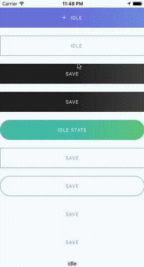
Provided Components
This library provided the following button components:
ButtonComponent
CircleButton
RoundButton
RectangleButton
Installation
npm install --save react-native-button-componentreact-native link react-native-button-component
Note
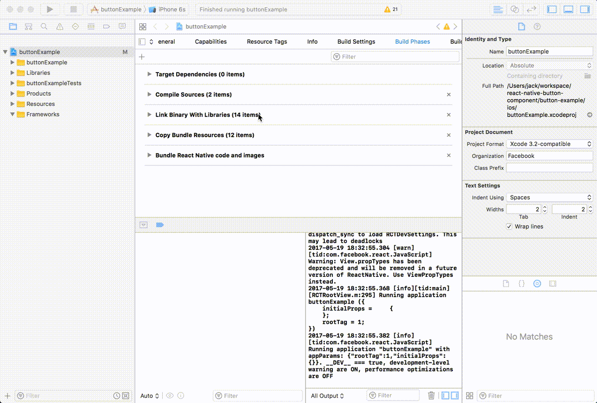
If you didn't see this item libART.a under the Link Binary With Libraries or you get this error No component found for view with name "ARTSurfaceView"
Please open Xcode project and add libART.a under Build Phases -> Link Binary With Libraries
The detailed steps:
- Open Xcode project
- Build Phases -> Link Binary With Libraries
- Click the
+button and ClickAdd Other... - Open with
node_modules/react-native/Libraries/ART/ART.xcodeproj - Click the
+and select thelibART.aand clickAdd
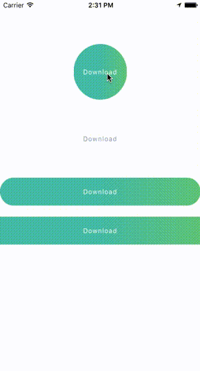
Some Simple Examples
One State ButtonMultiple States Button
Spinner Button
Progress Button
Circle Button
Documents
Props & Button OptionsOptions for Progress Button
Options for Spinner Button
Options for Circle Button
Usage - Basic
Button with one state
import ButtonComponent, { CircleButton, RoundButton, RectangleButton } from 'react-native-button-component';

// You can use CircleButton, RoundButton, RectangleButton to instead ButtonComponent
<ButtonComponent
  onPress={() => {}}
  image={require('button-image.png')}
  text="Button"
>
</ButtonComponent>
Button with multiple states
import ButtonComponent, { CircleButton, RoundButton, RectangleButton } from 'react-native-button-component';

// You can use CircleButton, RoundButton, RectangleButton to instead ButtonComponent
<ButtonComponent
  buttonState={this.state.buttonState} // "upload" or "uploading"
  states={{
    upload: {
      onPress: () => {
        this.imageUploader.upload();
        this.state.setState({ buttonState: 'uploading' });
      },
      image: require('upload-image.png'),
      text: 'Upload Image',
    },
    uploading: {
      onPress: () => {
        this.imageUploader.cancelUpload();
        this.state.setState({ buttonState: 'upload' });
      },
      spinner: true,
      text: 'Uploding Image...',
    },
  }}
>
</ButtonComponent>
Usage - With Your Configurations
Button with one state
<ButtonComponent
  text="Button"
  type="primary"
  shape="rectangle"
  backgroundColors={['#4DC7A4', '#66D37A']}
  gradientStart={{ x: 0.5, y: 1 }}
  gradientEnd={{ x: 1, y: 1 }}
  height={80}
  onPress={() => {}}
  image={require('button-image.png')}
>
</ButtonComponent>
Button with multiple states - different config for different states
import ButtonComponent, { CircleButton, RoundButton, RectangleButton } from 'react-native-button-component';

// You can use CircleButton, RoundButton, RectangleButton to instead ButtonComponent
<ButtonComponent
  buttonState={this.state.buttonState} // "upload" or "uploading"
  gradientStart={{ x: 0.5, y: 1 }}
  gradientEnd={{ x: 1, y: 1 }}
  states={{
    upload: {
      text: 'Upload Image',
      backgroundColors: ['#4DC7A4', '#66D37A'],
      image: require('upload-image.png'),
      onPress: () => {
        this.imageUploader.upload();
        this.state.setState({ buttonState: 'uploading' });
      },
    },
    uploading: {
      text: 'Uploding Image...',
      gradientStart: { x: 0.8, y: 1 },
      gradientEnd: { x: 1, y: 1 },
      backgroundColors: ['#ff4949', '#fe6060'],
      spinner: true,
      onPress: () => {
        this.imageUploader.cancelUpload();
        this.state.setState({ buttonState: 'upload' });
      },
    },
  }}
>
</ButtonComponent>
Button with multiple states - one config for different states
<ButtonComponent
  buttonState={this.state.buttonState} // "upload" or "uploading"
  gradientStart={{ x: 0.5, y: 1 }}
  gradientEnd={{ x: 1, y: 1 }}
  backgroundColors={['#4DC7A4', '#66D37A']}
  states={{
    upload: {
      text: 'Upload Image',
      image: require('upload-image.png'),
      onPress: () => {
        this.imageUploader.upload();
        this.state.setState({ buttonState: 'uploading' });
      },
    },
    uploading: {
      text: 'Uploding Image...',
      spinner: true,
      onPress: () => {
        this.imageUploader.cancelUpload();
        this.state.setState({ buttonState: 'upload' });
      },
    },
  }}
>
</ButtonComponent>
License
MIT
Note that the project description data, including the texts, logos, images, and/or trademarks,
for each open source project belongs to its rightful owner.
If you wish to add or remove any projects, please contact us at [email protected].