chilijung / React Native Carousel View
Programming Languages
Projects that are alternatives of or similar to React Native Carousel View
react-native-carousel-view
react-native carousel, work on both iOS and android, test on RN >= 0.45 (if this work on earlier version, please open an issue. And will add here)
Install
npm install react-native-carousel-view
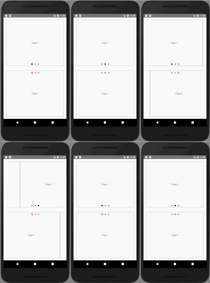
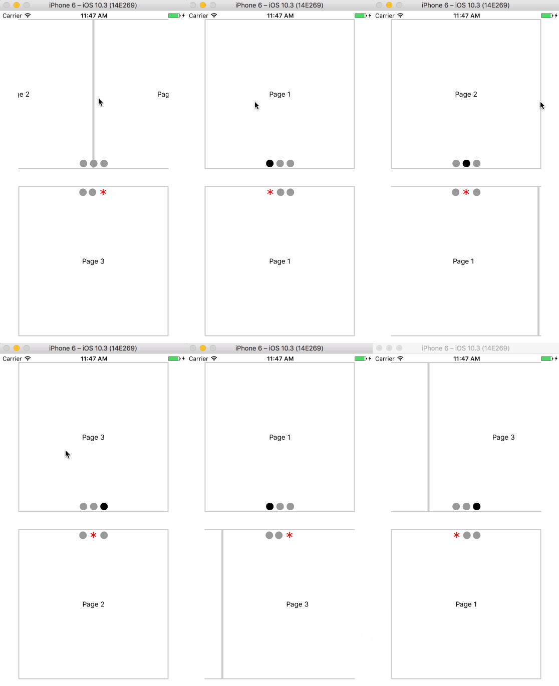
NOTE: styling in iOS and Android is slightly different
Demo
| Android | iOS |
|---|---|

|

|
Props
type Props = {
  hideIndicators: boolean, // Set to true to hide the indicators
  indicatorColor: string, // Active indicator color
  indicatorSize: number, // Indicator bullet size
  inactiveIndicatorColor: string, // Inactive indicator color
  indicatorAtBottom: boolean, // Set to false to show the indicators at the top
  indicatorOffset: number, // Indicator relative position from top or bottom
  indicatorText: string, // Active indicator content ( You can customize to use any Unicode character )
  inactiveIndicatorText: string, // Inactive indicator content ( You can customize to use any Unicode character )
  width: ?number, // the width of the carousel
  height: number, // the height of the carousel
  initialPage: number, // initial start page
  indicatorSpace: number, // space between each indicator
  animate: boolean, // Enable carousel autoplay
  delay: number, // Set Animation delay between slides
  loop: boolean, // Allow infinite looped animation. Depends on Prop {...animate} set to true.
  contentContainerStyle?: {[attr: string]: any}, // content container style, in `Android` this will pass to ViewPagerAndroid style props, in `iOS` this will pass to ScrollView contentContainerStyle props.
  children: any,
  onPageChange?: (number) => void, // Called when the active page changes
  onScrollBegin?: () => void, // Called when scroll begin
  onScroll?: () => void, // Called while scrolling
}
default props:
static defaultProps = {
  hideIndicators: false,
  indicatorColor: '#000000',
  indicatorSize: 20,
  inactiveIndicatorColor: '#999999',
  indicatorAtBottom: true,
  indicatorOffset: 0,
  indicatorText: '•',
  inactiveIndicatorText: '•',
  width: null,
  height: 200,
  initialPage: 0,
  indicatorSpace: 10,
  animate: true,
  delay: 1000,
  loop: true,
}
Examples
Simple example (iOS and android is slightly different), see in Difference section.
import React, {Component} from 'react';
import {
  StyleSheet,
  Text,
  View,
  AppRegistry,
} from 'react-native';
import Carousel from 'react-native-carousel-view';

export default class example extends Component {
  render() {
    return (
      <View style={{
        flex: 1,
        justifyContent: 'center',
        alignItems: 'center',
      }}>
        <View style={styles.container}>
          <Carousel
            width={375}
            height={300}
            delay={2000}
            indicatorAtBottom={false}
            indicatorSize={20}
            indicatorText="✽"
            indicatorColor="red"
            >
            <View style={styles.contentContainer}>
              <Text>Page 1</Text>
            </View>
            <View style={styles.contentContainer}>
              <Text>Page 2</Text>
            </View>
            <View style={styles.contentContainer}>
              <Text>Page 3</Text>
            </View>
          </Carousel>
        </View>
      </View>
    );
  }
}

const styles = StyleSheet.create({
  container: {
    flex: 0.5,
    justifyContent: 'center',
    alignItems: 'center',
  },
  contentContainer: {
    borderWidth: 2,
    borderColor: '#CCC',
    flex: 1,
    justifyContent: 'center',
    alignItems: 'center',
  },
});


AppRegistry.registerComponent('example', () => example);
Difference
In Android the carousel effect use ViewPagerAndroid, on the other hand, in iOS use ScrollView. Due to the mechanism difference between iOS and Android so the styles settings is slightly different.
The contentContainerStyle props should be set in different settings if you want to have the same appearance in iOS and Android.
In iOS contentContainerStyle means the container of the child.
This is an example.
<Carousel
  width={375}
  height={300} // =====> the container will be height 300
  >
  <View style={{height: 200, width: 300}}> // ===> child height 200, width 300. if the children's height and width is not set width and height from Carousel component will set to children.
    <Text>Page 1</Text>
  </View>
  <View style={{height: 200, width: 300}}> // ===> child height 200, width 300
    <Text>Page 2</Text>
  </View>
  <View style={{height: 200, width: 300}}> // ===> child height 200, width 300
    <Text>Page 3</Text>
  </View>
</Carousel>
but in Android it means it is the children's view style. According to the react-native docs https://facebook.github.io/react-native/docs/viewpagerandroid.html
Container that allows to flip left and right between child views. Each child view of the ViewPagerAndroid will be treated as a separate page and will be stretched to fill the ViewPagerAndroid. It is important all children are s and not composite components. You can set style properties like padding or backgroundColor for each child.
<Carousel
  width={375}
  height={300} // =====> the container will be height 300
  >
  <View style={{height: 200}}> // ===> child height will still be 300, and width will automatically be 375 and can't be changed
    <Text>Page 1</Text>
  </View>
  <View style={{height: 200}}> // ===> child height will still be 300, and width will automatically be 375 and can't be changed
    <Text>Page 2</Text>
  </View>
  <View style={{height: 200}}> // ===> child height will still be 300, and width will automatically be 375 and can't be changed
    <Text>Page 3</Text>
  </View>
</Carousel>
Develop
go to example folder and enter yarn install and yarn run haul
select your platform:
➜  example git:(master) yarn run haul
yarn run v0.27.5
$ haul start
? Select platform to bundle for (Use arrow keys)
❯ ios - Serves iOS bundle
  android - Serves Android bundle
  all - Serves both platforms
and run react-native run-ios or react-native run-android to open simulators.
See also
- https://github.com/Canner/react-native-image-page - a react-native image carousel, with zoom-pan gestures and full-screen support, work on both iOS and Android
NOTE
this repo is original from https://github.com/nick/react-native-carousel with lots of improvements.
License
Apache 2.0
