alexbrillant / React Native Expanding Circle Transition
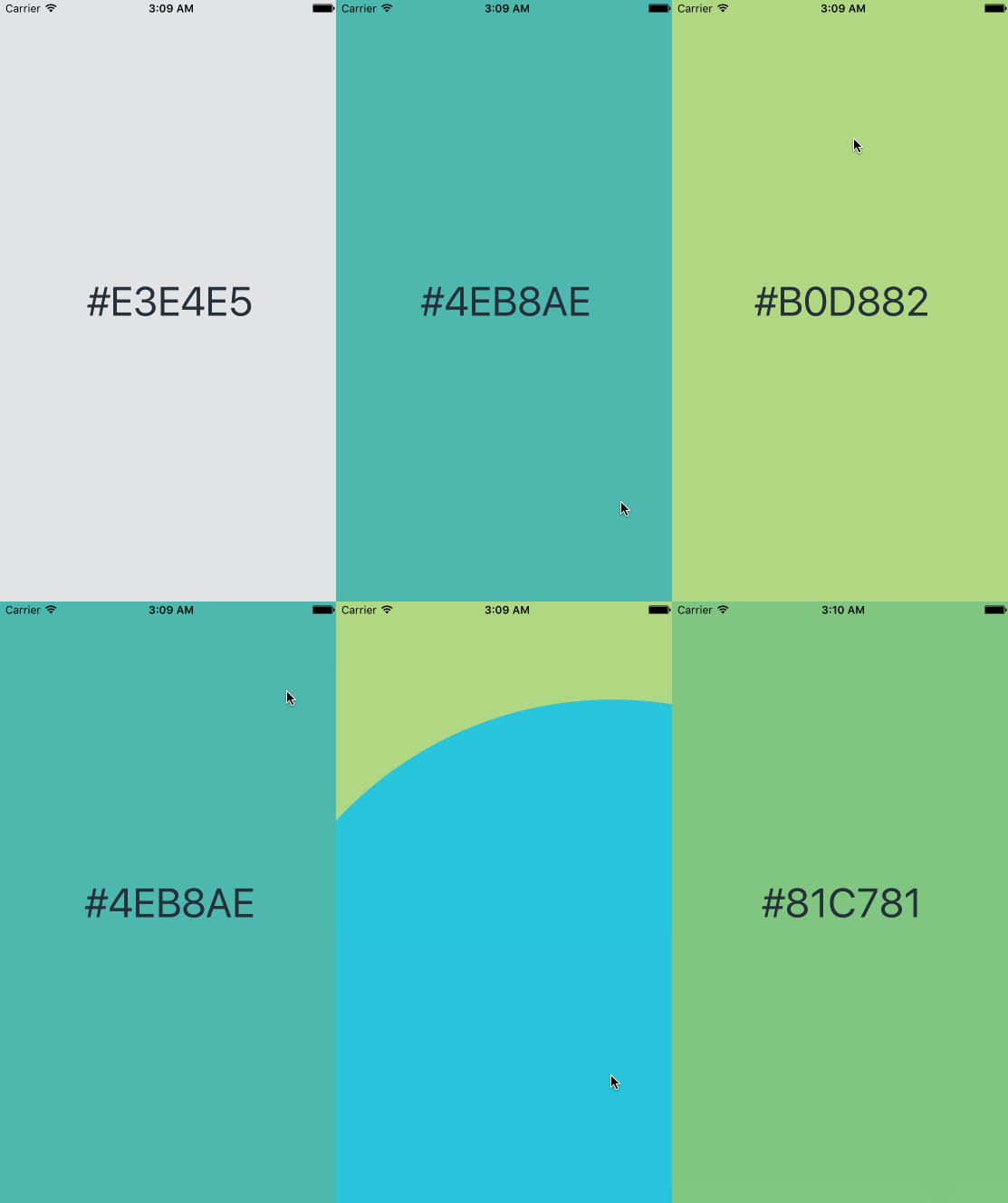
A simple react native component to make an expanding circle transition.
Stars: ✭ 125
Programming Languages
javascript
184084 projects - #8 most used programming language
Projects that are alternatives of or similar to React Native Expanding Circle Transition
Css Animations Pocket Guide
A pocket guide to get started writing CSS Animations. ✨
Stars: ✭ 94 (-24.8%)
Mutual labels: transition
React Native Web Modal
React Native Modal Implementation for Web
Stars: ✭ 114 (-8.8%)
Mutual labels: animated
Yudisplacementtransition
A GPU accelerated transition library makes use of displacement maps to create distortion effects.
Stars: ✭ 121 (-3.2%)
Mutual labels: transition
Particles.js
A lightweight, dependency-free and responsive javascript plugin for particle backgrounds.
Stars: ✭ 1,336 (+968.8%)
Mutual labels: animated
Sortinganimation
A visual representation for sorting algorithms
Stars: ✭ 105 (-16%)
Mutual labels: animated
Easytransitions
A simple way to create custom interactive UIViewController transitions
Stars: ✭ 1,592 (+1173.6%)
Mutual labels: transition
React Native Rating
🌟 cross-platform rating for react-native built with Animated and native driver 🌟
Stars: ✭ 90 (-28%)
Mutual labels: animated
Typewriterview
Android library for typewriter like effects
Stars: ✭ 124 (-0.8%)
Mutual labels: animated
Redux Idle Monitor
A Redux component to schedule events at stages of user idleness across multiple browser tabs.
Stars: ✭ 105 (-16%)
Mutual labels: transition
Floatingtoolbar
A toolbar that morphs from a FloatingActionButton
Stars: ✭ 1,540 (+1132%)
Mutual labels: transition
React Native Animated Header Example
example of an animated header that contains components who animate based on the scroll position of a ScrollView
Stars: ✭ 97 (-22.4%)
Mutual labels: animated
Compose Shared Element
Experiment with SharedElement transition in Jetpack Compose, inspired by Flutter Hero widget.
Stars: ✭ 102 (-18.4%)
Mutual labels: transition
Pixelwave
Fully customizable pixel wave animation for seamless page transitions.
Stars: ✭ 119 (-4.8%)
Mutual labels: transition
Transformationlayout
🌠 Transform into a different view or activity using morphing animations.
Stars: ✭ 1,329 (+963.2%)
Mutual labels: transition
Microstates
Composable state primitives for JavaScript
Stars: ✭ 1,312 (+949.6%)
Mutual labels: transition
React Router Transitions
Easily handle transitions in your React application 🍃
Stars: ✭ 117 (-6.4%)
Mutual labels: transition
React Native Submit Button
Animated Submit button. Works on both android and ios.
Stars: ✭ 124 (-0.8%)
Mutual labels: animated
Morpherings
CSS Animations that cause buttons to morph into forms.
Stars: ✭ 121 (-3.2%)
Mutual labels: transition
react-native-expanding-circle-transition
Preview
Installation
npm install react-native-expanding-circle-transition --save
Props
| Props | type | description | required or default |
|---|---|---|---|
| color | string | Color of the circle view | 'orange' |
| size | number | Size of the circle view. Important: It has to fit in the window | Math.min(width, height) - 1 |
| scaleShrink | number | Scale factor to shrink the circle | 0 |
| scaleExpand | number | Scale factor to expand the circle | 4 |
| transitionBuffer | number | Buffer between the transition and the animation. The transition must happen before the circle is hidden | 5 |
| duration | number | Animation duration | 800 |
| expand | bool | Expand the circle if true, reduce the circle if false | true |
| position | enum | Circle position : ['topLeft', 'topRight', 'bottomLeft', 'bottomRight', 'center', 'left', 'right', 'top', 'bottom', 'custom'] | 'topLeft' |
| customLeftMargin | number | Custom position's left margin from the center of the circle positioned at topLeft | 0 |
| customTopMargin | number | Custom position's top margin from the center of the circle positioned at topLeft | 0 |
| easing | func | React Native Animation Easing | Easing.linear |
How to use
To trigger the animation, you need to use a ref to call the start function of this component. To change the scene before the circle is hidden, pass a callback(check out usage exemple handlePress function).
Usage exemples
import React, {
  Component
} from 'react'

import {
  Easing,
  StyleSheet,
  Text,
  View,
  TouchableWithoutFeedback
} from 'react-native'

import CircleTransition from 'react-native-expanding-circle-transition'
const ANIMATION_DURATION = 1200
const INITIAL_VIEW_BACKGROUND_COLOR = '#E3E4E5'
const CIRCLE_COLOR1 = '#29C5DB'
const CIRCLE_COLOR2 = '#4EB8AE'
const CIRCLE_COLOR3 = '#81C781'
const CIRCLE_COLOR4 = '#B0D882'
const TRANSITION_BUFFER = 10
const POSITON = 'custom'

const reactMixin = require('react-mixin')
import TimerMixin from 'react-timer-mixin'

class Exemples extends Component {
  constructor (props) {
    super(props)
    this.state = {
      viewBackgroundColor: INITIAL_VIEW_BACKGROUND_COLOR,
      circleColor: CIRCLE_COLOR1,
      customLeftMargin: 0,
      customTopMargin: 0,
      counter: 0
    }
    this.handlePress = this.handlePress.bind(this)
    this.changeColor = this.changeColor.bind(this)
  }

  handlePress (event) {
    let pressLocationX = event.nativeEvent.locationX
    let pressLocationY = event.nativeEvent.locationY
    this.setState({
      customLeftMargin: pressLocationX,
      customTopMargin: pressLocationY
    }, this.circleTransition.start(this.changeColor))
  }

  changeColor () {
    const { circleColor, counter } = this.state
    let newCounter = counter < 3 ? counter + 1 : 0
    let newCircleColor = this.getColor(newCounter)
    this.setState({
      viewBackgroundColor: circleColor,
      counter: newCounter
    })
    this.changeCircleColor(newCircleColor)
  }

  changeCircleColor (newCircleColor) {
    this.setTimeout(() => {
      this.setState({
        circleColor: newCircleColor
      })
    }, TRANSITION_BUFFER + 5)
  }

  getColor (counter) {
    switch (counter) {
      case 0:
        return CIRCLE_COLOR1
      case 1:
        return CIRCLE_COLOR2
      case 2:
        return CIRCLE_COLOR3
      case 3:
        return CIRCLE_COLOR4
      default:
        return CIRCLE_COLOR4
    }
  }

  render () {
    let {
      circleColor,
      viewBackgroundColor,
      customTopMargin,
      customLeftMargin
    } = this.state
    return (
      <View style={[
        styles.container,
        {
          backgroundColor: viewBackgroundColor
        }]}>
        <TouchableWithoutFeedback
          style={styles.touchable}
          onPress={this.handlePress}>
          <View style={styles.touchableView}>
            <Text style={styles.text}>{viewBackgroundColor.toString()}</Text>
          </View>
        </TouchableWithoutFeedback>
        <CircleTransition
          ref={(circle) => { this.circleTransition = circle }}
          color={circleColor}
          expand
          customTopMargin={customTopMargin}
          customLeftMargin={customLeftMargin}
          transitionBuffer={TRANSITION_BUFFER}
          duration={ANIMATION_DURATION}
          easing={Easing.linear}
          position={POSITON}
        />
      </View>
    )
  }
}

reactMixin(Exemples.prototype, TimerMixin)

const styles = StyleSheet.create({
  container: {
    flex: 1,
    flexDirection: 'column',
    justifyContent: 'center',
    alignItems: 'stretch'
  },
  touchableView: {
    flex: 1,
    alignItems: 'center',
    justifyContent: 'center'
  },
  text: {
    fontSize: 45,
    fontWeight: '400',
    color: '#253039'
  },
  touchable: {
    flex: 1,
    flexDirection: 'row',
    alignItems: 'center',
    justifyContent: 'center'
  }
})

export default Exemples
Note that the project description data, including the texts, logos, images, and/or trademarks,
for each open source project belongs to its rightful owner.
If you wish to add or remove any projects, please contact us at [email protected].


