gkueny / React Native Pin Code
Licence: mit
A simple pin code component for react-native
Stars: ✭ 52
Programming Languages
javascript
184084 projects - #8 most used programming language
Labels
Projects that are alternatives of or similar to React Native Pin Code
Radicle Alpha
A peer-to-peer stack for code collaboration
Stars: ✭ 921 (+1671.15%)
Mutual labels: code
Renew
Mix task to create mix projects that builds into Docker containers.
Stars: ✭ 33 (-36.54%)
Mutual labels: code
Bartycrouch
Localization/I18n: Incrementally update/translate your Strings files from .swift, .h, .m(m), .storyboard or .xib files.
Stars: ✭ 1,032 (+1884.62%)
Mutual labels: code
Qpdialcodepickerview
International Dial Code Picker View for Country or Area 国家或地区国际区号选择器
Stars: ✭ 15 (-71.15%)
Mutual labels: code
Fundamentals Of Python Data Structures
《数据结构(Python语言描述)》"Fundamentals of Python:Data Structures" 电子书和配套代码
Stars: ✭ 30 (-42.31%)
Mutual labels: code
Tr Geozones
Ülkeler ve Türkiye İl İlçe Semt Mahalle ve Posta Kodu Veritabanı (Laravel)
Stars: ✭ 46 (-11.54%)
Mutual labels: code
Clink
A developer assistance tool to help with refactoring and keeping related code up to date with changes
Stars: ✭ 40 (-23.08%)
Mutual labels: code
Java Sec Code
Java web common vulnerabilities and security code which is base on springboot and spring security
Stars: ✭ 1,033 (+1886.54%)
Mutual labels: code
Code Notes
A simple code snippet & gist manager for developers built with Electron & Vue.js 🚀
Stars: ✭ 919 (+1667.31%)
Mutual labels: code
Jupyterlab black
A JupyterLab extension to apply Black formatter to code within codecell.
Stars: ✭ 35 (-32.69%)
Mutual labels: code
Mix Format.el
Emacs package to format Elixir code in Emacs with elixir-mode
Stars: ✭ 46 (-11.54%)
Mutual labels: code
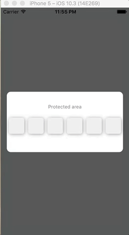
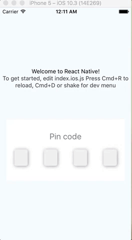
react-native-pin-code
A simple pin code component
Installation
npm install react-native-pin-code --save
Example
<CodePin
  code="2018" // code.length is used if you not pass number prop
  success={() => console.log('hurray!')} // If user fill '2018', success is called
  text="A simple Pin code component" // My title
  error="You fail" // If user fail (fill '2017' for instance)
  autoFocusFirst={false} // disabling auto-focus
/>
or
<CodePin
  number={4} // You must pass number prop, it will be used to display 4 (here) inputs
  checkPinCode={(code, callback) => callback(code === '1234')}
  // Check manually code (ask server for instance)
  // and call callback function with
  //    true  (code pin is correct)
  // or false (code pin is false)
  success={() => console.log('hurray!')} // If user fill '2018', success is called
  text="A simple Pin code component" // My title
  error="You fail" // If user fail (fill '2017' for instance)
  autoFocusFirst={false} // disabling auto-focus
/>
Code prop is not needed if checkPinCode is used
props
| prop | type | description | isRequired | default value |
|---|---|---|---|---|
| code | number | pin code | not required | '' |
| success | function | call on success | required | |
| checkPinCode | function | this function is called to check pin code. The parameters are : code (the code filled by user) and a callback function. callback must be called with true (code pin is correct) or false (code pin is wrong) |
not required | null |
| obfuscation | boolean | If true, obfuscate code with '*' | false | |
| text | string | text to display as title | 'Pin code.' | |
| error | string | text to display on error | 'Bad pin code.' | |
| number | number | number of input to display | 4 | |
| autoFocusFirst | boolean | auto focus first input | true | |
| containerStyle | object, StyleSheet object | container style | { height: 150, width: width - 30, backgroundColor : '#FFF' } | |
| containerPinStyle | object, StyleSheet object | inputs container style | { width: width - 30, height: 40, flexDirection: 'row', justifyContent: 'space-around', alignItems: 'center', marginTop: 20 } | |
| pinStyle | object, StyleSheet object | input style | { backgroundColor : '#F0F0F0', textAlign: 'center', flex: 1, marginLeft: 20, marginRight: 20, borderRadius: 5, shadowColor: '#000000', shadowOffset: {width: 1,height : 1}, shadowRadius: 5, shadowOpacity : 0.4 } | |
| textStyle | object, StyleSheet object | text style | { textAlign: 'center', color: 'gray', fontSize: 20, marginTop: 30 } | |
| errorStyle | object, StyleSheet object | error text style | { textAlign: 'center', color: 'red', paddingTop: 10 } |
All other props are pass down to TextInput component.
For instance you can customize keyboardtype :
<CodePin
  //...
  keyboardType="numeric"
/>
Functions
To use pin code component function, use ref :
  <CodePin
    ref={ref => this.ref = ref}
    ...
  />
clean
clean inputs and focus first input.
this.ref.clean();
focus
focus input at specified index
this.ref.focus(1);
Examples
To test examples (use expo) :
  git clone https://github.com/gkueny/react-native-pin-code-examples
  cd blurExample
  npm install
  npm run ios
or
  git clone https://github.com/gkueny/react-native-pin-code-examples
  cd simpleExample
  npm install
  npm run ios
Note that the project description data, including the texts, logos, images, and/or trademarks,
for each open source project belongs to its rightful owner.
If you wish to add or remove any projects, please contact us at [email protected].