mochixuan / React Native Smart Tip
🔥🔥🔥Toast , SnackBar , Modal , Show Toast above Modal
Stars: ✭ 198
Programming Languages
javascript
184084 projects - #8 most used programming language
Projects that are alternatives of or similar to React Native Smart Tip
bs5-utils
A JavaScript utility package for Bootstrap 5 components.
Stars: ✭ 26 (-86.87%)
Mutual labels: modal, toast, snackbar
Sneaker
A lightweight Android library for customizable alerts
Stars: ✭ 928 (+368.69%)
Mutual labels: toast, snackbar
React Toastify
React notification made easy 🚀 !
Stars: ✭ 8,113 (+3997.47%)
Mutual labels: toast, snackbar
Android Appmsg
In-layout notifications. Based on Toast notifications and article by Cyril Mottier (http://android.cyrilmottier.com/?p=773).
Stars: ✭ 1,384 (+598.99%)
Mutual labels: toast, snackbar
Gsmessages
A simple style messages/notifications, in Swift.
Stars: ✭ 595 (+200.51%)
Mutual labels: message, toast
Fftoast
A very powerful iOS message notifications and AlertView extensions. It can be easily realized from the top of the screen, the bottom of the screen and the middle of the screen pops up a notification. You can easily customize the pop-up View.
Stars: ✭ 649 (+227.78%)
Mutual labels: message, toast
Customalertviewdialogue
Custom AlertView Dialogue is the world's most advanced alert view library. Custom AlertView Dialogue includes simple message popups, confirmation alerts, selector popups, action sheet bottom menus, and input/feedback contact forms.
Stars: ✭ 100 (-49.49%)
Mutual labels: message, modal
Hot Toast
🍞 Smoking hot Notifications for Angular. Lightweight, customizable and beautiful by default.
Stars: ✭ 328 (+65.66%)
Mutual labels: toast, snackbar
Vuetify Toast Snackbar
Basic Vue toast service that uses Vuetify Snackbar component.
Stars: ✭ 123 (-37.88%)
Mutual labels: toast, snackbar
Nativescript Feedback
📢 Non-blocking textual feedback for your NativeScript app
Stars: ✭ 127 (-35.86%)
Mutual labels: message, toast
Flash
⚡️A highly customizable, powerful and easy-to-use alerting library for Flutter.
Stars: ✭ 174 (-12.12%)
Mutual labels: toast, snackbar
Cookiebar
CookieBar is a lightweight library for showing a brief message at the top or bottom of the screen.
Stars: ✭ 497 (+151.01%)
Mutual labels: toast, snackbar
React Cool Portal
😎 🍒 React hook for Portals, which renders modals, dropdowns, tooltips etc. to <body> or else.
Stars: ✭ 458 (+131.31%)
Mutual labels: modal, toast
Devutils
🔥 ( 持续更新,目前含 160+ 工具类 ) DevUtils 是一个 Android 工具库,主要根据不同功能模块,封装快捷使用的工具类及 API 方法调用。该项目尽可能的便于开发人员,快捷、高效开发安全可靠的项目。
Stars: ✭ 680 (+243.43%)
Mutual labels: toast, snackbar
Androidutilcode
AndroidUtilCode 🔥 is a powerful & easy to use library for Android. This library encapsulates the functions that commonly used in Android development which have complete demo and unit test. By using it's encapsulated APIs, you can greatly improve the development efficiency. The program mainly consists of two modules which is utilcode, which is commonly used in development, and subutil which is rarely used in development, but the utils can be beneficial to simplify the main module. 🔥
Stars: ✭ 30,239 (+15172.22%)
Mutual labels: toast, snackbar
Notistack
Highly customizable notification snackbars (toasts) that can be stacked on top of each other
Stars: ✭ 2,562 (+1193.94%)
Mutual labels: toast, snackbar
Toast
To use it in PCL or .NetStandard projects write this line of code : CrossToastPopUp.Current.ShowToastMessage("Message");
Stars: ✭ 51 (-74.24%)
Mutual labels: toast, message
Livesmashbar
An elegant looking and easy to use informative library with LiveData integration for Android.
Stars: ✭ 107 (-45.96%)
Mutual labels: toast, snackbar
react-native-smart-tip
React-native smart tip, including Toast、Modal、SnackBar

2020.5
- Add property isShowShadow to WSnackBar and WToast
- Add sliding hide function for WSnackBar
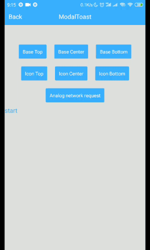
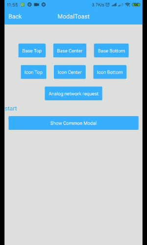
2020.3 Show Toast above Modal (Compatible with Android and iOS)
import { ModalShowToastView } from 'react-native-smart-tip'

getToastInstance = (toastInstance) => {
    this.toastInstance = toastInstance;
}

<Modal>
	<View>
		<ModalShowToastView toastInstance={this.getToastInstance} />
	</View>
</Modal>

this.toastInstance({data: 'toast'})
2019.7 Remove the method in the componentWillMount method. Compatible with future React 17 versions, [email protected] version.
Installation
yarn add react-native-smart-tip
or
npm i react-native-smart-tip --save
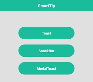
Features
Toast
SnackBar
Modal
Show tips on Modal
Tip: Modal shows that modal can only be used on Android issue
Usage
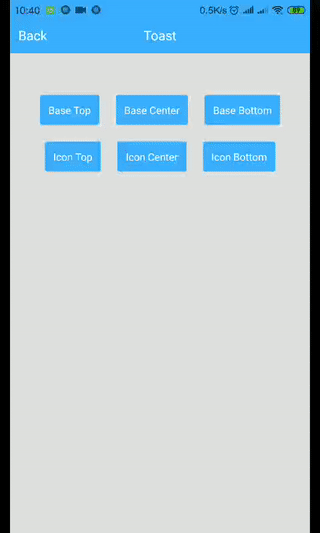
WToast
import {WToast} from 'react-native-smart-tip'

// Base
show = () => {
	WToast.show({data: 'hello world'})
}

// Other
show = () => {
	const toastOpts = {
	    data: 'Success',
	    textColor: '#ffffff',
	    backgroundColor: '#444444',
	    duration: WToast.duration.LONG, //1.SHORT 2.LONG
	    position: WToast.position.TOP, // 1.TOP 2.CENTER 3.BOTTOM
	    icon: <Image source={require('../data/img/success.png')} style={{width: 32,height: 32,resizeMode: 'contain'}}/>
	}

	WToast.show(toastOpts)
}

WToast.hide(); // Can be hidden immediately
WToast API
| Props | Type | Required | Default | Description |
|---|---|---|---|---|
| data | String | true | ' ' | Displayed content |
| duration | Number | false | WToast.duration.SHORT | The duration of the toast |
| position | Number | false | WToast.position.BOTTOM | Displayed position |
| inEasing | Easing | false | Easing.elastic(1) | Admission animation |
| textColor | String | false | 'white' | font color |
| backgroundColor | String | false | 'black' | background color |
| icon | Component | fasse | undefined | Image to be displayed |
| isShowShadow | boolean | false | true | Shadow effect |
WSnackBar
import {WSnackBar} from 'react-native-smart-tip'

// Base
show = () => {
	WSnackBar.show({data: 'hello world'})
}

// Other
show = () => {
	const snackBarOpts = {
	    data: 'Please check the network first.',
	    position: WSnackBar.position.BOTTOM, // 1.TOP 2.CENTER 3.BOTTOM
	    duration: WSnackBar.duration.LONG, //1.SHORT 2.LONG 3.INDEFINITE
	    textColor: '#ff490b',
	    backgroundColor: '#050405',
	    actionText: 'Sure',
	    actionTextColor: '#ff490b',
	    onActionHide: (isSlideHide)=>{
	    	// Click Action
	    },
	}

	WSnackBar.show(snackBarOpts)
}
WSnackBar API
| Props | Type | Required | Default | Description |
|---|---|---|---|---|
| data | String | true | ' ' | Displayed content |
| statusBarHeight | Number | false | -1 | Prevent Android statusBar |
| height | Number | false | 44 | Height to display |
| duration | Number | false | WSnackBar.duration.SHORT | The duration of the toast |
| position | Number | false | WSnackBar.position.BOTTOM | Displayed position |
| inEasing | Easing | false | Easing.linear | Admission animation |
| textColor | String | false | 'white' | font color |
| backgroundColor | String | false | 'black' | background color |
| actionText | String | false | undefined | action text |
| actionTextColor | String | false | 'white' | action text color |
| isAllowSlideExit | boolean | false | true | Whether to run sliding hide |
| onActionHide | Function | false | undefined | listener click |
| isShowShadow | boolean | false | true | Shadow effect |
| numberOfLines | number | false | 1 | Maximum number of rows |
WModal
import {WModal} from 'react-native-smart-tip'

// Base
show = () => {
	WModal.show({data: 'hello world'})
}

// Other
show = () => {
	const modalOpts = {
	    data: 'Loading',
	    textColor: '#fff',
	    backgroundColor: '#444444',
	    position: WModal.position.CENTER,
	    icon: <ActivityIndicator color='#fff' size={'large'}/>
	}

	WModal.show(modalOpts)
}
WToast API
| Props | Type | Required | Default | Description |
|---|---|---|---|---|
| data | String | true | ' ' | Displayed content |
| position | Number | false | WToast.position.BOTTOM | Displayed position |
| inEasing | Easing | false | Easing.elastic(1) | Admission animation |
| textColor | String | false | 'white' | font color |
| backgroundColor | String | false | 'black' | background color |
| icon | Component | fasse | undefined | Image to be displayed |
| onRequestClose | Function | false | undefined | Android Back |
MIT Licensed
Note that the project description data, including the texts, logos, images, and/or trademarks,
for each open source project belongs to its rightful owner.
If you wish to add or remove any projects, please contact us at [email protected].