searchy2 / Customalertviewdialogue
Programming Languages
Labels
Projects that are alternatives of or similar to Customalertviewdialogue
Custom AlertView Dialogue

The most advanced Android dialogue library.
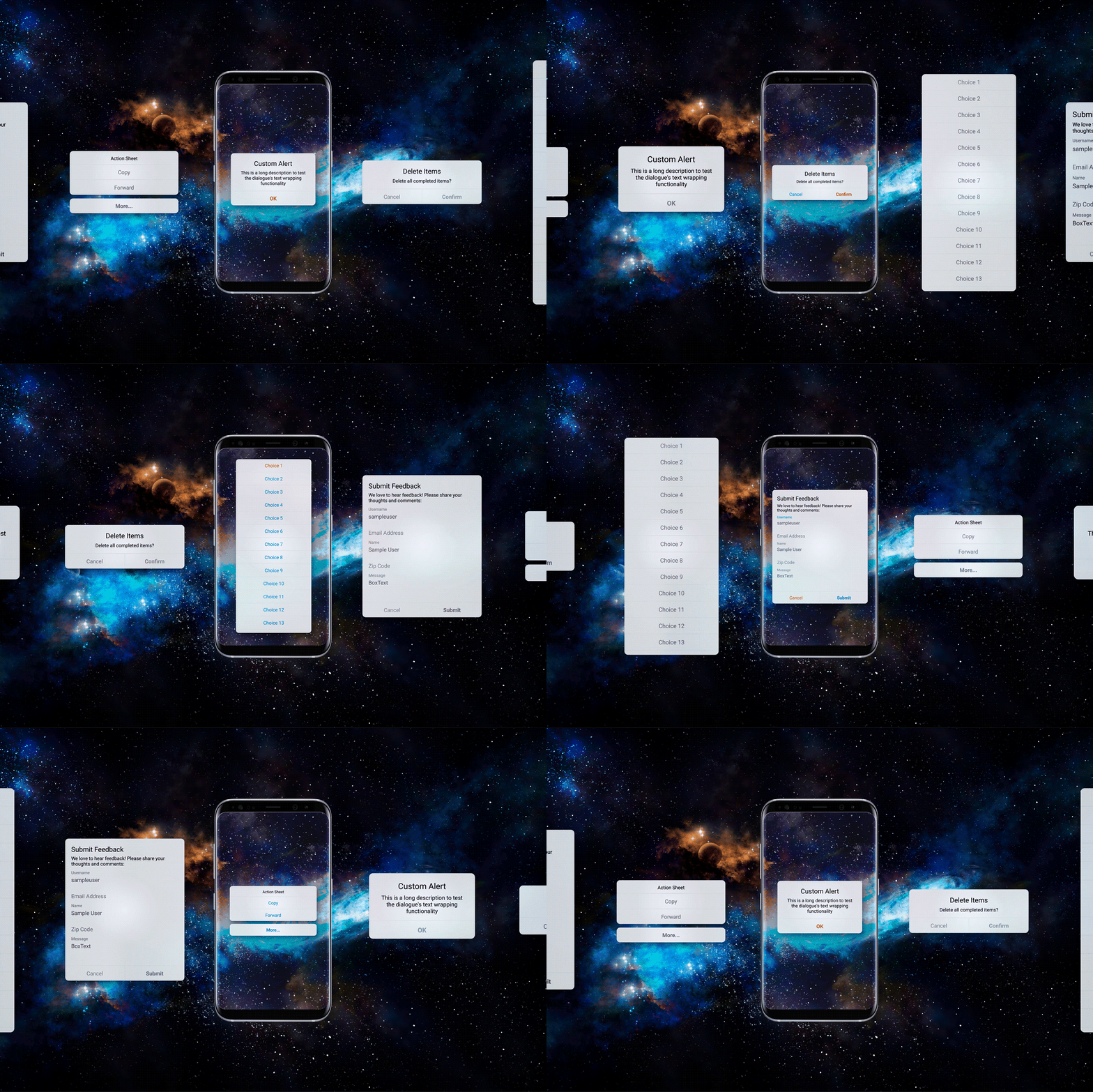
Custom AlertView Dialogue includes simple message popups, confirmation alerts, selector popups, action sheet bottom menus, and input/feedback contact forms. This library fixes many issues and crashes that plague other alert dialogue libraries and looks amazing while doing so!
Custom AlertView Dialogue is part of the Custom UI collection of beautiful, minimalistic, and customizable Android UI components.
About
Android alert dialogues are bland, limited in functionality, and visually inconsistent across Android versions. Existing Android dialogue libraries often crashed and were hard to customize. CustomAlertDialogue was created to offer a beautiful alert dialogue with advanced capabilities. Here at Codelessly, we're building a Flutter website/app builder, development tools, and UI templates to increase productivity. If that sounds interesting, you'll want to subscribe to updates below 😎
CustomAlertViewDialogue is licensed under Zero-Clause BSD and released as Emailware. If you like this project or it helped you, please subscribe to updates. Although it is not required, you might miss the goodies we share!
Import
Add this library to build.gradle.
repositories {
    maven { url 'https://jitpack.io' }
}
implementation 'com.github.searchy2:CustomAlertViewDialogue:latest-version'
Usage
Custom AlertView Dialogue uses the Builder format to initialize an alert view programmatically. To display an simple alert message, just drag and drop the following code into your project. It's that easy!
CustomAlertDialogue.Builder alert = new CustomAlertDialogue.Builder(MainActivity.this)
        .setStyle(CustomAlertDialogue.Style.DIALOGUE)
        .setTitle("Custom Alert")
        .setMessage("This is a long description to test the dialogue's text wrapping functionality")
        .setNegativeText("OK")
        .setOnNegativeClicked(new CustomAlertDialogue.OnNegativeClicked() {
            @Override
            public void OnClick(View view, Dialog dialog) {
                dialog.dismiss();
            }
        })
        .setDecorView(getWindow().getDecorView())
        .build();
alert.show();
IMPORTANT: The Dialog Fragment is extremely picky about the Activity passed into the builder. If the improper Activity is passed, the dialogue will crash! Here's how to pass the proper Activity in the following cases:
- Activity - construct with
ClassName.this - Fragment - construct with
getActivity() - ViewHolder - construct with
getActivity().getApplicationContext()
Do not attempt to construct the dialogue with getContext(). The Builder requires an Activity and passing a Context does not work!
Hint: Passing the DecorView to the Dialogue Builder in setDecorView will create a nice blurred background. Here's how to pass the correct DecorView:
- Activity - use
getWindow().getDecorView() - Fragment - use
getActivity().getWindow().getDecorView() - Viewholder - use
((Activity) mContext).getWindow().getDecorView()
Examples
Custom AlertView Dialogue provides many customization methods to display the alerts you need.
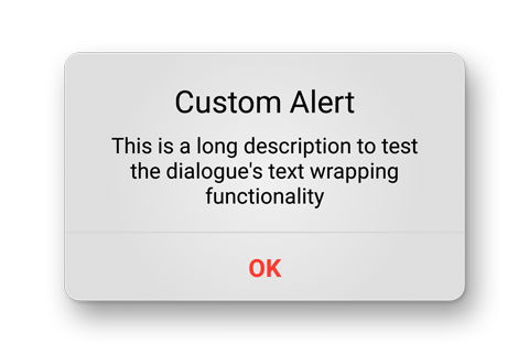
Simple Alert - a simple popup message.
CustomAlertDialogue.Builder alert = new CustomAlertDialogue.Builder(MainActivity.this)
        .setStyle(CustomAlertDialogue.Style.DIALOGUE)
        .setTitle("Custom Alert")
        .setMessage("This is a long description to test the dialogue's text wrapping functionality")
        .setNegativeText("OK")
        .setNegativeColor(R.color.negative)
        .setNegativeTypeface(Typeface.DEFAULT_BOLD)
        .setOnNegativeClicked(new CustomAlertDialogue.OnNegativeClicked() {
            @Override
            public void OnClick(View view, Dialog dialog) {
                dialog.dismiss();
            }
        })
        .setDecorView(getWindow().getDecorView())
        .build();
alert.show();
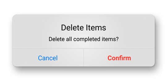
Confirmation Alert - a popup dialogue with two customizable choices.
CustomAlertDialogue.Builder alert = new CustomAlertDialogue.Builder(MainActivity.this)
        .setStyle(CustomAlertDialogue.Style.DIALOGUE)
        .setCancelable(false)
        .setTitle("Delete Items")
        .setMessage("Delete all completed items?")
        .setPositiveText("Confirm")
        .setPositiveColor(R.color.negative)
        .setPositiveTypeface(Typeface.DEFAULT_BOLD)
        .setOnPositiveClicked(new CustomAlertDialogue.OnPositiveClicked() {
            @Override
            public void OnClick(View view, Dialog dialog) {
                dialog.dismiss();
                Toast.makeText(mContext, "Items Deleted", Toast.LENGTH_SHORT).show();
            }
        })
        .setNegativeText("Cancel")
        .setNegativeColor(R.color.positive)
        .setOnNegativeClicked(new CustomAlertDialogue.OnNegativeClicked() {
            @Override
            public void OnClick(View view, Dialog dialog) {
                dialog.dismiss();
            }
        })
        .setDecorView(getWindow().getDecorView())
        .build();
alert.show();
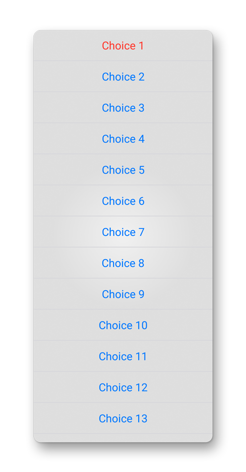
Selector - a scrollable list of options.
ArrayList<String> destructive = new ArrayList<>();
destructive.add("Choice 1");

ArrayList<String> other = new ArrayList<>();
other.add("Choice 2");
other.add("Choice 3");
other.add("Choice 4");
other.add("Choice 5");
other.add("Choice 6");
other.add("Choice 7");
other.add("Choice 8");
other.add("Choice 9");
other.add("Choice 10");
other.add("Choice 11");
other.add("Choice 12");
other.add("Choice 13");
other.add("Choice 14");
other.add("Choice 15");
other.add("Choice 16");
other.add("Choice 17");
other.add("Choice 18");
other.add("Choice 19");
other.add("Choice 20");

CustomAlertDialogue.Builder alert = new CustomAlertDialogue.Builder(MainActivity.this)
        .setStyle(CustomAlertDialogue.Style.SELECTOR)
        .setDestructive(destructive)
        .setOthers(other)
        .setOnItemClickListener(new AdapterView.OnItemClickListener() {
            @Override
            public void onItemClick(AdapterView<?> adapterView, View view, int i, long l) {
                CustomAlertDialogue.getInstance().dismiss();
                Toast.makeText(mContext, "Selected " + i, Toast.LENGTH_SHORT).show();
            }
        })
        .setDecorView(getWindow().getDecorView())
        .build();
alert.show();
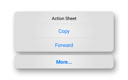
Action Sheet - a highly customizable bottom menu.
ArrayList<String> other = new ArrayList<String>();
other.add("Copy");
other.add("Forward");

CustomAlertDialogue.Builder alert = new CustomAlertDialogue.Builder(MainActivity.this)
        .setStyle(CustomAlertDialogue.Style.ACTIONSHEET)
        .setTitle("Action Sheet")
        .setTitleColor(R.color.text_default)
        .setCancelText("More...")
        .setOnCancelClicked(new CustomAlertDialogue.OnCancelClicked() {
            @Override
            public void OnClick(View view, Dialog dialog) {
                Vibrator vibe = (Vibrator) mContext.getSystemService(Context.VIBRATOR_SERVICE);
                vibe.vibrate(10);
                dialog.dismiss();
                Handler handler = new Handler();
                Runnable r = new Runnable() {
                    public void run() {
                        MoreSelector();
                    }
                };
                handler.postDelayed(r, 50);
            }
        })
        .setOthers(other)
        .setOnItemClickListener(new AdapterView.OnItemClickListener() {
            @Override
            public void onItemClick(AdapterView<?> adapterView, View view, int i, long l) {
                String selection = adapterView.getItemAtPosition(i).toString();
                Vibrator vibe = (Vibrator) mContext.getSystemService(Context.VIBRATOR_SERVICE);
                vibe.vibrate(10);
                switch (selection)
                {
                    case "Copy":
                        CustomAlertDialogue.getInstance().dismiss();
                        Toast.makeText(mContext, "Copied", Toast.LENGTH_SHORT).show();
                        break;
                    case "Forward":
                        CustomAlertDialogue.getInstance().dismiss();
                        Toast.makeText(mContext, "Forwarded", Toast.LENGTH_SHORT).show();
                        break;
                }
            }
        })
        .setDecorView(getWindow().getDecorView())
        .build();
alert.show();
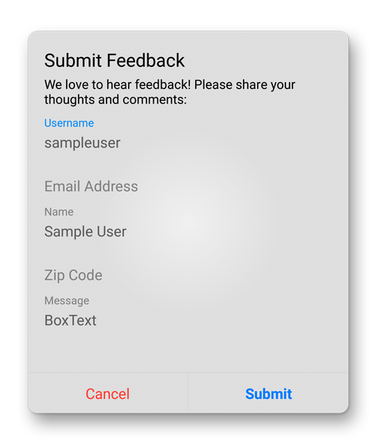
Input Box - helps collect user input. Can be used as a contact/feedback form.
ArrayList<String> lineHint = new ArrayList<>();
lineHint.add("Username");
lineHint.add("Email Address");
lineHint.add("Name");
lineHint.add("Zip Code");

ArrayList<String> lineText = new ArrayList<>();
lineText.add("sampleuser");
lineText.add(null);
lineText.add("Sample User");

ArrayList<String> boxHint = new ArrayList<>();
boxHint.add("Message");

ArrayList<String> boxText = new ArrayList<>();
boxText.add("BoxText");

CustomAlertDialogue.Builder alert = new CustomAlertDialogue.Builder(MainActivity.this)
        .setStyle(CustomAlertDialogue.Style.INPUT)
        .setTitle("Submit Feedback")
        .setMessage("We love to hear feedback! Please share your thoughts and comments:")
        .setPositiveText("Submit")
        .setPositiveColor(R.color.positive)
        .setPositiveTypeface(Typeface.DEFAULT_BOLD)
        .setOnInputClicked(new CustomAlertDialogue.OnInputClicked() {
            @Override
            public void OnClick(View view, Dialog dialog, ArrayList<String> inputList) {
                Toast.makeText(mContext, "Sent", Toast.LENGTH_SHORT).show();
                for (String input : inputList)
                {
                    Log.d("Input", input);
                }
                dialog.dismiss();
            }
        })
        .setNegativeText("Cancel")
        .setNegativeColor(R.color.negative)
        .setOnNegativeClicked(new CustomAlertDialogue.OnNegativeClicked() {
            @Override
            public void OnClick(View view, Dialog dialog) {
                dialog.dismiss();
            }
        })
        .setLineInputHint(lineHint)
        .setLineInputText(lineText)
        .setBoxInputHint(boxHint)
        .setBoxInputText(boxText)
        .setDecorView(getWindow().getDecorView())
        .build();
alert.show();
Customization
Override Fullscreen
By default, showing an alert dialogue enters fullscreen mode. This behavior can be disabled by overriding the dialogue's style.
Place the following code in your project's style.xml to override the dialogue's style and disable fullscreen mode.
<!-- Override AlertView Dialogue Fullscreen -->
<style name="CustomDialog" parent="android:Theme.Dialog">
    <item name="android:windowNoTitle">true</item>
    <item name="android:windowFullscreen">false</item>
    <item name="android:windowContentOverlay">@null</item>
    <item name="android:windowBackground">@android:color/transparent</item>
    <item name="android:backgroundDimEnabled">true</item>
    <item name="android:backgroundDimAmount">0.5</item>
    <item name="android:windowIsFloating">false</item>
    <item name="android:gravity">center</item>
</style>
Builder Attributes
| Attribute | Description |
|---|---|
| setStyle(Style style) | Set AlertView type DIALOGUE ACTIONSHEET SELECTOR INPUT
|
| setTitle(String title) | set AlertView title text |
| setMessage(String message) | setMessage(String message) |
| setPositiveText(String positiveButtonText) | set Confirmation Alert right button text |
| set Confirmation Alert right button text | set Confirmation Alert right button text |
| set Confirmation Alert right button text | set Action Sheet cancel button text |
| setTitleColor(int titleColor) | set title text color |
| setMessageColor(int messageColor) | set message text color |
| setPositiveColor(int positiveTextColor) | set positive button text color |
| setNegativeColor(int negativeColor) | set negative button text color |
| setCancelColor(int cancelColor) | set cancel button text color |
| set cancel button text color | set title text font. Must pass the path to the font in the assets folder |
| setMessageFont(String bodyFontPath) | set message text font. Must pass the path to the font in the assets folder |
| setPositiveTypeface(Typeface positiveTypeface) | set positive button text typeface |
| set positive button text typeface | set positive button text typeface |
| setOnPositiveClicked(OnPositiveClicked onPositiveClicked) | pass a listener to be called when the positive button is clicked |
| setOnNegativeClicked(OnNegativeClicked onNegativeClicked) | pass a listener to be called when the negative button is clicked |
| setOnCancelClicked(OnCancelClicked onCancelClicked) | pass a listener to be called when the cancel button is clicked |
| setOnItemClickListener(AdapterView.OnItemClickListener onItemClickListener) | pass a listener to be called when a selection item is clicked |
| setOnInputClicked(OnInputClicked onInputClicked) | pass a listener to be called when an input box is submitted |
| setDestructive(ArrayList destructive) | converts a String ArrayList into destructive options in the selector |
| setOthers(ArrayList others) | converts a String ArrayList into neutral options in the selector |
| setLineInputText(ArrayList lineInputText) | converts a String ArrayList into single line text input boxes |
| setLineInputHint(ArrayList lineInputHint) | converts a String ArrayList into single line input boxes hints. Array length must match LineInputText length. |
| setBoxInputText(ArrayList boxInputText) | setBoxInputText(ArrayList boxInputText) |
| setBoxInputText(ArrayList boxInputText) | converts a String ArrayList into multiline input boxes hints. Array length must match BoxInputText length |
| setAutoHide(boolean autoHide) | set true to automatically hide alert after a set time |
| setTimeToHide(int timeToHide) | set time in milliseconds for popup to automatically dismiss. No listeners are triggered when dismissed automatically. |
| setCancelable(boolean cancelable) | set false to prevent dialogue dismissal through tapping outside or pressing the back button. Force the user to choose an option. |
| setDecorView(View decorView) | pass the Window DecorView for a nice blurred background. Defaults to overlay color. |
| build() | construct the Dialogue Builder |
| show() | display the Dialogue with Builder parameters |
View the Layouts section or the sample app for examples of how to use these Builder attributes.
New Layout Creation
Custom AlertView Dialogue provides a powerful framework to creating new alert layouts quickly. If one of the existing alerts do not meet your needs, creating a new alert is very simple! You can take advantage of the existing dialogue code and just declare a new style in the Style enumerator.
Once you have a new style, you can duplicate an existing layout or start from scratch. Dialog Fragment behaves much like a regular fragment with support for RecyclerViews and Relative Layouts. Most existing layout and code can be dragged and dropped into a Dialog Fragment. Note: ViewPagers cannot be placed in a Dialog Fragment because Dialog Fragments do not support ViewPagers (an entire day's work was lost due to this unfortunate limitation :P).
With your new layout, all that is left is adding the corresponding code and listener callbacks. Most code works well within a Dialog Fragment just like layouts do. If you wish to pass back information, follow the existing examples to create your own onClickListener callback.
Create the necessary Builder methods to customize your new layout and you're done!
Features Wishlist
These features would make this library even more awesome. You can contribute to this library by developing any of the features below. Or, if you really want to see a feature developed, you can sponsor me to develop the feature.
Dynamic Blur Background ✔️ (Completed 2/22/2018)
Thanks to @Dimezis for fixing his BlurView library to work with DialogFragments. Without Dimezis's help, there would be no blurred background!
Date Selector
There are a lot of ugly date selectors. Then their are a lot of beautiful date selectors that don't calculate dates correctly or require a time to be selected as well. A beautiful, dedicated date selector with correct date calculation would be wonderful!
Slider Value Picker
The easiest way to choose a number is with a slider. Having a slider integrated into this library would help cover many number entry scenarios.
Number Setter
This is a more precise way to select small numbers or numbers that do not change much. The number setter would have a text box in the middle that accepts direct number input and buttons on either side to increment or decrease the number.
Pull requests are most welcome!
If you've fixed a bug or have a feature you've added, just create a pull request. If you've found a bug, file an issue. If you have any questions or would like to discuss upcoming features, please get in touch. You can get in touch with me in the Contact section below.
★ Acknowledgements ★
♥ Developer ♥
♥ Designer ♥
♥ Inspiration ♥
UI design and functionality - https://github.com/saiwu-bigkoo/Android-AlertView
Dialog Fragment code - https://github.com/geniusforapp/fancyDialog
♥ Sponsor ♥
Codelessly - Flutter Website and App Builder
★ Get in Touch ★
Apps Using This Library
Add your app here by making a pull request.
| Rocket Notes | |
| Crowdfunding Community | |
| Blank Icon |
Search Terms
android, alert, alertview, popup, dialog, dialogs, select, selector, confirmation, bottom menu, action sheet, chooser, choice, options, display, input, box, message, contact, feedback, form, modal
License
BSD Zero Clause License

Copyright © 2020 Ray Li

Permission to use, copy, modify, and/or distribute this software for any
purpose with or without fee is hereby granted.

THE SOFTWARE IS PROVIDED "AS IS" AND THE AUTHOR DISCLAIMS ALL WARRANTIES WITH
REGARD TO THIS SOFTWARE INCLUDING ALL IMPLIED WARRANTIES OF MERCHANTABILITY
AND FITNESS. IN NO EVENT SHALL THE AUTHOR BE LIABLE FOR ANY SPECIAL, DIRECT,
INDIRECT, OR CONSEQUENTIAL DAMAGES OR ANY DAMAGES WHATSOEVER RESULTING FROM
LOSS OF USE, DATA OR PROFITS, WHETHER IN AN ACTION OF CONTRACT, NEGLIGENCE OR
OTHER TORTIOUS ACTION, ARISING OUT OF OR IN CONNECTION WITH THE USE OR
PERFORMANCE OF THIS SOFTWARE.


