react-native-whc-toast
A react native module to show toast alert, it works on iOS and Android.


Content
Installation
- 1.Run
npm install react-native-whc-toast --save - 2.
import Toast from 'react-native-whc-toast'
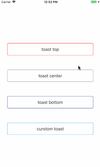
Demo
Getting started
Add react-native-whc-toast to your js file.
import Toast from 'react-native-whc-toast'
Inside your component's render method, use Toast:
 render() {
         return (
             <View style={styles.container}>
                 ...
                 <Toast ref="toast"/>
             </View>
         );
 }
Then you can use it like this:
1.default display bottom:
 /// alert toast bottom
 this.refs.toast.show('hello toast');
 /// or
 this.refs.toast.showBottom('hello toast');
2.display top:
 /// alert toast bottom
 this.refs.toast.showTop('hello toast');
 /// or
 this.refs.toast.show('hello toast', Toast.Duration.long, Toast.Position.top);
3.display center:
 /// alert toast center
 this.refs.toast.showCenter('hello toast');
 /// or
 this.refs.toast.show('hello toast', Toast.Duration.long, Toast.Position.center);
Basic usage
render() {
        return (
            <View style={styles.container}>
                <TouchableHighlight
                    onPress={()=>{
                        this.refs.toast.show('hello toast');
                    }}>
                    <Text>Start Toast</Text>
                </TouchableHighlight>
                <Toast ref="toast"/>
            </View>
        );
    }
Custom Toast
render() {
        return (
            <View style={styles.container}>
                <TouchableHighlight
                    onPress={()=>{
                        this.refs.toast.show('hello toast', Toast.Duration.long, Toast.Position.bottom);
                    }}>
                    <Text>Start toast</Text>
                </TouchableHighlight>
                <Toast
                    ref="toast"
                    style = {styles.toast}
                    textStyle = {styles.text},
                    position = {Toast.Position.bottom}
                    fadeInDuration = {300}
                    fadeOutDuration = {300}
                    duration = {Toast.Duration.long}
                    opacity = {0.9}
                    positionValue = {100}
                />
            </View>
        );
    }
API
| Position | Description |
|---|---|
| Position.top | toast show top |
| Position.center | toast show center |
| Position.bottom | toast show bottom |
| Duration | Description |
|---|---|
| Duration.short | toast default show short duration |
| Position.long | toast default show long duration |
| Position.infinite | toast alway show |
| Props | Type | Optional | Default | Description |
|---|---|---|---|---|
| style | ViewPropTypes.style | true | {} | Custom default toast style |
| textStyle | Text.propTypes.style | true | {} | Custom default toast text style |
| position | Toast.Position | true | Toast.Position.bottom | Custom default toast show position |
| fadeInDuration | PropTypes.number | true | 300 | Custom default toast fade in duration |
| fadeOutDuration | PropTypes.number | true | 300 | Custom default toast fade out duration |
| duration | Toast.Duration | true | Toast.Duration.long | Custom default toast show duration |
| opacity | PropTypes.number | true | 0.9 | Custom default toast fade in or fade out opacity animation |
| positionValue | PropTypes.number | true | 100 | Custom default toast show top, bottom margin |
| Method | Type | Optional | Description |
|---|---|---|---|
| show(message, duration, position) | function | true | show toast custom position default bottom |
| showTop(message, duration) | function | true | show toast top |
| showCenter(message, duration) | function | true | show toast center |
| showBottom(message, duration) | function | true | show toast bottom |
| close(isNow) | function | true | hide toast |
Contribution
Issues are welcome. Please add a screenshot of bug and code snippet. Quickest way to solve issue is to reproduce it on one of the examples.
Pull requests are welcome. If you want to change API or making something big better to create issue and discuss it first.
MIT Licensed